Brand articulation / Brand evolution / Brand narrative / Segmentation strategy
LEAD DON’T FOLLOW
The Brief
"Since you first worked on our brand in 2013 we’ve grown from £3 million to £100 million in revenue. We’re a big hit amongst avid gym goers and fitness fanatics but now we want to broaden our appeal and be a more inclusive brand for all. Can you help?"
The Opportunity
More people are recognising the important role fitness and nutrition plays in their lives. But in a category saturated with buff bodies, complicated claims and heavy discounts, it can be hard to know where to start and who to trust.
The opportunity, as we saw it, was to challenge convention and present a new way of doing things – elevating the newly-named bulk™ from perceived commodity to an aspirational lifestyle brand for any goal and every body.
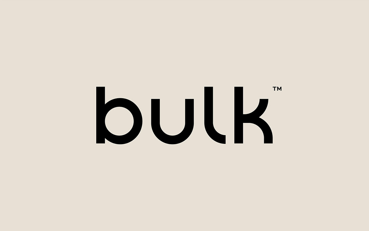
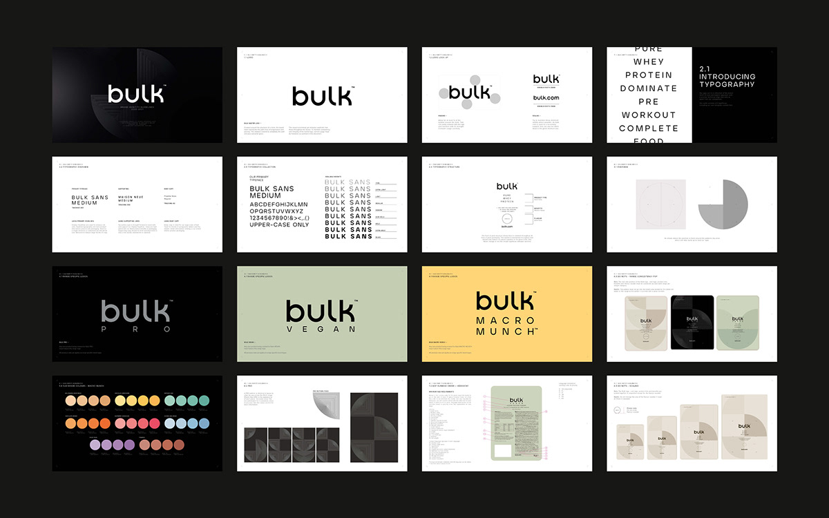
A key part in building a more inclusive, lifestyle brand was to soften the connotations of the word ‘bulk’. To help achieve this we created a new lowercase wordmark, drawing inspiration from the circular structure of the previous logo to craft the curves and contours of each letter.


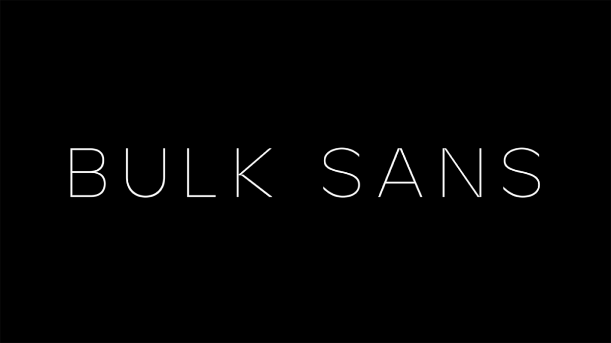
Alongside the wordmark we created a bespoke font suite, Bulk Sans. The technical cuts and visual variances of the font add an ownable edge to the identity and bolster the newly defined, confident and motivational tone of voice.

The biggest challenge was to broaden bulk™'s appeal without alienating its core audience of gym enthusiasts. We found that what united these two audiences was the importance of the fitness ‘journey’ – so we positioned the brand as an integral part of that journey.

From this came a strong reason to believe; that no matter who you are, if you have a goal, bulk™ will help you achieve it.


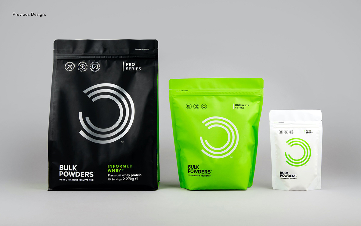
For the packaging, we needed to reduce the feeling of intimidation within the category whilst making bulk™'s extensive product range easier to shop.
We opted for a less is more approach, inspired by contemporary health and beauty brands, to pull bulk™ firmly apart from others in the category – whilst allowing enough flexibility to clearly differentiate the ranges.

We created a series of new circular patterns, inspired by nutritional charts, to represent the idea of constant progression.
Differing between ranges, each pattern and colour are key to their pack expressions, adding an element of depth and flex that’s missing from the category.


Off pack, we considered every step in the customer experience to build a rich brand world that transforms bulk™ from just another product, to a compelling and aspirational lifestyle.
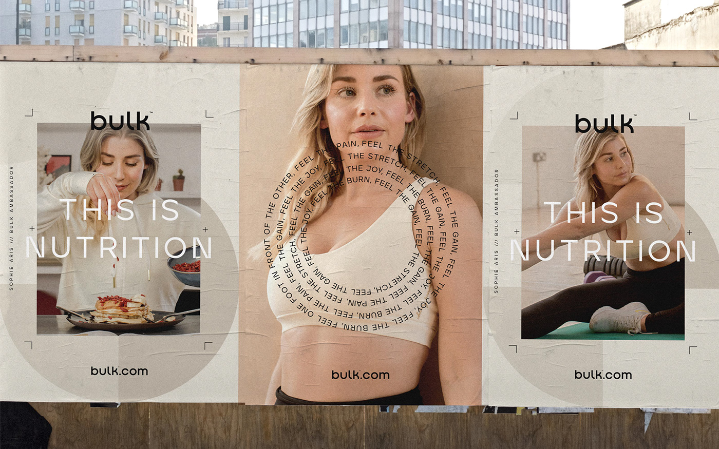
The realistic, gritty photography style celebrates the passion, determination and hard graft that comes with achieving a personal fitness goal, whilst high-energy, motivational messaging empowers customers to be the best they can be.


Finally, to ensure consistency across all touchpoints, we created in depth brand guidelines to equip bulk™ with everything they needed to bring their brand to life.