BR
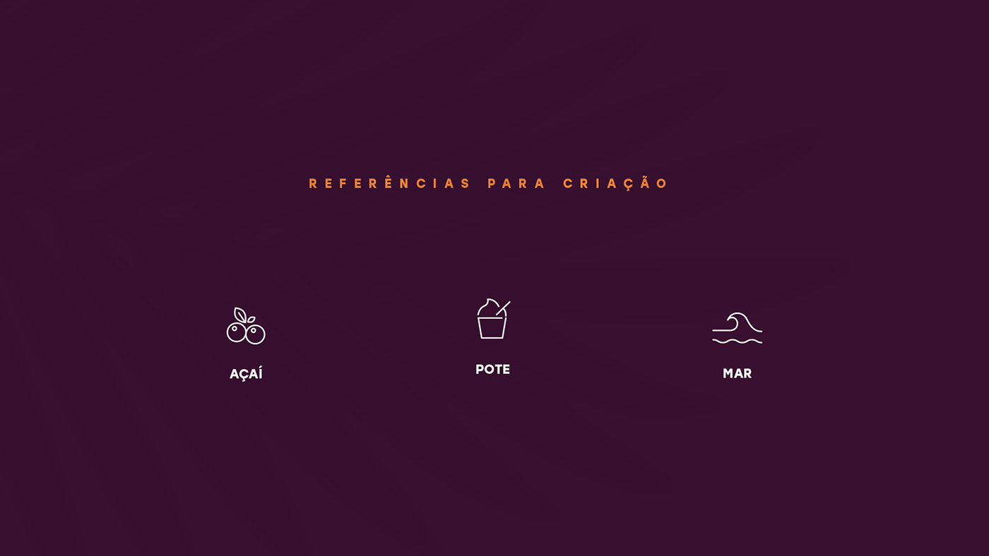
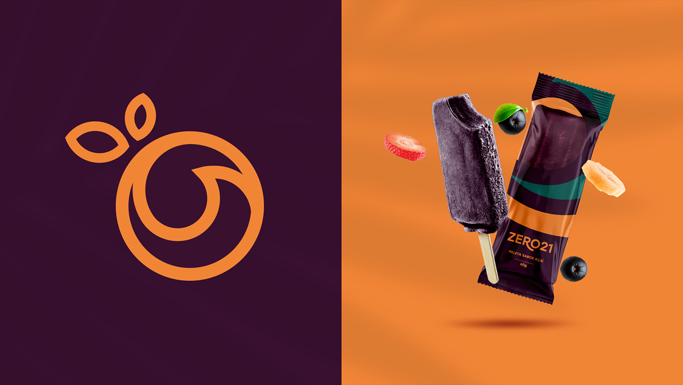
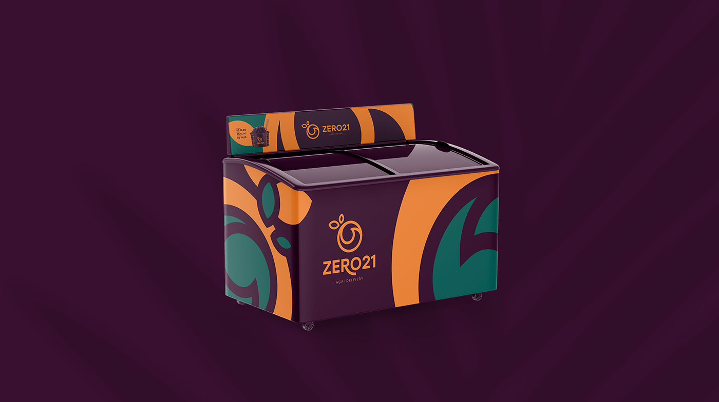
Uma marca divertida, alegre e moderna. Para a construção da logo Açaí 021, foi utilizado um conceito que agrega três vertentes: o fruto do açaí, o pote para o produto e a onda, que remete ao Rio de Janeiro (021 no DDD). Dessa forma, criou-se um ícone extremamente dinâmico e atrativo, que combina o sabor do açaí com o clima tropical brasileiro. Junto ao ícone, temos uma fonte moderna que complementa o sentido, proporcionando estilo e atratividade, tornando-se convidativo aos clientes.
EN
-
-
A fun, cheerful and modern brand. For the construction of the Açaí 021 logo, a concept was used that aggregates three aspects: the fruit of the açaí, the pot for the product and the wave, which refers to Rio de Janeiro (021 in DDD). This way, an extremely dynamic and attractive icon was created, which combines the flavor of açaí with the Brazilian tropical climate. Next to the icon, we have a modern fountain that complements the sense, providing style and attractiveness, becoming inviting to customers.