


Acknowledgement
I was inspired for this project by Emanuele Abrate's project "The worst logos ever, Redesigned". I really loved his work and I was so deeply influenced that I got very excited to make my own version, which I present here as - "The worst logos ever, Redesigned - 2 ".
So all it took to make this project a perfect brew was a tablespoon of Emanuele's inspiration, a swoosh of curiosity, extra large cubes of creativity and most importantly - rivers of coffee ;)

Kostelecké uzeniny
This logo was the one I had the most fun with while fixing.
Apart from our gentleman here, there were few other design faults which I saw like the striking red background which is painful to look at and bad font choices.
Still, I wanted to save the design as much as I can, work with a similar color palette, and yet enjoy the artistic freedom in this logo and make it look a bit modern and somehow more "welcoming".
So, I'd just say I taught our fine gentleman here some table manners and gave him a smile. That did just the trick :)
I chose Futura as the font to give that classic yet modern look. Trashed the idea of dual shaded text.
Kept my palette just a bit over minimal and changed the chroma (chromaticity) of background to make it more soothing for the eye.


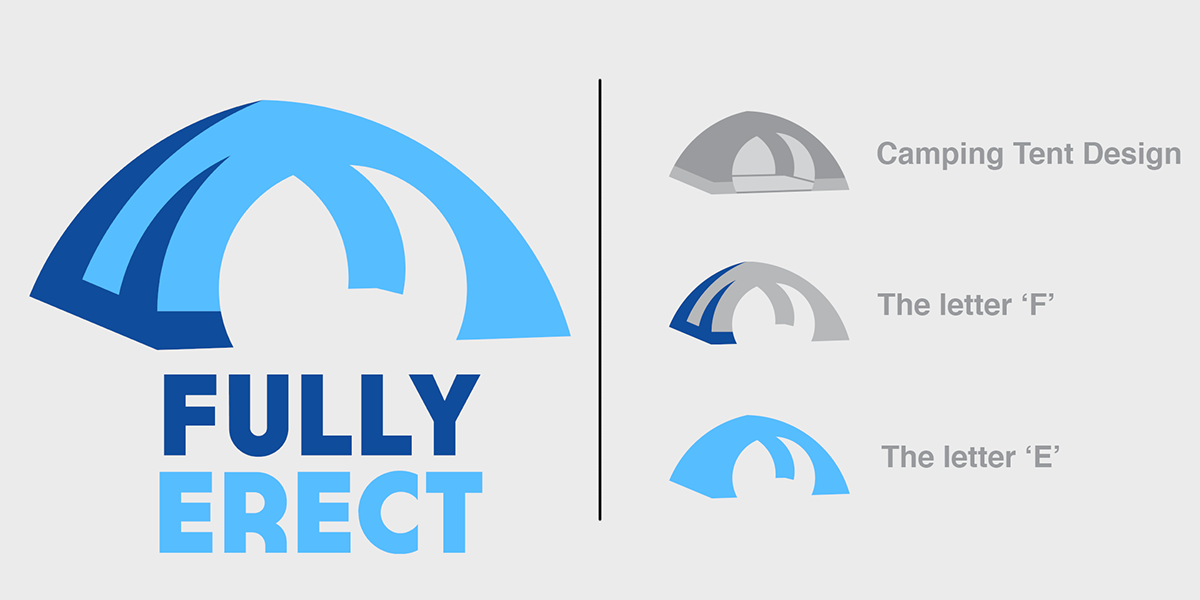
Fully Erect Tents
Well definitely "someone is very excited to go camping" (tagline not copied at all, 100% original XD ).
For this particular logo, nothing much could be saved except maybe the font style and the color scheme. So I sent our Mr Protagonist for fishing and meanwhile renovated his tent ;D
I redesigned the whole logo concept. The idea was pretty simple - to make a logo with the initials of the company name i.e. the letters F and E. And somehow combine this idea with the actual product, which is, the camping tents.
I adapted an overall cooler theme for the logo to resemble the original color scheme, and removed "grass" from the font, although I liked the bold "blocky" fonts from the original logo and thus preserved them.


Locum Real Estate
We all know that Christmas is all about spreading love and happiness throughout the world. But it appears that in these season's greetings, our pals at Locum Real Estate took this motto a bit too literally ;P
Although the logo very obviously depicts an ambiguous message. At the same time there are several things which I actually liked about it and thus tried my best to preserve these elements like the white and royal blue color scheme, the minimalism of logo and the logotype i.e., a wordmark with customized letter 'O'.
Moreover, I have used a custom hand-drawn font for the wordmark which looks like a flowing ribbon and thus enhances the festive vibes, HoHoHo :)
P.S. The kid inside me really wanted to give a nice little Santa hat to 'M', but then I decided to stick with the approach of original logo and thus dropped the idea :(


Deccan Engineering Enterprise
We get it - engineers are great at everything, but certainly there are better ways than this symmetrical logo to exhibit that. The ambiguity was so profound in this one that I decided to redesign from scratch, keeping just the idea of a bunny rabbit intact.
So my approach for the redesign was pretty simple - the initials of the company combined to form a rabbit.
But as a wise man once said, " The hardest task is to make things simple ". So it took a million unstable reactions between the artist me, designer me and the critic me to finally attain equilibrium on this minimalist design :)
My overall try was to just make the logo minimalist yet elegant, so I found a better vantage point for our bunny and helped him get in shape ;P


Sherwin William Paints
"Cover The Earth" : RED! - isn't a good idea until it's either Friday - The 13th or La Tomatina :P
Thanks to the ambiguous message portrayed trough this logo, the SWP guys are often facing criticism, and are being doubted upon for their motives. So let's just give our good friends some rest and clear up the air a bit, after all it's a paint company not Illuminati XD
With this logo I just tried to make as little amendments as possible, in fact for the most part I just played along the color scheme and tried to make the logo overall - friendlier.
In a nutshell - This is a pretty ambitious redesign as it's an attempt to create a positive vibe in contrast to the original logo using minimal changes. My solution to which, was to make the design look more "playful" by using a very cool and soothing color palette and by making the logo look like it was a child's drawing straight out of the sketchbook of a 4th grader.


MONT-SAT DTH
After seeing this logo, one thing can be said for sure - the mascot loves his job ;P
However, as minimal flat logos continue to trend this year, I wanted to swim upriver in this redesign. I got inspired for this redesign from the retro and maximalist logo styles and thus decided to combine them with the rather newer wordmark design.
Thus in this logo, a very modern and stylish look in the left half with the letter 'O' showing the horizon / orbit ( giving a sense of vast reach ) ; is combined with a rather retro design of letter 'T' as an antenna with intricate details. Thus establishing a sense of contrast - a salute to the brand for surviving the test of time.
Another perspective can be where the letter 'O' resembles a dish antenna and the letter 'T' is the old-fashioned retro cable-TV antenna which overall again signifies the journey of the brand through decades.


Bureau of Health Promotion, Taiwan
I absolutely LOVE the minimal logos with clever usage of negative space. However negative space has joined the dark side here.
In this logo, the "curvy" typeface combined with this usage of negative space portrays a rather embarrassing image. However, I liked the overall concept of writing the company initials and then trying to portray H and a "+" symbol using negative space with the full name of the company on the outer edges of logo.
So I just reapplied the same concept with a rather cleaner approach where I ditched the "heads" and applied the typography in such a way that one can see a cross symbol in the negative space and this time the letter 'P' looks like a leaf.
Then finally wrapped it all in the nice green color to represent a healthy environment :)


Catholic Church's Archdiocesan Youth Commission
I personally see this original logo as a rather decent one. But still, as there are peaceful angels, there are chaotic devils too. (E.g. Me with coffee vs me without coffee XD )
So people saw some ambiguous details in this one. Some of the Santa's nice-listers saw a Poké Ball in it while other grown up naughty-listers saw a totally different scenario.
Anyway, the redesign for this logo was the most challenging one for me because I couldn't find much data to work with. Besides just the name of the organization and the fact that this logo was made in 1973, there were just peanuts on the name of data :P
So I was rather unsure whether I should do this one or not, but then I thought it'd be a great challenge if I can work with that handful of design brief and come up with something even half as good as my other designs. So I took it on anyway :D
Overall I have tried to stick with the original design style but I replaced our father here with a nun, gave that child a raise ( quite literally ;P ) and displaced his position a bit to the left to tackle the previous situation of ambiguity.
And to be honest, I loved the end result so much that this one became one of my most cherished designs ever :)


State of Vermont - Pure Maple Syrup
I've read somewhere and I totally agree that seriously nobody could've thought how much the map of Vermont resembles with someone's thigh until he/she has seen this logo XD
Apart from the very obvious ambiguous message portrayed here, the font choices, the different stroke weights, the absolute eye wrecking red and green colored palette, they all make this logo a legendary mess. For a guy like me, it's a feast to work with.
Being a teetotaler myself, apart from coffee, I'm a die-hard fan of juices and syrups. So this logo redesign got me really excited and thus I played a long shot of trying convey the whole process of obtaining sap from trees through this redesign. Thus I put all the elements into this one as a composite logo which included Maple leaf, the sugar maple tree, the wooden spile (used to 'tap' the trees) and the sap, that too, chronologically :)
Having said that, I also wanted the logo not to be very cluttered or jam-packed, so although I followed the previous messy approach - but I tried to maintain a cleaner output.
Also the color palettes for different elements in the logo are taken directly from the respective real life objects thus maintaining an overall "real and natural" vibe throughout the design.


That's All Folks ;)
Any CC are most welcome, I'd be glad to hear from you.


