Bauer Display
Role: Designer
Agency: OWD
For: Oklart Type Foundry
Typography / Type Design
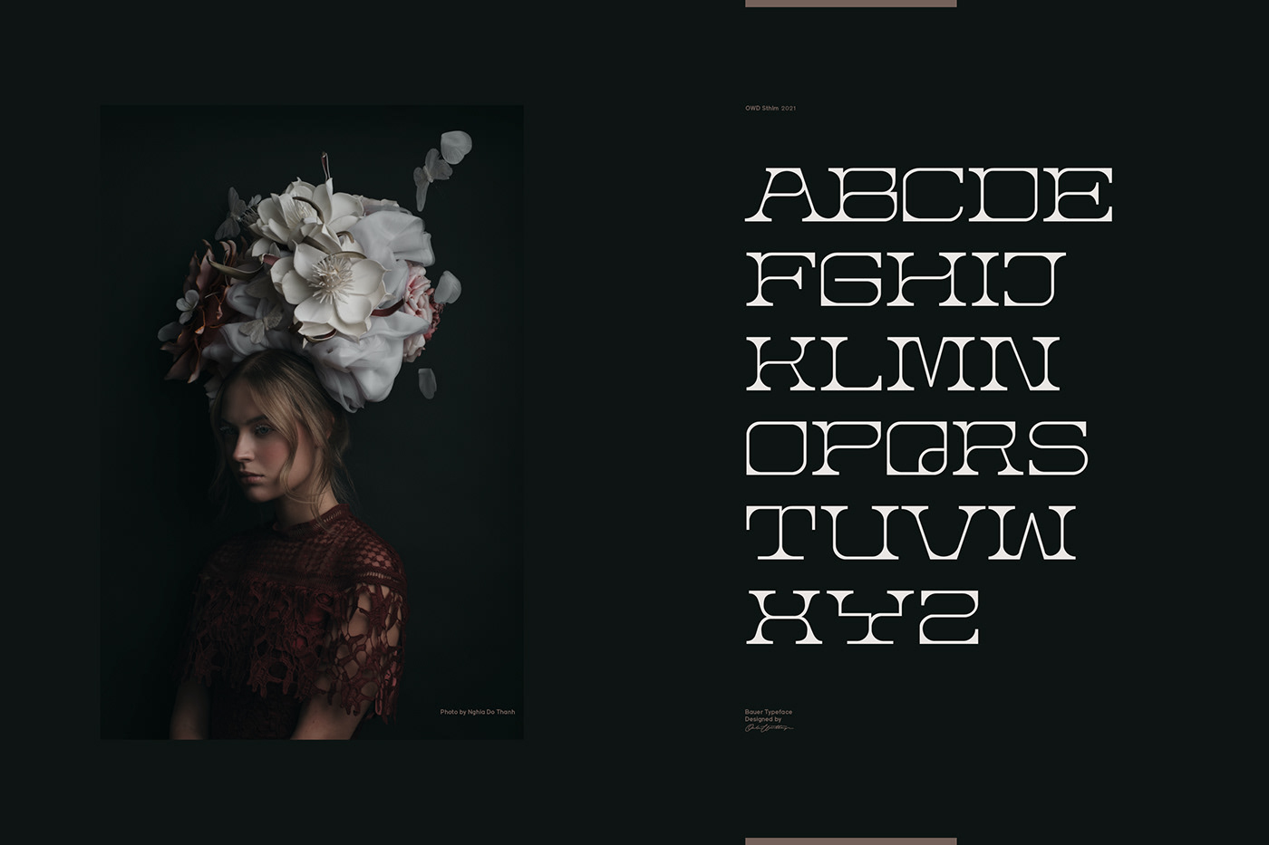
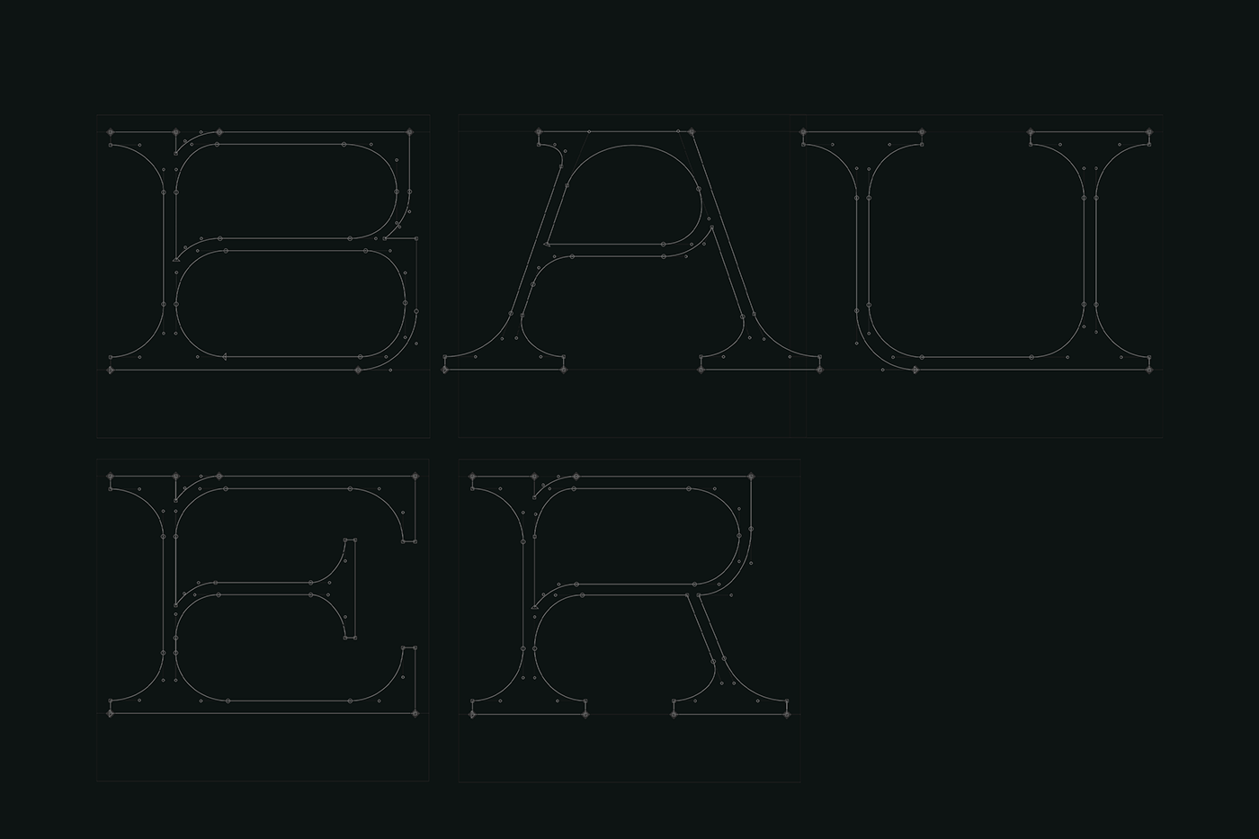
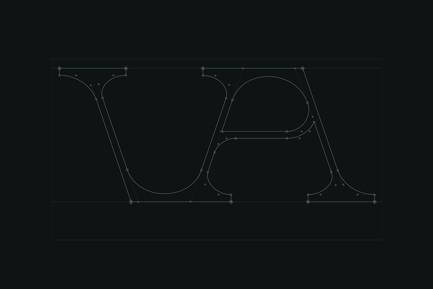
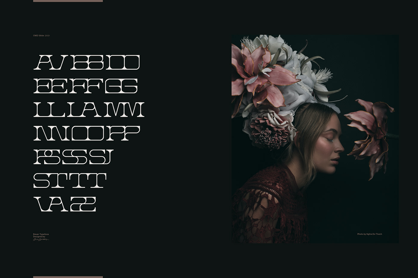
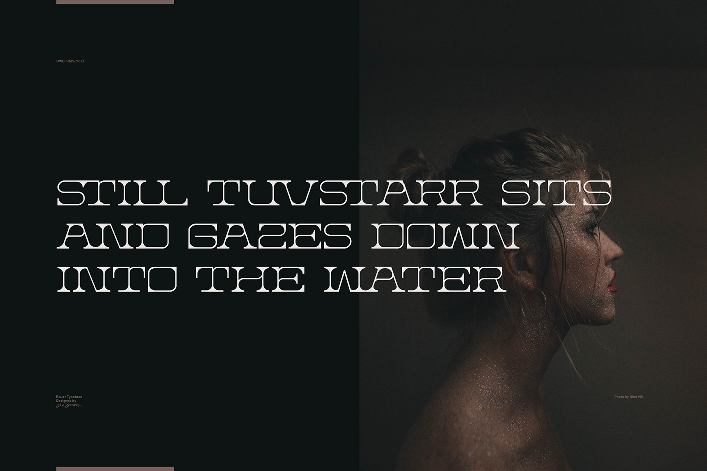
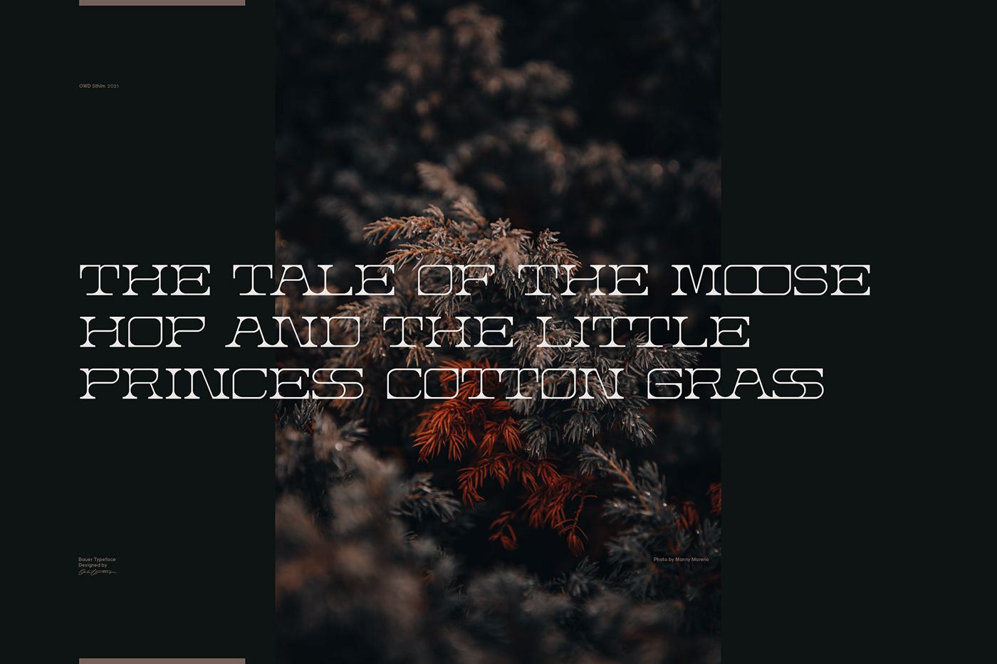
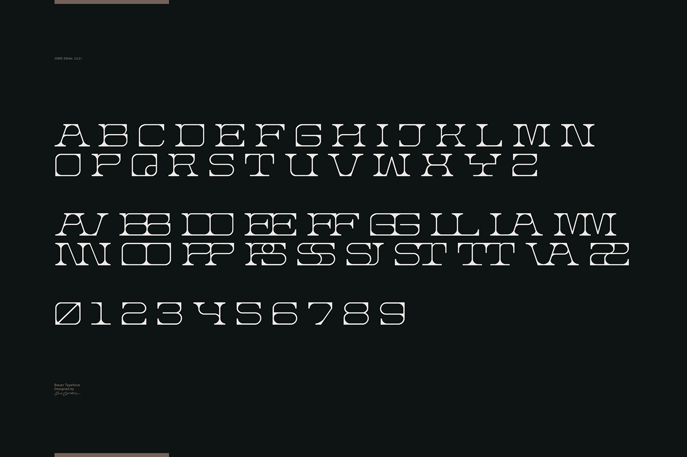
John Bauer’s illustrations had a very soft and naturally mystical quality to them, but at the same time there was often a darkness and a sense of danger present. I wanted to represent both these opposites in the Bauer font. This is achieved by combining soft, curved crossbars and a warm middle in with a hard surrounding shell and sharp angular serifs. Like vines climbing a structure, the insides are soft, flowing and decorative enhanced by deeply rounded corners while the shell is sharp with harsh, unforgiving edges.
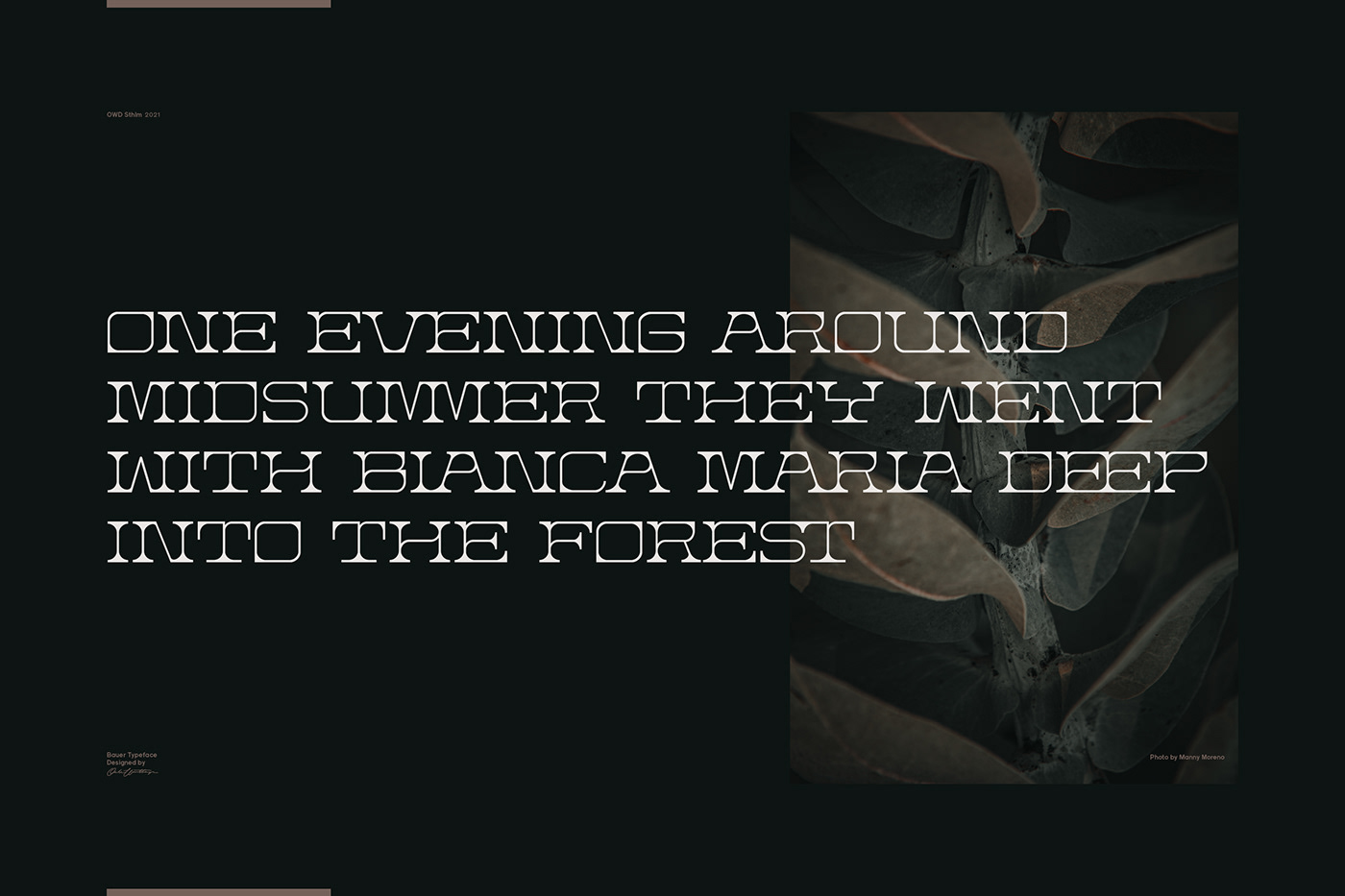
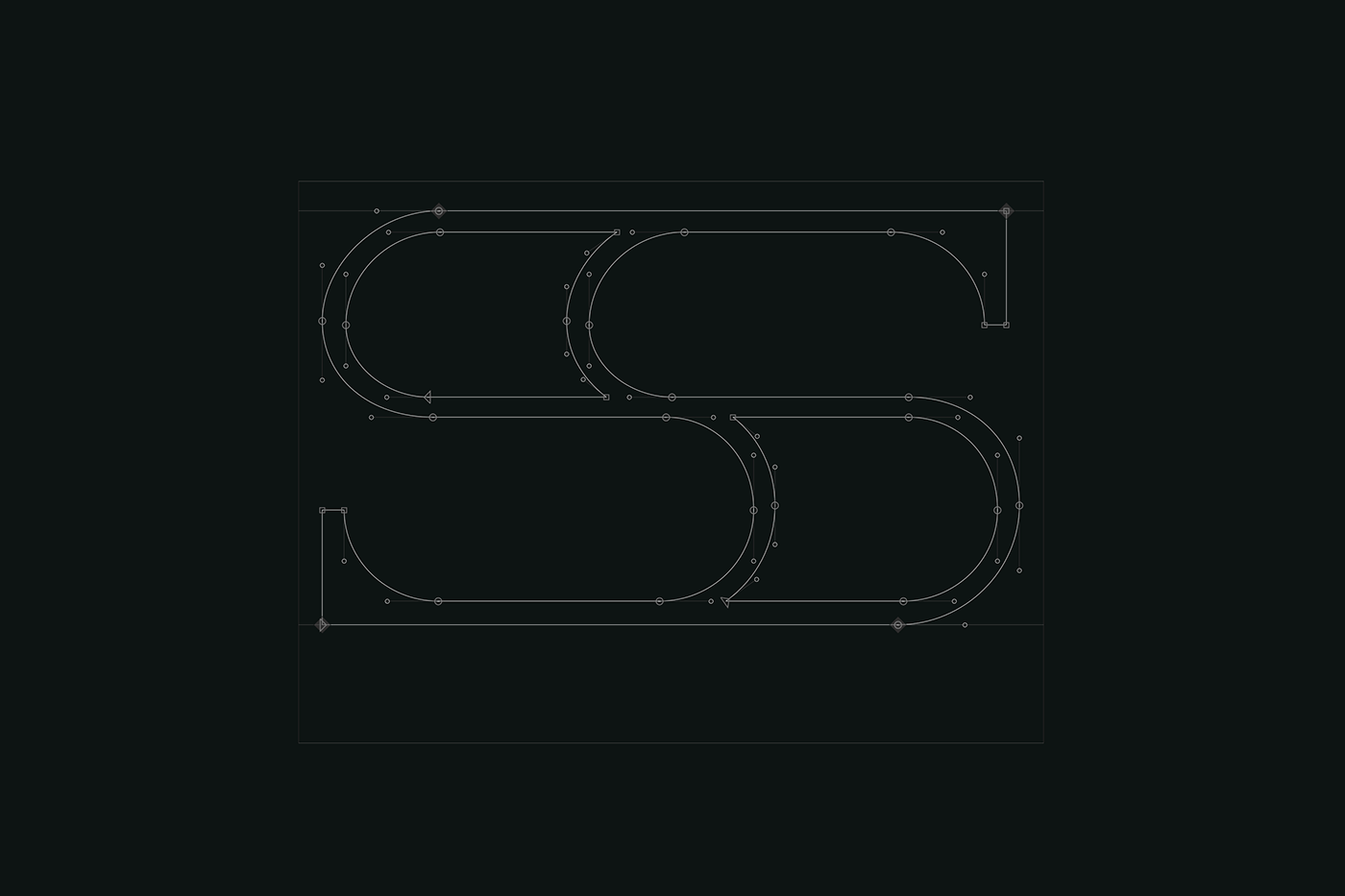
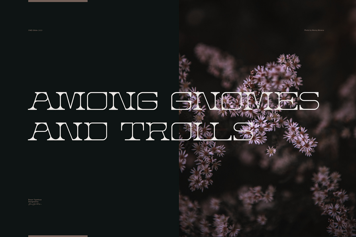
The goal was to find elegance and frailty within a harsher environment. I chose to use quite heavy brackets, as the curved transitions create a soft blackness to otherwise low contrast lines, and at the same time play with the roundness of the counters. I also wanted it to flow together and enlace like roots in a forest, so I made a set of ligatures to enhance this feeling of natural intertwine while sustaining legibility.
The goal was to find elegance and frailty within a harsher environment. I chose to use quite heavy brackets, as the curved transitions create a soft blackness to otherwise low contrast lines, and at the same time play with the roundness of the counters. I also wanted it to flow together and enlace like roots in a forest, so I made a set of ligatures to enhance this feeling of natural intertwine while sustaining legibility.