Assignment Brief
Designing a responsive homepage for a travel website. The screen resolution for the three breakpoints the website needs to support are 320 x 480px, 769 x 1024px and 1024 x 800px.
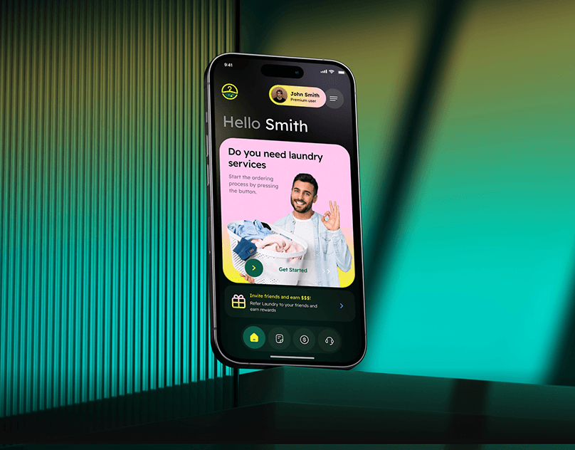
Mobile View (320 x 480px)
- The images and information in the footer is displayed vertically as the mobile view is too small and does not have enough space to view all the content at once
- The global navigation is put into a hamburger menu as the space is too limited to display the whole global navigation on mobile this way it can help to save space
- The hero image is removed as well due to insufficient space

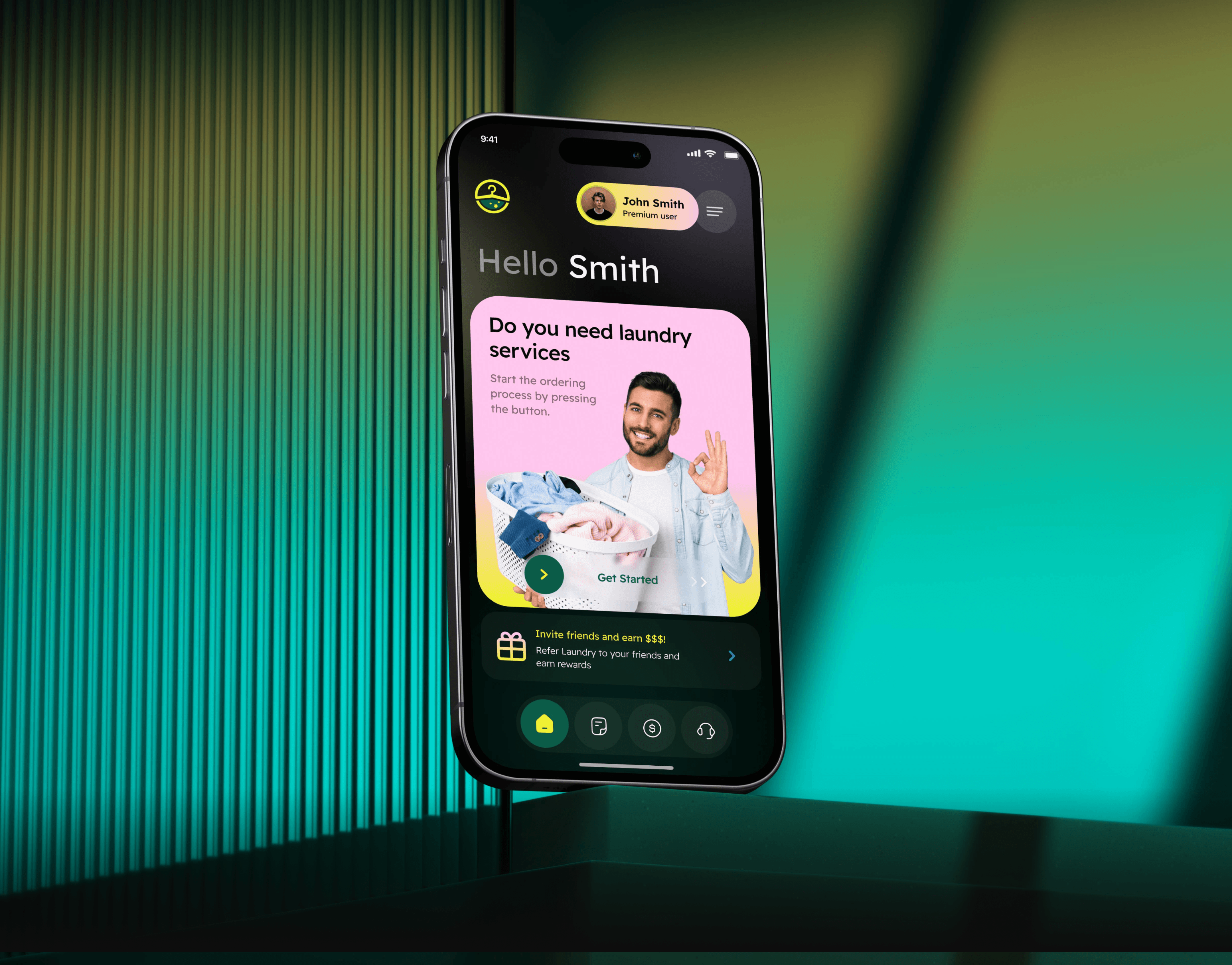
Tablet View (768 x 1024px)
The tablet version is similar to the desktop
The difference is that:
- The images on the tablet are resized smaller for it to be able to fit onto the tablet as the tablet view is smaller compared to the desktop view
- The wordings and icons on the desktop are more spaced out compared to the tablet

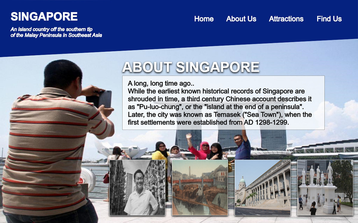
Desktop View (1024 x 800px)

Similarities of all 3 pages
- The fonts are consistent throughout
- The font size are consistent throughout
- The icons are consistent throughout
- The information in the footer are consistent throughout
Desktop View Mockup
Home Page

About Us Page
Attractions Page

Find Us Page