


KRAFT. Attorneys at Law defends individuals in white-collar and criminal tax proceedings and, if necessary, protects their rights before parliamentary committees of inquiry. It also represents (also international) companies involved in criminal offences and acts in this context both as a „corporate defense“ and as a representative of injured companies . Outside of such crisis situations, the firm provides preventive advice and advice on criminal compliance issues (setting up compliance systems, conducting corruption audits, internal investigations, in-house training, reviewing existing compliance programs).


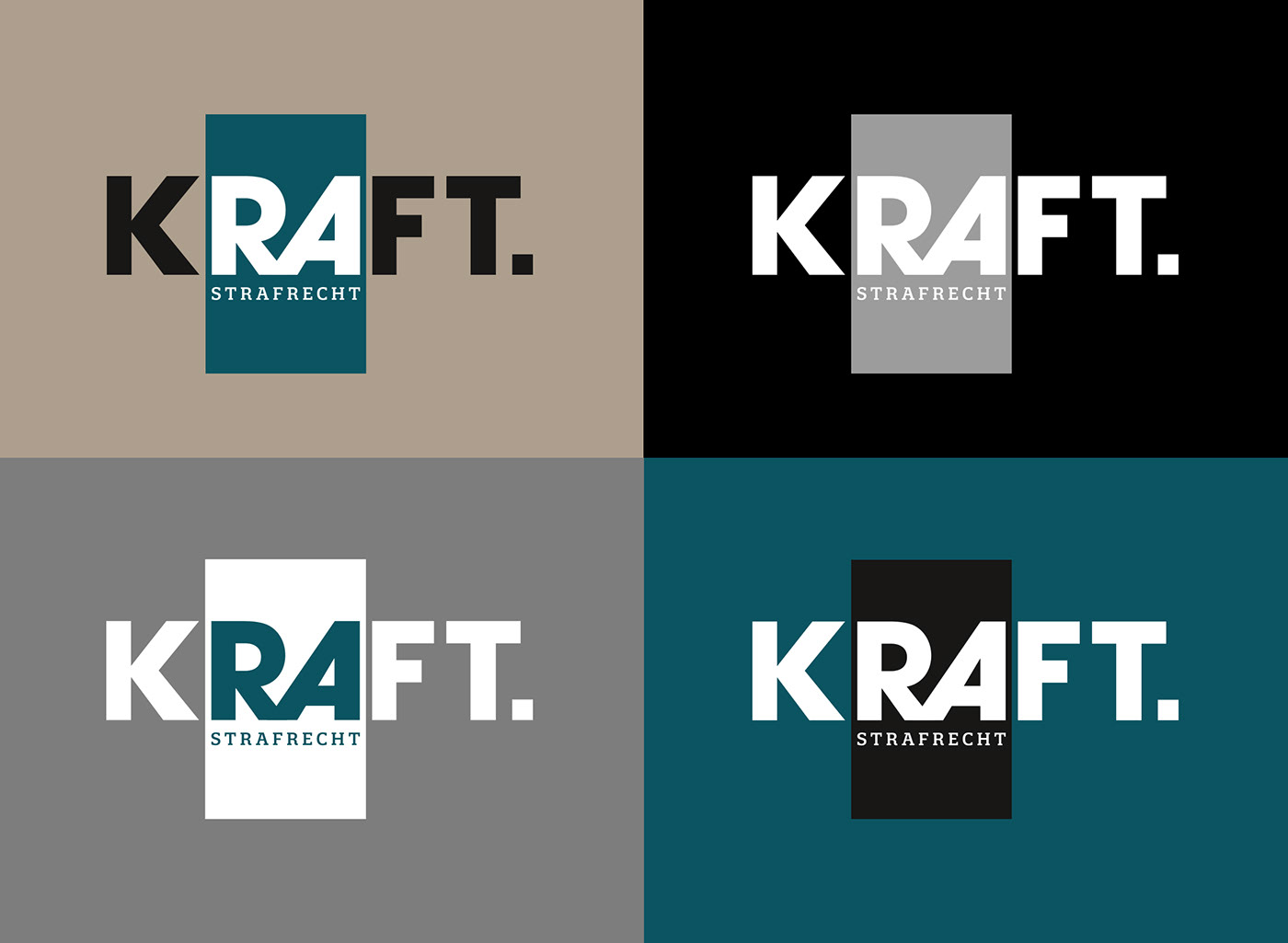
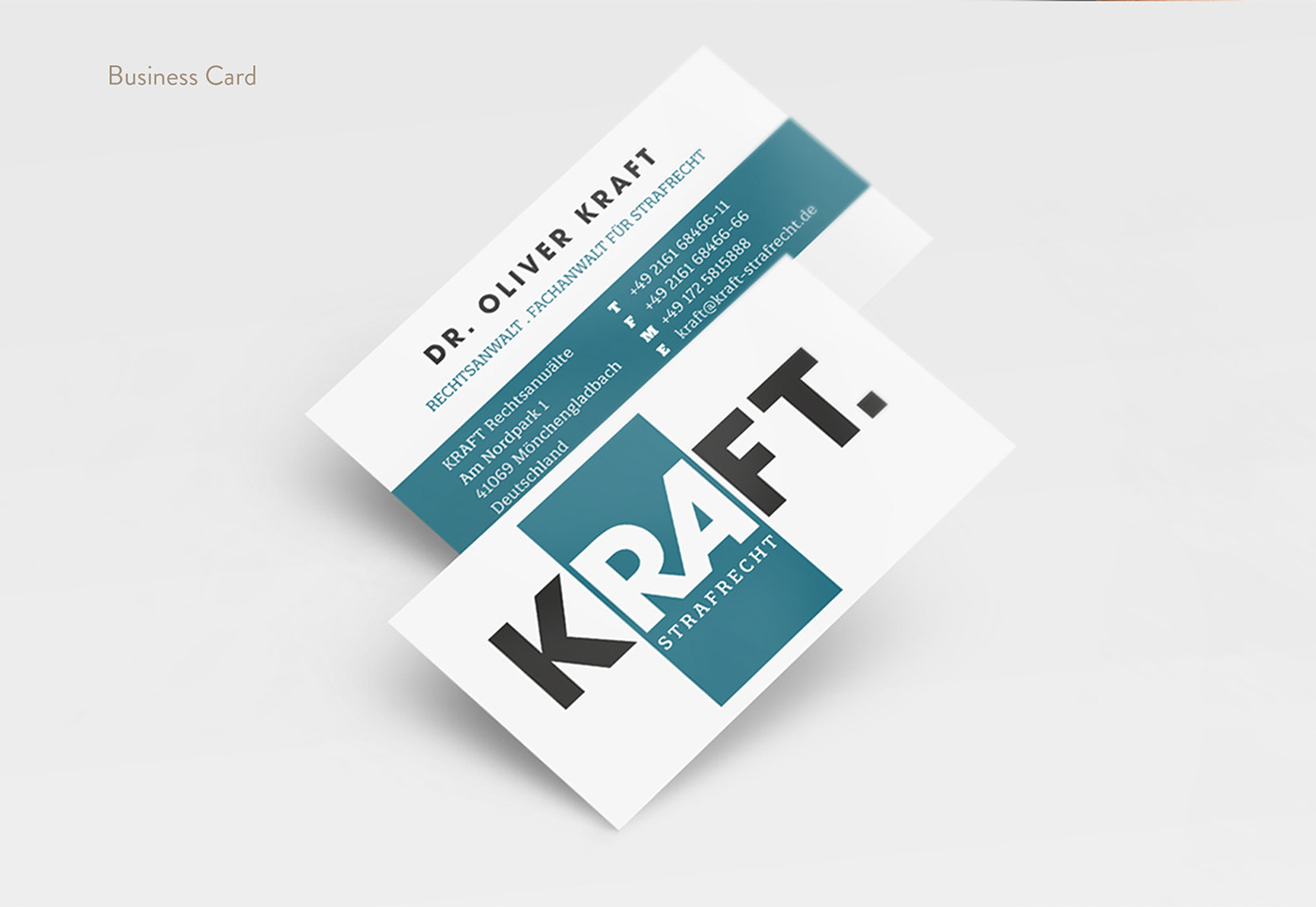
The logo is clean and at the same time extremely expressive. The word KRAFT in connection with the dot conveys strength and seriousness, constancy and a high credibility. The two letters RA (for Rechtsanwalt) are emphasized by the rectangle. Through the subline, the specialization in criminal law is also mentioned.
In terms of color, the company also presents itself in a simple yet expressive manner.
The color combination of black and petrol looks elegant and shows determination.
The color combination of black and petrol looks elegant and shows determination.


The protection zone is intended to ensure that the logo is not obscured by other elements or otherwise impaired in its effect.
impaired in any other way. The protection zone is defined by twice the width of the dot at the end of the logo. It runs around the entire
logo and grows proportionally to the
display size.


Thanks for watching!


