“Anyone who isn't embarrassed of who they were last year
probably isn't learning enough.”
― Alain de Botton
probably isn't learning enough.”
― Alain de Botton
This year, I continued to explore new ways of presenting data & information. I tried collages, fonts, colors, pattern, long format and small format. These were good lessons. Beautiful numbers. Sad conclusions. Hard illustrations. I mainly don't like any of these anymore, visually, but they somehow encapsulate the craziness of 2020 and a lot of subjects close to my heart. Some of these data illustrations shall live somewhere. Here. A tribute to 2020.

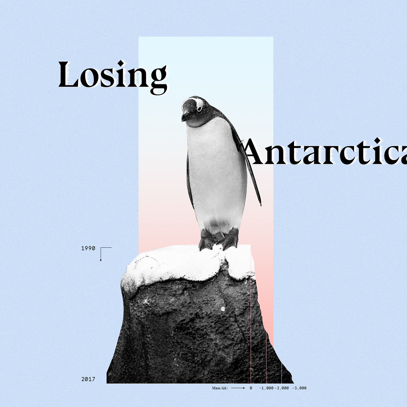
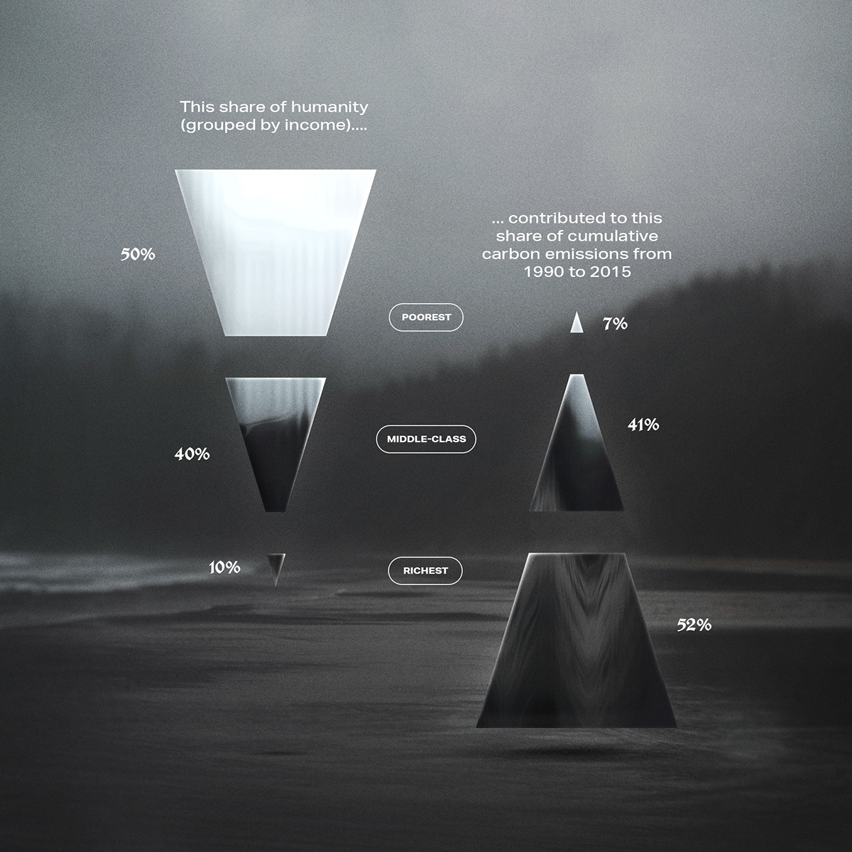
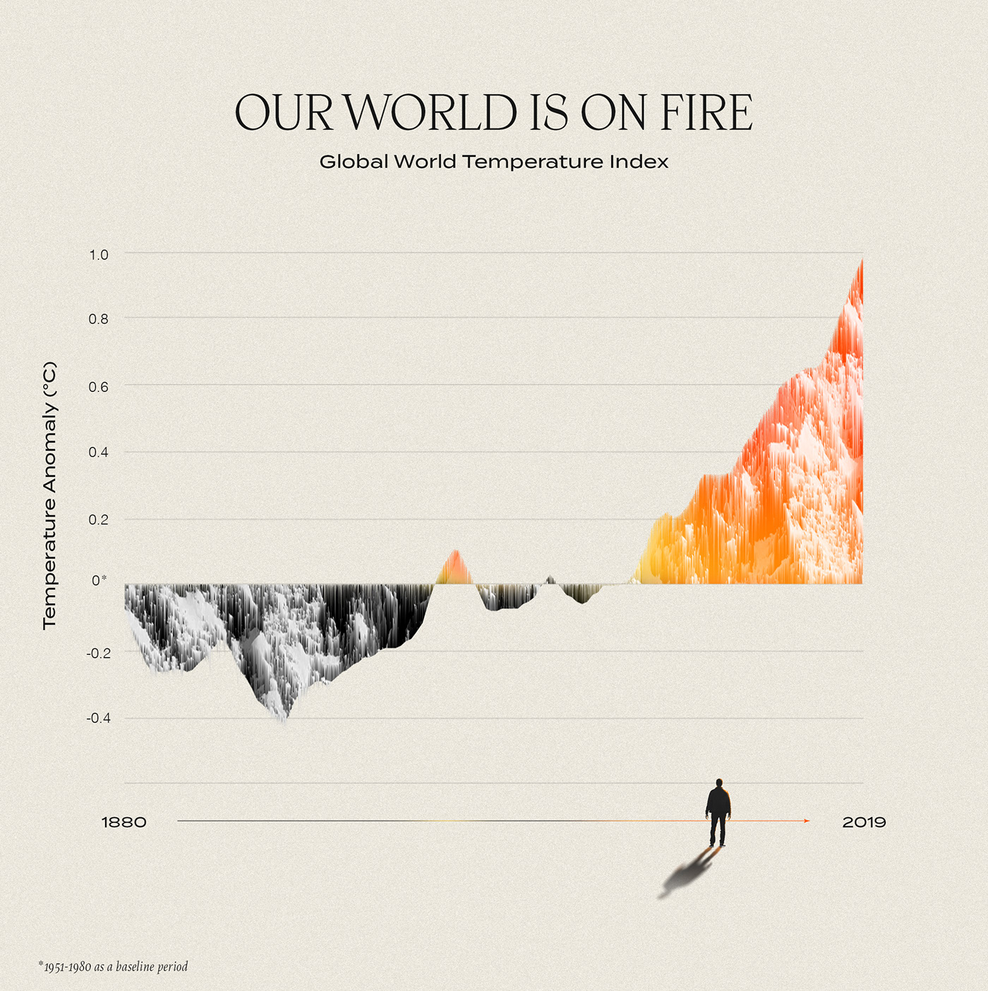
It started with the planet. I illustrated data from news but also from scientific papers. Showing the climate emergency. The long decline of Antarctica ice while Australia was burning.


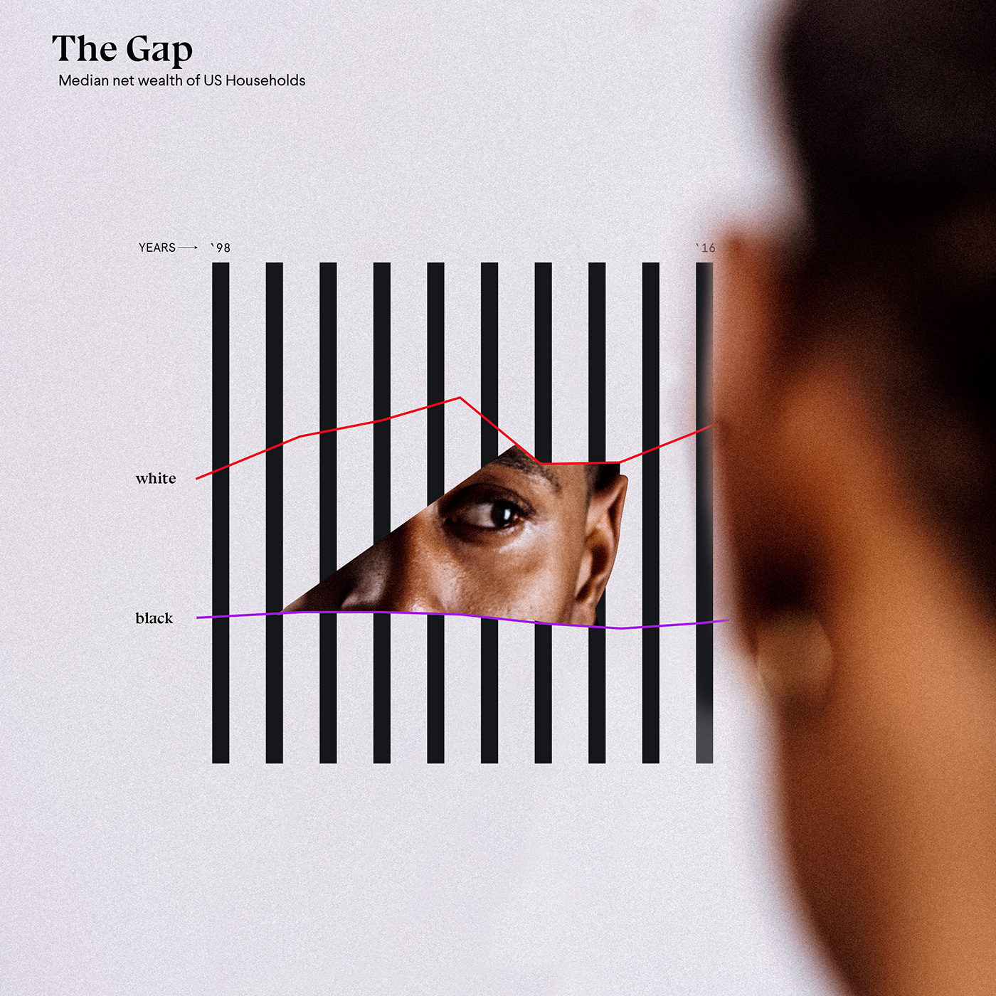
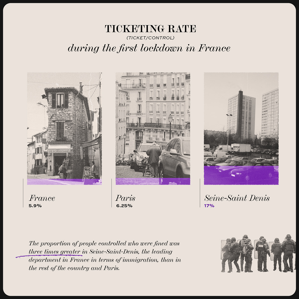
Living in the U.S woke me up to the racial disparities I was ignoring, even in my home country: France. I took a deep long painful look behind the data of racism and history. Then there was Georges Floyd. The protests. The wake up call. And a viral data post that led to pretty hateful comments. One way to show that data can evoke emotions!


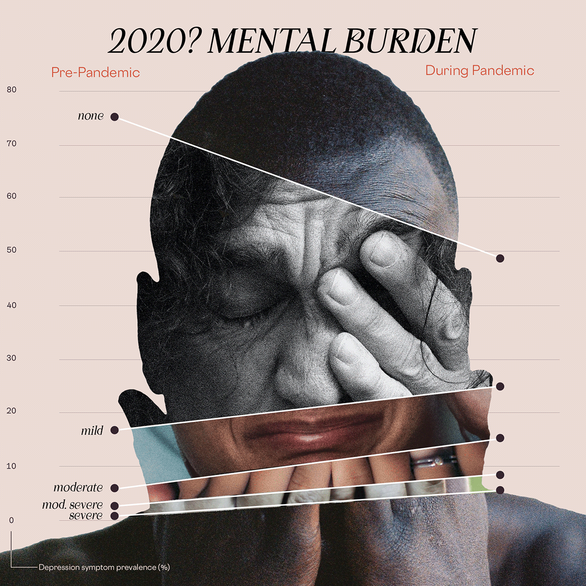
While we watched wave after wave of COVID cases and deaths, I left the medical information to the specialists. I focused on the untold data. Hands that can't be washed. Forgotten grandparents isolated from their family and slow test results.


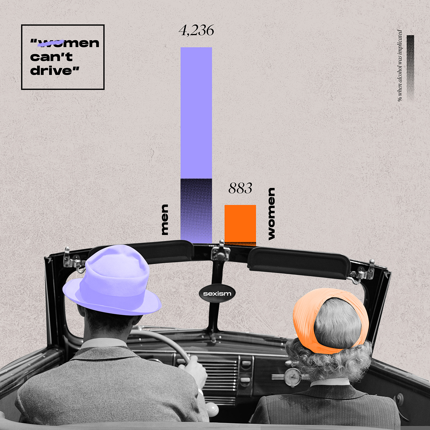
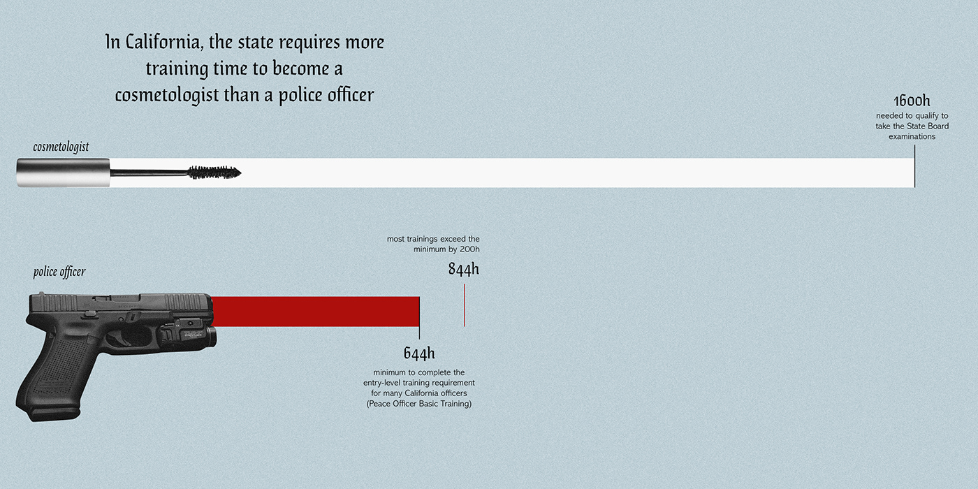
And among all these very serious data topics, I illustrated some of the data to answer my daily life interrogations, or some questions by others. Questions like "can women really not drive?", "do you take your shower at night or in the morning?". Some fun, some less fun. A little bit of me, you and everyone else.