


Competition
Regional Museum in Stalowa Wola
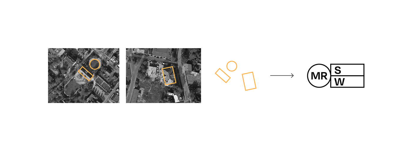
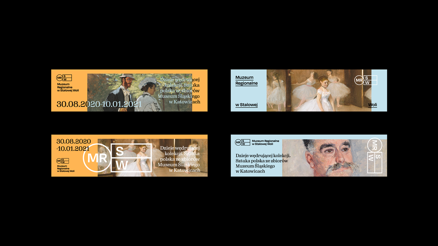
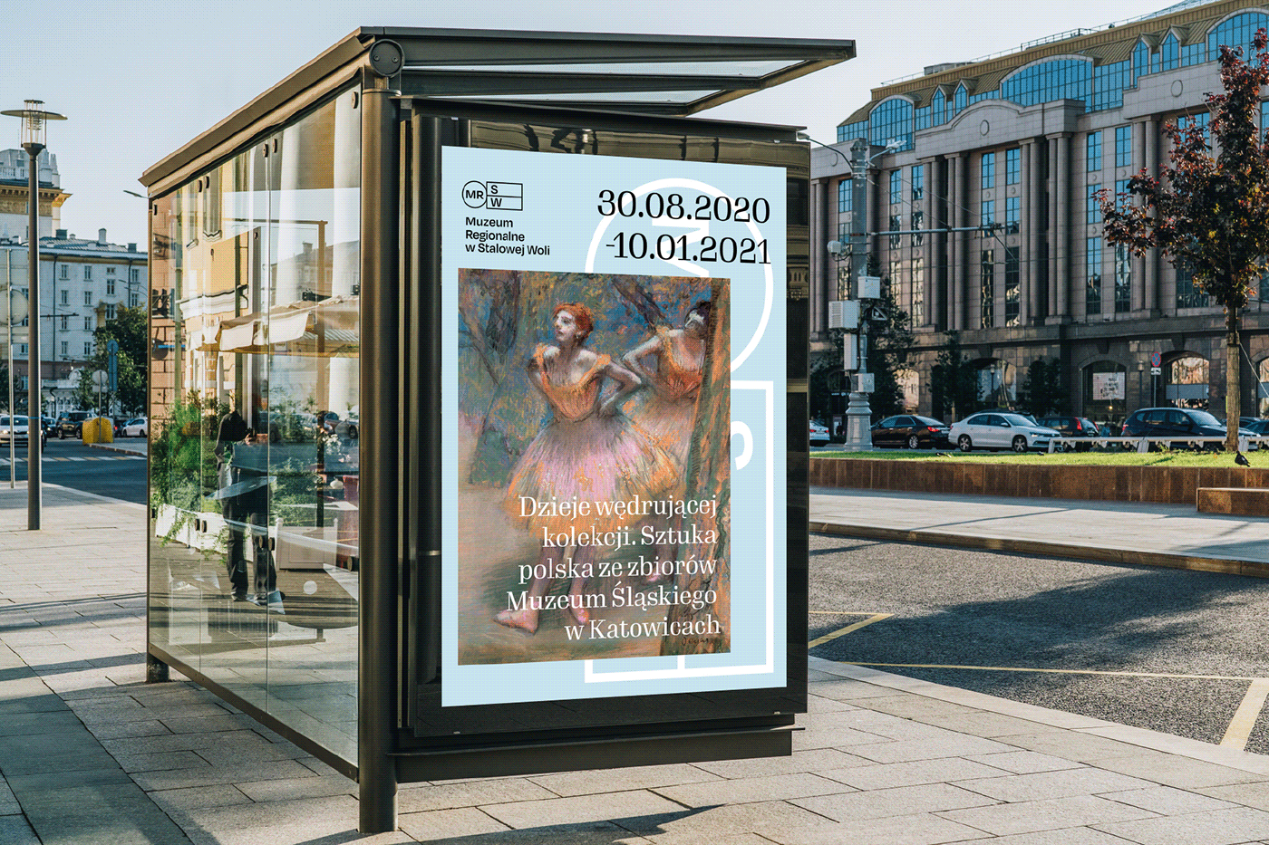
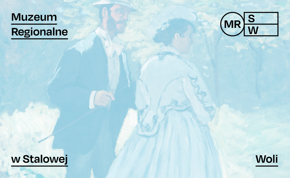
The idea of the sign is based on a symbolic representation of the uniqueness of the Museum - i.e. its location. As the Museum consists of two buildings in two different locations, we decided to show them symbolically as two rectangles and also a round circus. Their common denominator is the idea of the Museum - promotion of art, painting and the idea of the Central Industrial District. These three symbols form a signet in which we have written the abbreviation MRSW, which is used by the Museum.
Concept
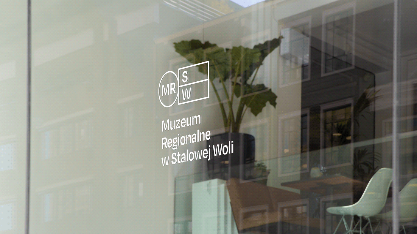
The whole concept of a sign and the identification inseparable from it is based on the concept of modernity and timelessness. We really wanted the project to be timeless, to resist the passing trends. Hence the pure form of the signet, simple but refined in detail lettering and visual identification based on a non-obvious layout.


challenge:
logo design & visual identity competition
art direction and graphic design:
Gosia Macioch
client:
Regional Museum in Stalowa Wola | Year: 2020
Do you like it?
Please don't hesitate to comment or tap a thumb up button
Please don't hesitate to comment or tap a thumb up button
CHEERS!


