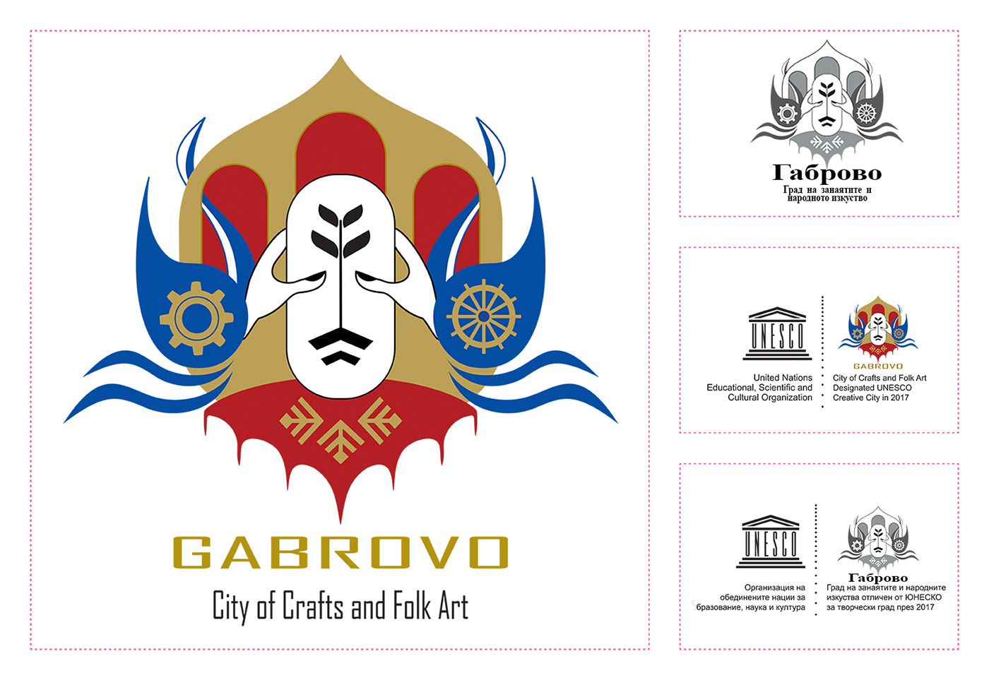
This logo is designed based on two general principles: visual beauty and requested messages:
*The face located in the middle of the logo, which is similar to pottery, is a symbol of a flourishing of thought and creativity, due to the plant germinated in its brain. The root of the plant is designed similar to the mouth and mustache to make the human face.
*The two hands are located around the face in such a way that show the human eyes and indicate they are building pottery that is a symbol of Gabrovo's craft pottery.
*Top design is similar to the entrance of church “Uspenie Bogorodichno” which is one of the most important historical and cultural buildings.
*The two birds on both sides of the logo are the symbol of travel and migration.
*Combining birds with the waves of the rivers below them represent the natural and geographical position of Gabrovo, including the existence of many gardens, rivers, and cascades in this city.
*The plan on the right bird shows the water mill, such as “Doliapkiniya” and the plan on the left bird shows the gear, which is a symbol of industry dynamics.
*Finally the fabric and the traditional design on it below the logo represents another of Gabrovo's handicrafts.

