


dō - Japanese Beauty Care Product
Naming / Branding / Art Direction / Packaging / Website Design
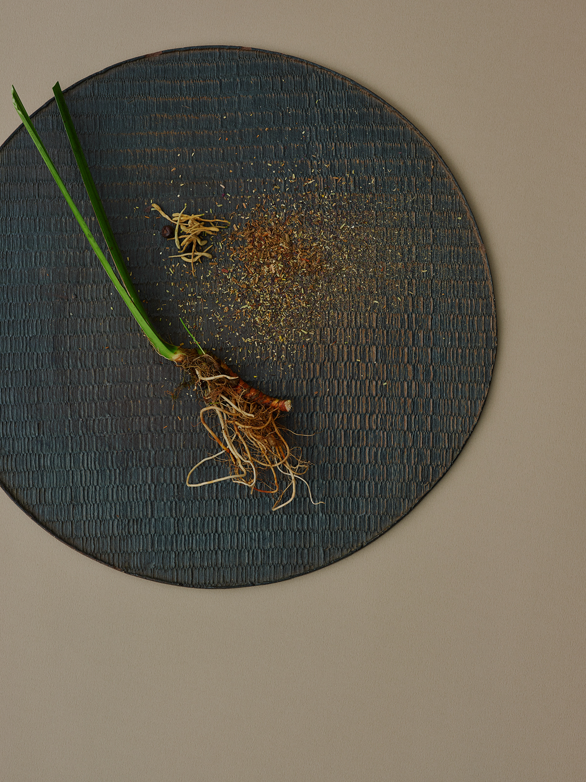
“dō” is a new beauty line born in Japan that proposing to bring back a powerfully balanced body by introducing health and beauty regimens based on the Yin and Yang theory into our daily lives. All “dō” products contain carefully selected Japanese and Chinese plant extracts based on traditional healing recipes.
This beauty line is created by a woman with over 15 years of experience as a nail stylist. Over the course of her career, while providing nail care services for countless clients, she gradually realized that it is essential to take care of the balance of the body and the mind in order to nurture the growth of healthy nails.
“dō” products were born when her long term wish to “create a special line of care products for healthy nails” encountered her new desire to “provide a moment of healing for modern humans.”
東洋思想が育む、健やかな身体と美しいこころ
たとえば、月と太陽、プラスとマイナス、男性性と女性性。
あらゆる事象や万物はすべて陰と陽、つまり、相反する二つの性質をもっています。
古代中国の思想であり、東洋哲学の基礎でもある「陰陽説」は、陰と陽が調和することによって、世界は保たれているという理論です。
わたしたち人間の身体においても、陰と陽のバランスが保たれている状態が健康であり、バランスが崩れると病気になりやすいと考えられています。
外的な刺激や生活リズムの乱れによって崩れてしまったバランスを、本来のベストな状態へと戻すことで、身体はもちろん、こころや感情も、健やかであり続けることができるのです。
“どう”はこの陰陽説に基づく養生文化を暮らしに取り入れて、健康な身体、美しいこころを取り戻すことを提案するブランドです。

Brand Identities


Name of the Brand
"dō" is derived from the Japanese word “do-u (dəʊ)” meaning soil, which is one of the five elements that form the pillars of the theory of Yin and Yang and the Five Elements.
Soil plays a very important role in circulating and creating organic matter in the Earth.
The Chinese character for soil “土” can also be seen as a combination of plus (+) and minus (-) symbols, symbolizing Yin and Yang.
The brand name was inspired by the combination of these characteristics of the word “dō”. Images of a sculpture that forms while adding or scraping off a clay mass comes to mind that depict the principle of addition and subtraction - the basic concept of Eastern philosophy. It is also pronounced like “dough” - an English word meaning bread dough or a soft mass.
“どう”のネーミングは、陰陽五行説の柱となっている五元素のひとつ「土」に由来しています。
土は、循環させる、有機物を誕生させるという、非常に重要な役割をもっています。
また、プラス(+)とマイナス(-)が縦に組み合わさった漢字、という見方もできます。
粘土を足したり削ったりしながら形づくっていく彫刻のイメージに、東洋哲学の基本概念である足し引きの法則をなぞらえ、パン生地、柔らかいかたまりといった意をもつ英単語「dough」から音の響きを採用しました。


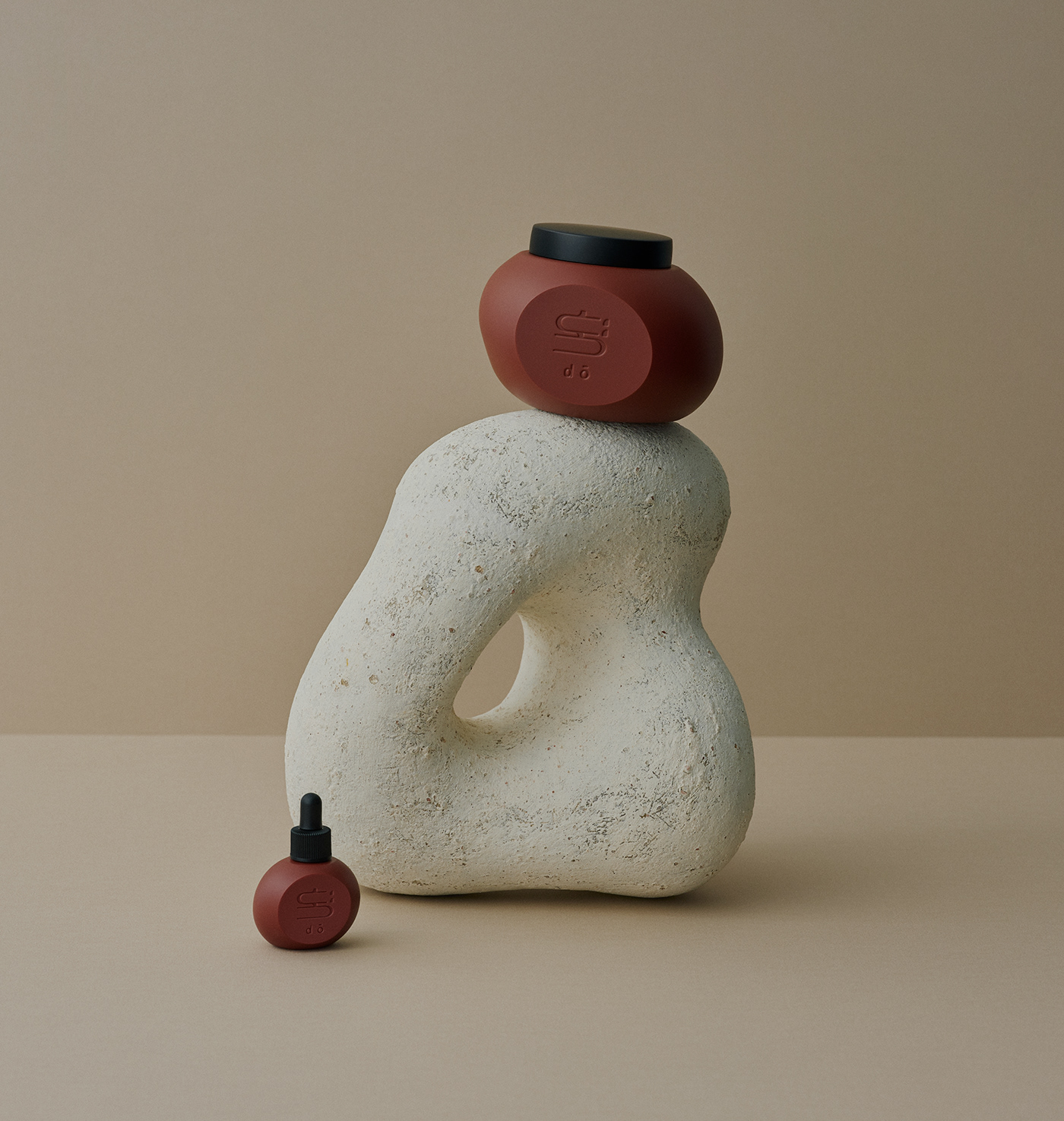
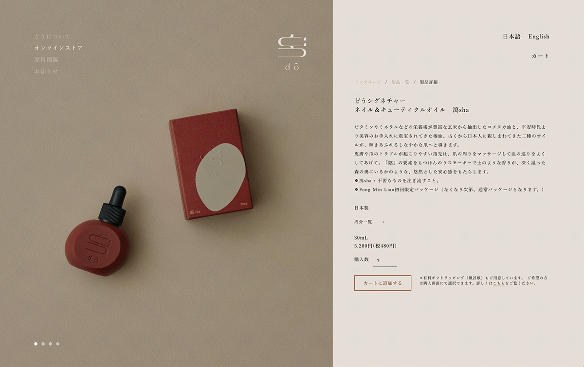
Package Design
Primary / Secondary


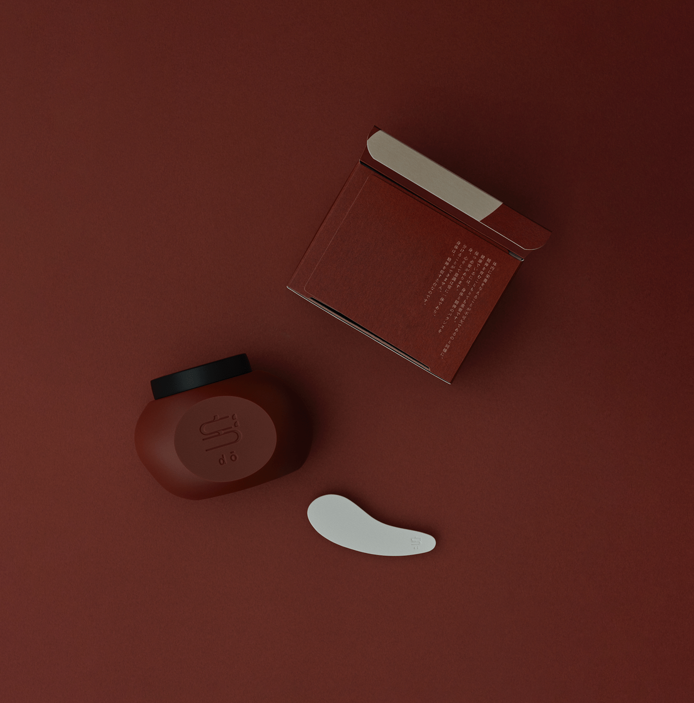

Gift Wrapping “Tsutsumi”
The origin of the cloth “Tsutsumi” used for gift wrapping at dō goes back to the Nara period.
At that time, “Tsutsumi” was used as a cloth to wrap special things such as clothing and musical instruments used by monks.
Since the Muromachi period, it has been known as Furoshiki, the name we still use today.
The Shosoin in Todaiji Temple still holds the oldest “Tsutsumi” in Japan.
“Tsutsumi” is a sustainable gift wrapping created by traditional Japanese culture.
With the desire to foster the mind that loves and cares for all things, we created our original “Tsutsumi”.
After using it as a gift wrap, it can also be used as a bag or storage.
どうのギフト包装に用いられている布 “ 裹(ツツミ)”の起源は、奈良時代に遡ります。
当時、“裹”は僧侶の装束や楽器といった特別なものを包むための布として使われていました。
室町時代以降は現在に至るまで、風呂敷と呼ばれています。
東大寺の正倉院には今も、日本最古の“裹”が所蔵されています。
“裹”は日本の伝統文化が生んだ、持続可能なギフト包装。
ものを慈しみ、大切に扱う心をもち続けたいという願いを込めて、どうオリジナルの“裹”をお作りしました。
ギフト包装として使用したあとは、バッグや収納としても使用できます。


Social Media Design - Instagram
@dojapan.jp


To be continued...
Founder of dō - Misato Matsuo
Art Direction / Design - Kazuha Otake
Photography - SHINMEI
Prop Stylist - Keiko Hudson
Artwork on Secondary Packaging - Fong Min Liao
© 2020 dō Japan All Rights Reserved


