_BRIEF
The ISTD 2013 brief stated that you create a brand for a circus museum of your choice. This must be done using typography as the main vehicle of expression. The brief was open and offered the opportunity to explore the world of the circus and develop a concept/theme within our choice of museum.
_DESIGN
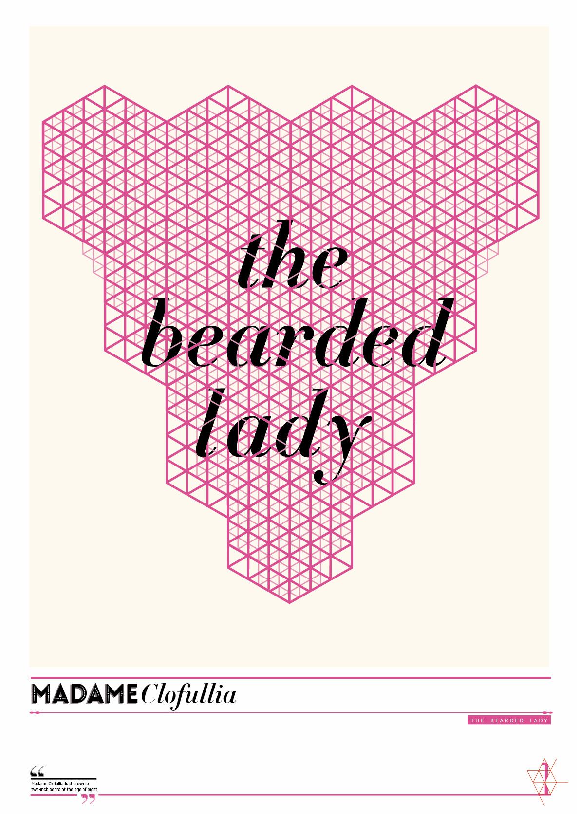
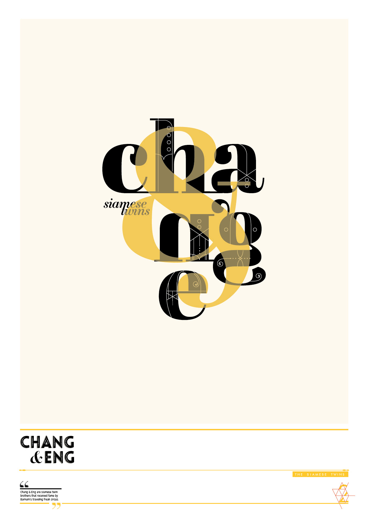
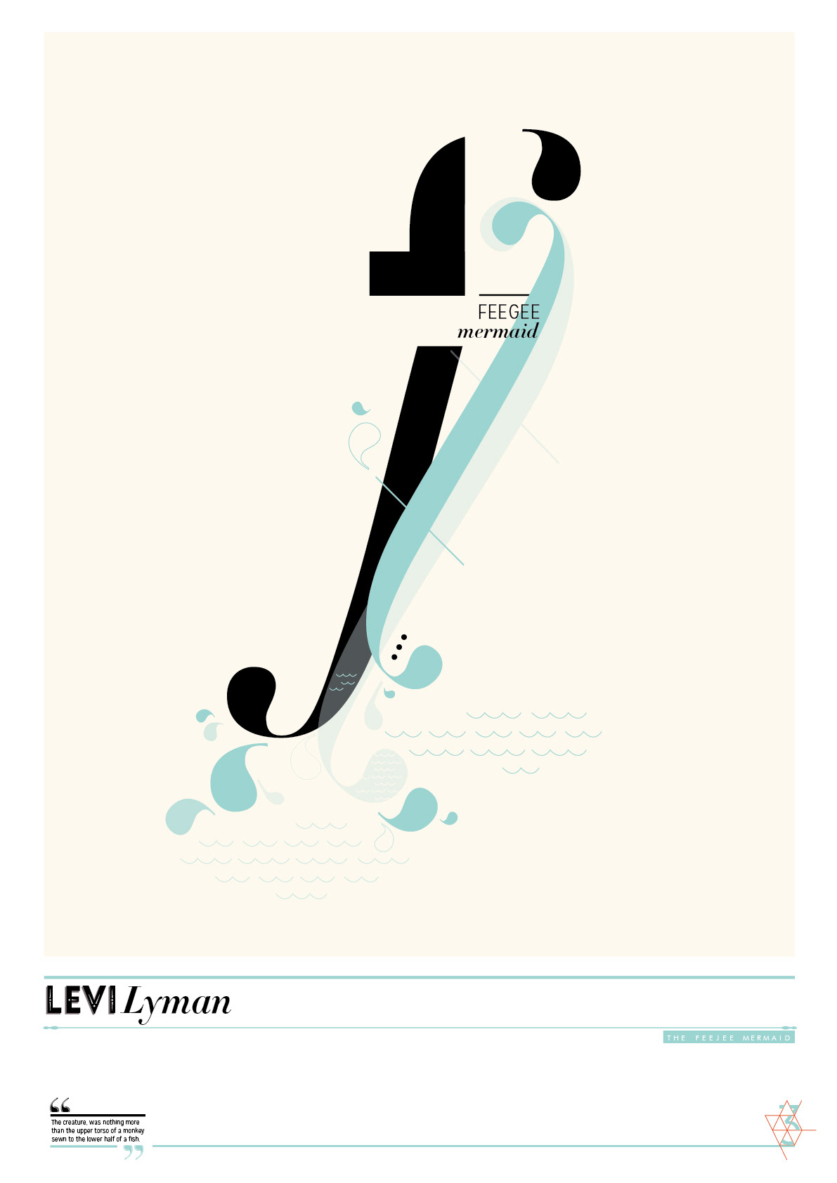
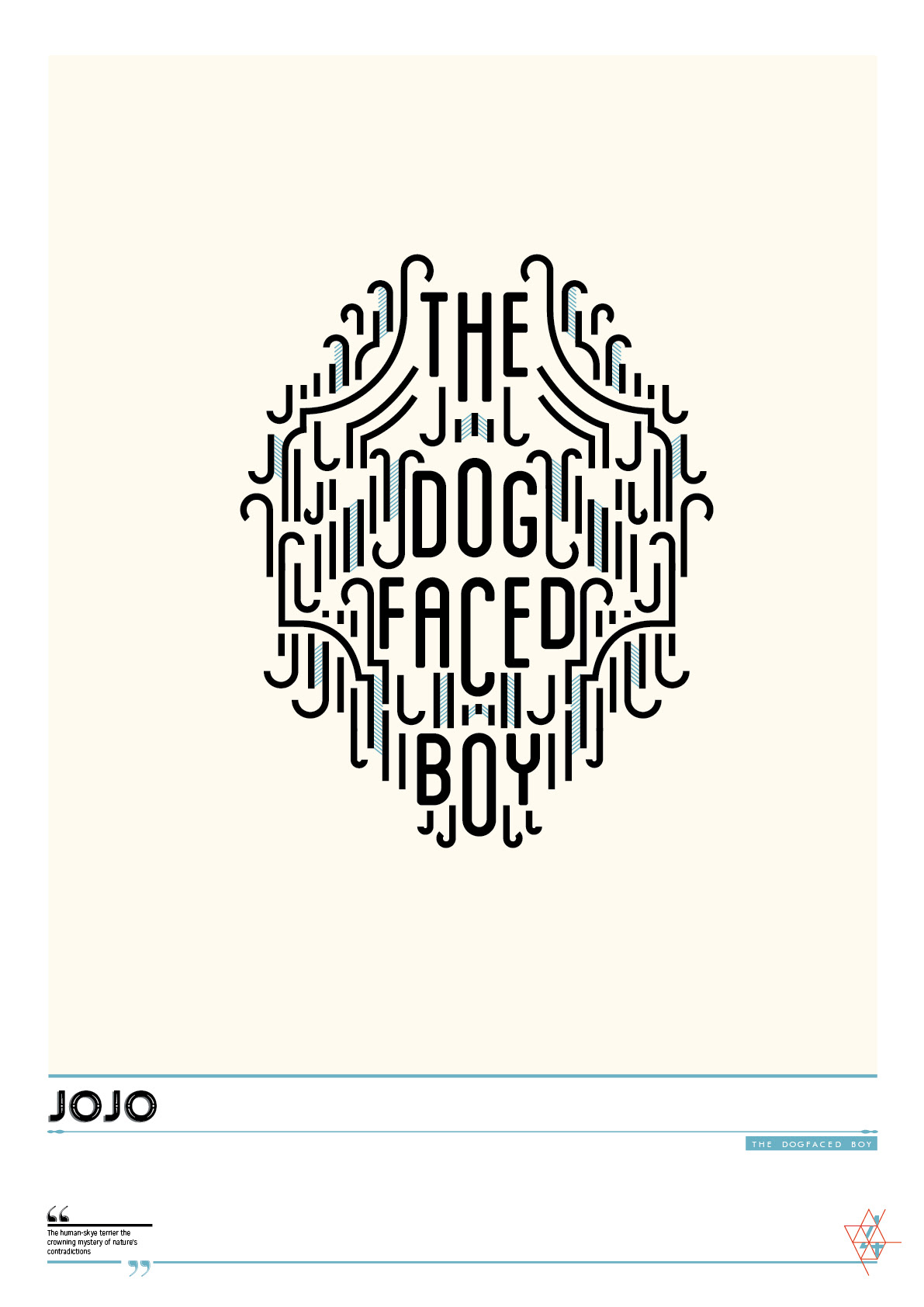
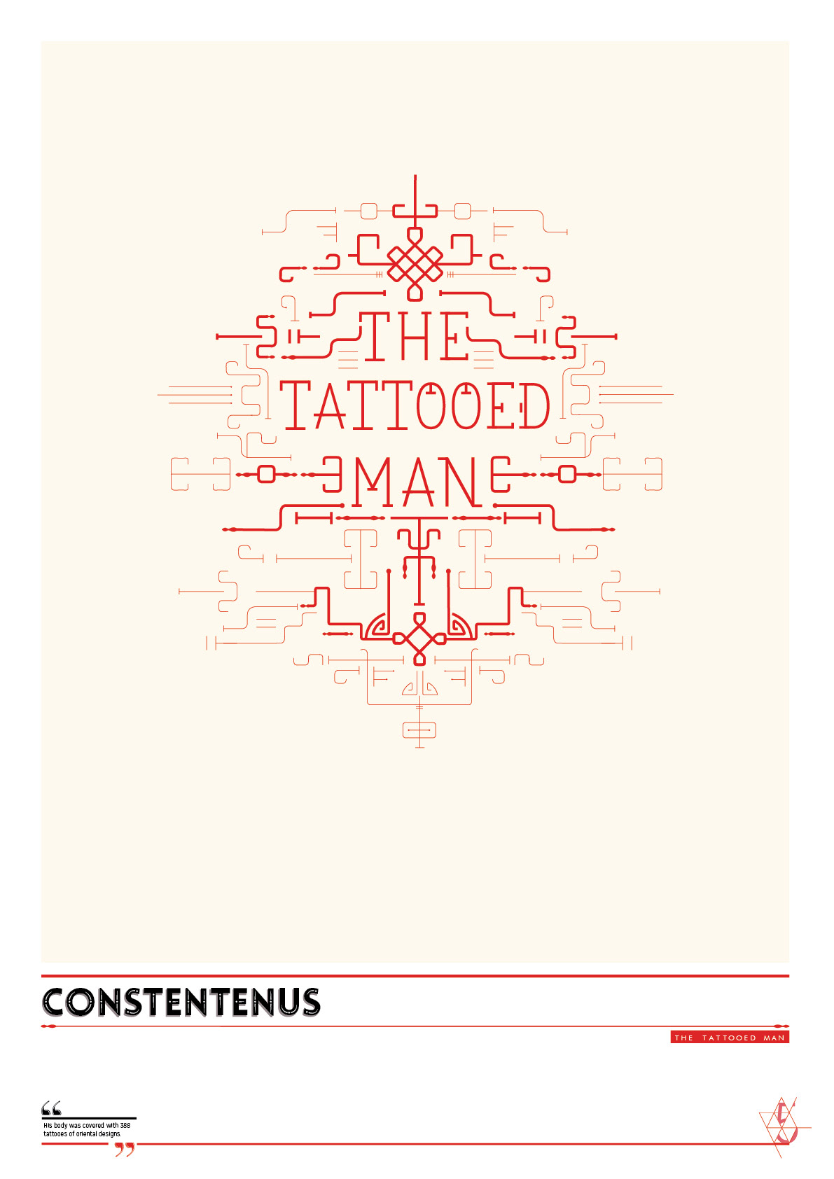
For the ISTD circus brief I decided to focus on specific circus ringleader, called Barnum. Barnum is known for his traveling freak circus during the 1800s. I decided to do the branding/promotion for the circus by means of a direct mailer information posters. The aim of the posters is to be a sneak peek of what the audience can expect from the museum. Further there will be a catalogue with more information about the museum.
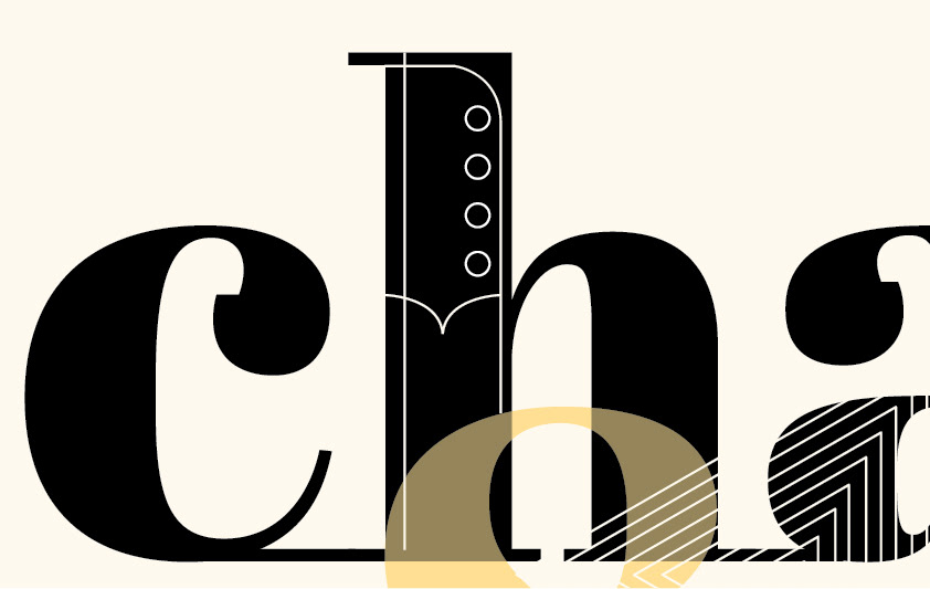
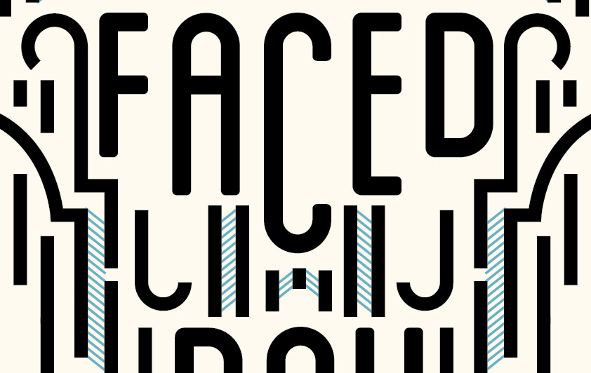
I wanted to make a contemporary interpretation of the subject. The aim was to direct the focus on the performers who were the mainstay of the traveling freak show, instead of on the circus elements. All the posters has the same grid. The grid for the back of the posters is based on the enlarged logo grid. The front has a more basic and structured grid.
_CONCEPT
The concept of this project entails a process of revealing. The direct mailers reveals each performer to the audience. The first sneak peek of the performer can be seen in the envelope’s window. The process begins on this voyeristic note by showing just a small part of what can be seen inside it. More is revealed when unfolding the poster.
The direct mailer is a discovery process where the audience gets to experience a part of the history of Barnum’s traveling freak circus. The revealing theme can also be seen in the typographic treatment where parts of the type is left out or cut into smaller pieces.
ENVELOPES
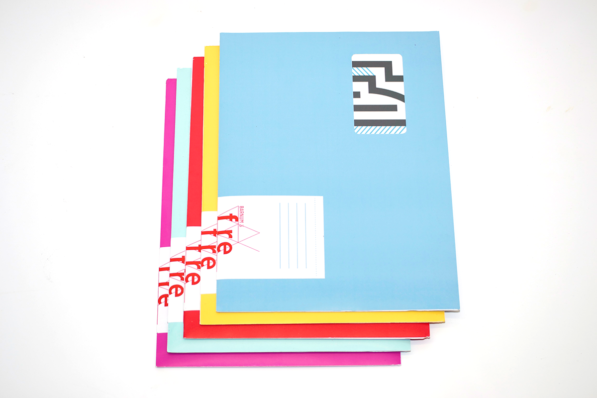

FREAK POSTERS
POSTER DETAILS