Graphic Designer: Renan Vizzotto
Product Designer: Robert Ashorn
Copywriter: Caio Evangelista
Photographer: George Atanassov
Client: @saarichocolate
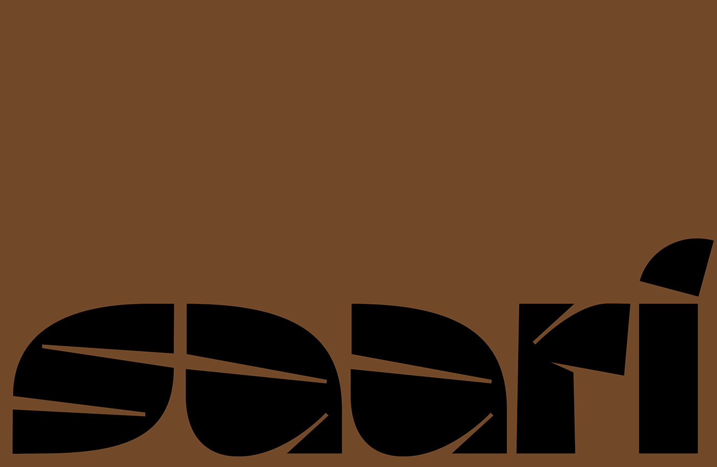
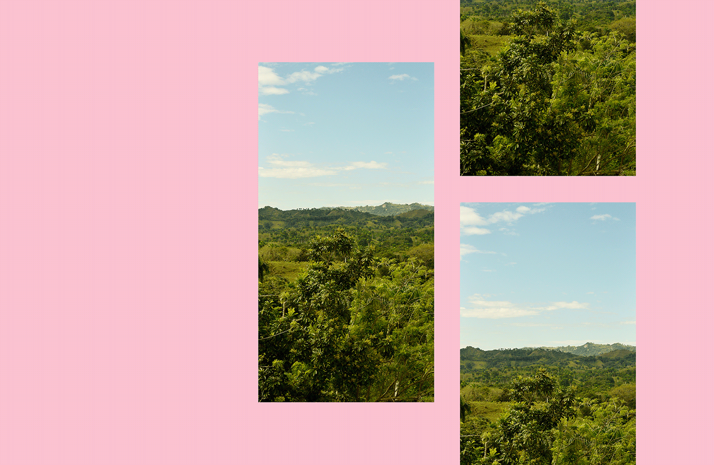
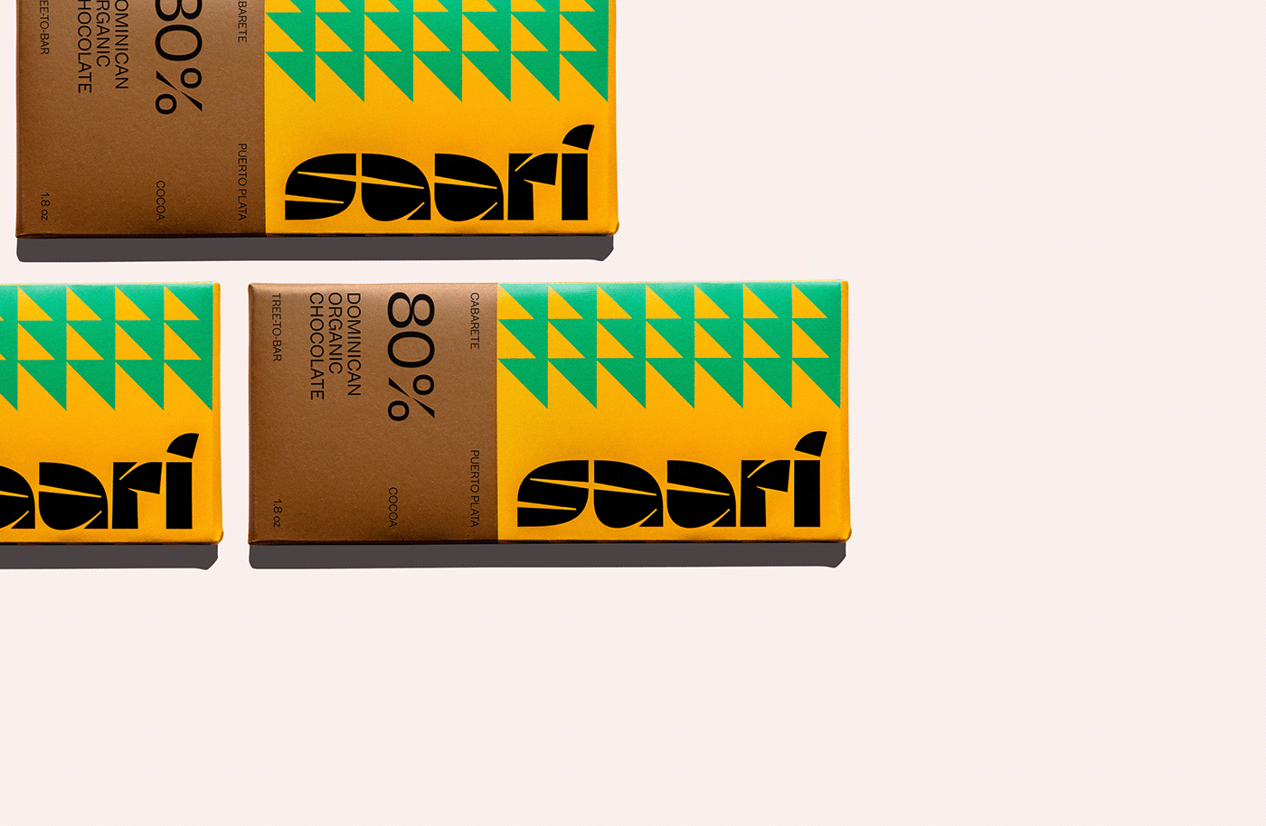
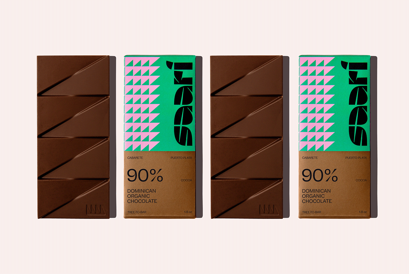
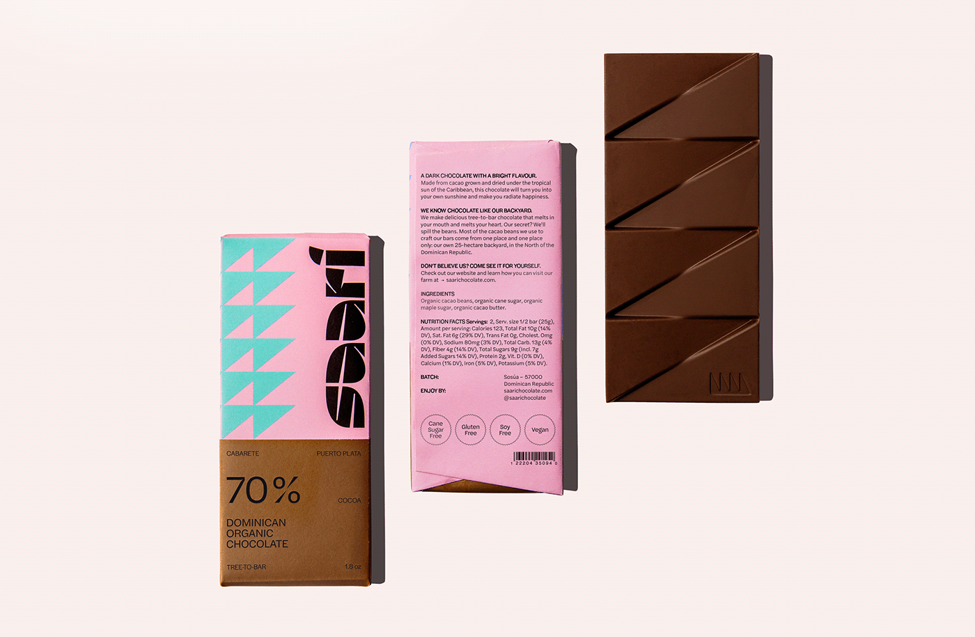
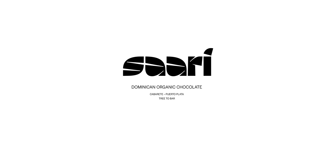
Saari is a Dominican chocolate brand with a Finnish twist.
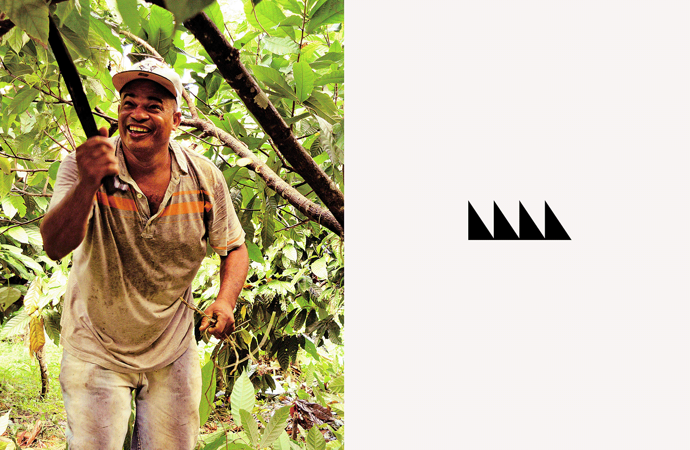
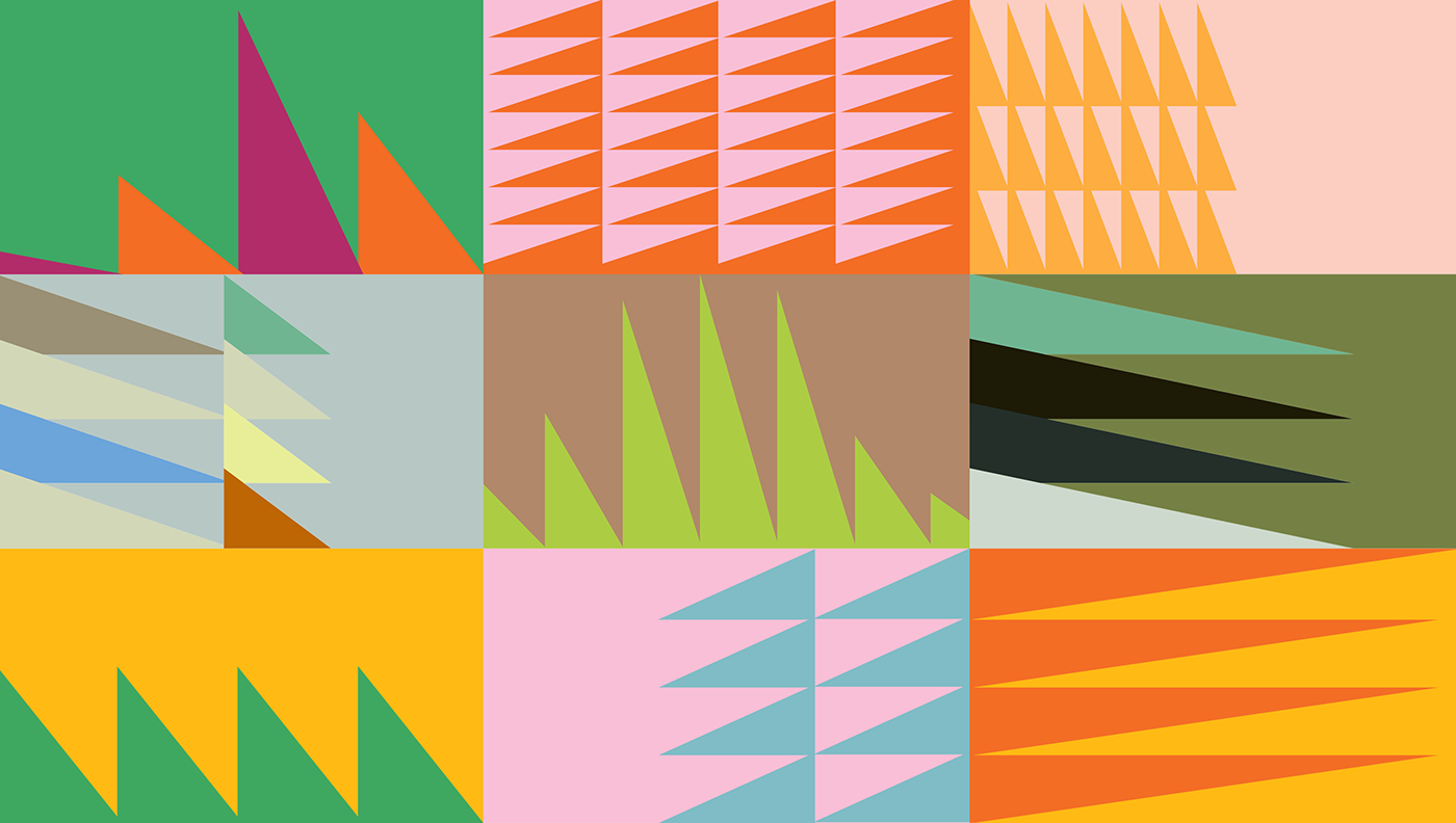
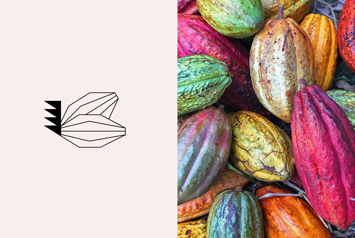
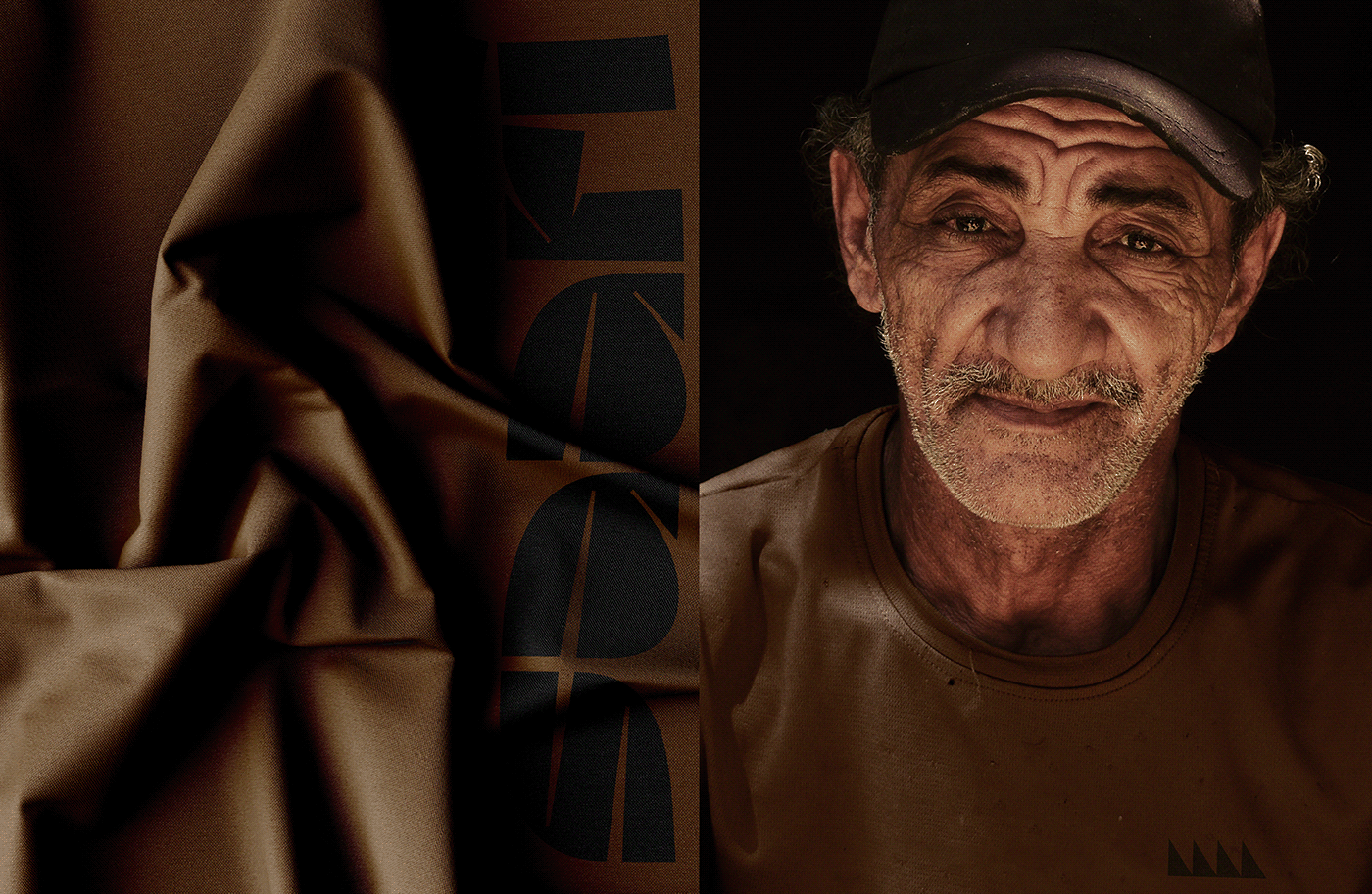
For the branding, we were tasked to bring its tropical roots front and centre. To find the inspiration for the project, we just had to sit back under a palm tree and look around to have our own Eureka moment. Luckily, no coconut fell on our heads, but one thing struck us: nothing represents more the tropicals than the evergreen, majestic palm trees, which are all over the Dominican Republic.
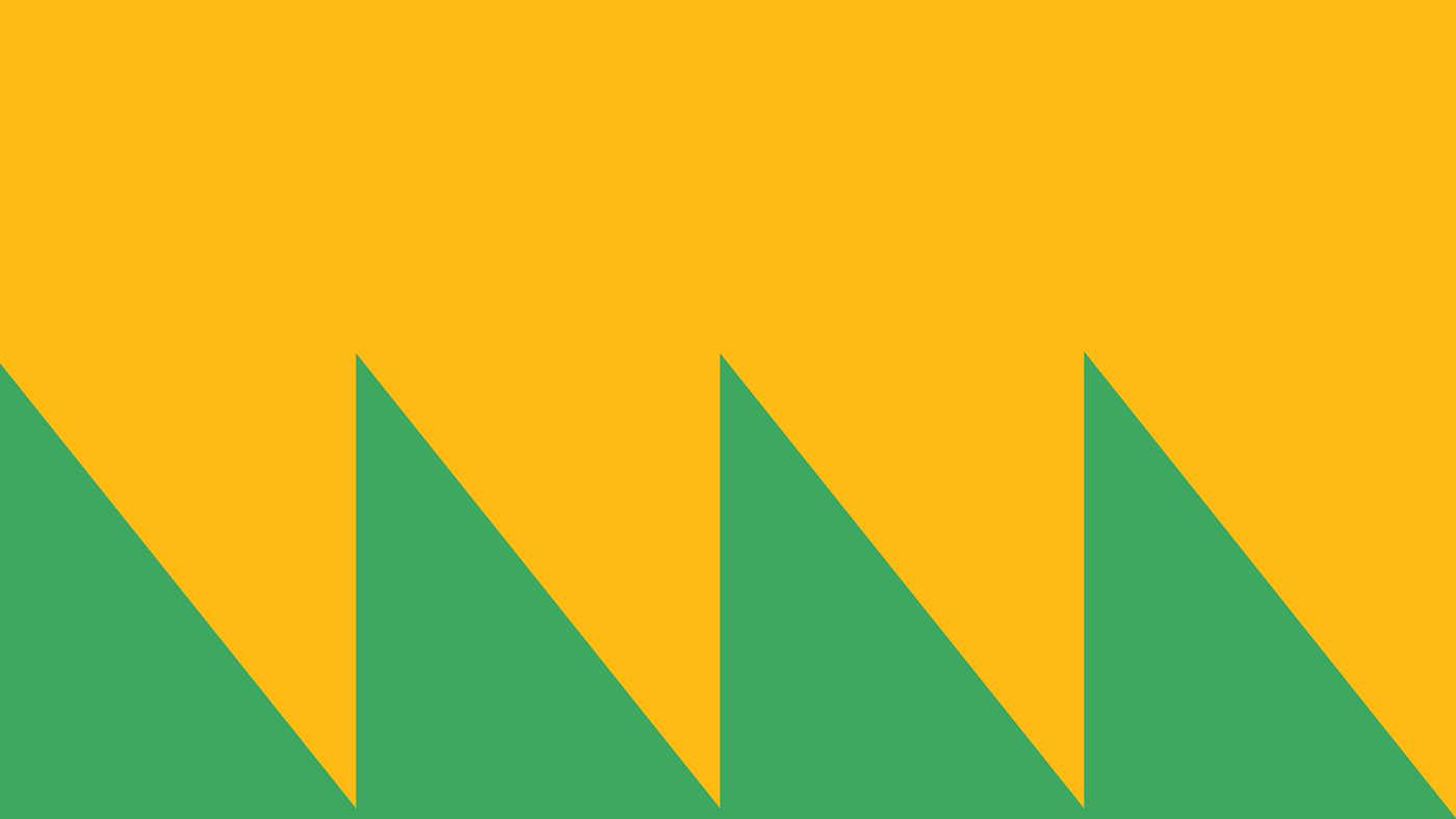
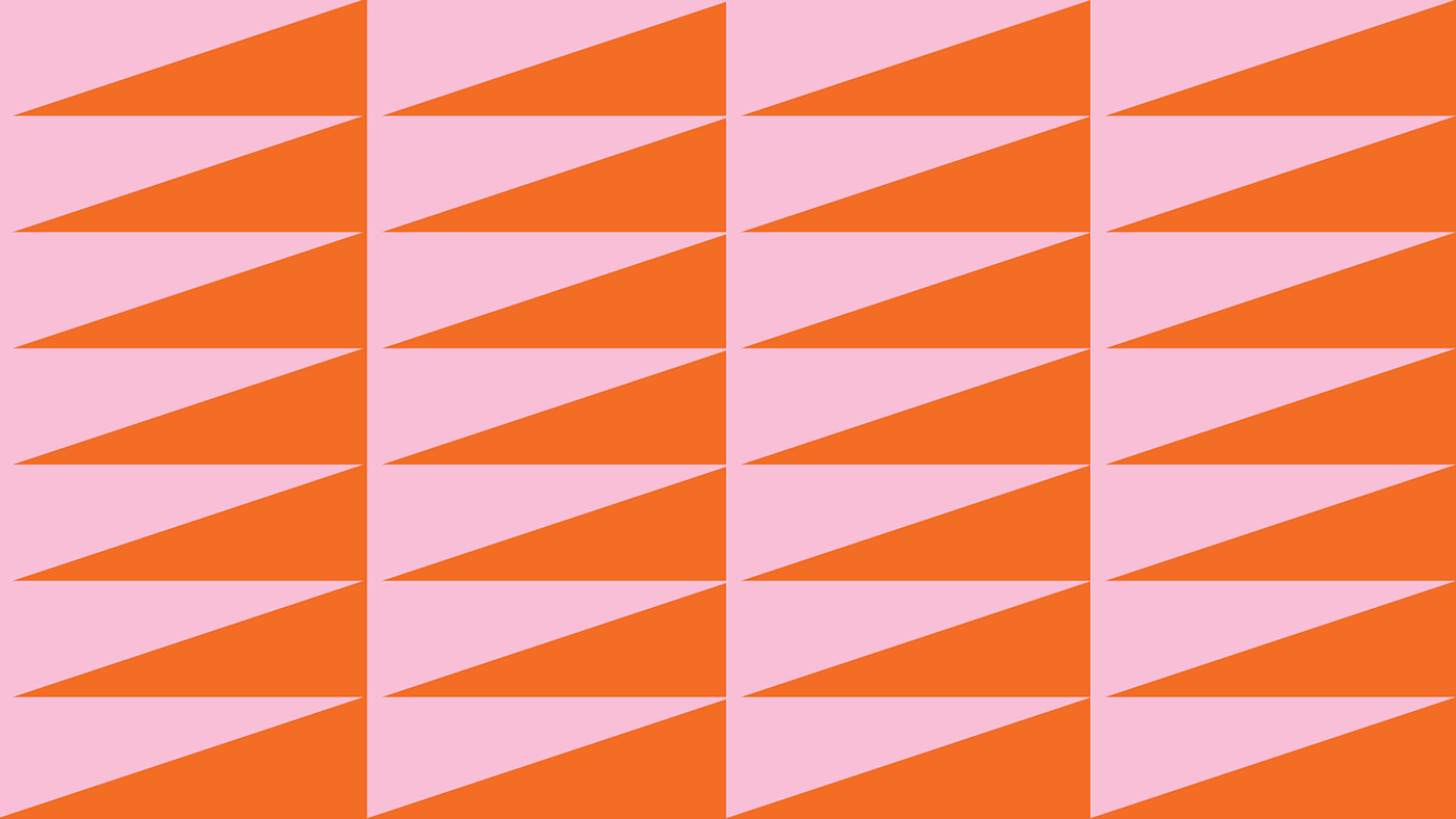
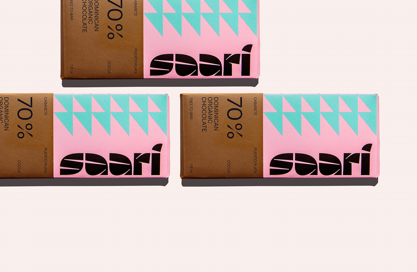
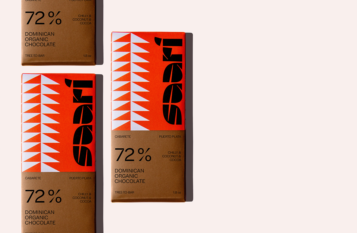
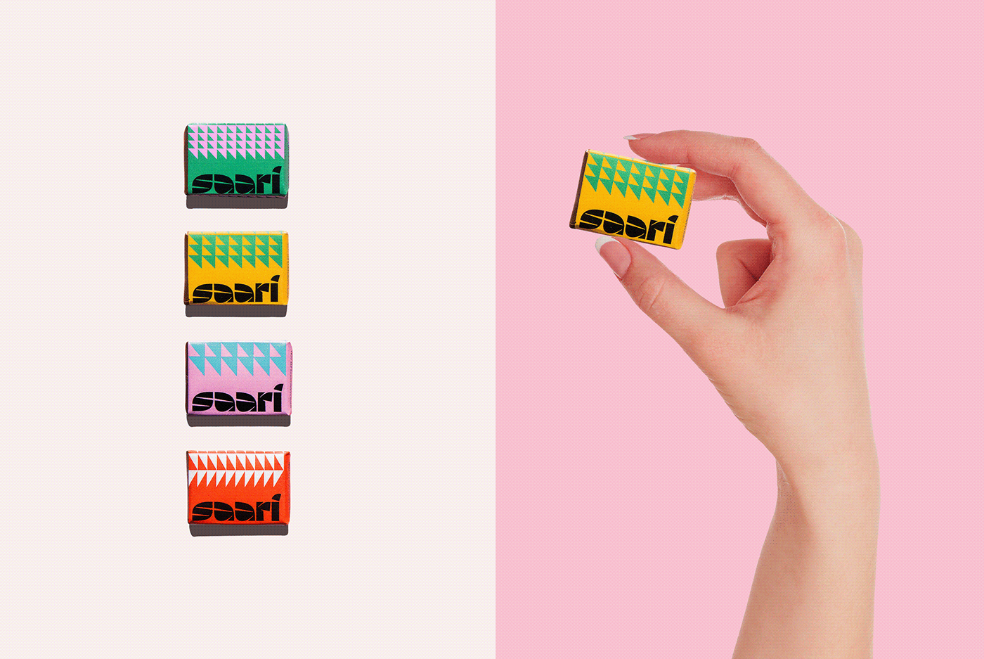
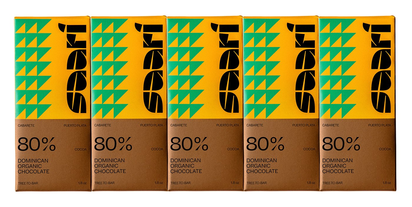
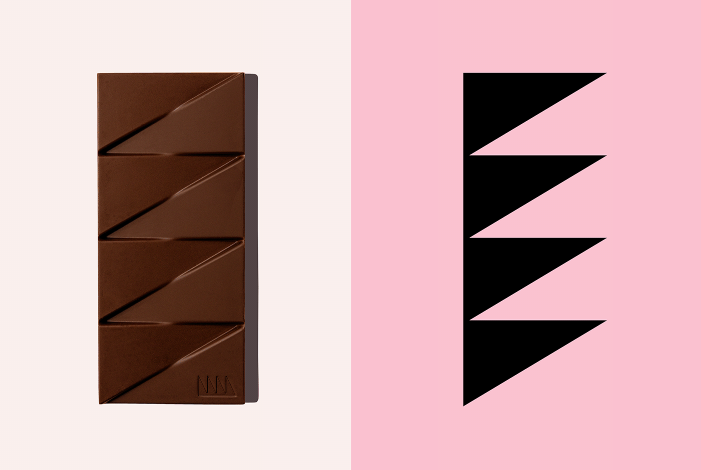
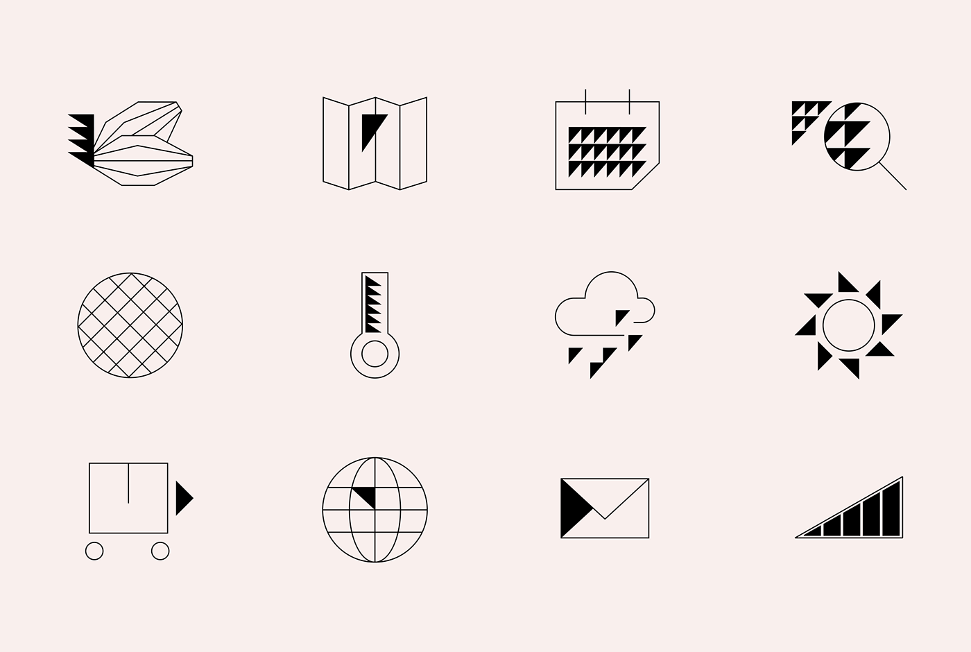
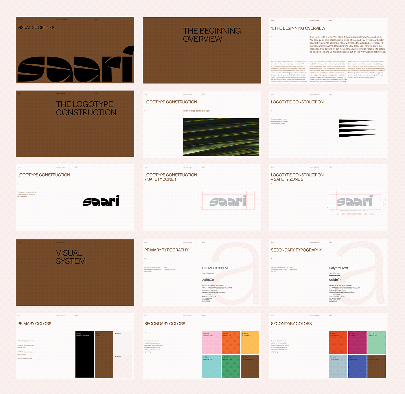
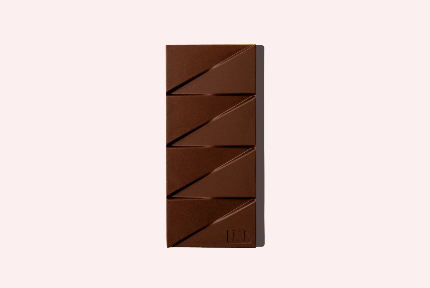
The logotype was designed based on the palm tree leaves, with large filled spots and peaked white space. As a Finnish-owned company (with its farm and factory headquartered in the Dominican Republic), we decided to create a minimalist design. The solution was simplifying the palm tree leaf counters in a flexible triangle, bringing simplicity to match the tropical colours and logotype. That way, we can use the number of triangles to represent the cacao percentage or the recipe mix.
The visual identity uses the Halyard font, which represents a mix of organic and geometric shapes. The brand identity also has geometric icons to match the primary typography. The icons were designed looking at the Halyard Light font and the triangle graphics so that we have a consistent look and feel throughout - all inspired by the Dominican Republic and Finland.