


LIFT Festival 2010
Client
LIFT
Details
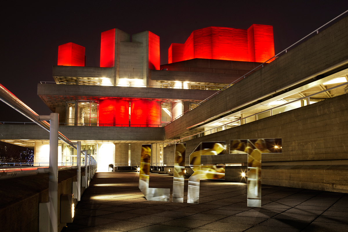
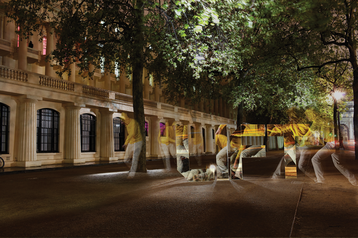
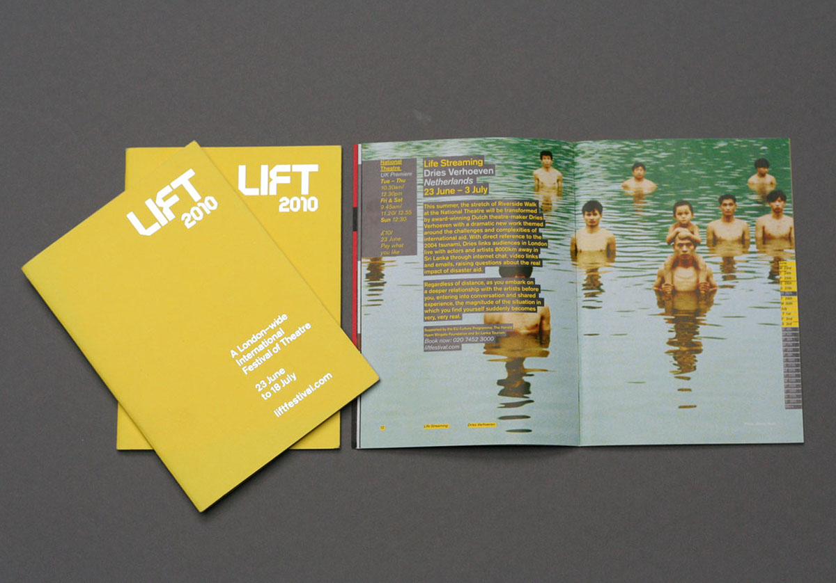
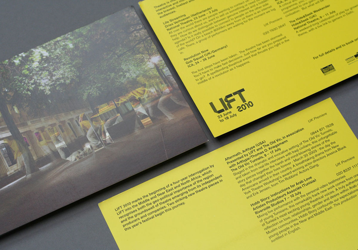
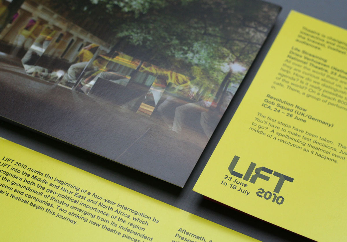
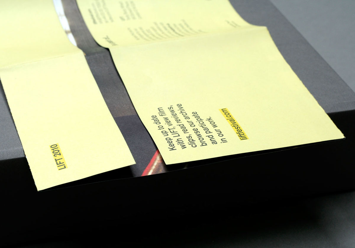
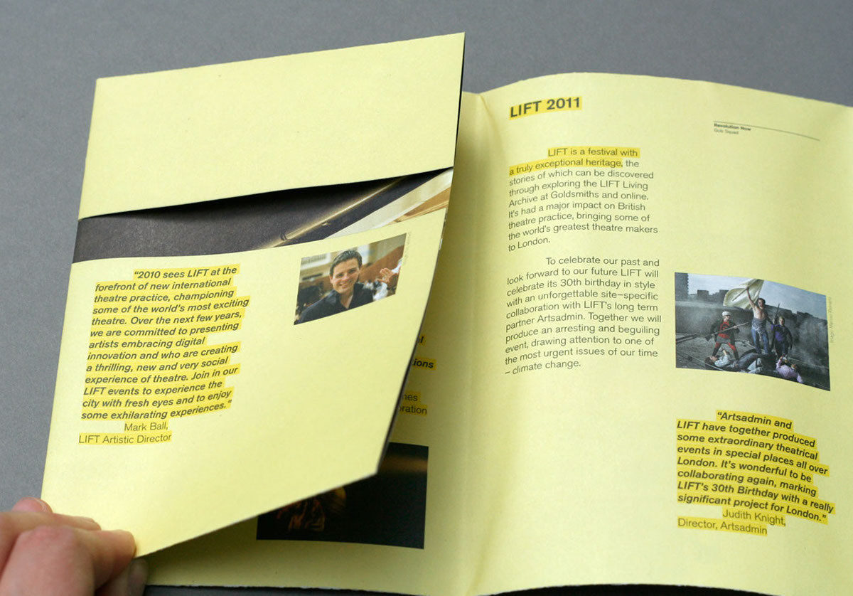
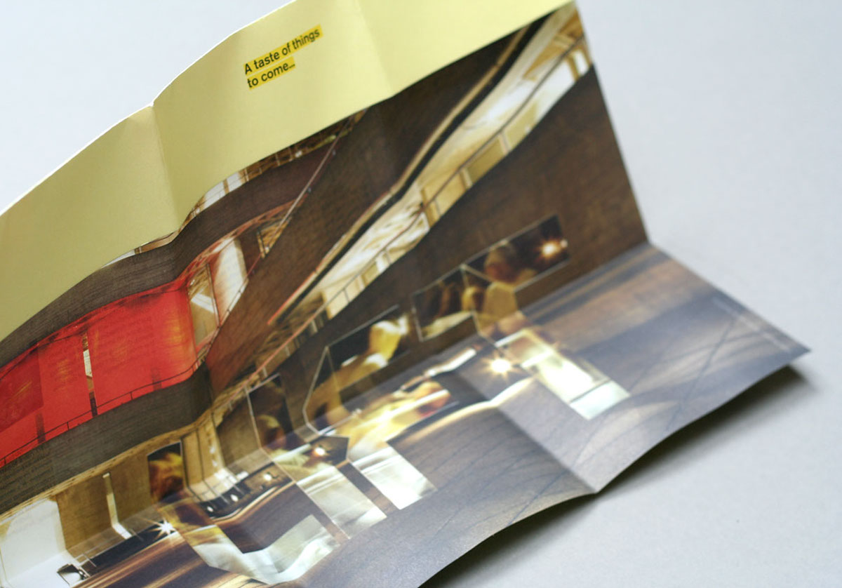
Summer 2010 saw the return of the London-wide, international LIFT Festival. We were brought in to brand the series of events under one banner; by changing the otherwise static logo into three-dimensional mirrored letter forms we were able to visualise the anticipation of the coming festival through the reflection of movement of dancers and actors within the logo itself. Taking fluro yellow and foil-blocking as constant production values we united a disparate series of communications under a consistent brand style.
Winner at the Cream London Awards for Use of Typography.
2010
Photography by

