Dev.Pro, аутсорсингова компанія з розробки програмного забезпечення, була заснована підприємцями і технологами, об’єднавши в собі сили американського бізнесу та українського інжинірингу. Протягом багатьох років Dev.pro помогає численним технологічним компаніям розробляти свої інноваційні програмні продукти і розвивати свій бізнес. Компанія легко знаходить спільну мову зі своїми клієнтами, створюючи для них найкращі рішення їх конкретних потреб, надаючи інженерні знання, швидке виконання та економічну ефективність. Але що дійсно відрізняє Dev.pro від інших, так це альянс, який вони створюють разом зі своїми клієнтами, спрямований на загальний успіх. Це і лягло в основу позиціонування компанії.
Завдання: оновити логотип, відображаючи актуальні цінності компанії, бажання рухатися вперед і виділятися серед інших технологічних компаній, зберігаючи спадковість. Фірмовий стиль повинен донести, що Dev.pro може надати кваліфікованих технічних фахівців для компаній. У той же час, він повинен залучити нових інженерів, показуючи що Dev.pro — престижне місце для роботи.
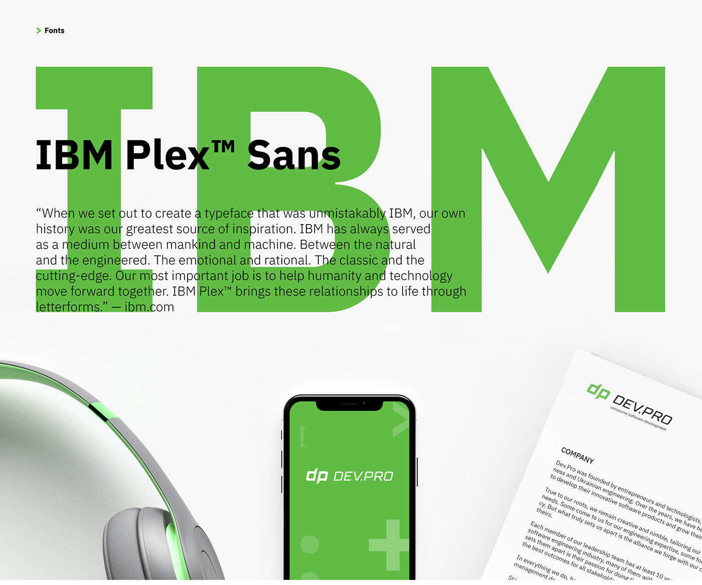
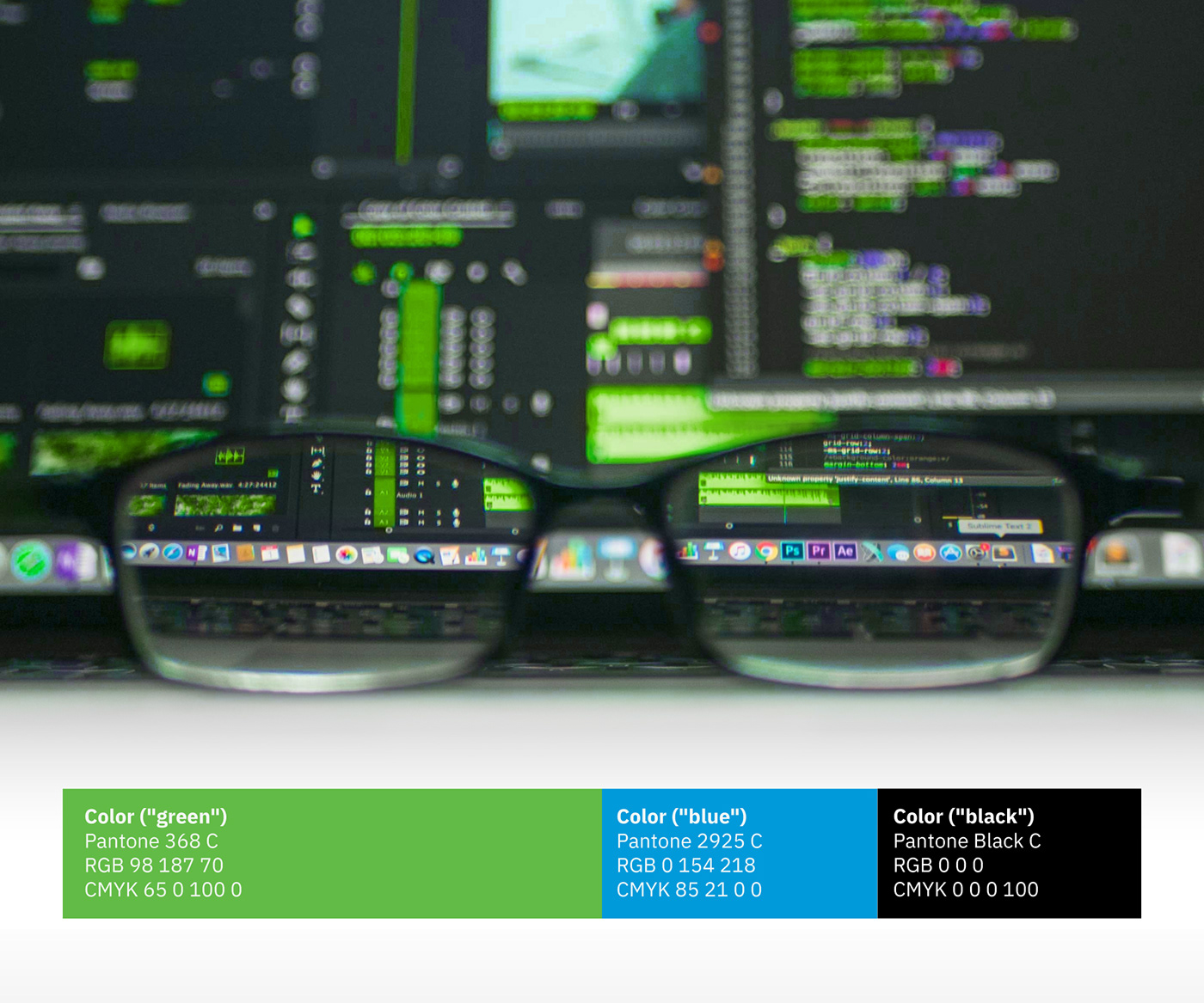
Рішення: новий логотип – це переосмислений, допрацьований старий. Весь фірмовий стиль покликаний продемонструвати оновлення в принципах роботи компанії, а також її бажання стати більш відкритою і зрозумілою клієнтам. Ми вибрали яскраві, індивідуальні кольори, щоб відрізнятися від безлічі компаній, що використовують традиційну для IT-сфери синю гаму. Для фірмового шрифту був обраний IBM Plex Sans, корпоративний шрифт IBM з відкритим вихідним кодом, який є сполучною ланкою між технологіями, наукою і людиною.
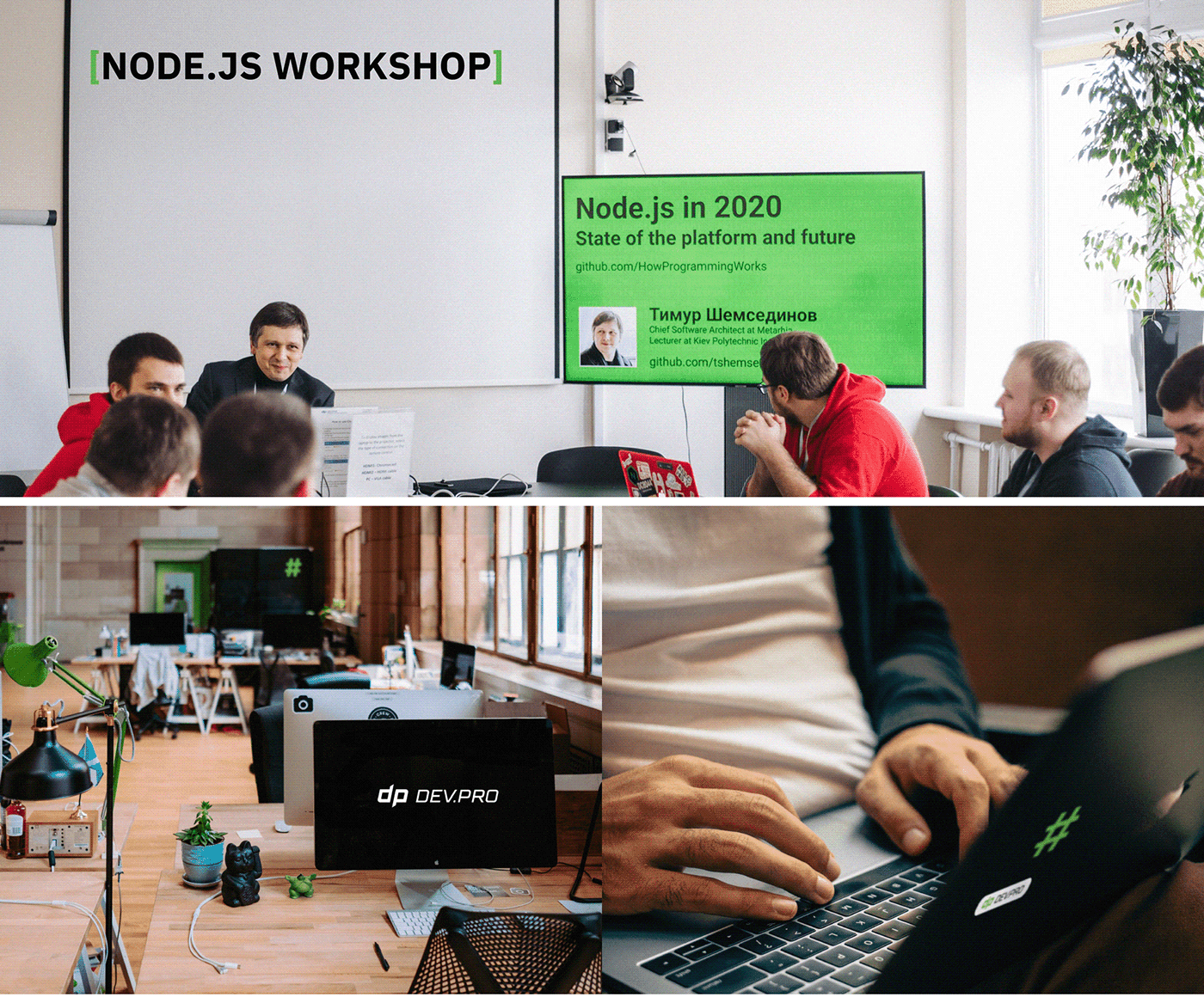
Елементами фірмового стилю були обрані спеціальні символи з мов програмування. Вони використовуються в тексті, як дизайн-елемент для оформлення і як ілюстрації з цих символів, що дозволяє фірмовому стилю бути більш різноманітним та цікавим.
>>>>>>>>>>>>>>>>>>>>>>>>>>>>>>>>>>>>>>>>>>>>>>>>>>>>>>>>>>>>>>>>>>>>>>>>>>>>>>>>>>>>>>>>>>>>>>>>>>>>>>>>>>>>>>>>>>
Dev.Pro, a software development outsourcing company, was founded by entrepreneurs and technologists, combining the strength of American business and Ukrainian engineering. Over the years Dev.pro has helped numerous technology companies develop their innovative software products and grow their businesses. The company easily finds common language with its clients, creating for them the best solutions to their specific needs, providing engineering knowledge, fast implementation, and cost effectiveness. But what really sets Dev.pro apart from others is the alliance they create together with their clients to achieve common success. This formed the basis for the company’s positioning.Task: to update the logo that reflects the company’s current values, the desire to move forward and stand out from other technology companies, while maintaining continuity. The corporate identity should show that Dev.pro can provide qualified technical specialists for companies. At the same time, it should attract new engineers, showing that Dev.pro is a prestigious place to work.Solution: the new logo is a revised, redone old one. The entire corporate identity is intended to demonstrate the renewal of the company’s operating principles, as well as its desire to become more open and understandable to customers. We have chosen bright, individual colors to differentiate ourselves from the many IT-companies that use traditional blue colors. As a corporate font, IBM Plex Sans font was chosen. It’s an open font that combines technology, science, and humans. Special symbols from programming languages were chosen as the elements of the corporate identity. They are used in the text, as design elements for decoration and as illustrations of these symbols, which allows the corporate identity to be more varied and interesting.