


Project Overview
Cook It is a responsive web app which was designed as a part of the UX intensive course program at CareerFoundry. The intention of designing this app was to connect people who had the same interest which is cooking and also to connect with expert cooks.
The reason for this is because through my research I found out that cooking is perceived as a duty by few and some don't cook because they find it uninteresting. Therefore in order to create a spark of interest for cooking I decided to design this app.
The reason for this is because through my research I found out that cooking is perceived as a duty by few and some don't cook because they find it uninteresting. Therefore in order to create a spark of interest for cooking I decided to design this app.
My Role
UX/UI Designer
Duration
August-December 2020
Tools
Adobe XD
Adobe Illustrator
Adobe Photoshop
Adobe InDesign
Balsamiq Mockup
Pen & Paper
Optimal Workshop
Usability Hub
Techniques
Competitor Analysis
UX Analysis
User Interview
Survey
User Persona
User Journey Maps
User Flow
Wireframing and (Rapid) Prototyping
Moderated Remote Test
Usability Testing
Preference Testing
Expert Reviews
Design System Language

For this project I employed the Design Thinking Process illustrated above. This methodology has allowed me to approach the design process step by step in a more organised manner.
Understand

The Double Diamond Strategy helped me to understand and analyse the problems and what possible solutions to come up with based on the derived problem statement with reference to the field I was going to deal with:
Cooking for passionate home cooks.
Cooking for passionate home cooks.
Problem Statement
Users often find cooking mundane, and hence need inspiration. They also need a way to contact an expert without any friction because he/she would like some guidance as a starting point into their new venture of cooking and can avail the help from those who need help to cater to large crowds in an event.
We will know this to be true when we see the user engages more into the social circle of cooks and thereby consult help from experts when needed.
We will know this to be true when we see the user engages more into the social circle of cooks and thereby consult help from experts when needed.
Solution
To create a user friendly app to integrate budding passionate cooks and help them contact expert home cooks in the same platform to have an exchange of ideas.
In addition has provision for users to easily contact the experts through a chat box, a phone call, video call at anytime. This will also allow provision of immediate help for the users in dire need of experts in terms of cooking, catering what they are good to offer an economical solution for the users and the income for the home cooks.
Observe
Competitive Analysis

I’ve decided to conduct a competitive analysis on to two most famously used cooking apps, Yummly and CookPad. Assessing their objectives, marketing strategies, UX analysis and a SWOT analysis I was able to understand the competition better and what opportunities are available to implement in the app.


Please click here to view the complete Competitive Analysis
User Stories
I created about 30 user stories to jot user needs and the core functions of the app. Below are examples of some of the user stories.
"As a user, I want a clear and a catchy on-boarding process, so that I feel like creating an account with this app and can understand the app better."
"As a user (and expert), I want to be able to navigate smoothly with the app, so I can effortlessly get things done."
"As a user (the same for an expert), I want to upload my recipes and post, so that I can share my knowledge among other users/experts following me."
User Research
Here I conducted both user interviews on three participants and simultaneously conducted survey and received responses from over 70 people. By conducting interviews I can ask my participants open ended questions on their opinions, and identify their pain points on the related topic. At the same time by also conducting a survey I wish to understand the ideas and thoughts on cooking from a mass number of target users.
Goals
• To identify users’ behaviour
• To identify users’ pain points and their problems
• Reason behind their passion for cooking and what does cooking mean to them
• Data on existing apps/sites/blogs do they use and what features they like/dislike about them
Interview
Due to the current situation I was able to only conduct my interview via Skype video call and with my participants' consent I recorded the call for further analysis.
Affinity Mapping
After Conducting interviews with the three participants, I then recorded the important points mentioned by them. Each colour represents one participant and quoting some of their points, I have grouped similar points and categorized them to observe which points were repeatedly brought up which I should take into consideration when designing the app. In my case I categorized the points as :
1. Factors that inspire people to cook
2. Factors that frustrate people when learning a new recipe
3. Experience with catering services
4. Other suggestions
Below is an example of one of the affinity maps.

Survey
Survey helped me to collect data from a mass number of people. I created and generated the survey link using Google Forms and shared it to many groups to collect data. Over 70 people responded to my survey and the data collected helped me to get in insight on their views on cooking with statistics.
Main Insights
• Only with good mood and the right kind of inspiration from people will make them cook
• Instructions must be clear in simple language and with images
• People must give alternatives to one recipe
• Search function should improve
• Searching for caterers must be an easy process and they must take end-to-end responsibilities
• A lot of them find cooking a therapeutic process
• Cooking should be made an enjoyable process and not made to be seen as a duty so that they enjoy what they do
• Content of recipes should also cater to office goers, college students who don’t have time in their hands but would like to eat a healthy, tasty meal spending less amount of time
• Cooking apps are not really famous among the crowd
Please click here to view the User Research Process
POV
Using the research as the basis I created personas. These are visual representation of the characteristics of my target audience with the help of this representation I will be able to proceed to the next steps of designing the app.


Ideate
User Journey Map
By doing my background research, I have condensed my findings to a more relatable scenario by user journey maps. User journey maps help me to understand my personas' daily routines, what they think and feel and opportunities that inspired me to create user flows of the features of my app. All these are based on my hypothesis so by presenting them to my team and stakeholders, I will learn how my team and the stakeholders think and feel and can update them.
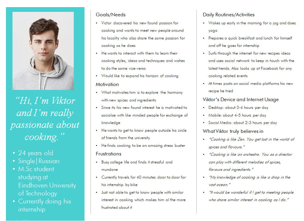
I made a total of three user journey map, one for each persona and below is an example of Viktor's journey map.

Task Analysis and User Flows
Once I created my user journey maps I started to think about what basic features I would like to include in my MVP and proceeded to create user flows which serve as the blueprint for my app. I focused on user flows on the three important features which included:
1. User being able to create and upload a recipe on the feed
2. User being able to search and bookmark recipes
3. User being able to contact an expert cook for guidance/class
These features happened to relate more to Viktor’s needs and goals. Hence I created three user flows on what steps Viktor would take to complete his tasks successfully.


Please click here to view the Task Analysis & User Flow
Sitemap
Based on my findings from user research, I went ahead and created my initial sitemap of the app. I chose to keep the navigational structure fairly flat so that the users can have access to the main functions easily without having to go back several steps to access them. I then conducted an un-moderated hybrid card-sort activity using Optimal Workshop. Through this exercise I got useful insights on how my potential users felt about the categorization. With all these inferences from the card sort, I made revisions and made a final version of it, which is the image of the sitemap below.

Please click here to view the Card-Sort Process
Prototype
Low-Fidelity Wireframes
This was where I penned down the idea of how I envisioned the app to navigate. Based on the user flows I created earlier, I went about designing wireframes for the three most important feature of the app. In addition, I also sketched out the user onboarding flow. For my low-fidelity prototype I chose to sketch them all out with pen and paper as I found it more effective to ideate my designs spontaneously.

Mid-Fidelity Wireframes
After creating the low fidelity prototype I moved onto translating them digitally using Balsamiq.

I had further developed the wireframes using Adobe XD, thereby bringing the design closer to the look of the actual app.

High-Fidelity Wireframes
I made further refinements by adding colour and designed the logo for the app.

Test
I started to chart out a plan to conduct usability test on real people to test my design and observe how they respond to my prototype. In order to be able to effectively observe how my participants would react, closely examining their facial expression, body language and be able to ask them follow-up questions I chose to go with the remote moderated test method. These sessions were done via Skype and were recorded with the participants' consent. This enabled to make deeper analyses and articulate my test report. For the metrics I chose to use Jakob Nielsen’s 5 Components of Usability to evaluate my design with the reference to the feedback I receive from the usability test.
Test Methodology
The tests were held remotely and moderated via Skype video calls. It included a short introduction, task performance with a prototype of Cook It where the participants shared their screen and a feedback session. Six participants participated in this test and with their consent the sessions were recorded. Throughout the session I used a method called Think Aloud method where I made the participants to speak out their thoughts when they do the tasks. This gave me a fresh perspective of how my design was perceived by them.
Test Script
The test script helped me to consistently orchestrate the usability tests across all the participants so that I could obtain data without deviating. 1. User being able to create and upload a recipe on the feed
2. User being able to search and bookmark recipes
3. User being able to contact an expert cook for guidance/class
Please click on this link to view the Test Script
Usability Test Results
Using affinity mapping and the Rainbow Spreadsheet I consolidated the participants' feedback on my prototype to had a better picture of what the issues were and the severity of errors.
Below is an example of one of the affinity maps.

Please click on the link to view the Usability Test Results
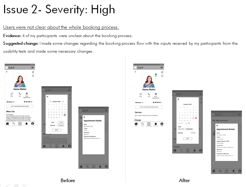
Overall I received positive feedback. At the same time with one particular task (where users will have to book an appointment with an expert cook) I found the many of my participants struggled to complete the task. So after analyzing the results I made the necessary rectifications.


Preference Testing
Simultaneously I conducted preference test using Usability Hub on two design layouts of the Landing page. The results were pretty obvious with what people preferred and I chose to go with the screen on the left.

Expert Review
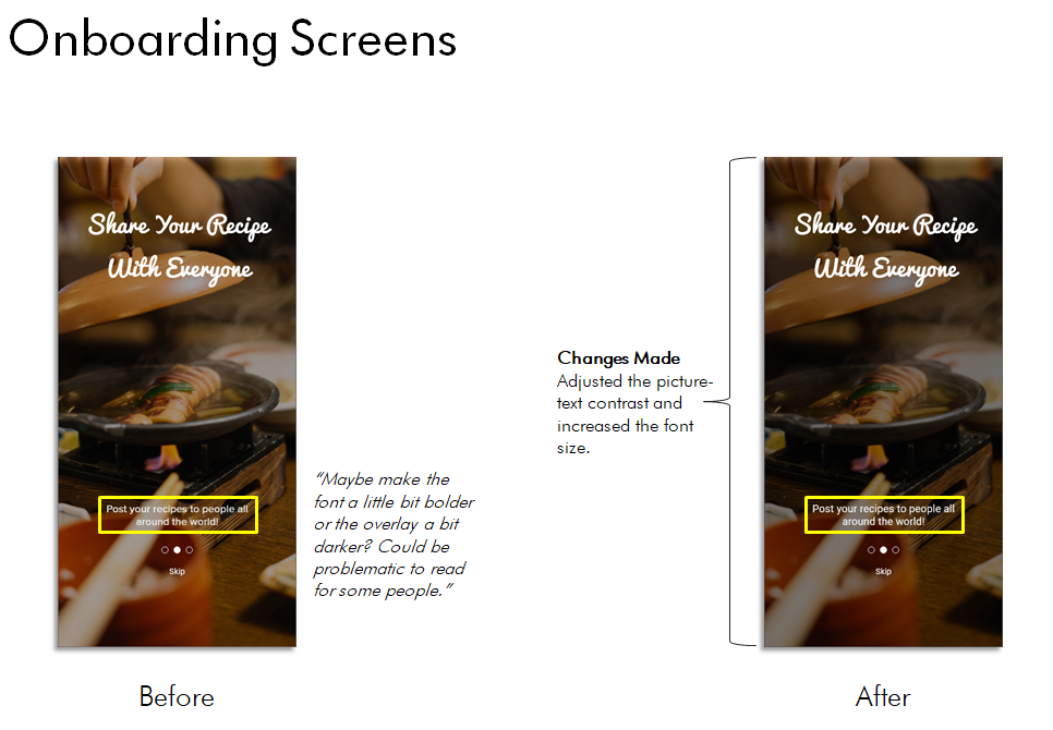
I also did a peer review design. Four peers volunteered to give their views and opinion on my design. Based on their feedback I noted down about 10 issues which were minor and made the necessary changes.
Below are examples of some of the issues which I rectified.

Design System Language
As I was wrapping up my work I created a design language system to document all the UI elements, typefaces, colour palette, icons, etc. I used where and why. This document will serve as a reference to maintain a consistency for future use if this app was to be designed for iPad, tablets and desktop and if it were to be upgraded to a newer version.
Below I have an example showing what typefaces I used, colour palette, and some UI elements

Please click on the link to view the full document of the Design System Language
Final Design
What's the next steps?
• Conduct further rounds of usability tests
• Introduce new features such as registering as an expert cook, accessing your network, settings, etc.
• Prepare designs to hand over to the developing team


Check out the prototype below
Thank You!


