
Package Series - TAZO tea
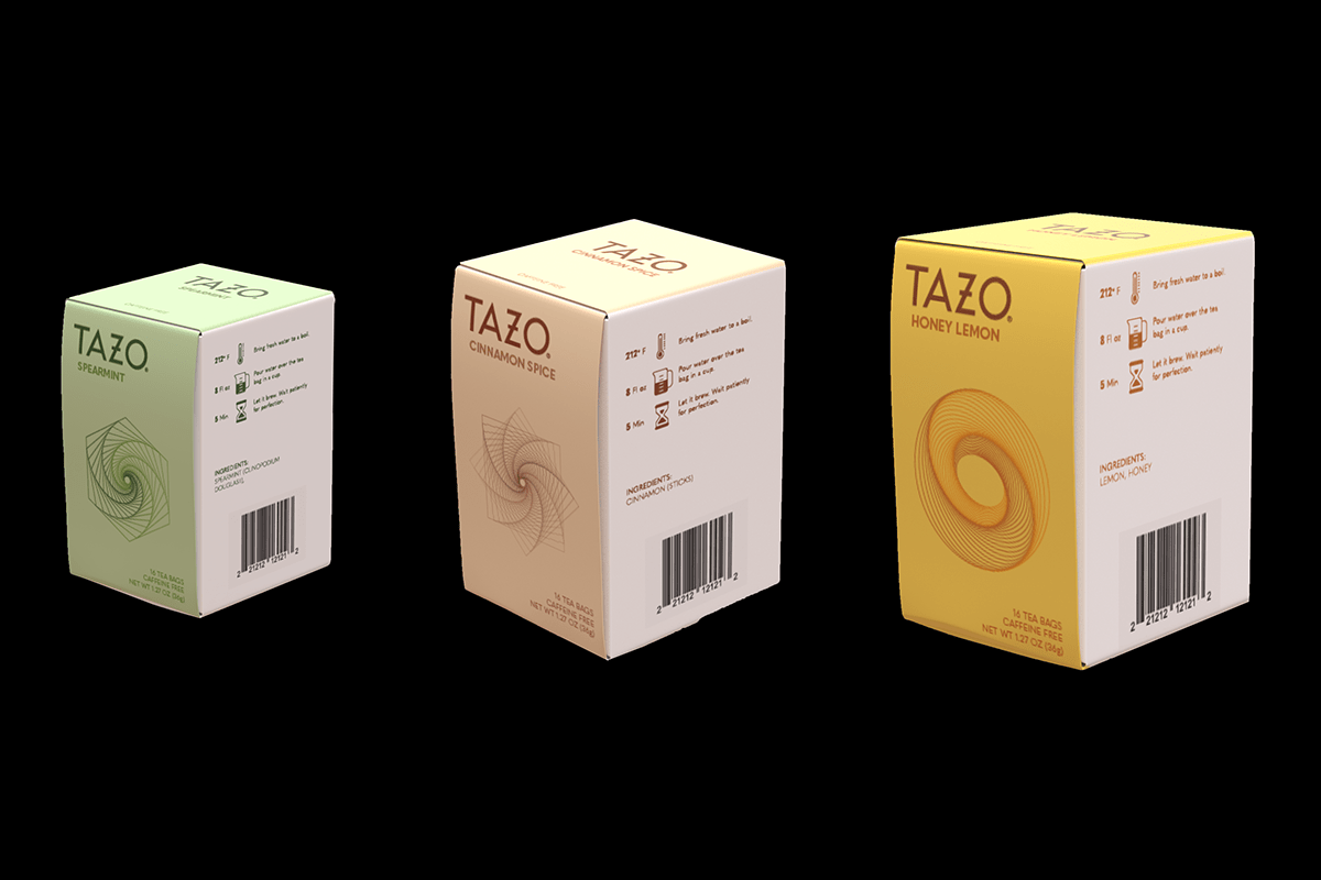
TAZO tea is known for using fresh herbed-quality ingredients. To associate the design layout and color choice with their fresh herbed ingredients, I decided to use gentle colors that would represent the flavors.


My idea was to keep it simple but to make the packaging look very modern in sleek design. I decided to keep the ingredients side white with the instructions type and icons in color.


The top of the box is only displaying the TAZO logo, flavor and if it is caffeinated or not. The flavors I chose, go back to my childhood memories of waking up up in the morning with a spicy smell of "Canela" Cinnamon tea in the air. Or my mother would ask me to go plug some Spearmint leaves in the backyard garden to make tea. My favorite over all of them has to be when I felt a bit under the weather and my mother would bring me some honey lemon tea to boost my immune system.

The full brand text description of the back is displayed in three small paragraphs with a small TAZO logo in the bottom right. I decided to make the brand statement with one word on each line break because it stands out as a direct attention grabber, with a piece of the front covering an abstract shape to show connection.

Lastly the front of the box is where the Logo, tea flavor and “NET WT”, quantity, caffeinated or not, and the abstract shape gives off an emotion.


