Graphic Design (photography portfolio)
MY INITIAL CONTACT SHEET EXPLORING HUMAN FORM AND CONTRASTS
The first project I am going to be showing is based on Human Form and tonal contrasts. My focus for this was to look closely at linking human form and contrasts by digitally editing my photographs. I aimed to create an illusion of movement and then carry this forwards into the idea of distortion using the skills and techniques which I have learnt using photoshop. Here is my contact sheet of original images. This idea of movement was originally inspired by Nicola Selby and Felix Milburn Foster. I had always had an interest in dance photography due to the grace and peace that surrounds them.
Here is a brief overview of my planning sheet for editing my photographs


My focus for these edits was to look closely at linking human form and contrasts by digitally editing my photographs. This contact sheet presents the initial photographs which are very basic and were inspired by a contemporary photographer Nicola Selby. These are my initial edits which I created by layering and enhancing. These three images here best describe my interpretation of Michael Milburn Foster's work as they create the sense of movement in combination with stillness. I layered my images but desired to leave a blurred effect to highlight the idea of a sequence and to make the fabrics merge.


Nicola Selby is a UK based photographer who gained recognition for her dance photography. The imagery created from her photographs are expressive and captures the critical moment of the dancers movement. Her passion for this photography stems from her love of dance as she used to be a dancer. This combination of art and dance has allowed her to create a personal connection to her photography. Michael Milburn Foster creates images which illustrate movement while incorporating the human form and also contrasts. He was born in North Wales and used sequence photography as his initial inspiration in his work. His artwork illustrates the shapes of the human body which best describe movement. He does not blur his images, rather uses the idea of a positive and negative space to show an almost puzzle like work.
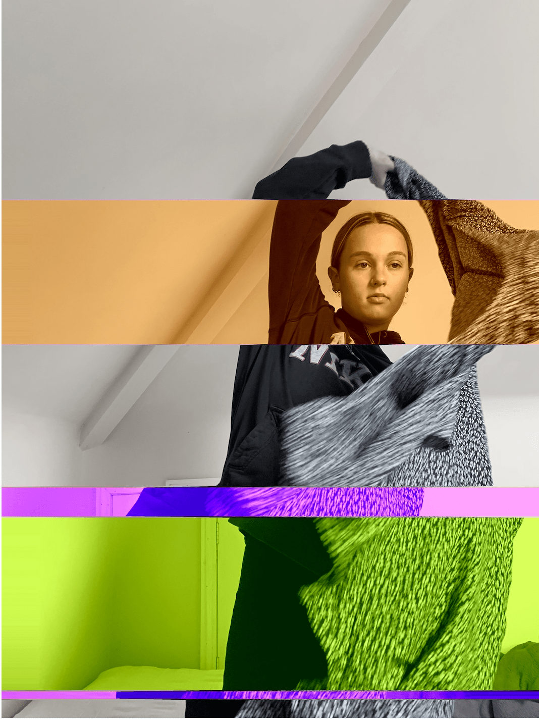
For this edit I created four different segments of colour and black and white to create a contrast. I did this by layering and changing the saturation and tones in each section. It shows the different layers in a block effect which I think create emphasis on the distortion and portrays a sort of glitching effect which furthers the ideas of Nicola Selby's photography.

Again influenced by Milburn Foster this edit is one of my favourites as it has an impacting effect, it shows a sequence of images in repetition yet they differ in colour. The three images together seamlessly merge into one which is similar to Milburn Foster's work.

This edit is inverted, it was very simple to create however I like the effect it has, I like how the background becomes ominous which is similar to the fabric. The darkness of the figure and the lightness of the background changes the positive and negative spaces and create ambiguity. It therefore shows the impact of contrasts in the opposite way.

Finally, this is my other edit inspired by Nicola Selby's photography, I was inspired to create an illusion and something that offers thought. The dispersion of shapes is another way of representing movement and personally for me it feels as if you can imagine the figures next movement based on the direction of the shards of fabric.
Looking at different ways of presenting movement in a sequence:

I was inspired by my study of Rob Woodcox in my Related Study which led me to create this image of layered movement.

The process for creating this image was by screen shots from a video taken on my iPhone after each second until I reached my required sequence. I then added lots of layers one by one using the cut out tool and cutting and cropping each image on photoshop. This took lots of time as it was difficult to match up each image in order to create a realistic effect. I put all the images in a sequence by selecting them and placing them on top of each other so that the base of the figures were combined and the legs were fanned out. I also had to make sure that the composition was straight by remaining still during the video. I had to take particular notice of the tonal balance and composition.

This led to me develop this idea and create further edits where I erased the background to create a simpler effect so the figures would stand out more. I also wanted to create a focus point so in some of the images so I faded them and also changed the colour.
The videos I used to create my sequence
My method of putting the sequence together:


Duchamp's Nude Descending a Staircase 1912 and an un named sequence by Jesse Draxler - from which I took my inspiration.


After looking at sequences I further developed this with the incorporation of figures within a frame. The aim for this sequence was to create a triptych. These photographs were taken in Amsterdam, my aim when capturing them was to highlight everyday life in a busy town and contrasting this with figure that is moving through it. I experimented with sewing, collage and different adding dimensions. For the first image I used different colour thread to add dimension, the second I used a foam board to make my figure stand out against the photograph and be three dimensional. I was inspired by Maurizio Anzeri who layers threads and Jelle Martens variations of collage. The presentation of a journey can be seen due to the similar position of the figure and the stillness of the background.


Maurizio Anzeri was the starting point of inspiration in my work, as you can see our work differs slightly yet I was captivated by this concept of using thread and sewing on my images. I was motivated to recreate the different sewing pattern and as I felt they can create an aura that surrounds a figure through the use of colour and also the way it sits on the photograph adding dimension.


In this next photoshoot I wanted to create a narrative incorporating the ideas of ambiguity and being lost in thought. These were the images that came out of my initial attempts.


To explore ambiguity further I took the next series of photos with a person wearing a mask. I really enjoyed creating these images as they illustrate ambiguity so well. The figure is presented doing day to day things but the mask illustrates how the lack of identity and expression changes our view.

I used the tonal contrast and manipulation of colour ratio to develop and make my images stand out. The simpleness of the background brings the figure forwards in the composition. The double images within the frame shows a contrast as does the effect of the small boxes.


Benjamin Alire saenz and MiamoJolene - Masked photography influence
In this next project I looked at human features and what makes peoples identity differ. I came across Lauren Marek's work and was drawn to her idea of capturing different parts on the human body in a collage. I wanted to look closely at skin types and what makes up someones originality. What makes this kind of photography so effective is the simplicity of the images yet the power they retain when put together.

Here is my own interpretation of this:


The way Henrietta Harris uses distortion interested me so I decided to play around with my images and manipulated them using the photocopier so they displayed a similar distorted effect. I liked how the colours merge so that a contrast becomes present. It also presents a link between what is real and what is not. This idea links to the difference between reality and mortality. Henrietta Harris manipulates her images using watercolours.


Rosanna Jones had a huge impact on my work, having had an interest in her artwork and photography I decided to include her in my project. Her photography shows clear sharp edges and helps highlight the idea of things being different. She explores tonal variation in the foreground and background of her photography which is very effective in making the figures stand out. She uses a variety of styles to convey her work yet a reoccurring theme is the idea of staggering images and cutting them out.


My work influenced by Rosanna Jones


I then moved onto looking at the manipulation of distorted images. I used a collage to show the difference of age and skin tone while creating an illusion. I wanted to express the human face and how colour and tones affect this.


My aim for these four images was to show clear variation of colour and distortion. The comparison between the features explores a different way of looking at the face. What makes them so striking is they way in which the tones blend despite the obvious segments.


A collage by David Hockney which influenced me to create distorted images.

Matthew Bourel creates collages which derive from a narrative, He collects parts of books and magazines to evoke nostalgia. For my interpretation of this work I wanted the facial features and, in particular, the eyes to tell a story. After all the eyes tells us to much about a person. After editing using the black and white filter on photoshop I came to the conclusion that by darkening the lighter tones it made the eyes stand out more, this also applied to the lips. Despite the fact the images look similar they show perspective of the face from different angles.


Images by Matthew Bourel


I was again inspired by Matthew Bourel to create these images. I wanted to portray something that is both distorted and that shows a acknowledgement or the effect of colour contrasts. I played around with this particular image by using the cut out tool on photoshop to create the patches, i then changed the saturation and tones so that they would stand out. The black and white image defined the features more which I liked.

This is an edit which combines both contrasting tones and the distortion of the human face. Using photoshop to segment parts of the face, I then changed some into black and white and edited the saturation of the others.

To develop this idea first I wanted to create something that had a tonal structure. So using a light box I blended and layered colours into segments. On the other image I wanted to illustrate feelings of isolation so I collaged stripes of the same image on the top and added more facial features. The aim was to present a the feeling of being trapped inside your own head.


My initial contact sheet of images; looking at human form with particular reference to features and anatomy.

My first edits:


I cam across Rob Woodcox on pintrest and his work stood out to me in many ways, from the distortion element to the emotion that it creates. I attempted different ways in recreating this both in normal colour and inverted colours. The inverted image highlighted the human form element as you can se the stripes create a contrast over the collar bones of the figure and on the face.


Rob Woodcox's main aim in his work is to present something dreamy and unreal he focuses on presenting rights for LGBTQ , body neutrality, racial equality and environmental justice. His work holds a unique perspective yet it is very eye-catching and meaningful.

This shows my editing process, I created multiples lines across the face and down the body, I then gradually changed the tone fo them so that the further down they went darker they became to show a tonal range. The only tones I modified were the reds and yellow.


I created some further edits using the same ideas, firstly putting the hand in black and white. This is one of my favourite edits as it allows us to view the hand as a shadow looking similar to a skeleton. It also creates an abstract effect and contrast the skin tones of both figures. I like the supernatural idea of a contrast, as you can see from the other edit there is a sense of mystery and ambiguity in the black and white figure.

Here are two sequences of portraiture which i love as they capture the models and their personalities. They are completely unedited and un filtered.


For my next edit I used David Bowie, Ziggy Stardust as my influence. I began by cropping the image and adding a white background to make the head stand out. My intention was to make the eyes and the red lightning bold stand out against a paler skin tone to fit the context of contrasts.
Here is a sequence which shows my process:


David Bowie - Ziggy Stardust and my course work inspiration


For this work I was strongly influenced by Rocio Montoya, who is a Spanish based photographer and designer who creates surreal images about the human body in close relation to nature. I also liked the way the white background contrasts and makes figure stand out more.


Looking at typography and portraiture:

I am inspired by the work of Nick Chaffee a Graphic Designer to incorporate the use of text into my work. Here was my first edit, I like the way the text stands out and decided I could use it as a way of presenting emotion through the words.


Kelly Maker a digital artist and photographer inspired me to further this idea of using text in the images below. The thought process behind the text in the background was to add something irrelevant to the images, I wanted a text that was telling a narrative but something that was also ambiguous.


The image on the right, s by an unknown artist and as I love creating collages the idea of incorporating text compelled me. My work illustrated three different images which all contradict each other. The use of words comes from inner thoughts which can be inferred from the actions of the figures in the images.
During lockdown we created a project based on isolation.....

A very large part of lockdown was obviously the distance which it created between us and our families. I wanted to create a series of images showing this divide.


These were the two main edits which I created from them, I only wanted to change the tones and saturation as I felt that the image itself was powerful enough. I love how the contrast between the images instantly changes the emotions that it portrays.
Looking forward, I am going to be looking at typography and using letter blocks to create more prints. Here are some images showing the process of my first creations.


