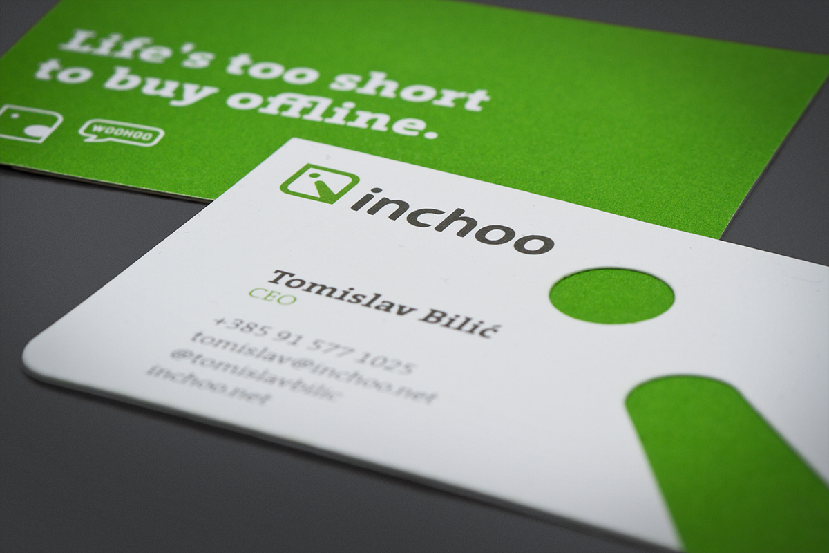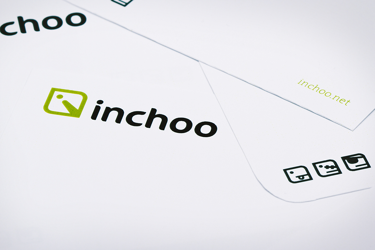
INCHOO
be ready, be capable
be ready, be capable
Inchoo is one of the best Croatian IT companies specialized in the development of online stores,
based on Magento system. Inchoo services are used by the world's largest brands and clients.
Internet and applications are platforms used by the end users of Inchoo solutions.
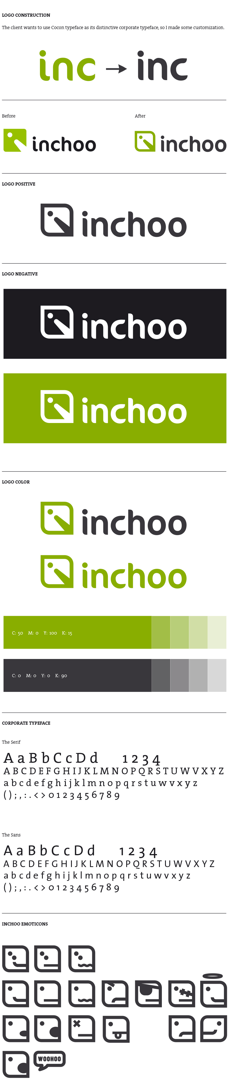
The most common form of the internet and app Interface today is square:
(buttons, application icons, avatars, communications network links, etc.)
Because of that we used square form in designing logo sign and give it additional symbolism
of Inchoo Pacman. Pacman movements in the maze symbolize searching for new and better solutions.
Except square, logo contains the initial of company name, which gives all the positive characteristics
of the letter "i" - ideas, innovation, information, imagination, inspiration.
Agency: Mit Design Studio
Client: Inchoo d.o.o.
Design: Leo Vinkovic
Art Direction: Leo Vinkovic
Illustration: Boris Matesic
Photography: Vedran Marjanovic Wekster
Illustration: Boris Matesic
Photography: Vedran Marjanovic Wekster