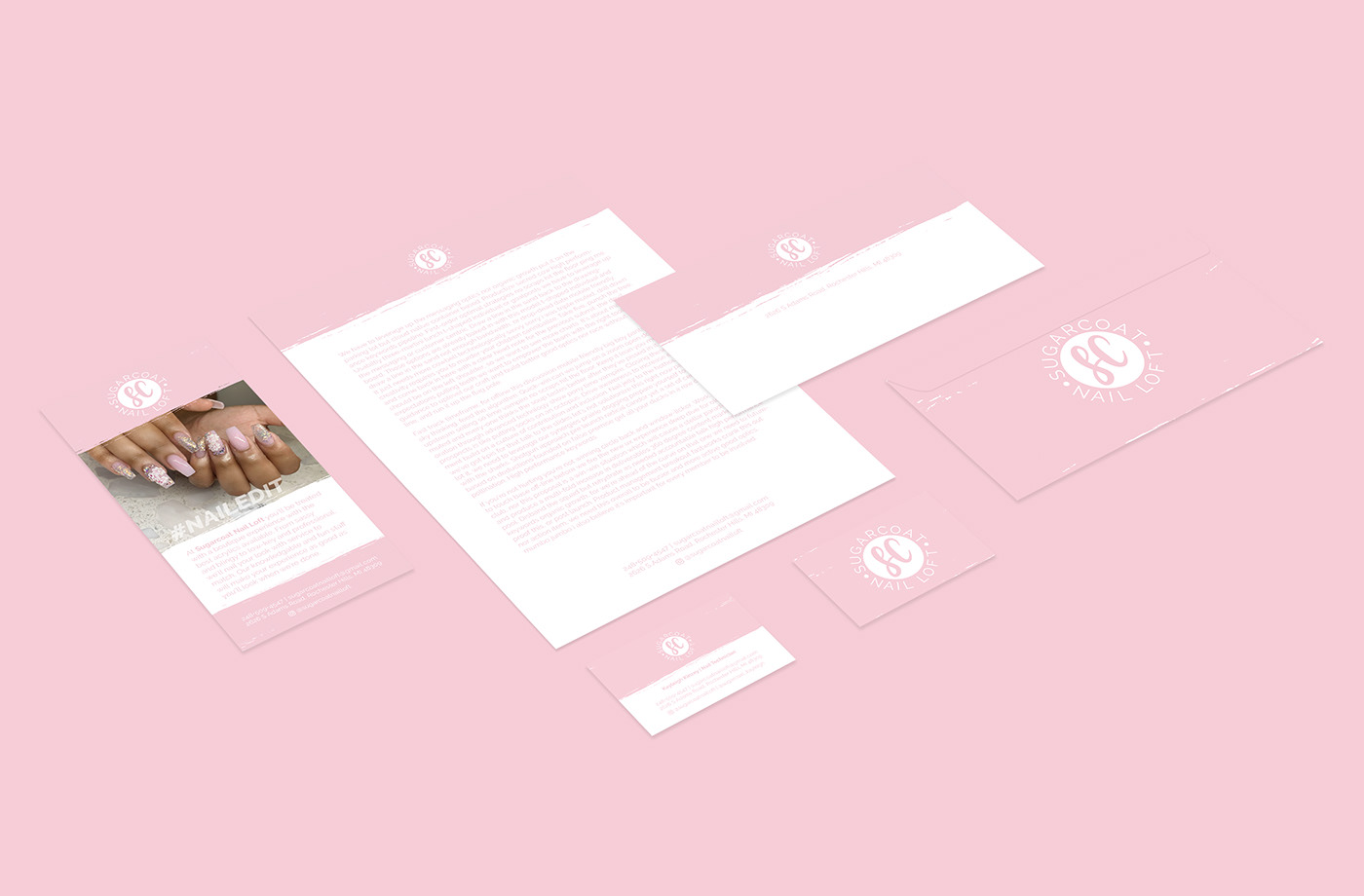
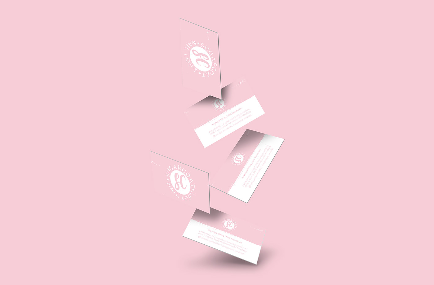
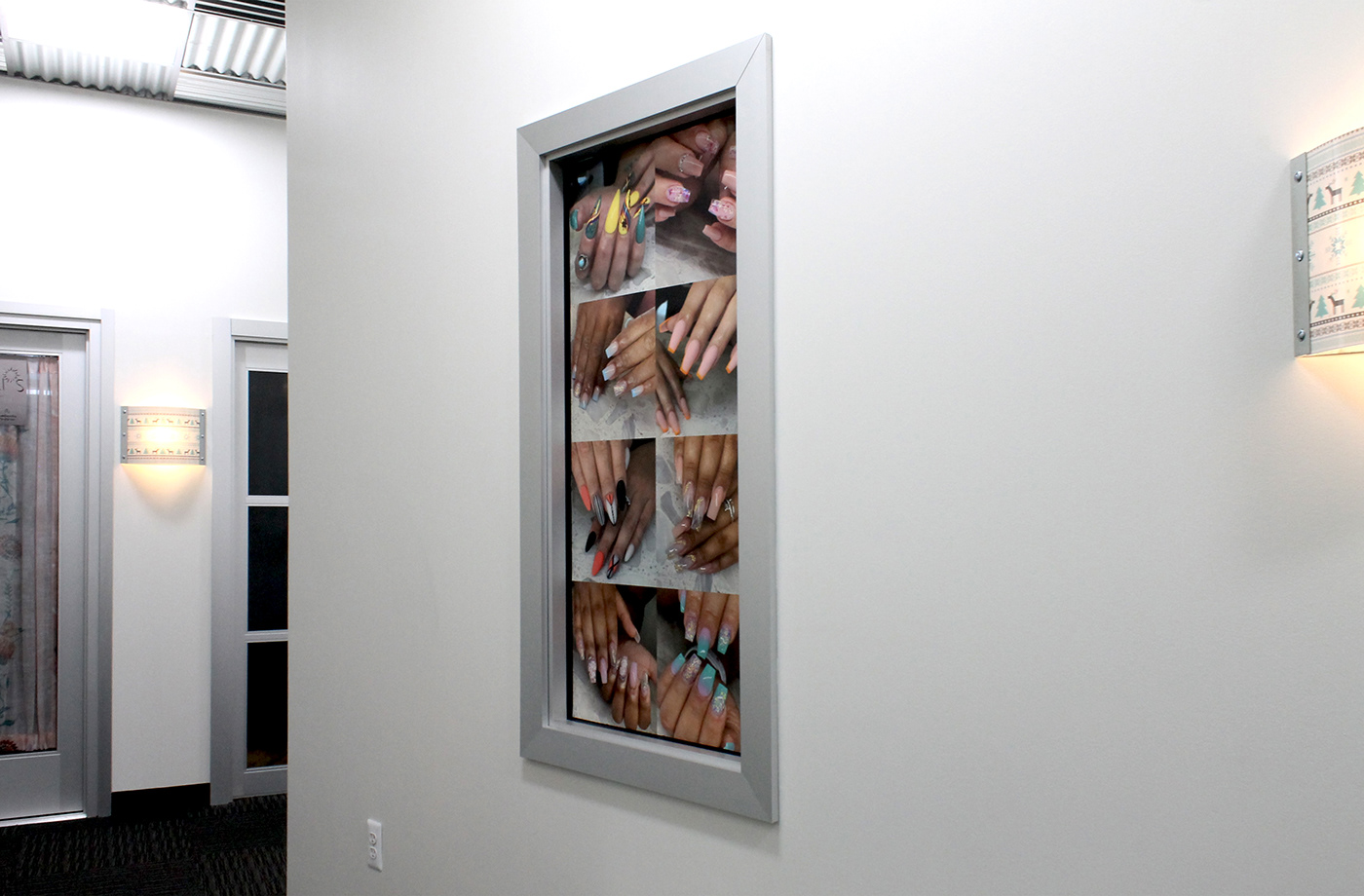
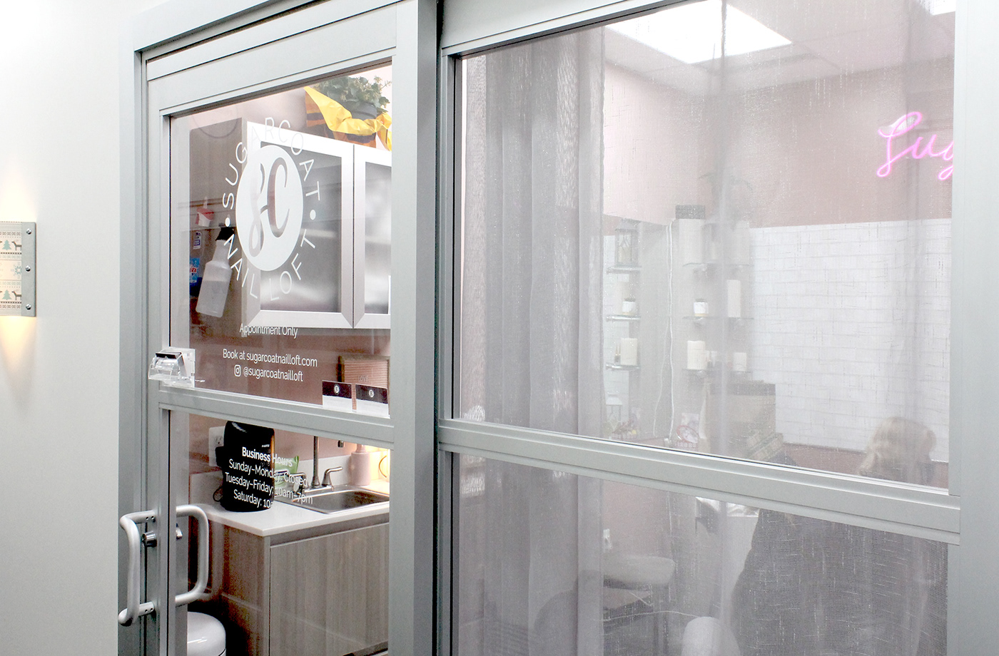
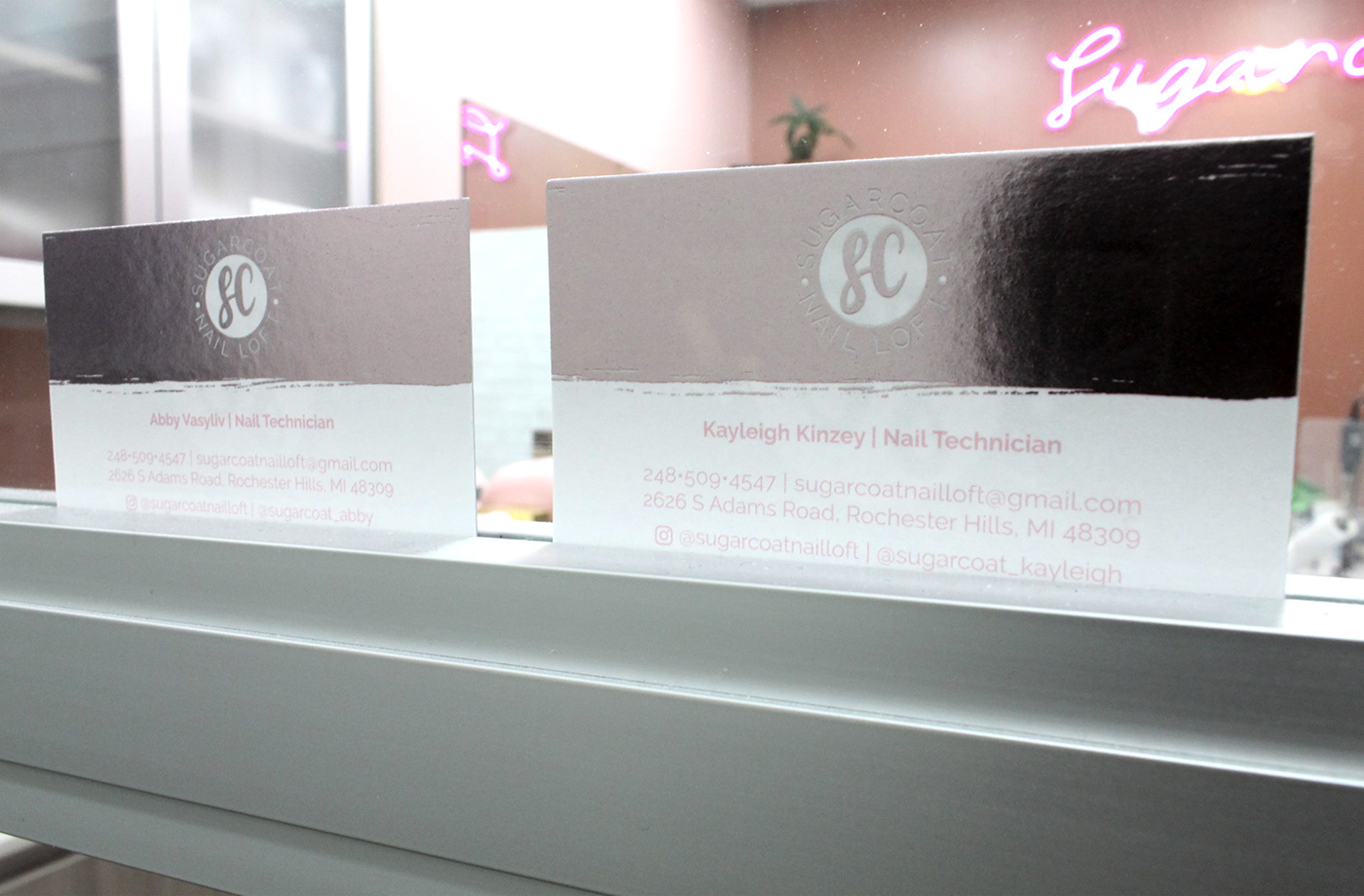
Sugarcoat Nail Loft is a newly opened nail salon in Rochester Hills, Michigan. They specialize in all looks ranging from blingy and boujee to short and professional. Sugarcoat was in need of a logo, business cards, and window graphics. Some key attributes the ladies wanted to capture in their branding were fun, girly, bright, and cute. We went through a decent number of revisions and tweaks before happening on the final solution for the logo. After that the rest of the identity fell into place nicely. The business cards were printed with a metallic coating to emulate a type of nail finish they use. The text is centered but the contact information and address give the design a sense of alignment. From there I used the layout of the business cards to lay out the information on the windows. Other materials were created to show how else the branding could be utilized.

The logo set the tone for the rest of Sugarcoat Nail Loft’s brand identity. I broke the brief down into key points about what kind of image Sugarcoat identifies with and wants to project. After playing around with incorporating nails, the final logo evolved into a badge-like design. The SC initial was derived from a typeface called Lovetime. It was rough and distressed looking out of the box so I took the pen tool to it and cleaned it up. Wrapping the business name around the logo added context. Circles have been used to separate the wording to make readability easier. The circular layout of the symbol and text lent itself to a flexible array of layout options.