Designing the product of a young star-up : Workez
A friend of mine started an entrepreneurial project. She wanted to connect restaurants and people that want to occasionally work as a waiter or waitress.
In France, we call that "to do an extra" (faire un extra).
The app would allow people to apply for one-day jobs in a restaurant, bar or café and pay the worker after shift.
As I got time for myself thanks to mister Corona, I offered to my friend to design her app based on preparatory work she'd already done.
Designing an app without any context, and without the possibility to iterate thanks to actual users isn't how I usually work. I'm more used to deal with professional software often made by a company for its employees. I also mainly focus on the ergonomy of a product, so mostly the Ux part, not the Ui.
Creating a product from scratch was a nice challenge, and I learned a lot about Figma thanks to this project.
Showcase
Main page
The main page contains a picture of the user, the date, and a list of available jobs.
I used shadows and a white stroke to add texture for the cards, and logos to give a clue about what kind of company is hiring as extra can work for restaurants, bars and cafés.

Seeing the details
When the user clicks on a job offer, more information is displayed: time of the shift, address of the restaurant, the dress code.
The call-to-action button allows to apply for the job.
You can also see more details about the restaurant, by clicking the "+" button
When the user clicks on a job offer, more information is displayed: time of the shift, address of the restaurant, the dress code.
The call-to-action button allows to apply for the job.
You can also see more details about the restaurant, by clicking the "+" button

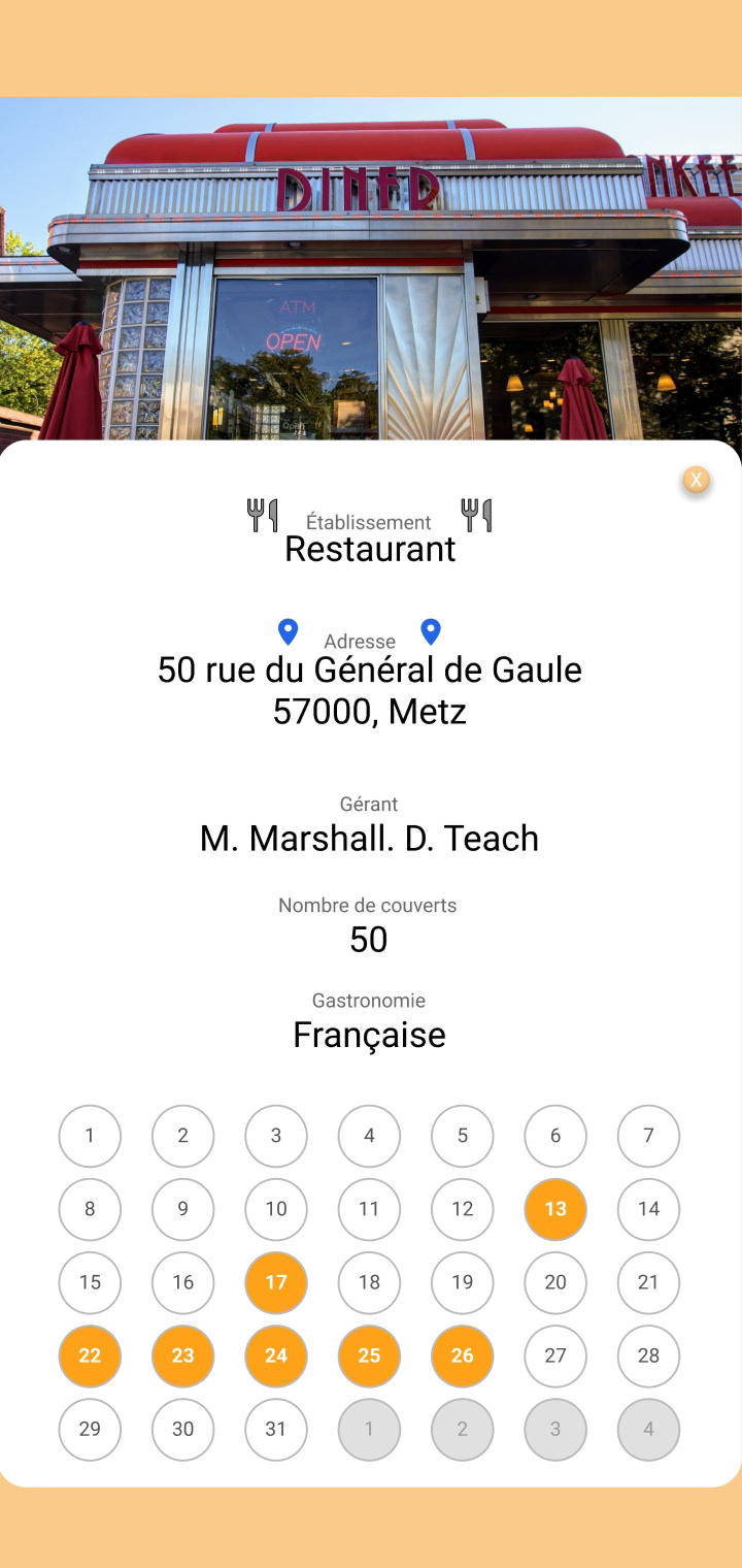
More details
By clicking the "+" button you access the restaurant profile page and can see the owner's name and a calendar showing next dates when the restaurant will need an extra
By clicking the "+" button you access the restaurant profile page and can see the owner's name and a calendar showing next dates when the restaurant will need an extra
Personal calendar
I created two views for the personal calendar.
The first one in line, with four circles representing the four shifts of a day.
If you are hired, clicking on the orange circle show essential information about your shift. Clicking on a white circle (available) would change it to grey (not available) and vice-versa. This functionality would allow the app to recommend your profile to restaurants based on your availabilities.

The second view for the calendar is a classical one. When clicking on an orange circle (hired), everything becomes blurred and essential information is shown.

The app for employers
For the restaurant's owner, our secondary user, the app is basically the same (with a color switch) but focus on the calendar. Again two views are available.
The call-to-action is to create a new offer.
The call-to-action is to create a new offer.

Asking for an extra
Here's a short form to define the number of extra needed, the date, hours and dress code for the shift.
Here's a short form to define the number of extra needed, the date, hours and dress code for the shift.

Hiring someone
People who apply for the shift would appear as little card, clicking on a card would show the full resume of the candidate. Hiring someone can be done in just one click.


