TASK:
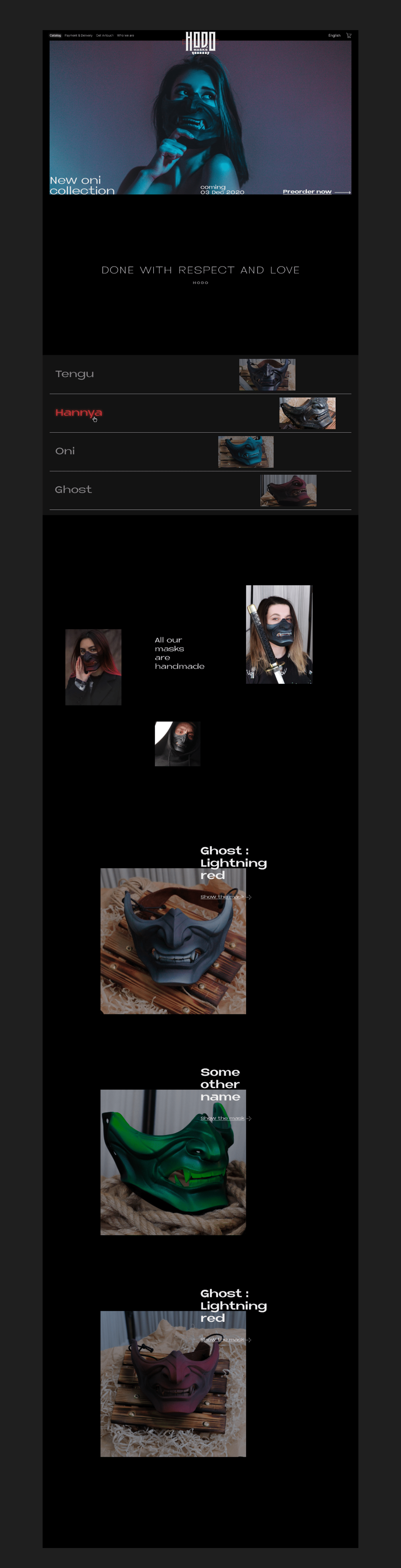
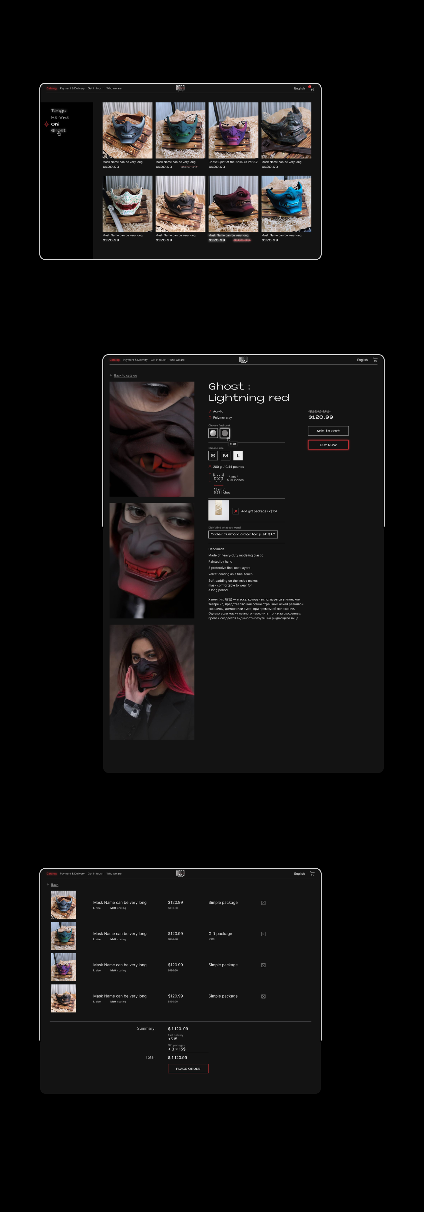
Logotype and web catalog
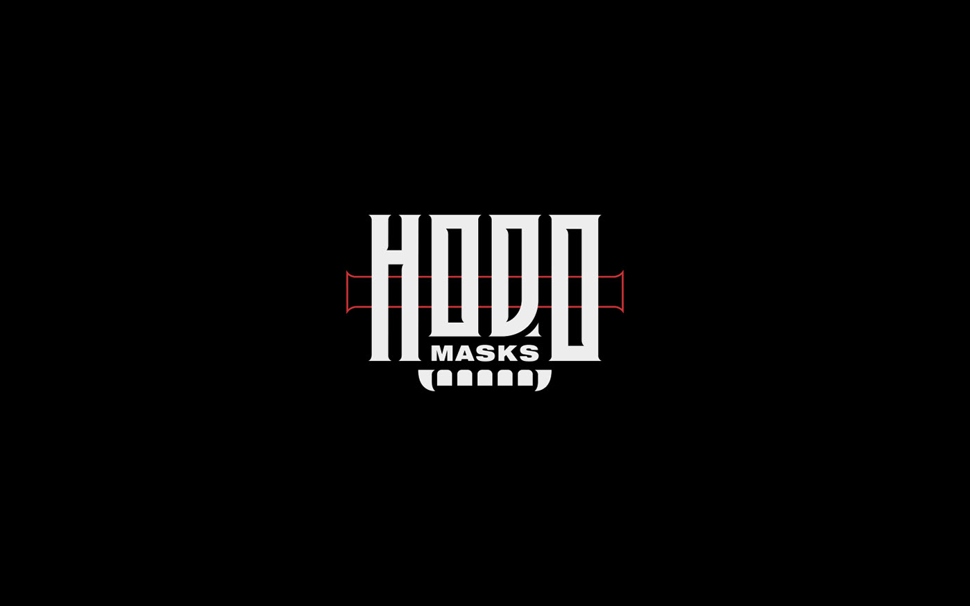
Hodo is a workshop, crafting neo traditional Japanese masks.
The logo refers to Japanese culture through the feelings of minimal geometrical typography — strong and robust. This way we could avoid using cliched Japanese visual images .
The logo feels independent, stands out among others of it's kind and visually transmits message "we are ready to explore and reinterperent traditional cultural code". Also, strong and robust typography represents a philosophy of a master, carving perfection of details through painstaking hard work.