


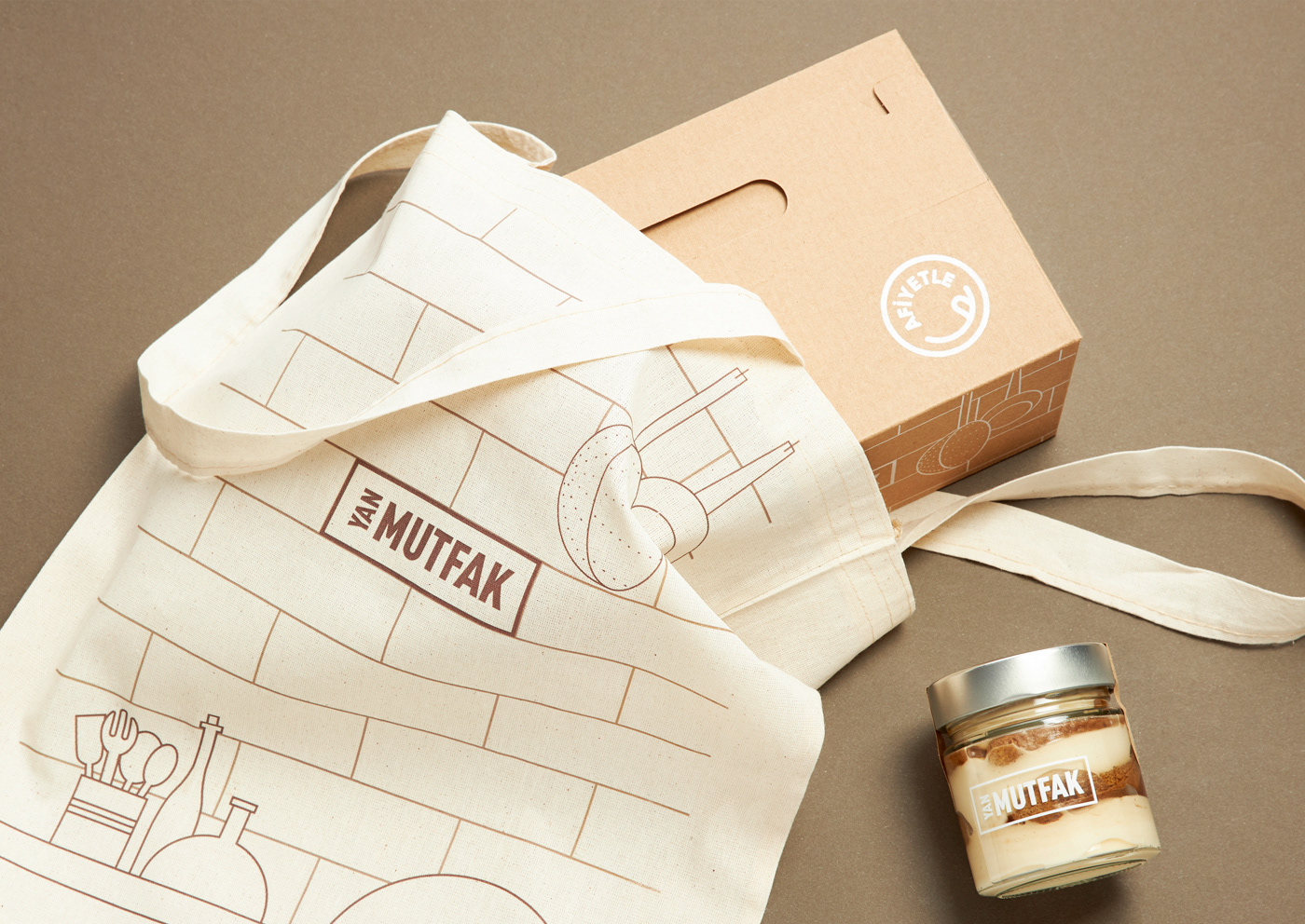
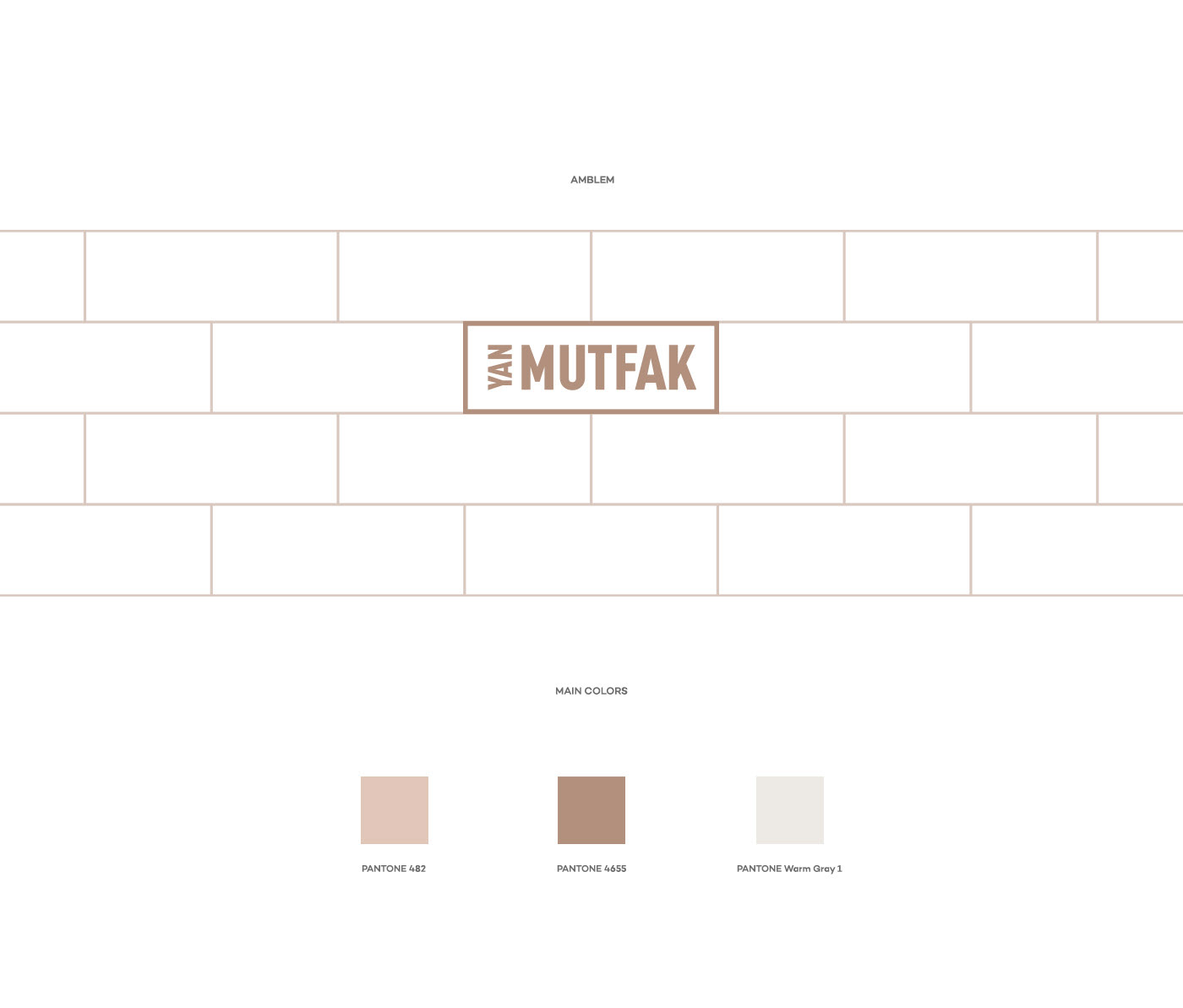
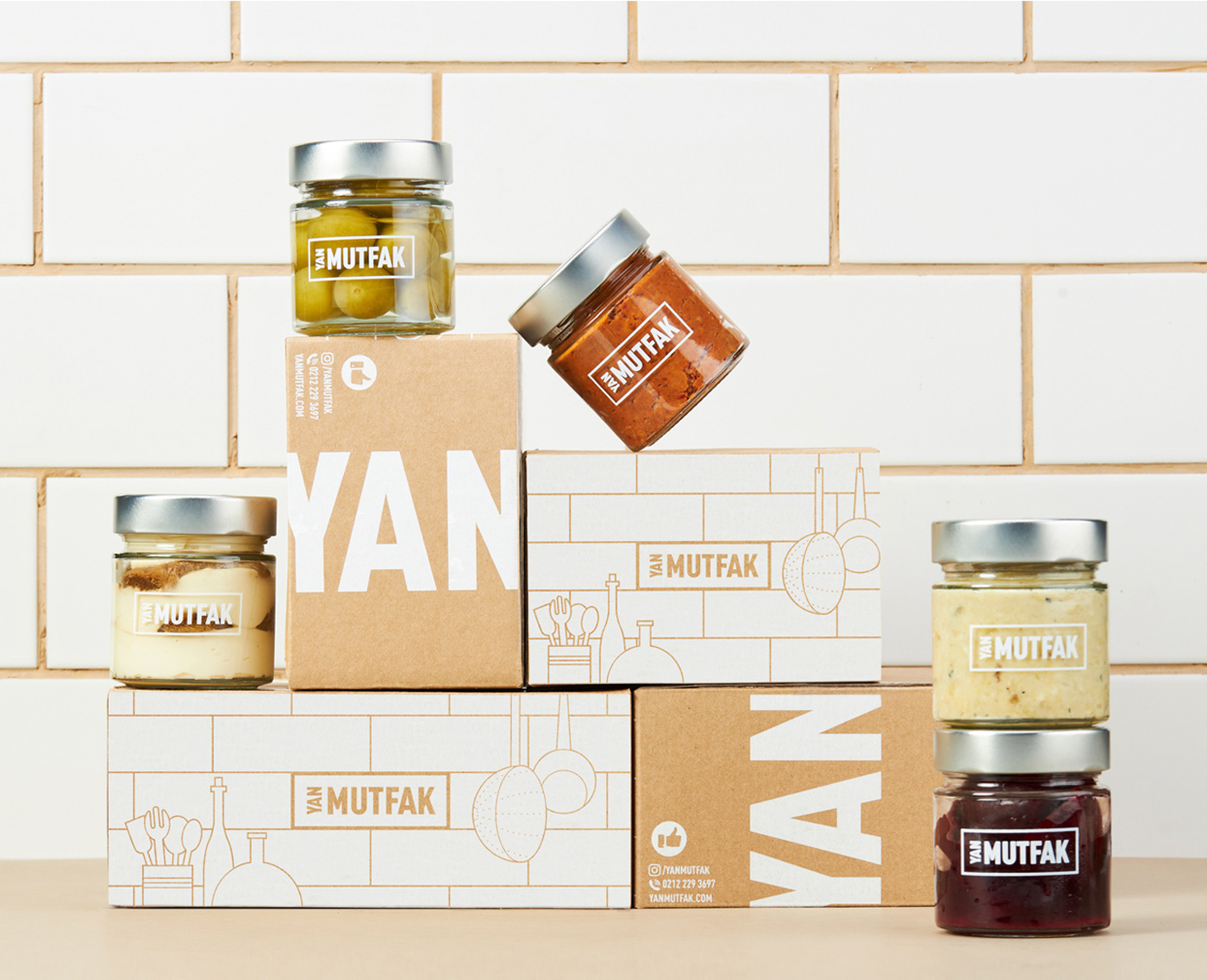
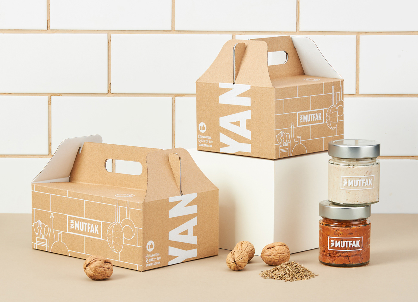
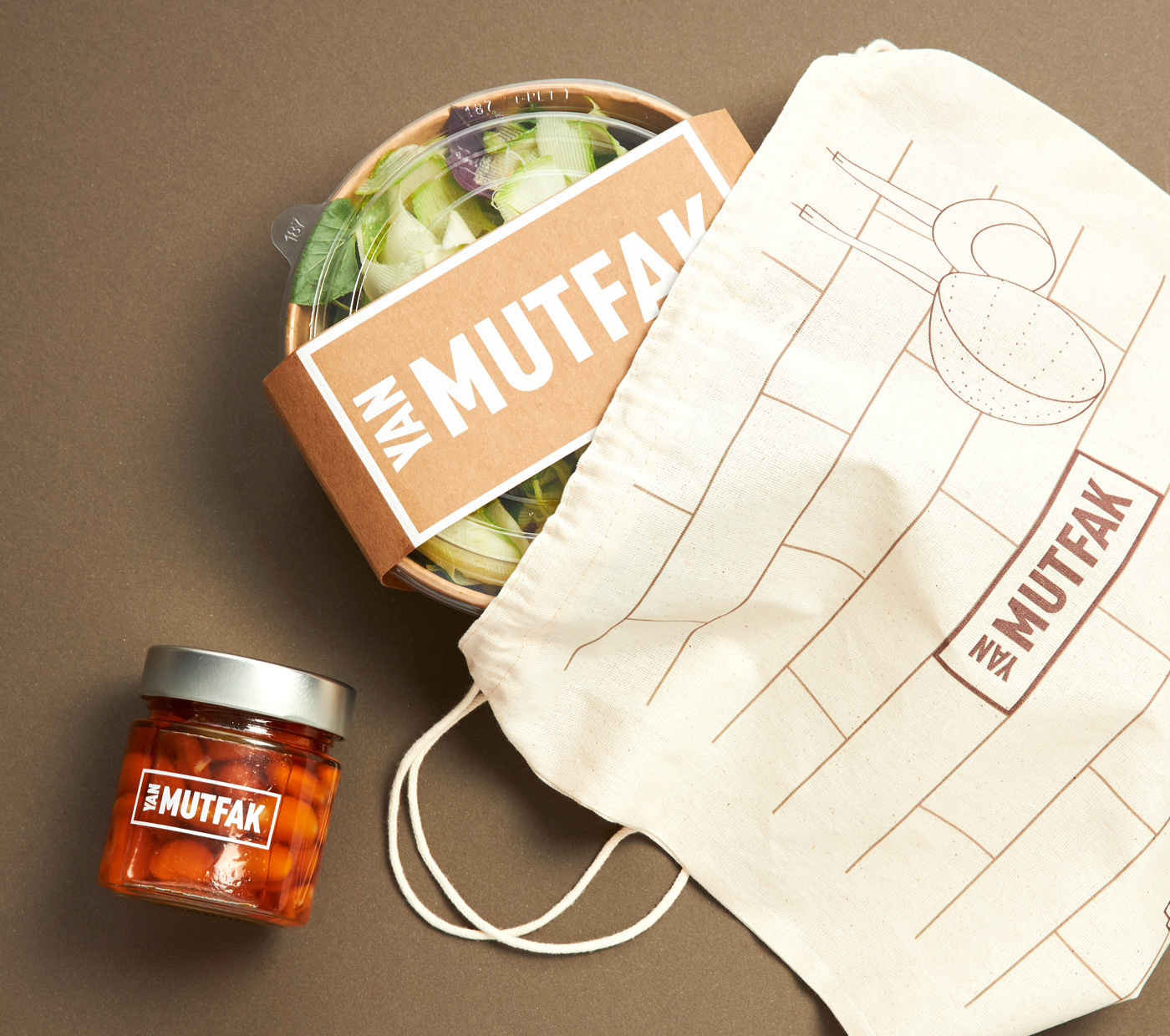
To differentiate the brand as well as to build a unique visual communication, we utilized the the word “Mutfak” meaning kitchen in Turkish. Inspired by the brand name, the kitchen space became our key visual. And the tiles that were present at the place of production as an eye-catching feature of that space became the most important feature of this structure.
Typography was placed inside one of these signature tiles for the logo design. The word “Yan” that means “side” in Turkish was typed vertically and on the side of the word “mutfak” that means kitchen. That allowed us to both emphasize the meaning of the word and customize the typography.
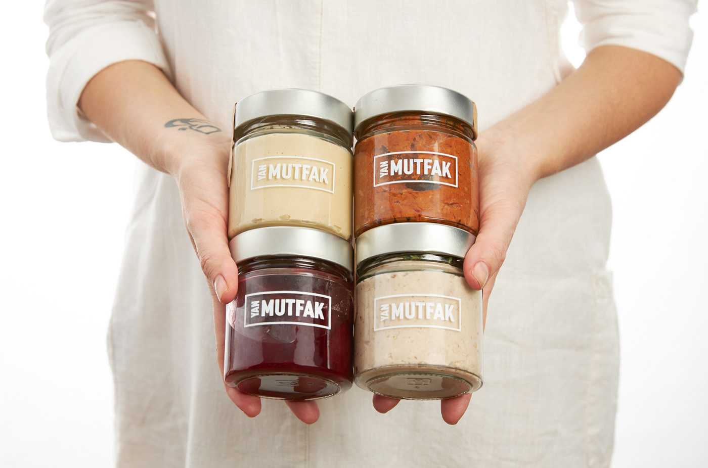
Using tiles as the background during photo shoots facilitated the continuation of the visual structure.
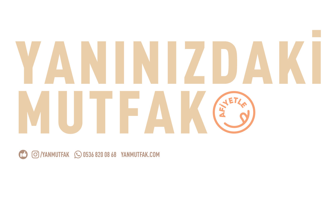


YAN MUTFAK 2020
LOGO / BRANDING / PACKAGING
CREDITS
Clients: Yan Mutfak
Concept & Design: Polat Gülkaş - Paper
Account Director: Sezen Aksoy Çakır - Paper
Photography: Fırat Eryılmaz
Styling: Sara Tabrizi


