Anamorphic Typography
An exploration of the potential and existing relationship between architecture and typography
An exploration of the potential and existing relationship between architecture and typography
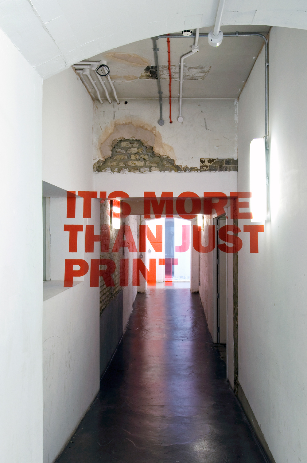
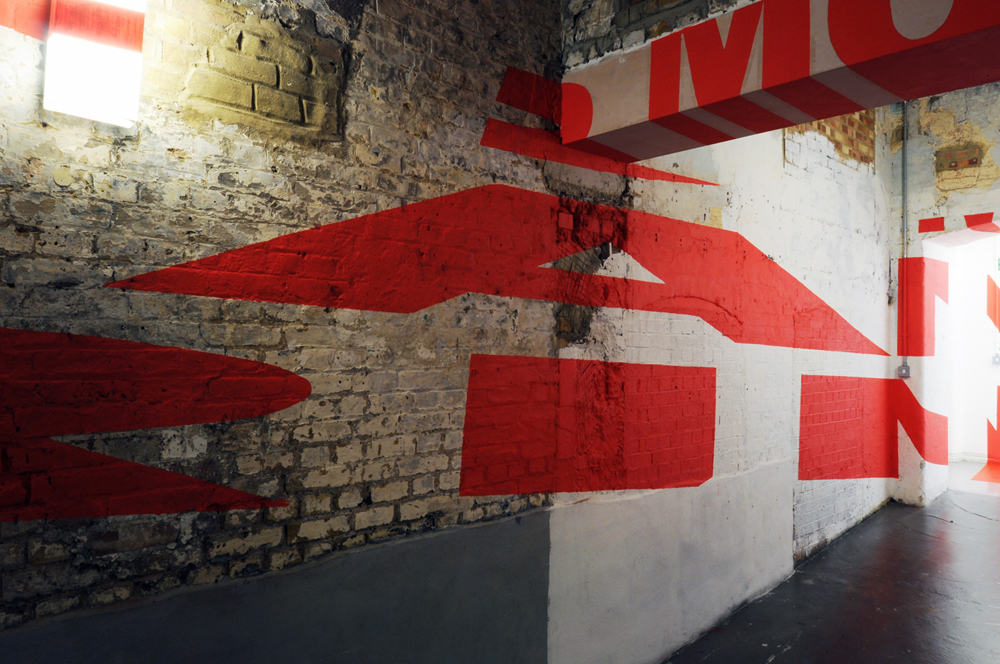
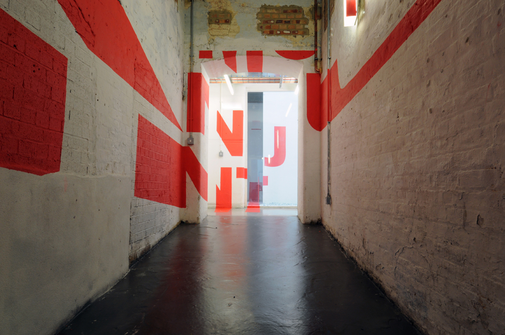
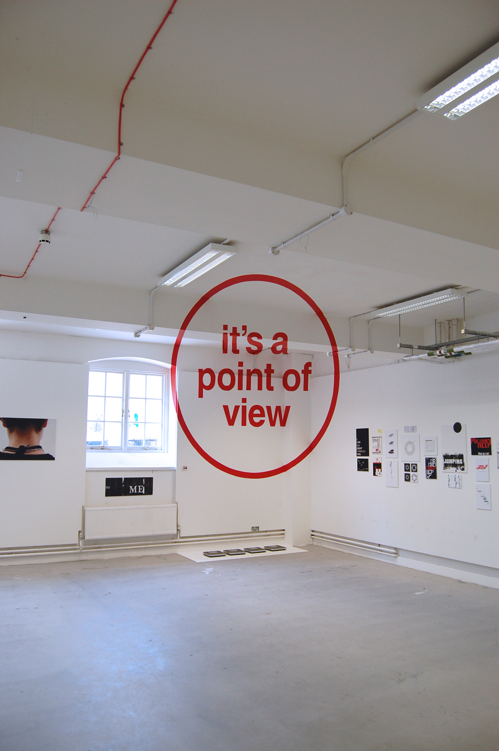
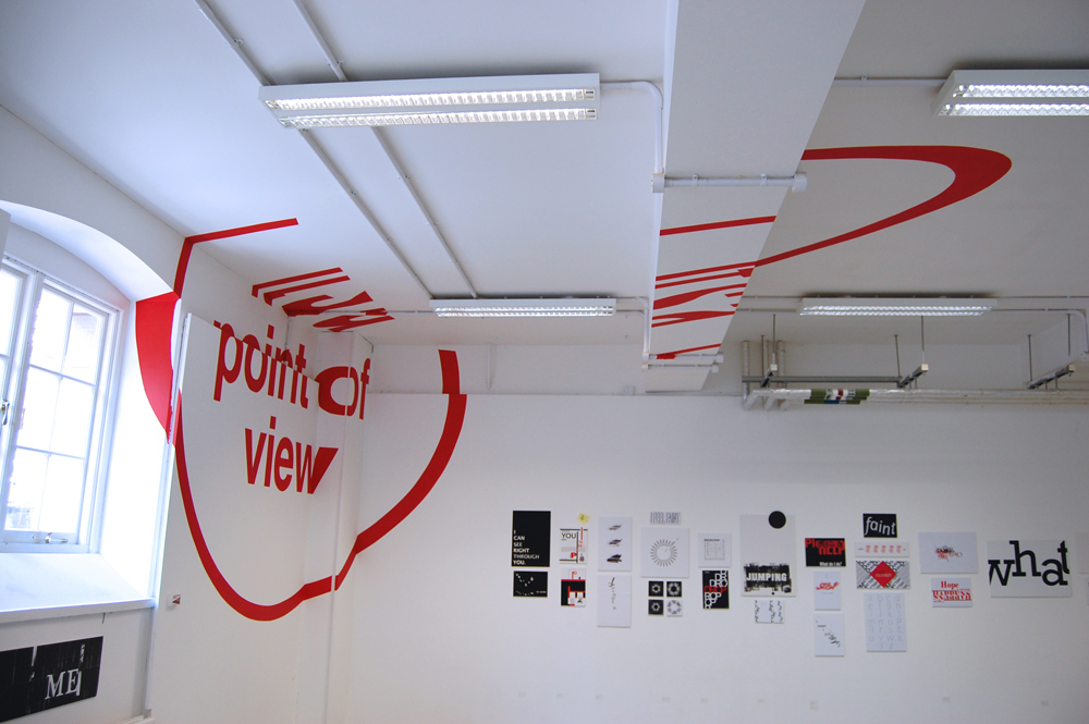
After researching and testing the process in our studio we began to search for an ideal architectural space within our college buildings to execute our installation in. When planning an anamorphic installation is it important to consider that to maximise the fracturing of the design, it is best to try and touch as many plains as possible. We eventually decided to carry out our installation in a corridor of our college (as shown in the images) using the long walls to maximise the distortion of the letterforms. All of our work is site specific and we spend as long as possible discussing a choosing the perfect architectural locations for our works.