Accordning to New York Times, Strings of Autumn is “…one of Prague’s most innovative undertakings…”. The imagery used in the 2010 visual identity is a visual metaphor of the different layers of this international musical festival, which combines classic music, jazz, world music and experimental performances.

Strings of Autumn 2010 - Alash @ České muzeum hudby

Strings of Autumn 2010 - David Orlowsky Trio @ Španělská synagoga
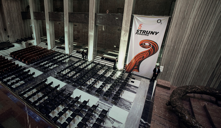
Strings of Autumn 2010 - Jan Garbarek & Hilliard Ensemble @ Národní památník na Vítkově

Strings of Autumn 2010 - Dowland Project @ Kostel Matky Boží před Týnem

Strings of Autumn 2010 key visual no. 1 (english version)

Strings of Autumn 2010 key visual no. 2 (czech version)
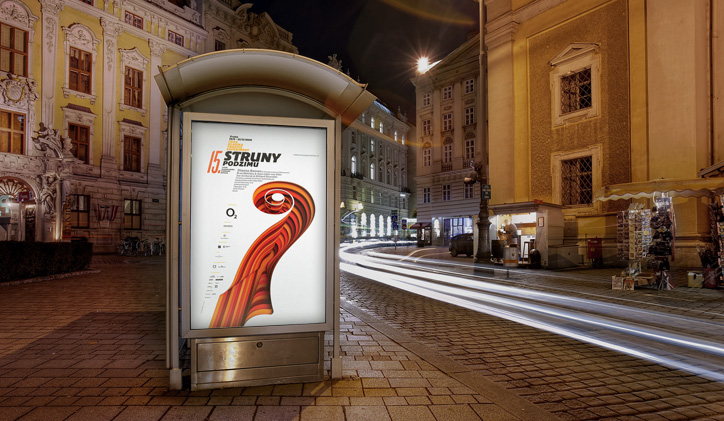
Strings of Autumn 2010 citylight poster

Strings of Autumn 2010 CD sampler and DL brochure
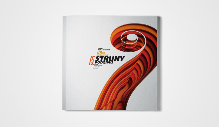
The cover of the festival's brochure
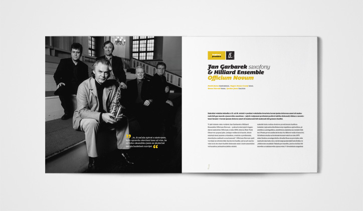
A double-page spread the festival's main brochure

A double-page spread the festival's main brochure

Event tickets
