PROJECT INFORMATION
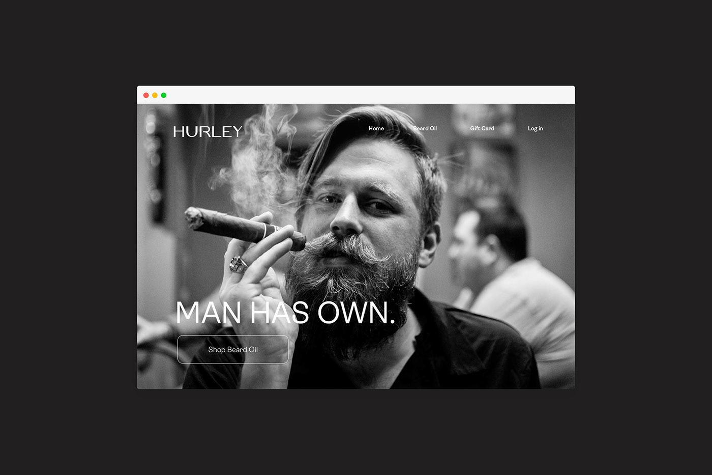
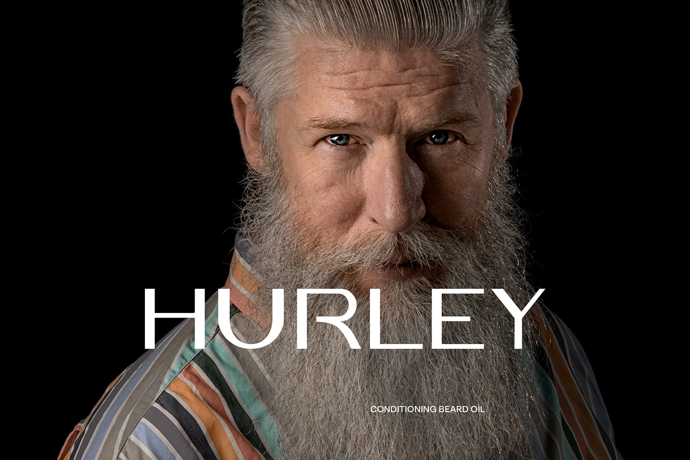
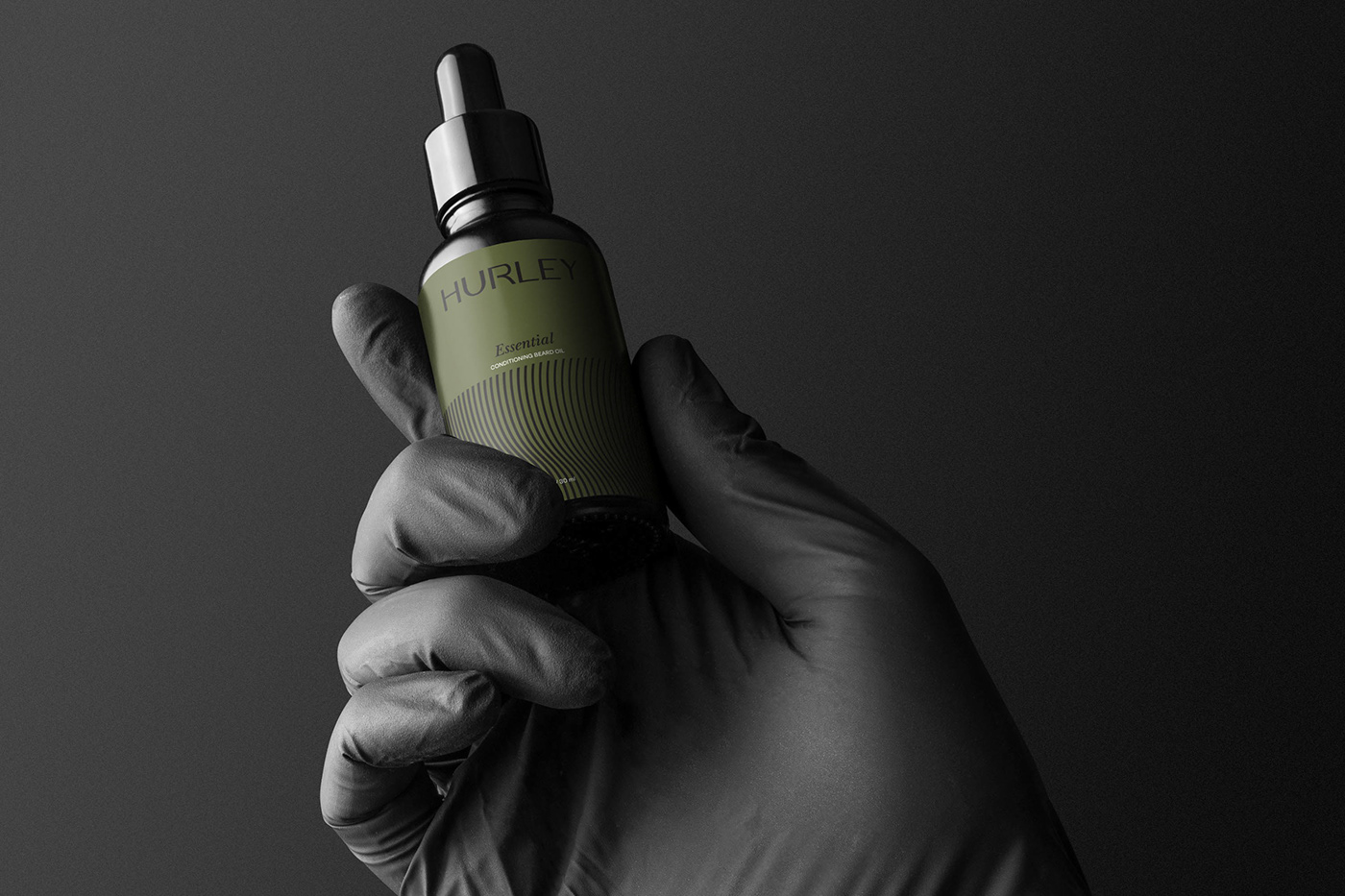
HURLEY is a startup for mens care, especially beard oil. With the premium quality presented, they want the brand’s appearance to feel elegant and gentleman. By targeting the middle east market share, especially the Y & X generation. Apart from having a strong brand personality, the brand must be in line with the consumer’s personality. This is to give an emotional impact to consumers about the brand image in their minds.
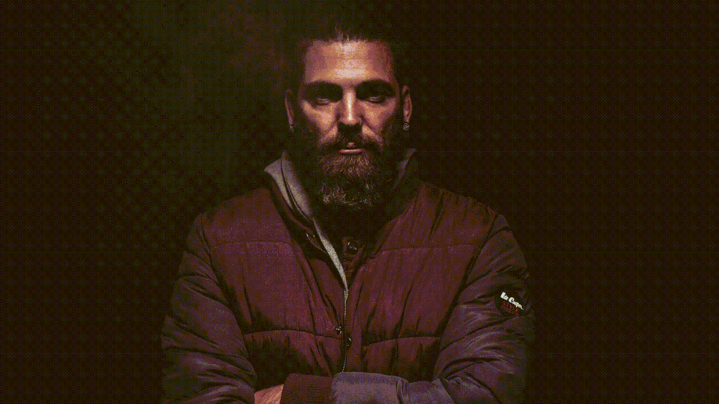
This brand aims to create a generation of good looks and courage from a man, looking elegant yet rebellious, regardless of age. Hurley products are made from natural ingredients that are good and safe, and are free from toxic and harmful ingredients to skin and hair.
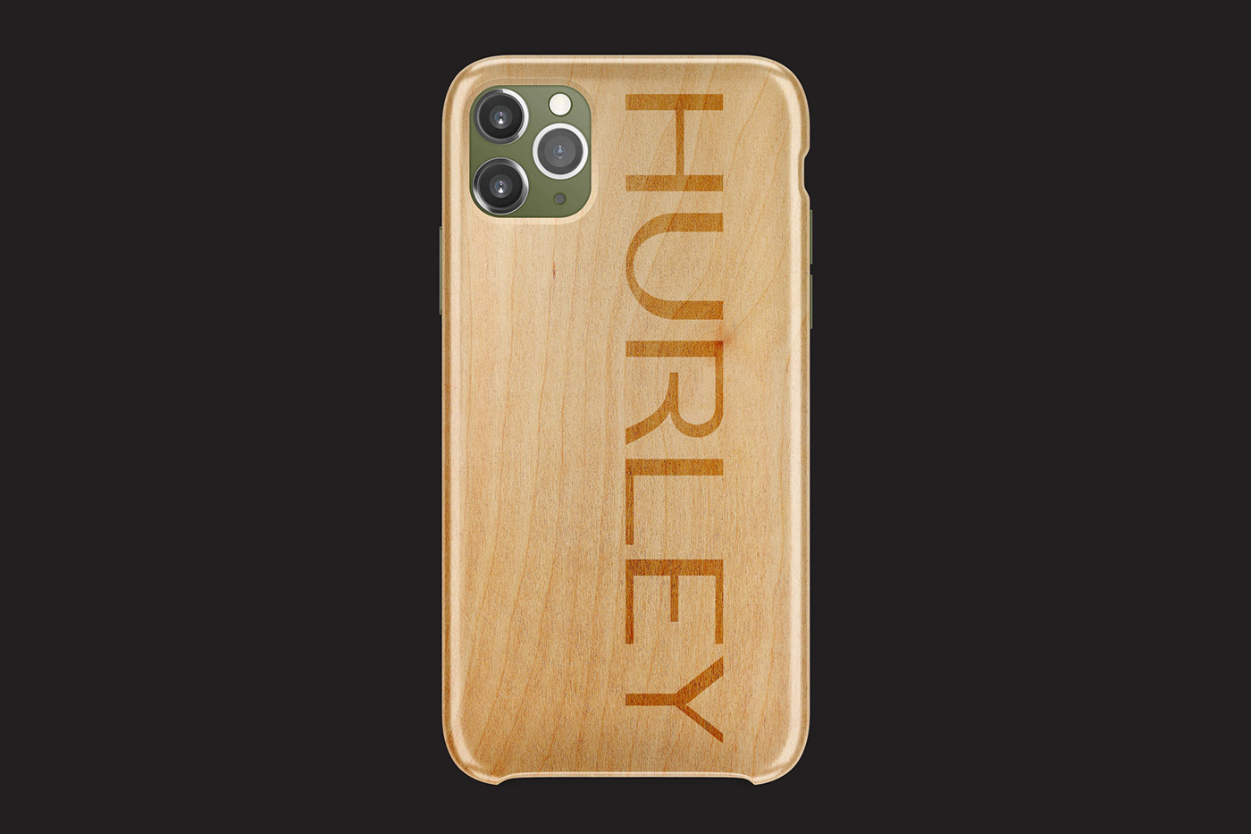
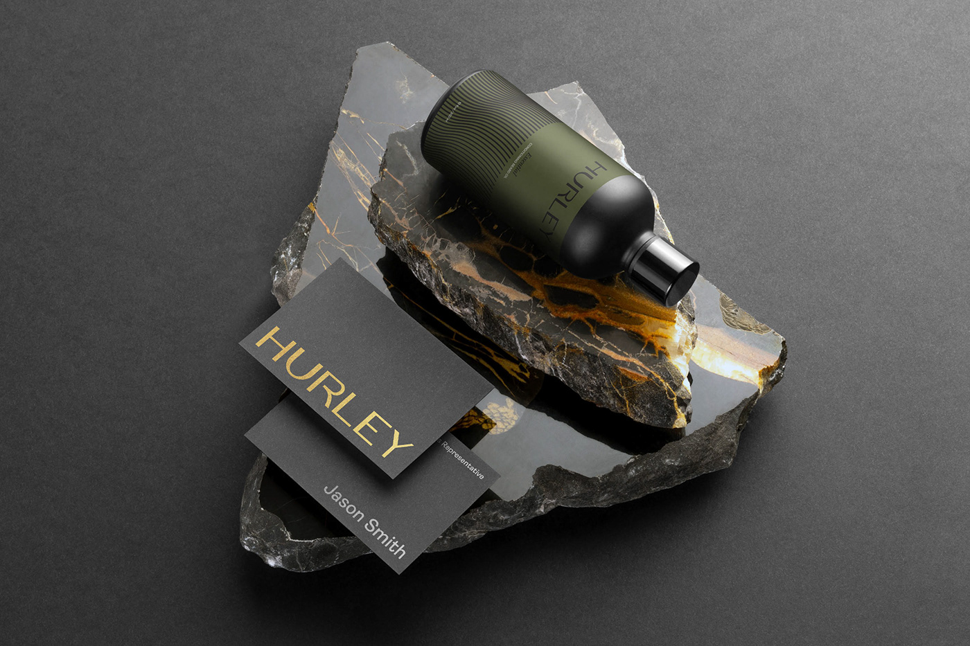
The brand name and visual identity created by Widarto Impact are inspired by Harley Davidson, which symbolizes the manliness and manhood of a man. By replacing the letter A with the letter U in the word Harley to Hurley, it looks more masculine and luxurious.
This expression of valor and masculine character is expressed throughout the brand identity, from letters for logos, graphic language, to color palettes, and photography.
DISCIPLINE
• Logo
• Brand identity
• Graphic systems
• Packaging design
• Brand guidelines
Photo pose style credit:
• Keenan Barber
• Masoud Nikookalam
• Joshua van der Schyff
• JJ Jordan
• unsplash.com

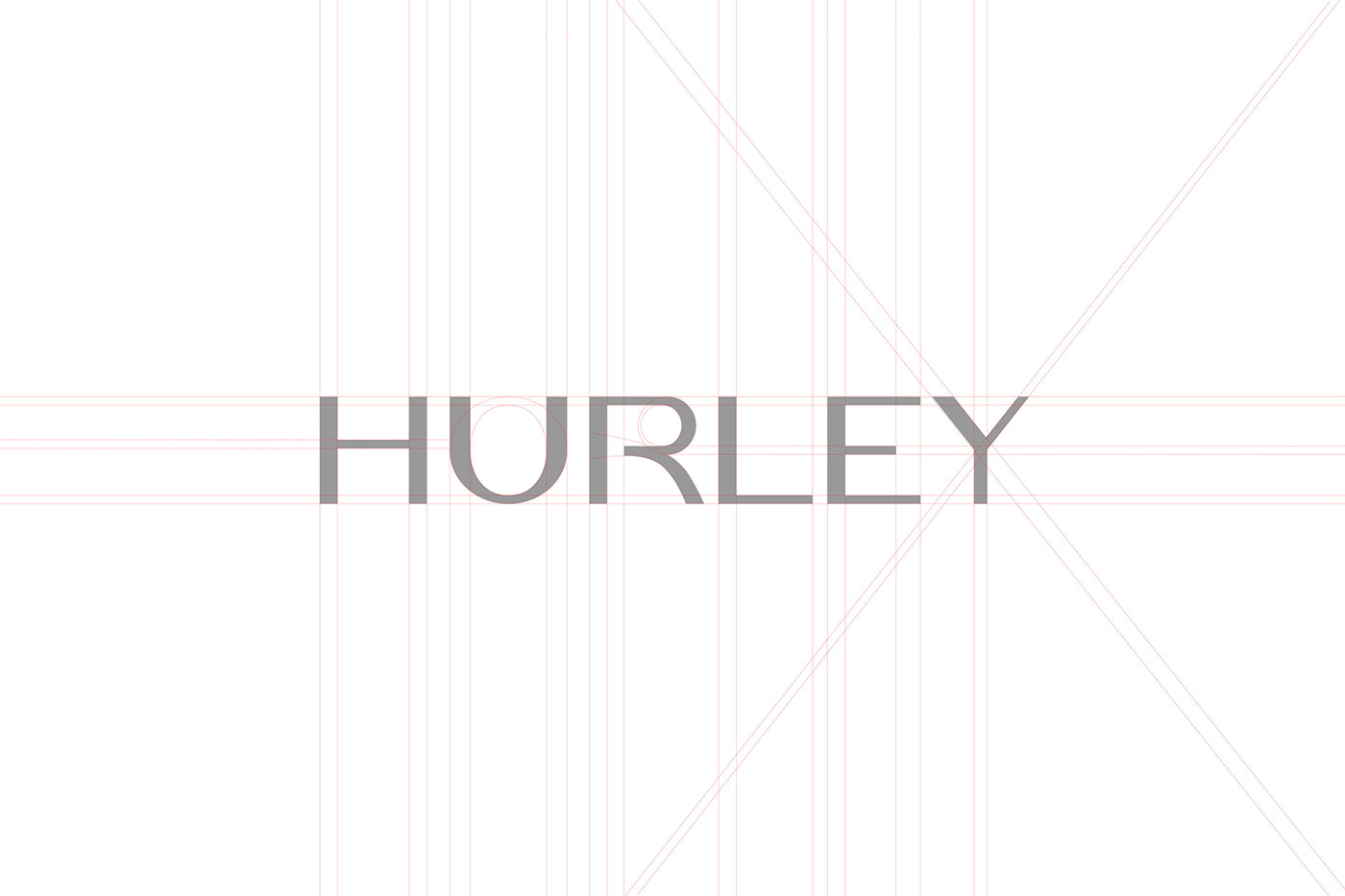
The Hurley typeface symbolizes the masculine, luxurious, manly, and good looks. This typeface is chosen from the side of the curve, as well as the weight of the contrasting strokes.
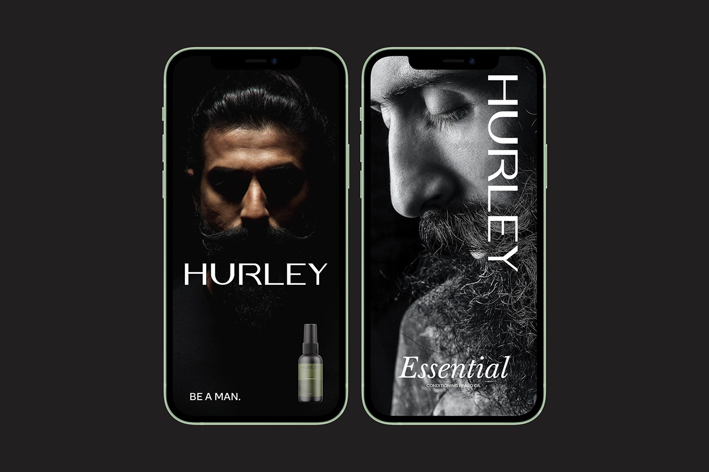
For the typeface, product label name and tagline, selected from the Sans Serif Ambit family, and the Serif Baskerville Pro family that gives a luxurious impression. These three elements when put together into one very strong identity element to represent the Hurley brand image.

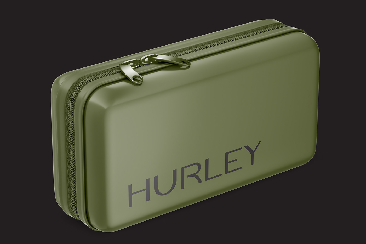
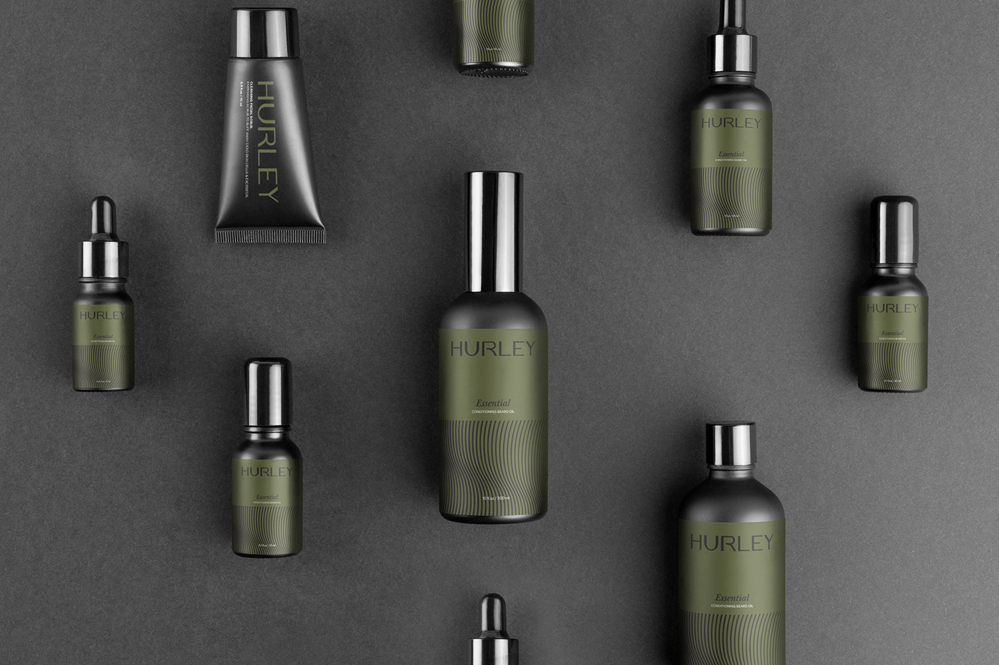
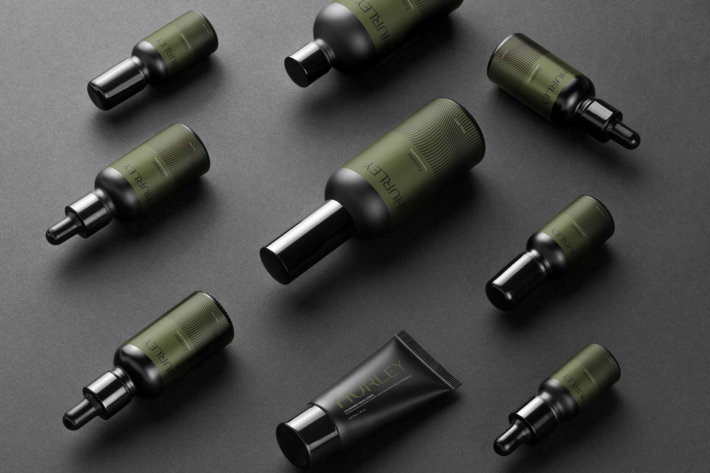
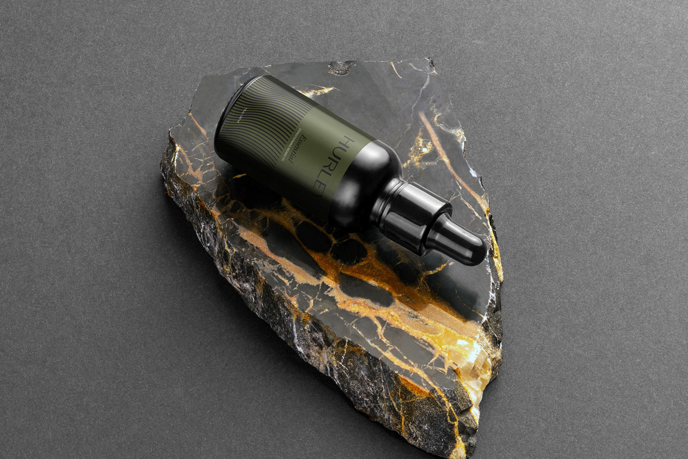
The Hurley brand color is “Greenley”, the color name is taken from a combination of dark pastel yellow which has a luminance of about 38%. It has a hue value of 70 ° indicating that it is a cool color. This color will continue to be communicated throughout all brand accents such as packaging, social channels, websites, stationery, and other brand identities.
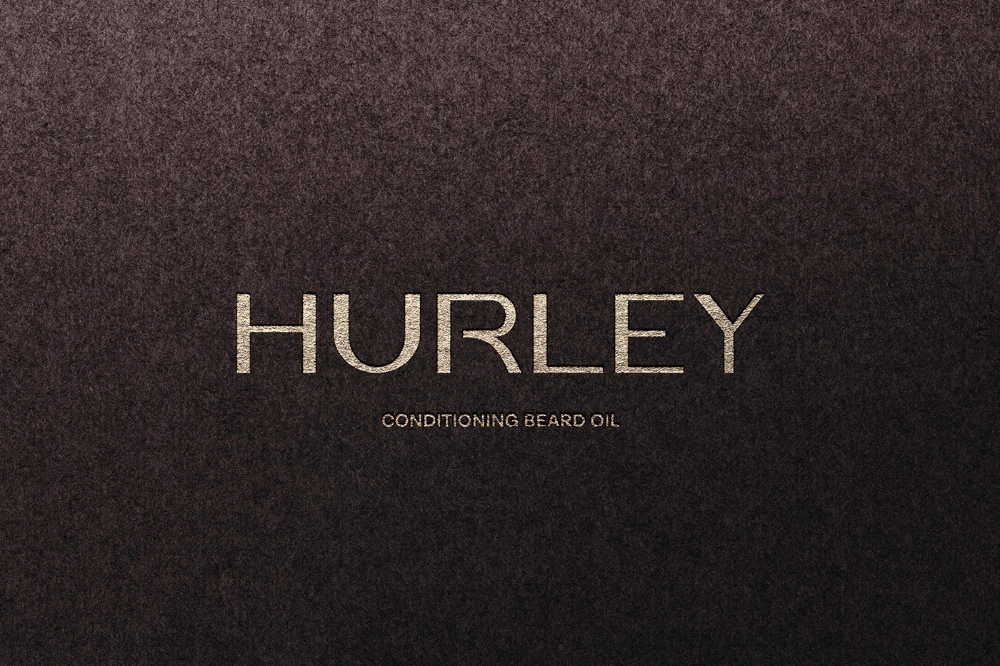
Less is more. We designed the logotype to identify the emotional benefits of the product about the valor and masculine side of men in a consistent, distinctive, and elegant way.
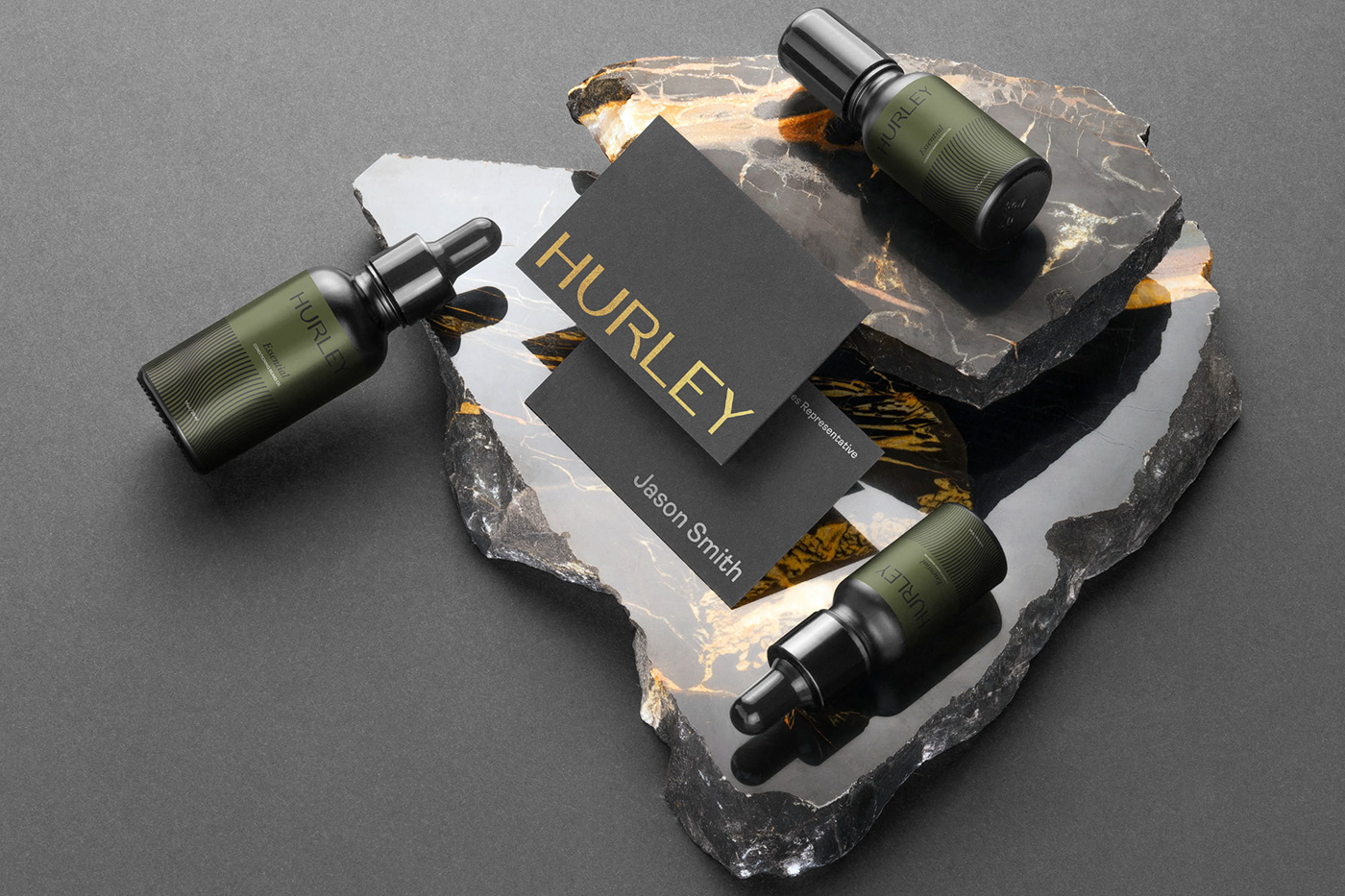
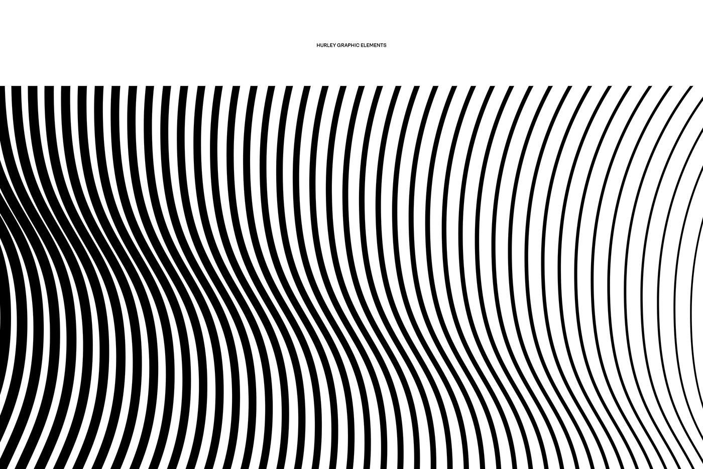
Geometric beard graphic as Hurley graphic elements. simple, but has a very crucial role in the design, especially in packaging.