Mume — Music & Media
[PT-BR]
A Mume é uma agência de música e media que atua com o agenciamento de Dj’s de funk. Atualmente eles atendem três artistas de São Paulo. A empresa trabalha com a parte de venda dos shows, contratos, estratégias de marketing e branding, comunicação visual para videoclipes, redes sociais e outros tipos de mídia.
O Desafio foi criar uma identidade forte que pudesse se destacar dos seus concorrentes por meio de uma linguagem visual moderna, autêntica, futurística e profissional.
—
[EN]
Mume is a music and media agency that works with the agency of funk Dj's. They currently serve three artists from São Paulo. The company works with the sale of shows, contracts, marketing and branding strategies, visual communication for video clips, social networks and other types of media.
The Challenge was to create a strong identity that could stand out from its competitors through a modern, authentic, futuristic and professional visual language.

Conceito | Concept
[PT-BR]
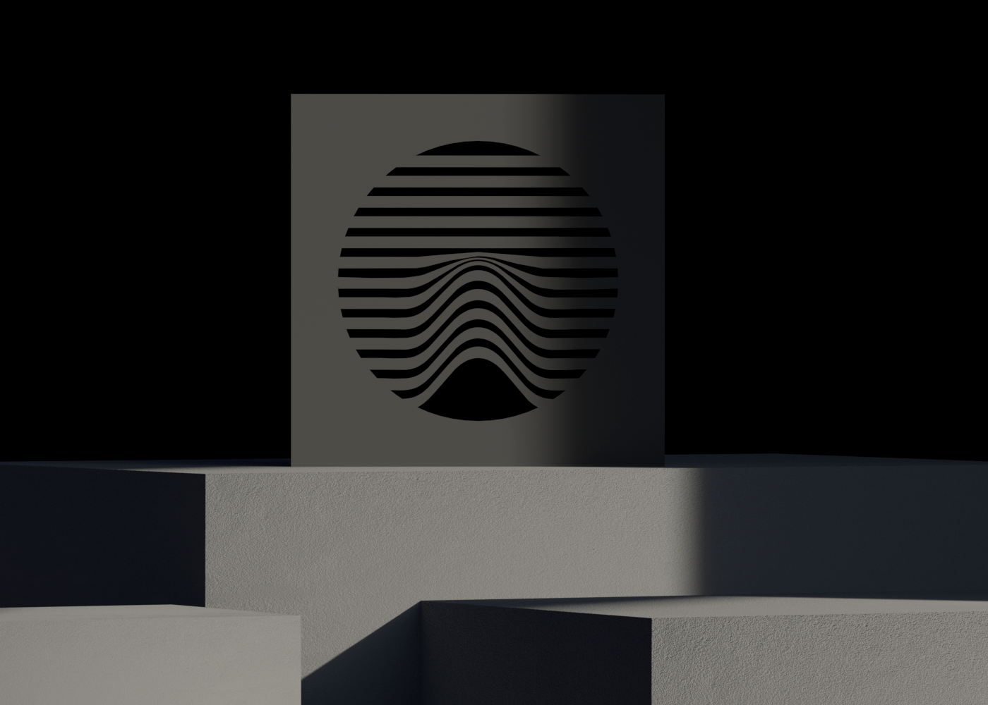
• Furacão 2000: A principal referência para o símbolo surgiu do formato de uma caixa de som. Na maioria das thumbnails de playlists ou backgrounds de clipes de funk quase sempre há uma caixa de som ou um paredão formado por várias delas. Se for levar em consideração a semiótica, o paredão é um índice, visto que - na maioria das vezes - onde há paredão, há funk. Voltando um pouco na linha do tempo, um dos primeiros paredões surgiu em um dos marcos do funk brasileiro, o famoso furacão 2000, onde muitos cantores de renome já se apresentaram. O visual da furacão foi a principal referência para o símbolo e pattern dessa identidade.
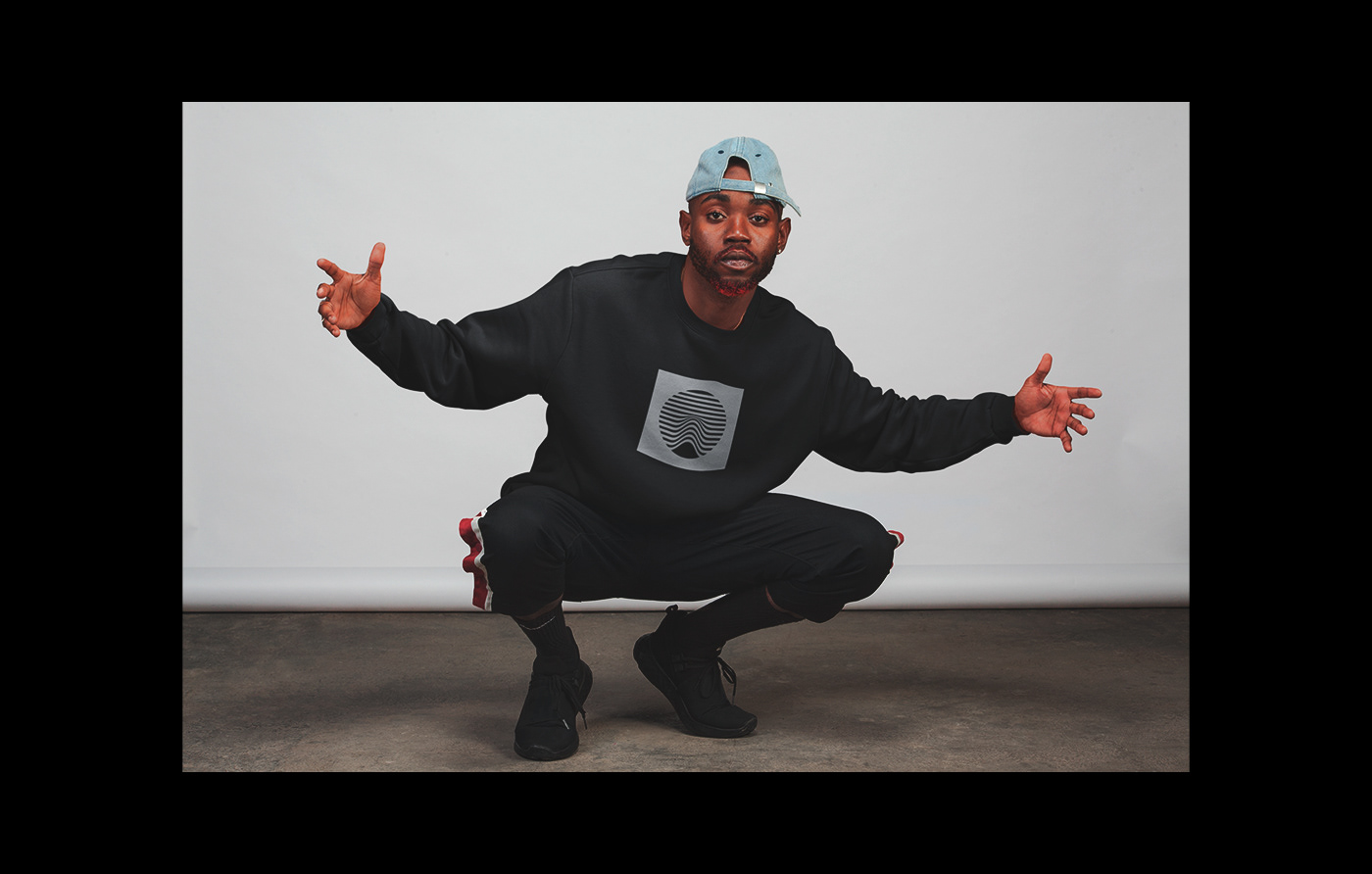
• Toque: O diferencial de qualquer Dj seja de funk ou não, sempre vai ser a forma que ele toca, a sua identidade está na ponta dos seus dedos - literalmente. Mas, não são somente Dj’s que tocam, a forma como qualquer empresa “toca” o seu negócio diz muito sobre ela. A Mume veio para trazer toques diferentes, sejam de músicas ou daquilo que se propõe a fazer. É sobre contato, impacto e vibração.
• Movimento: Ainda falando sobre impacto, sempre que o grave toca em uma caixa de som ele é sentido, há uma vibração, uma movimentação - e isso é muito presente no funk e música eletrônica, raves e similares. Existe até música falando sobre o “grave bater”. Ou seja, há um movimento e ele é onipresente, quando há grave na caixa, há pessoas dançando, há pessoas se movimentando. O símbolo se propõe a comunicar tudo isso - o constante movimento da Mume, seus clientes e seu público.
[EN]
• Furacão 2000: The main reference for the symbol came from the shape of a speaker. In most miniatures of playlists or backgrounds of sections of funk there is almost always a speaker or a wall formed by several of them. If semiotics is to be taken into account, the wall is an index, since - most of the time - where there is a wall, there is funk. Going back a bit in the timeline, one of the first walls appeared in one of the landmarks of Brazilian funk, the famous hurricane 2000, where many renowned singers are already independent. The look of the hurricane was the main reference for the symbol and pattern of this identity.
• Touch: The differential of any DJ, whether funky or not, will always be the way he plays, his identity is at his fingertips - literally. But, it's not just DJ's that play, the way any company “plays” its business says a lot about it. Mume came to bring different touches, be it music or what it proposes to do. It's about contact, impact and vibration.
• Movement: Still talking about the impact, whenever the bass plays in a speaker it is felt, there is a vibration, a movement - and this is very present in funk and electronic music, raves and the like. There is even music talking about "serious hitting". That is, there is a movement and it is omnipresent, when there is a bass in the box, there are people dancing, there are people moving. The symbol offers to communicate all of this. the constant movement of Mume, its customers and its public.


Tipografia | Typography
[PT-BR]
Os tipos escolhidos para darem voz a Mume carregam personalidade e fogem do comum. As fontes escolhidas possuem uma diferença anatômica para que haja um contraste entre as aplicações. A primeira tipografia é a Neue Machina, uma monospace composta por um estilo mais geométrico e robótico - o que tende a passar uma sensação mais futurística. O uso dela é restrito a títulos e textos corridos. A segunda tipografia é a Akkordeon - esse tipo possuí uma grande flexibilidade e seu uso deve ser restrito a títulos alternativos.
[EN]
The types chosen to give Mume a voice they carry personality and run away from the ordinary.
The chosen sources have an anatomical difference so that there can be a contrast between the applications.
The chosen sources have an anatomical difference so that there can be a contrast between the applications.
The first typography is Neue Machina, which is a monospace typography and has a more geometric and robotic style - which tends to feel more futuristic. Its use is restricted to titles and plain texts. The second typography is an Akkordeon - this type has great flexibility and its use should be restricted to alternative titles.

Cores | Colors
[PT-BR]
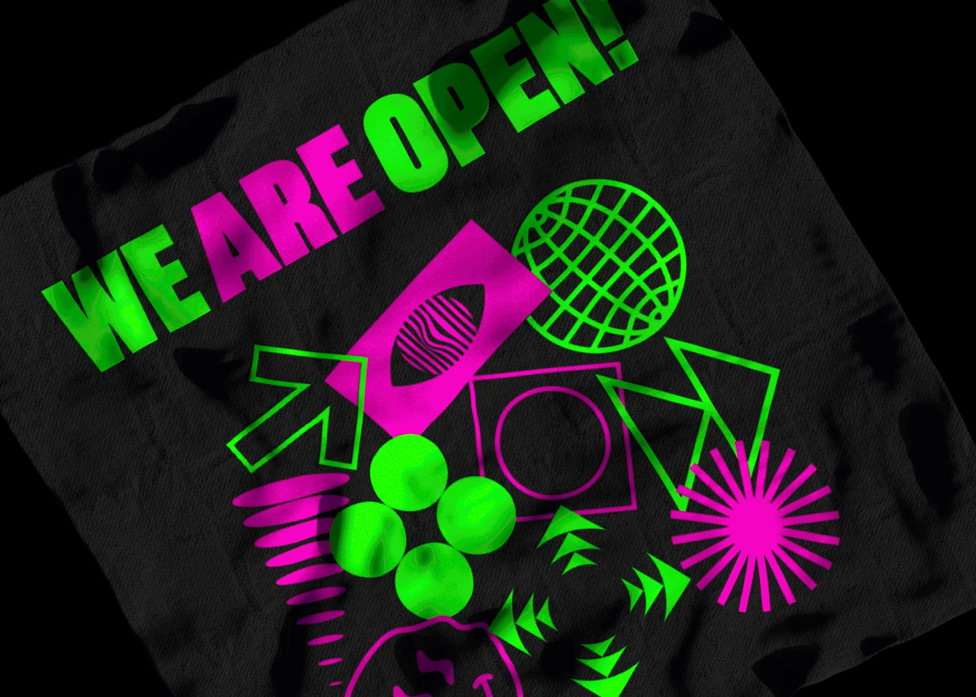
A paleta é composta por cores fortes e vibrantes que contrastam muito bem entre si e comunicam o propósito da marca. As cores primárias - preto e cinza devem ser aplicadas em visuais mais sérios e formais e as cores secundárias - Verde e rosa podem ser usadas para composições mais ousadas e diversas.
[EN]
The palette is composed of strong and vibrant colors that contrast very well with each other and communicate the purpose of the brand. Primary colors - black and gray should be applied to more serious looks and colors and secondary colors - Green and pink can be used for compositions bolder and more diverse.