


A brand derived from the combination of homeland love, long-standing friendship, and specialized strengths, Mr. Binh and Mr. Luan decided to cooperate in building a brand that specializes in foreign language education right in their homeland, Hung Yen. PNE English aims to become one of Vietnam’s leading brands for foreign language training and development, especially for university exam preparation, IELTS, and Toeic,...


Challenges
Impressed with the four core values of the brand, Tree wishes to put these messages into the identity image to help convey them through visuals alone. But this is also the “difficult route” from the position of Tree Creative when it is also necessary to closely connect the brand’s core values and slogans so that students can have the best impression of the brand.


Solutions
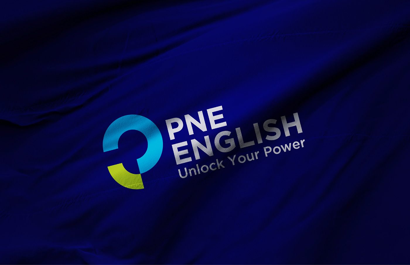
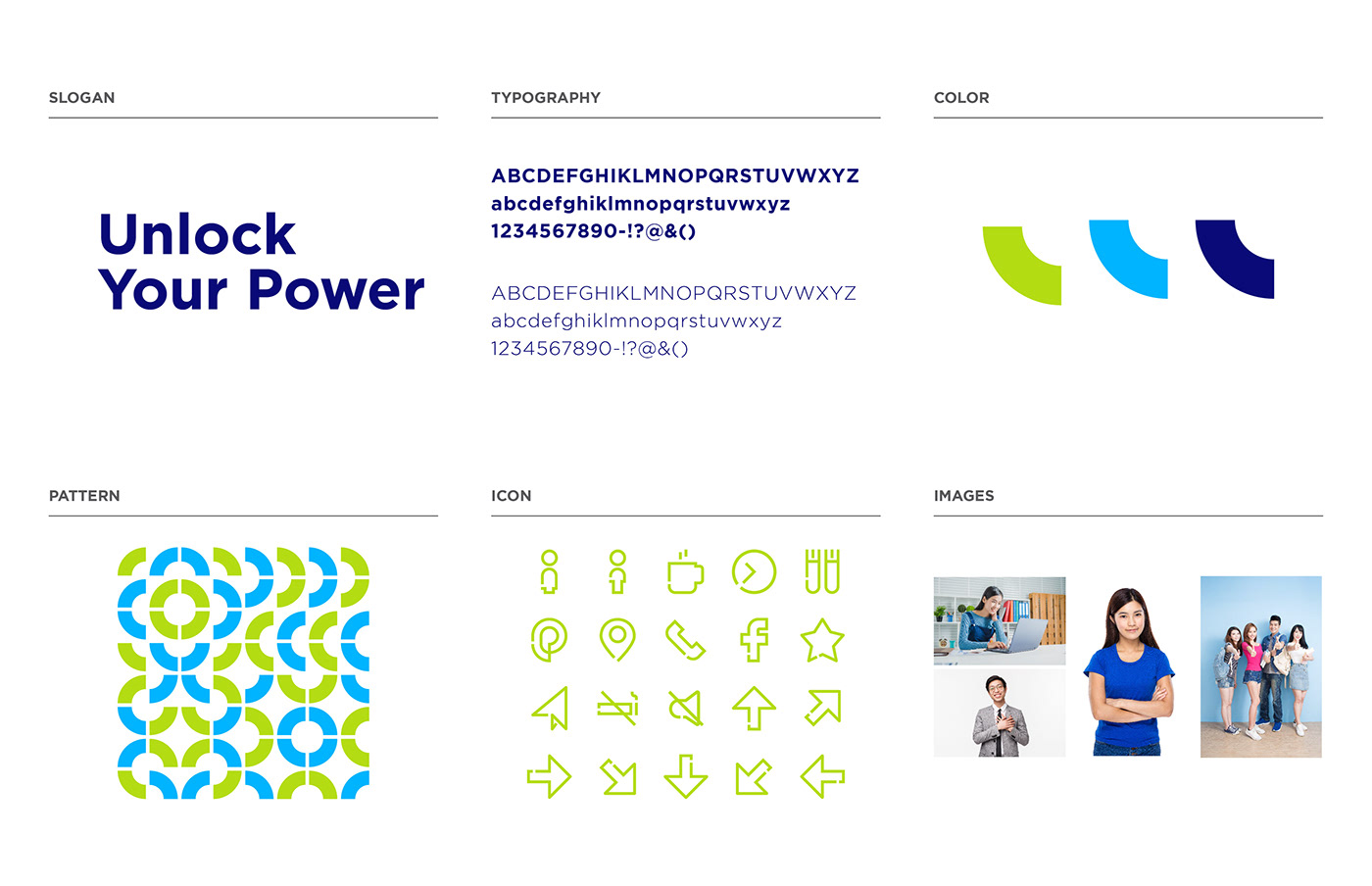
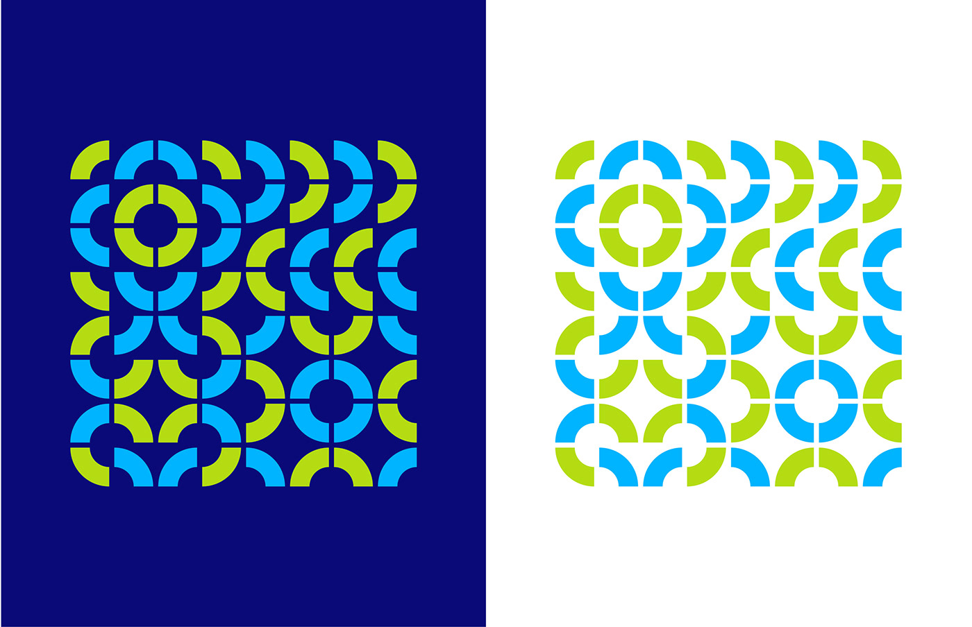
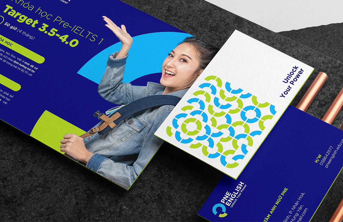
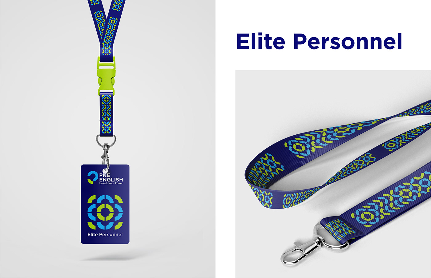
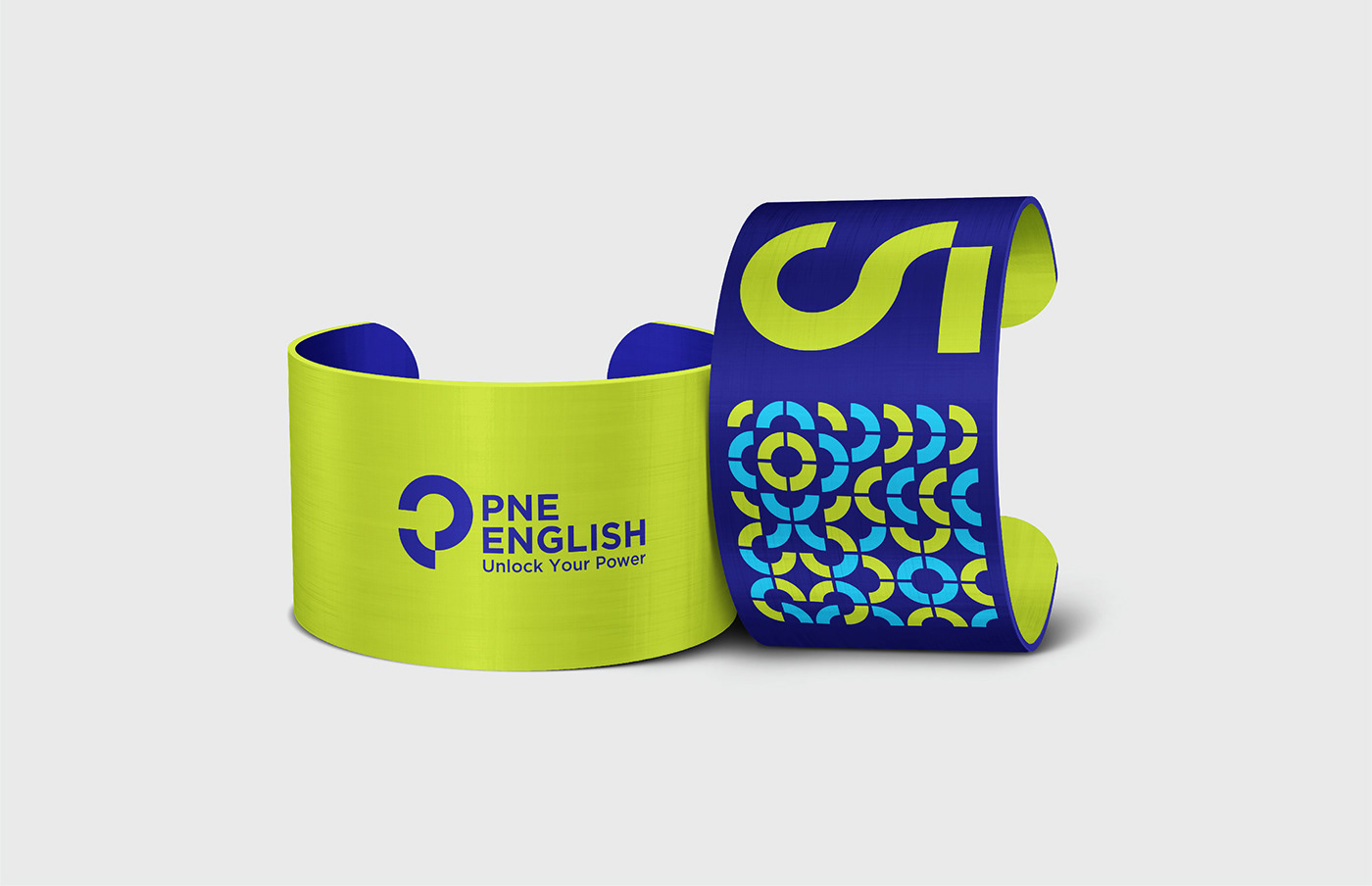
The inspiration for the design came from the slogan “Unlock your power” combined with the Zen circle originating from Japan, an unfinished full circle, that perfectly conveys ideas of strength and freedom. With that in mind, we start with a circle split into four parts representing the four core values of the brand: Elite personnel - Advanced methods - Professional action - Pervasive success.
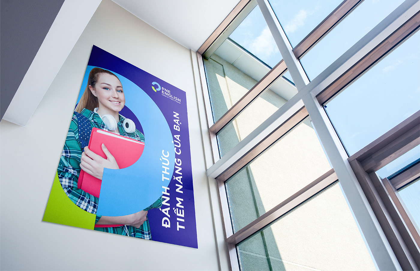
From it, the inspiration from the Zen circle is added to partially “unlock” the image, pushing-down parts of the circle, forming the “P” shape that represents the brand’s name. At the same time, this also shows how the brand has “unlocked” its potential as mentioned in the slogan. Everything coming together creates a distinct visual masterpiece, representing high spirit, unconstraint thinking, and the will to expand and develop.
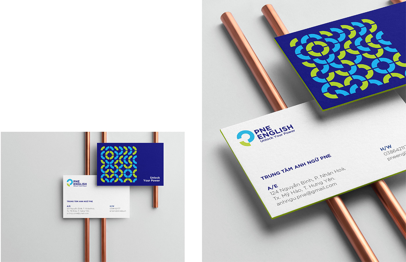
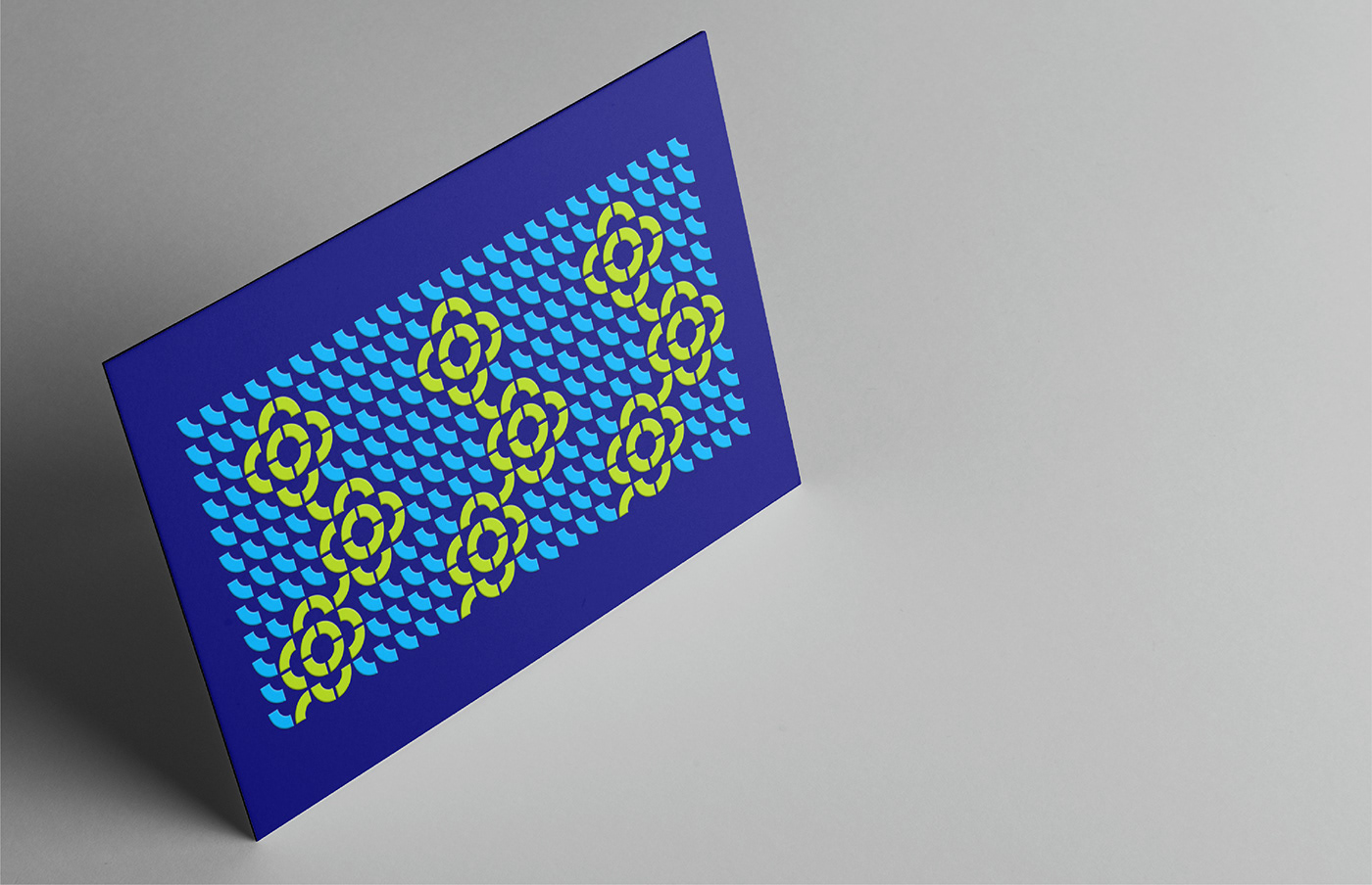
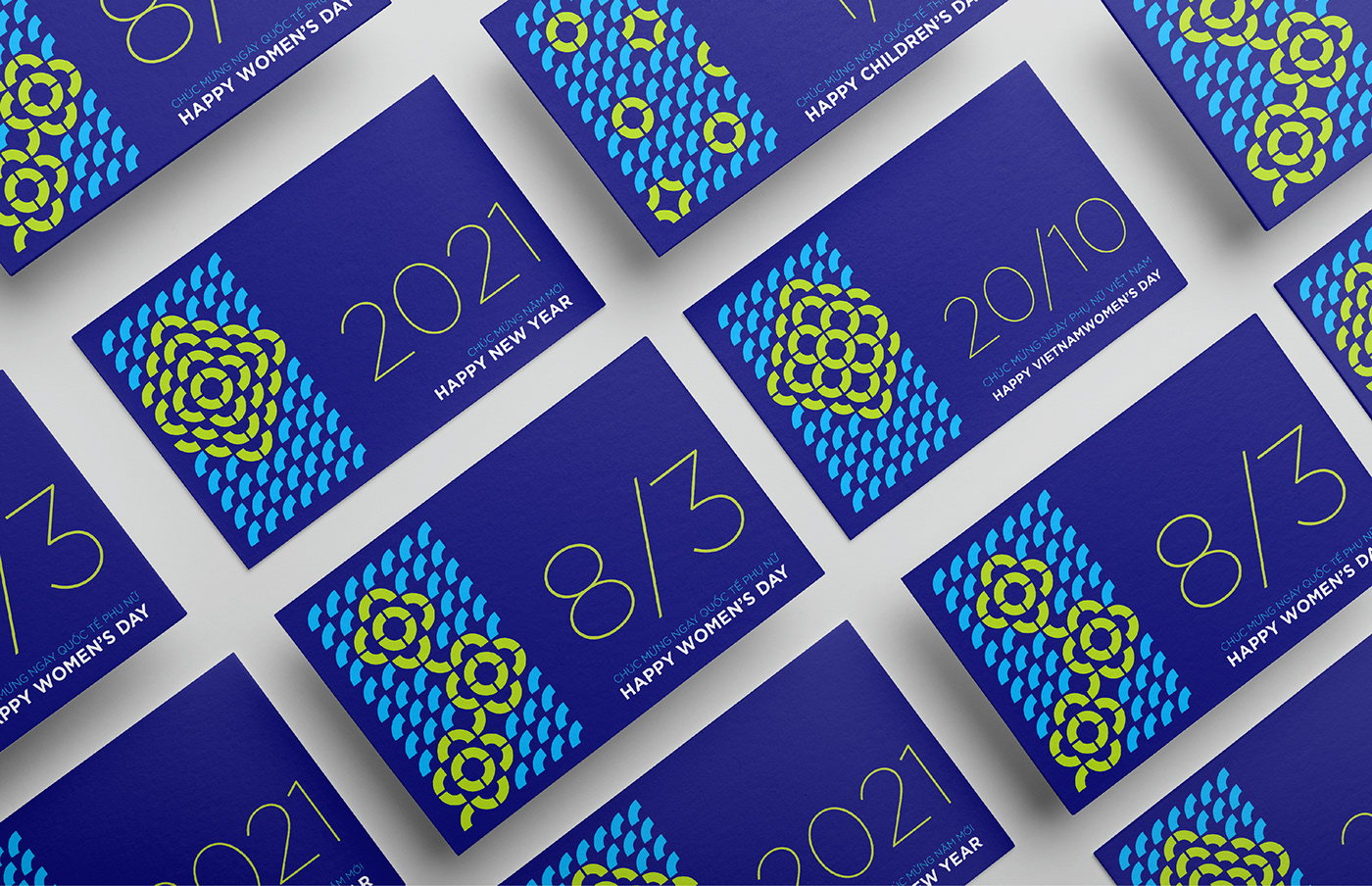
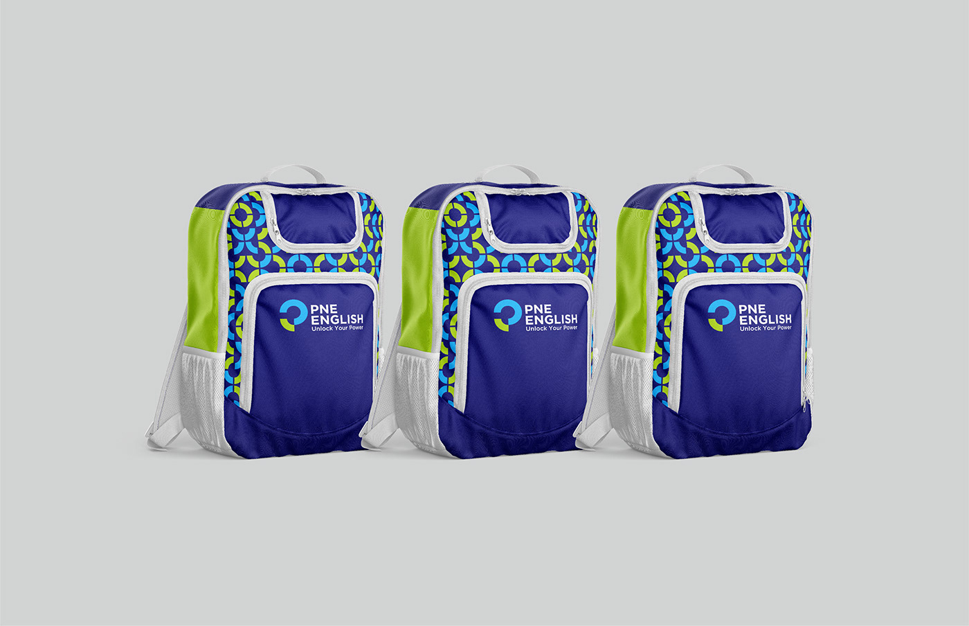
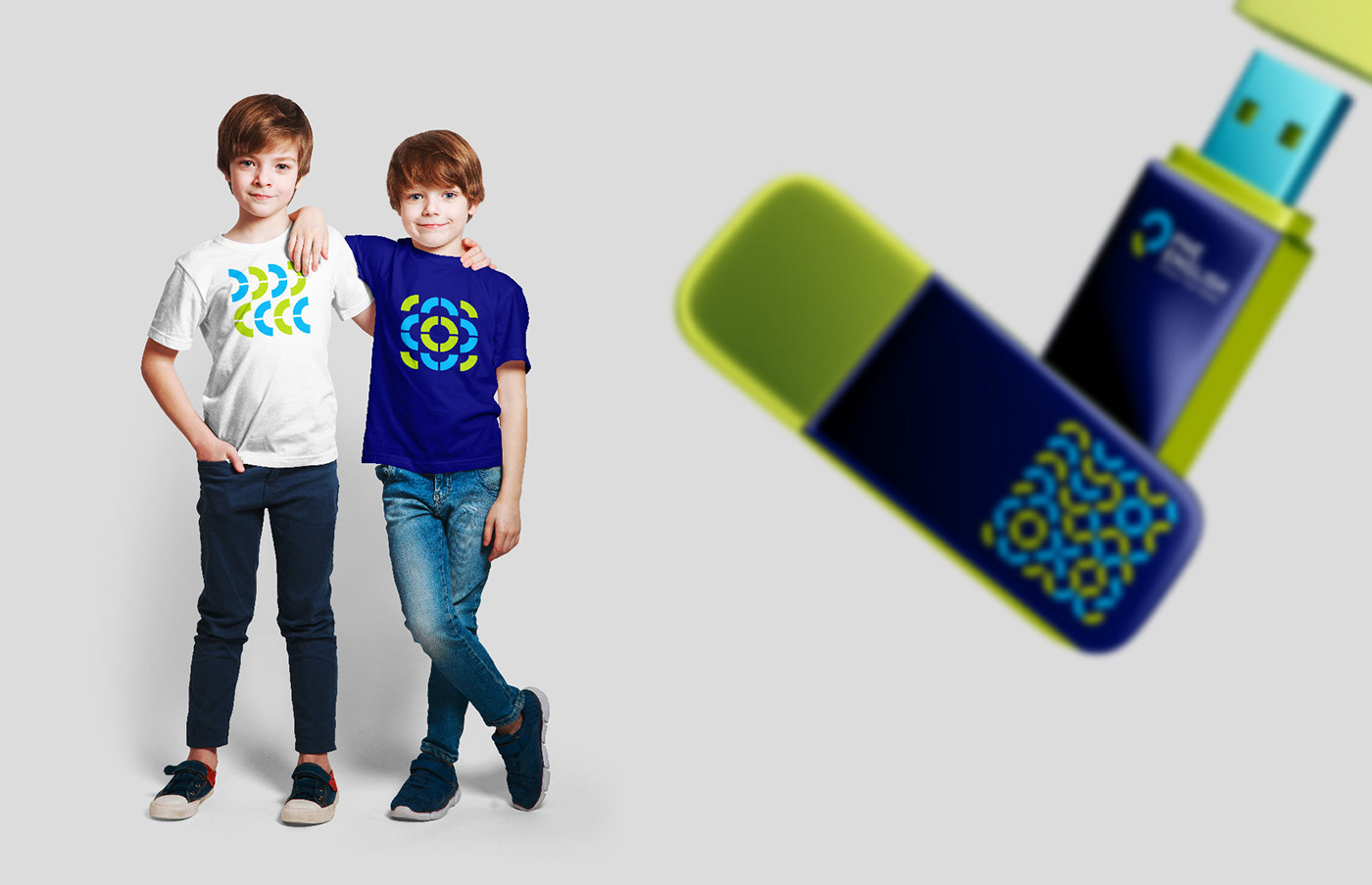
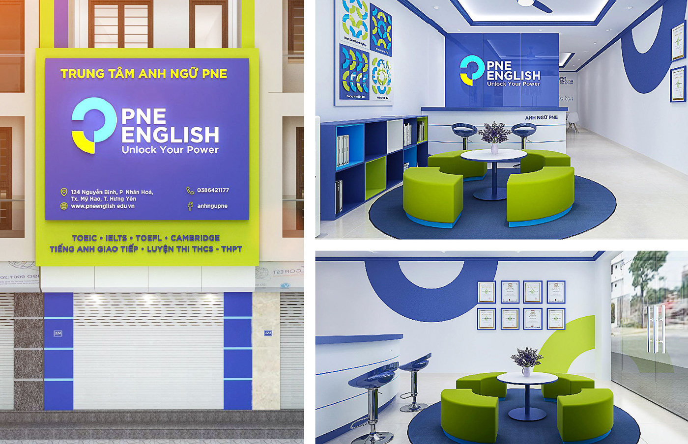
Tree chooses a blue tone throughout the identity, with green acting as highlights. The two colors are harmoniously combined, creating a dynamic while expressing the stability and prosperity of the brand. Furthermore, the capital font accompanying the image put emphasis on education, while showing the personality of a modern and youthful brand.


Results
An identity image was born that perfectly illustrates brand-specific education. The youthful and dynamic spirit exuding from the identity image represents the center learning spirit. More than that, the logo represents the success of the cooperation between the two Founders, followed by the collaboration with Tree Creative.


