Promarkers Series 2
As you may know from viewing the first series of Promarkers / Character Design, I decided to take a step back from the digital side of illustration and delve into traditional illustration by using my Pentel Quicker Clicker Mechanical Pencil and Promarkers.
In 2012, I moved to Germany I was unable to bring my art supplies with me. So once I began this case study I had to slowly build my arsenal of artistic weaponry back up. I have now since added several more colors into my collection of Promarkers and feel that I can move forward and create more intricate illustrations with a wider array of colors.
Please note that I will be adding more illustrations to this series as time progresses. I may even expand my experimentation into additional projects. So keep checking back to see if I have added more traditional illustrations to my portfolio from time to time.
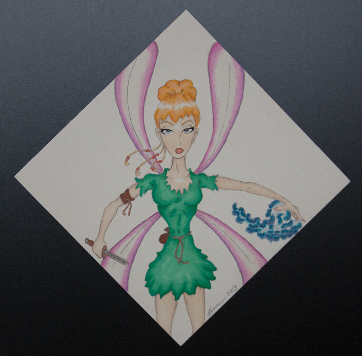
Tinker Bell
I began experimenting with fairy tale characters and wound up working on various revamps of some of the more well known characters.
Here is a version of Tinker Bell that I created. I wanted to stay somewhat true to the Disney version so that she would be easily recognizable as Tinker Bell. However, I wanted to give her more wild feel and to show that she is more magical than the Disney version. I kind of view her as a mini Amazonian warrior that happens to be a fairy. I think in Neverland you have to be a lot stronger than what the characters were in Disney's Peter Pan.

Ariel "The Little Mermaid"
In this version of the little mermaid, King Neptune is no longer around and Ariel has taken on the role of Queen. Still being beautiful and kind hearted, she has become a mighty adversary to anyone who wants to invade her underwater kingdom.
It would be and interesting story twist to have her and the prince from the original movie ruling both kingdoms. One could also add their children to the equation, thus expanding the characters creating potential spin-off films and/or video games.
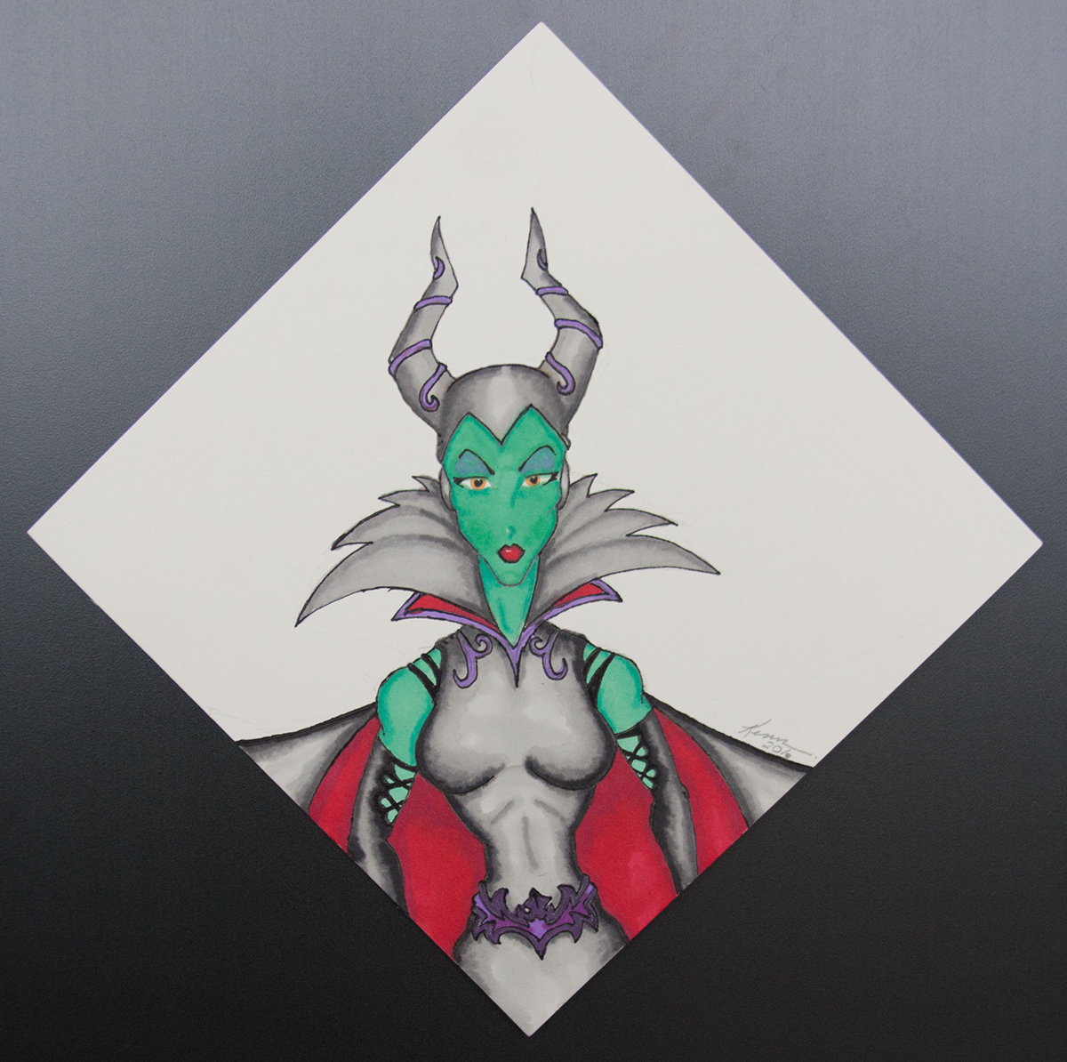
Maleficent
Colorful characters are not always good ones... I thought I would change things a bit and revamp a well known Disney villain. Unlike the new live version of this well known Disney character being portrayed by Angelina Jolie, I decided to keep with the green colored skin. I felt that this makes the character more intriguing when viewed as an illustration. However, I felt the costume needed a complete redesign or update. Using a similar color palate to the Disney animated version, I simply gave her more ornate details. Her cape can flow over shoulders, but when her body costume is revealed I wanted to have it look more dominating. Her character is that of a person seeking power, so I felt that the costume under the cape needed that touch to give her a strong yet elegant persona.
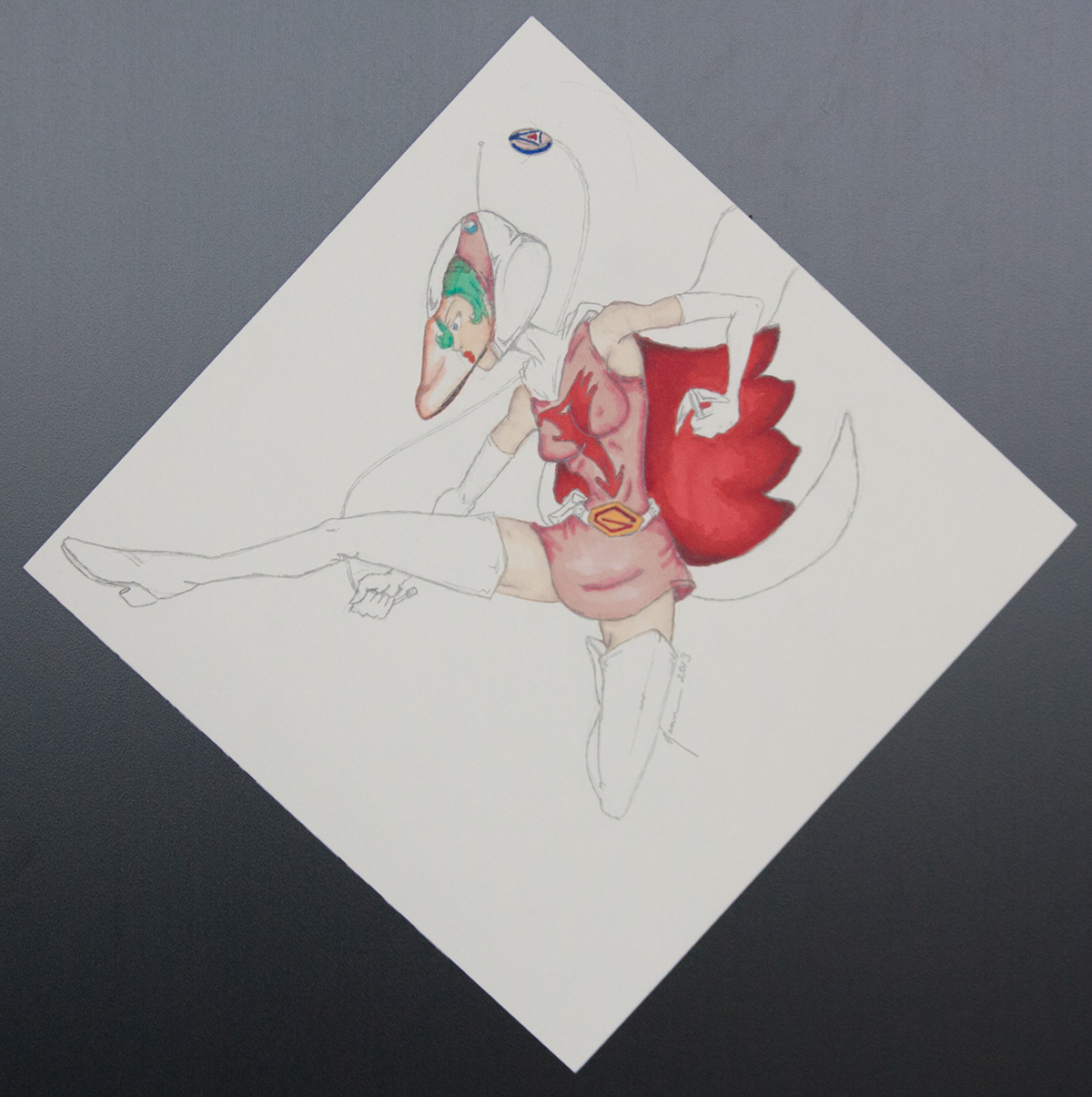
Jun... aka Princess (from Gatchaman)
This image started out as a quick action sketch, that I intended to leave black and white. However, I decided that giving her a little more color would be another practice in getting back in to the mind set of using markers. I do admit that if I were to create this character in Photoshop it would be easier to give her visor an orange tint. However, with markers it is a daunting task. Thus, I decided to give the idea of the helmet's visor having a tint to it by simply adding a little orange or in this case a peachy color.
The reason I jumped from fairy tale characters into anime and comics is because there are colorful characters in this genre of art that would be interesting to work with. So expect to see both fairy tale and superhero characters in my work with Promarkers.
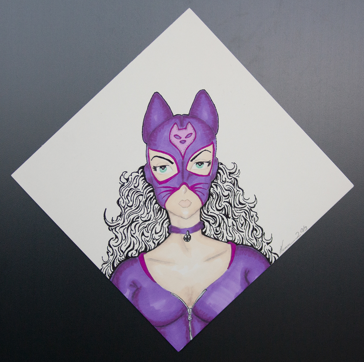
Catwoman (Luchador version)
Like I said above I would be adding superheroes to my Promarkers series.
Here I wanted to recreate Catwoman but I decided to give her mask a more Spanish Luchador feel. Like many Luchador masks there is a symbol in the middle and you can see the seam that runs down the middle of the mask. I though by giving her this style of mask I could add whiskers to the mask. The costume itself has a more retro feel to it. Because Luchadors usually have brightly colored costumes I felt purple was better than the black that the modern day Catwoman dawns. Expect to see more Luchador style super heroes in the future in my portfolio.
In addition, I did the fine lines utilizing a Stabilo pen. They are pretty affordable compared to Promarkers, which makes it easy to add several to my collection of art supplies.
email: kshinabery212@gmail.com

