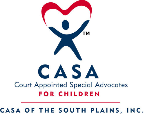
This is the current logo of the company I have chosen to rebrand; although it is a nationally recognized logo there are few changes that could be made. I believe there are more efficient ways for the organization to show that they involve not only one person fixing everything but, they also involve what is important to and will benefit the children they are helping most. What follows is the new corporate identity I have created.

I chose this logo because of the child-like feel this gave the company. It's a very youth-oriented business and many of its target customers include volunteers between the ages of 18 and up, but the overall feel of the visual identity makes it feel very playful and childish, which although what the company does is something serious and commendable, I believe this better explains the organization's ultimate goal.
Their original logo had a similar figure and colors, so I took that idea and modified it but using this font because I feel that the company should portray the fact that its main cause is to help children in need. The colors I chose reflect the traditional feel the company embodies and the overall shape of the logo will be easily recognizable no matter the method of presentation they choose to use for its display. The text is this distance from the logo because I believe it allows it the consumer to read it easily. The leading and kerning of this font were adjusted because the font "Espacio" is a very thin-lined font, the adjustment makes it easier to read. The name and graphic are this distance from each other because if it had been placed closer to the edging of the heart, it would have been difficult to read.
I decided to keep the same colors the organization previously had simply because they are already such a well-known organization, I didn't want to take the already good reputation and theme throughout the national chapters and change that as well.
I thought their logo needed to incorporate the fact that CASA is not an individual type of organization. It involves a close relationship with those children who need help. I found it important that the logo represent this fact and used both figures to create a sort of heart-shaped white space.
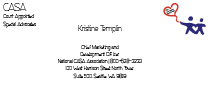
For the kerning and leading I separated the Director's name from her position and contact information to give the effect that the person who is actually performing the duties is far more important than any title or any other information that follows with her. I placed the logo in the upper right hand corner to symbolize the organization, which is another important aspect of the business card.
However, the organization's name is not very well seen in the logo, so I placed the acronym of the organization and its meaning in the upper left corner so there is no mistaking who the organization is. I kept the font of "Espacio", which I used throughout my rebranding of the company.
I believe as I stated before that the font allows the company to show that it stands for children (as it is somewhat child-like) while still remaining professional and clear to read and get the organization’s point across effectively.
Since the three different backs of the mini business cards have both a photograph and a quote I wanted to keep the front side of the business card simplistic and as free from graphic elements as possible, which is why I left only the new logo I created as a design element on the front of the business cards.

This is my revised version of the company business card. I grouped the employee's name with her job description and separated the business' address. I have also placed the phone number and title of the coporation's office location. I have also taken the text out of the balloon from the logo, so there would be no complications reading the text, and enlarged the logo. I have also strategically placed the logo in the bottom right corner so the balloon would guide the reader's eyes towards the company name and the employee's name.
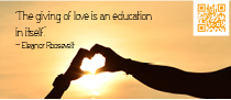
Once again I kept the font consistent throughout the rebranding of the corporation, I used several different quotes on the backs of the minibusiness cards that I feel as though would assist the company in promoting a call to action. I used an orange colored QR code, to help it blend and flow more clearly into the background it resides over.
I believe that CASA's most important aspect of their organization involves the fact that they are dedicated to helping those who almost seem voiceless in these cases, I believe this photograph depicts the fact that the organization is not a solo project. It takes more than one person to complete this heart shape silhouette just as it takes more than one person to help those who need it most.
I decided to use this kerning on the quote because I believe it allows the viewer to read it easily. It also creates a pattern that allows the reader's eyes to flow easily from the top left corner of the business card, to the middle, then full circle back to the QR code.
The colors I chose reflect the child-like feel the company embodies and the overall shape of the logo on the front side will be easily recognizable no matter the method of presentation they choose to use for its display. The text is this distance from the QR code because it leaves enough white space between the elements, which allow the reader to view it easily. The quote and graphic are this distance from each other because it gives the graphic design on the back of the card an element that allows it to flow easily.

Throughout the backs of the minibusiness cards, I enlarged the quotes themselves and shrunk the name of the individual who actually spoke the quote. I believe the importance behind the quote is what was actually said rather than who said it. I kept the general theme which showed that the organization had a typical call to action, CASA is mostly volunteer based organization so they must evoke effort to show that they are always looking for new volunteers to make a difference in the children's lives.
I believe the photograph as the background, carries repetition of the sun element throughout the business cards. This particular photograph also shows that CASA is all about involvement with children and family members.
The spacing and coloring of the text were changed to create an effect that allows the reader's eyes to flow from the largest text to the sunspot and lastly the rest of the photograph. I believe the rule of thirds in this photograph assists the reader in moving from the corner of the card to circling around the entire photograph.
The colors I chose reflect the child-like feel the company embodies and the overall shape of the logo on the front side will be easily recognizable no matter the method of presentation they choose to use for its display. The text is this distance from the QR code because it leaves enough white space between the elements, which allow the reader to view it easily. The quote and graphic are this distance from each other because it gives the graphic design on the back of the card an element that allows it to flow easily.

Personally this was my favorite quote, I believe it promotes the most call to action. I also believe this photograph has an emotional impact of key publics; Since it has infants holding hands it shows the most fragile lives in our society while simultaneously reminding us that we are the ones that need to make the changes we believe would better our world and future generations. As stated before, throughout the backs of the minibusiness cards, I enlarged the quotes themselves and shrunk the name of the individual who actually spoke the quote.
I spaced the kerning and leading of this particular font to allow the text to be read, there was also a second layer added to this photograph and it was blurred slightly to allow the text to be seen and read easier. It also ensure that the background was not too overpowering compared to the text.
The colors I chose reflect the child-like feel the company embodies and the overall shape of the logo on the front side and the photograph on the back will be easily recognizable no matter the method of presentation they choose to use for its display. This creates the element of repetition. The text is this distance from the QR code because it leaves enough white space between the elements, which allow the reader to view it easily. The quote and graphic are this distance from each other because it gives the graphic design on the back of the card an element that allows it to flow easily.

I believe their original letterhead and envelope were well done, however I thought that placing the logo throughout both these, either the one I created or their original logo, would have been too "busy". I really wanted to take the company in a way back to basics; I wanted a very simple letterhead and envelope that would get the company's message across without taking away from the meaning behind the organization.
I decided to go with the same design that I used throughout the letterhead; I believe it adds consistency and repetition throughout the corporation's rebranding. I also believe it is simple but efficient in displaying what the organization's goals and values regarding their services are. I also believe, as I said in the letterhead, that using the same heart-shaped outline from the rebranded logo allows for key publics to realize they are part of the same organization.
I believe the line allows for the separation of the organization's name and the envelope design I have created, which assists in the rule of thirds and allows the reader's eyes to fall first on the design before wondering what organization this could possibly be and moving to the name of the organization next.
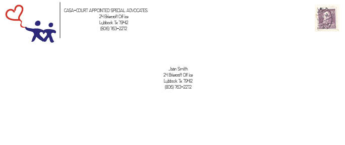
This is my revised version of the bussiness envelope, as you can see to create more consistent brand recognition with the logo I created in the first place. I also created a logo with no text in the balloon so it was easy for the target public to read. I also moved the text with the company's name to one line and grouped the address seperately.

The letterhead I created leaves plenty of room for the organization to fill it with text; I placed a lorem ipsum so you could view this well. I feel as though the letterhead still stands out in the design while not taking away the most important aspect of the design, the actual text of the letter. I created a wave in the heart-shaped design to give a playful feeling, since CASA is dedicated to assisting children; I thought it was important to showcase the innocence and playful aspect of the organization.
I added line work, consisting of the heart shapes, to the top of the page so that the logo and contact information would have a graphic element to bind it to instead of creating a feeling of unease with the information floating without support. As is the company's aim, the customer is always supported and the elements on the corporate identity support the idea that the organization is simply working towards helping children in need.
The heart designs were taken from the balloon design in the logo I originally created. I wanted to keep the same element of repetition throughout the branding while maintaining a consistent theme throughout the process. As with the envelope, I created and kept the same design that I took from the logo, I believe this allows the rebranding of the organization to flow more effectively. I also kept the same font,"Espacio", that I used throughout this process in the letterhead as well as in the body of the letter itself. I believe this also assists in keeping a consistent theme throughout the corporation's rebranding even though I have not used the logo I created on the actual document.

This is my revised version of the company letterhead, as you can see I also swapped the heart design to the regular logo I create as I said before to give a more consistent feel with the brand recognition. I enlarged the business' address and title and moved it to the upper left corner. I also placed the logo as a transparent backdrop and set the opacity to 15 percent so it was easy to see and allowed the text to be read.

