
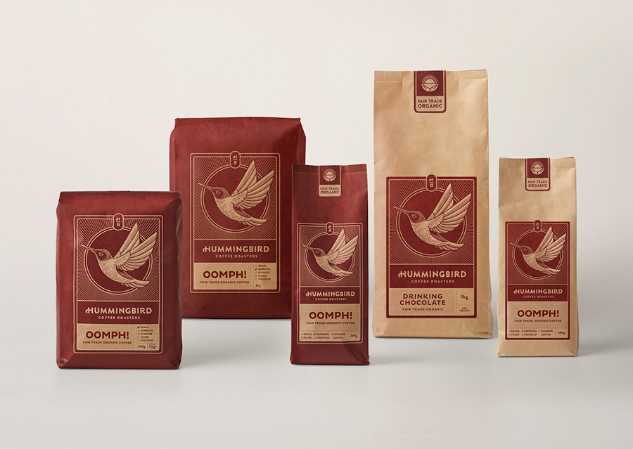
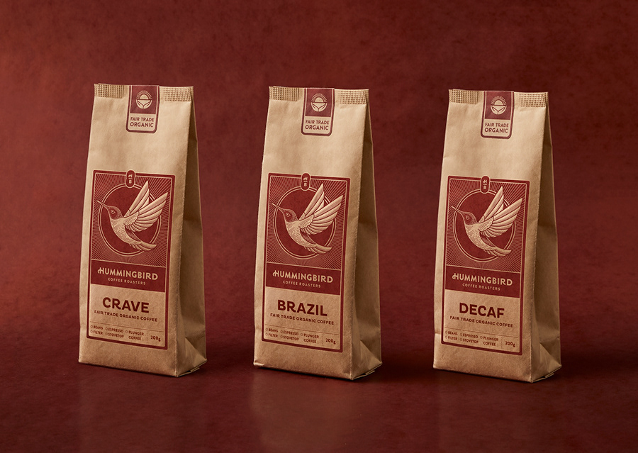

Hummingbird Coffee is a unique Kiwi coffee roaster with a big heart, amazing values and a great story to tell, but the packaging wasn’t doing that. It was an exciting opportunity to bring the company’s branding and packaging up to par with the high quality and ethical standards of their coffee. The brand lacked quality cues and visual presence, and this was most apparent on shelf, where it mattered most. We needed to evolve the brand, using key cues from the existing brand, taking the customer on a journey without compromising sales or losing the already loyal purchasers.
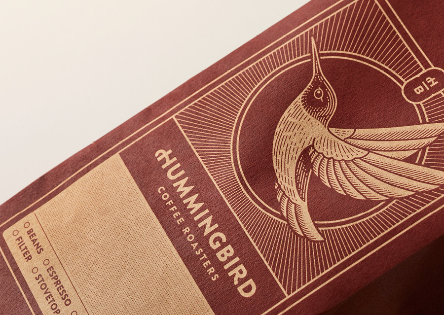
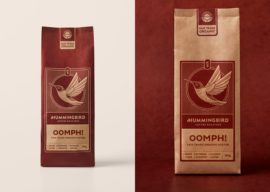
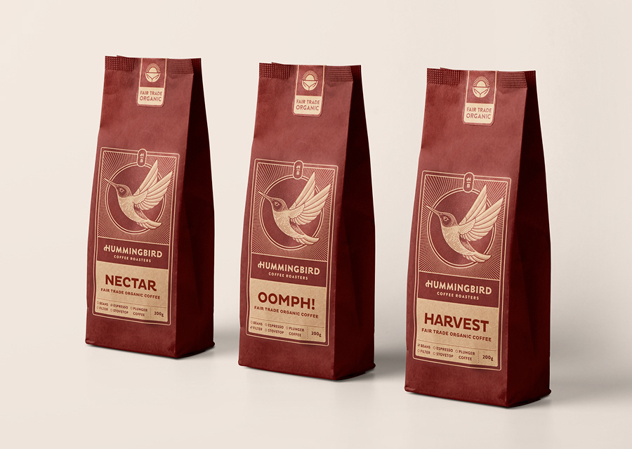
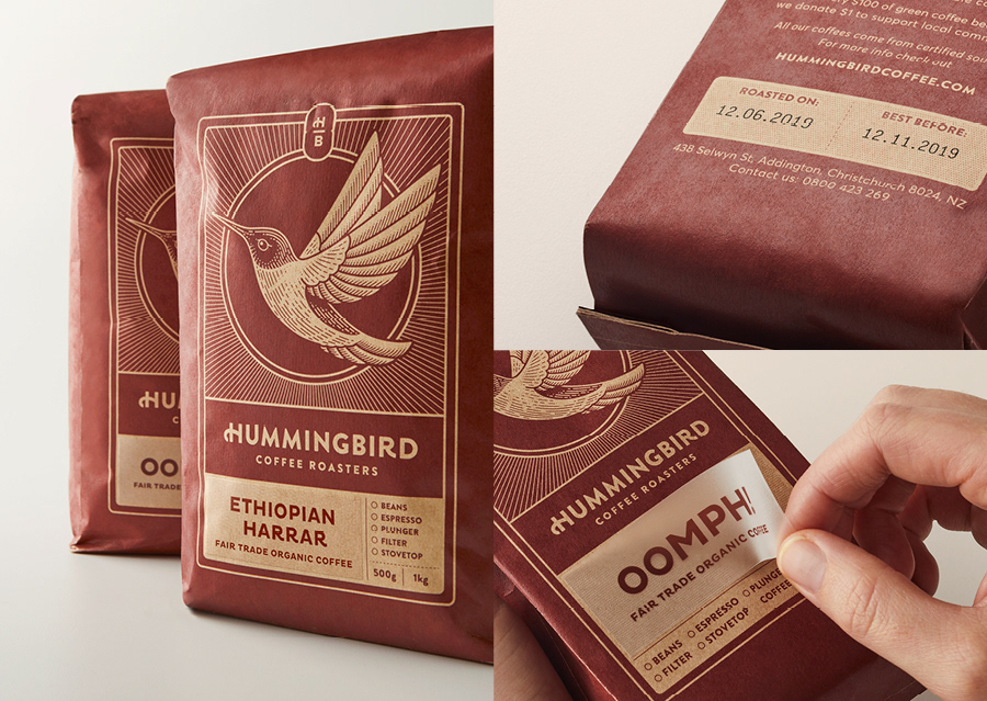
The hummingbird motif was to become a keystone of the brand, this was our diamond in the rough. We needed to realign the quality of the outside of the bag, with what is inside the bag. All the while bringing customers along for the ride. In redeveloping the hummingbird, a strong simple visual mascot that signals great coffee. The brand’s core colour, what was previously, unambiguously “brown”, has been shifted to a deep rich cherry. While still representing the coffee that Hummingbird produce, more importantly now the ripe coffee cherries that they take such pride in sourcing ethically.


