
Advise Law Network & Legal Advice App

Overview
About the App
Advise is an app that lets anyone, anywhere chat with a lawyer so they can get reliable up to date legal advice whenever they need it. It would connect users in need of legal advice with lawyers and law professionals qualified to help, making it possible for members to find an expert to turn to no matter where or when they might need it. All lawyers in the Advise network would be thoroughly vetted and their qualifications verified, ensuring that their advice can be counted on to be accurate and up to date.
Roles
UI/UX Design, User Research
Tools
Sketch, Balsamiq, Adobe XD, Invision
Initial Project Goals
The goal was to create a responsive web app that would let anyone, anywhere chat with a lawyer so they can get reliable up to date legal advice whenever they need it.
Feature Requirements
1. Instant messaging and video call support for both mobile and desktop devices
2. a search feature with filtering and sorting options
3. ability for payments to be made between parties using a variety of payment options
4. online appointment booking system
5. comprehensive rating system for users (client) to write and read reviews written by other users about other users (lawyers)

User Research
Interviews & Surveys
Having developed a concrete problem statement defining the problems that needed to be solved, the next think I had to do was learn more about the target audience.
I first created a user survey to gain more insight as to who it is I would be designing for, and then used that to recruit individuals who fit the target demographic (financially independent adults between 20 and 45 who have some prior experience with hiring a lawyer and/or needing to do legal research) for user interviews.
My goal was to learn more about how, why, and in what context the app would be used, as well as to learn more about interviewees’ past experience handling legal matters.
I then organised all my findings with an affinity map to look for patterns within the data, and was able to use this to create personas representative of each segment of the app’s user base.
Usability Testing
Later on, after having finished an iteration of low and then mid-fidelity wireframes, I conducted a usability test session with 6 test participants from our target demographic.
By relying on user feedback early on in the design process, I was able to keep moving in a more user-focused direction as the app’s design progressed.
Preference Testing
I also conducted preference tests during the design phase, to find out which versions of some screens were more popular with users. Seeing that participants consistently seemed to prefer clean/minimal designs and illustrations helped guide my design decisions for the rest of the interface.
Insights
1. 85% of users feel that a lawyer’s online reviews are the factor they consider most when choosing a lawyer (more than years experience or certifications).
2. More than 90% of users have had to seek legal advice 2 or more times in the past, and almost 40% have needed legal advice at least 5 times.
3.The law category that users have the most experience with is traffic/DUI law, followed closely by criminal cases and public transportation violations.
4. Users often need to be able to upload, download, and save documents while video chatting.
5. 83% of users would be interested in paying a small fee per minute to ask a lawyer a quick question rather than of book a 30+ minute consultation.
6. Many users would want to be able to reach a lawyer FAST in case of an emergency situation, arrest, etc.
User Personas
Based on what I had learned during user research analysis, I created three User personas for the project, each representative of a segment of the Advise user base.
Creating user personas made it easier to identify with the users that I was going to be designing for so that I could make sure that I am designing objectively, avoiding generalizations, and keeping all design decisions focused on meeting user goals.


User Journey Maps
In order to gain a deeper understanding of what users experience as they interact with the app and go about accomplishing their goals, I created user journey maps for each of the user personas. These illustrate the motivations, frustrations, goals, and emotional ups and downs experienced by users as they complete each task, which also helps to identify potential pain points.


User Flows
After creating the user personas and their journey maps, I then went about creating user flows mapping out each step from entry point to the completion of each goal, to determine exactly which screens would need to be created to achieve the best possible user experience and let users interact with the app more efficiently.
Two examples of user flows from this project can be seen below:
User Flow 1: Perform a search for immigration lawyers in Berlin, and sort the results by highest rating.
Entry Point: Launch/Introduction Screen
Success Criteria: User has searched for lawyers meeting the specific criteria and sorted by rating.

User Flow 2: Initiate a video chat consultation session with a lawyer from your saved favourites list.
Entry Point: Launch/Introduction Screen
Success Criteria: Use has initiated a video chat conversation with a lawyer from their Favourites list.

Wireframes
I started the next phase of the design process by creating a set of wireframes for each user flow, starting from low fidelity and working my way up to high fidelity. I relied on feedback from users, peers, and my mentor to make needed adjustments along the way so that the user experience could be improved with each iteration of the design.
Below are a couple of examples of the iterations different screens went through, as well as some design improvements made along the way.
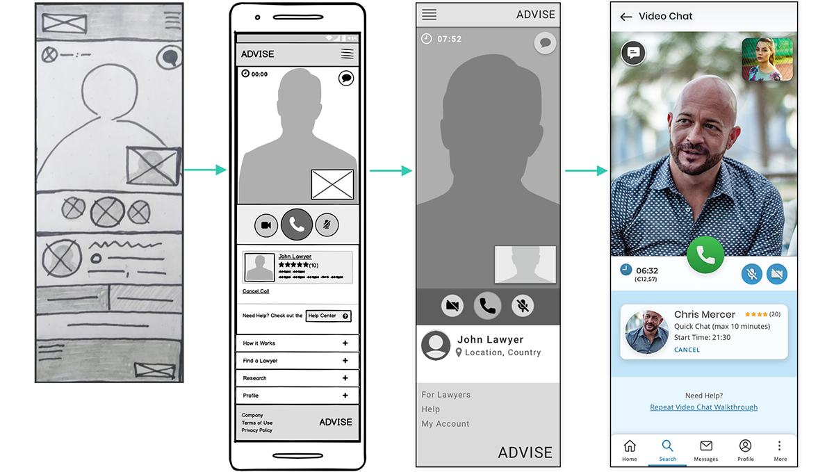
Iterations: Video Chat
Design Improvements Based on User Feedback-
1. Link to help added, for users who might be confused and need to review the video chat walkthrough.
2. The amount of time left and cost so far was added to the information on lawyers’ cards, so it’s clearer how much time has passed.
3. User’s video moved to the top of the screen, so the area with the buttons is less cluttered.
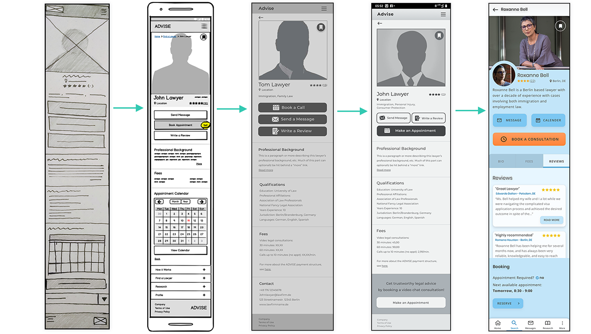
Iterations: Lawyer Profile
Design Improvements Based on User Feedback -
1. Calendar button added to each profile, showing a lawyer’s availability without being required to start appointment booking process.
2. Switched to tabbed content, it’s easier to navigate through than scrolling through one long screen.
3. Reviews added to each profile (Research revealed reviews are the most important factor for most users when choosing a lawyer.
4. Next available appointment date/time added to profiles, for conveniece.
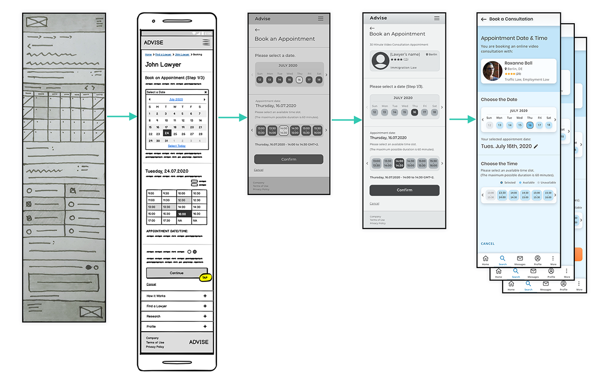
Iterations: Date/Time Picker
Design Improvements Based on User Feedback
1. The date and time selection was divided into three screens, to be easier for users to mentally process and looks visually cleaner.
2. Calendar replaced with more minimal date picker.
3. Lawyer card added to top of all appointment booking screens, to reassure users that they're still in the right place as they go through the steps of the booking process.
Personalized Home Screen Content
Design Improvement:
1. The home screen content was revised to be more personalized once a user has logged in.
2. Users’ notifications (new messages, files shared, appointments, etc.) added.
3. Old navigation replaced with sticky footer navigation linking to important user features (after login/sign up)

Other Design Improvements
1. The search results and lawyer directories pages were updated to include the number of results available at the beginning of the list, instead of only showing the number of pages.
2. Touch points were increased in size on the search filters and search results pages after they were found to be uncomfortably small to tap.
3. Search filters were added for appointment date and time, for users with a busier schedule that would need to plan for a specific time.
4. Active screen indicator was added to the navigation, after usability testing showed that users were often confused without it.
High Fidelity Mockups
Task: Call a Favourite Lawyer

Task: Search for a Lawyer

Task: Book an Appointment

Advise Clickable Prototype
Note – I am still working on this so not every feature is functional yet, but the onboarding , appointment booking process, and search feature screens are ready for you to try out.
Check it out here.


