


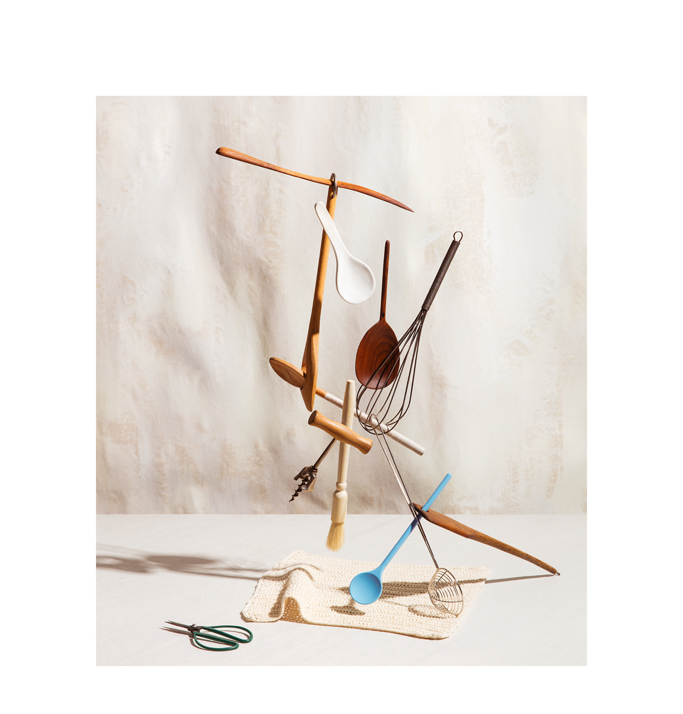

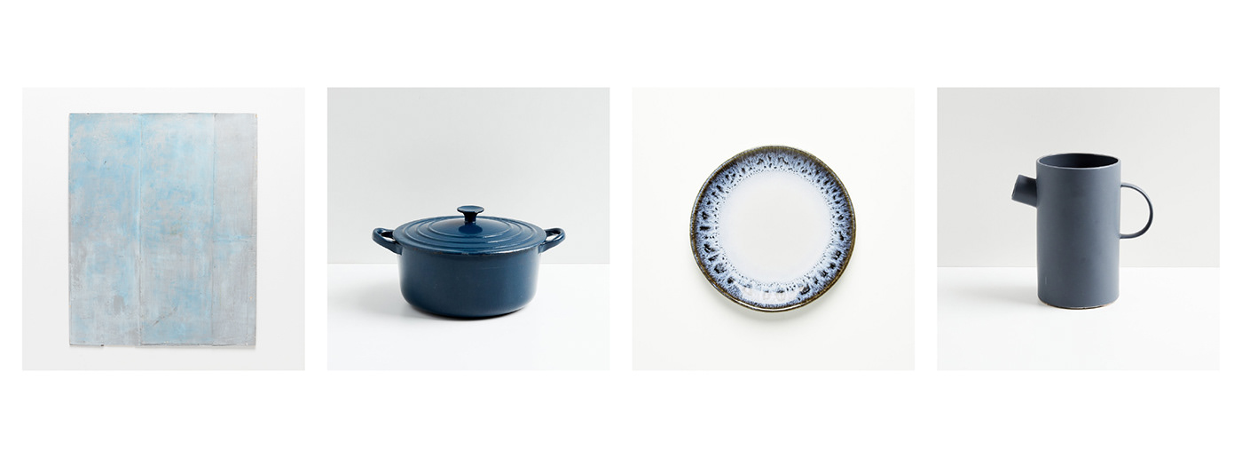
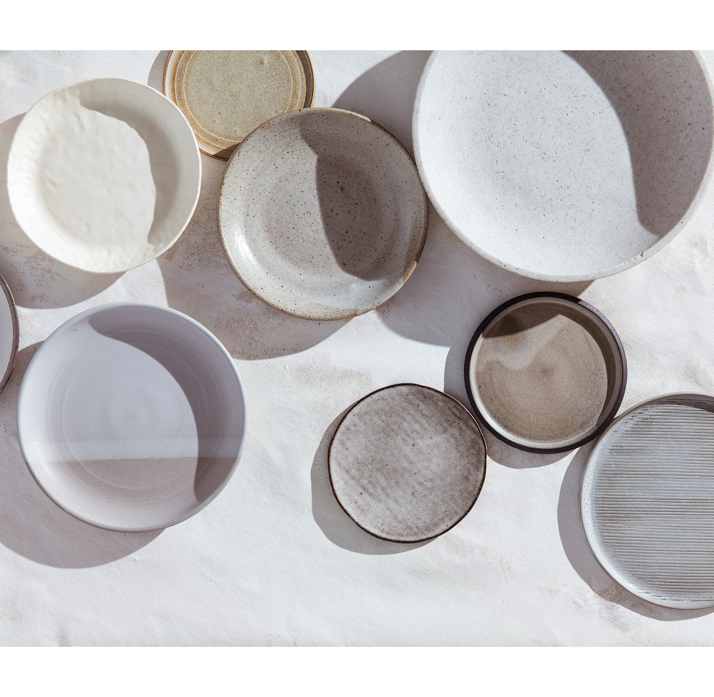
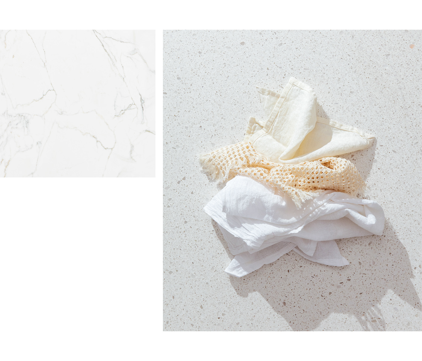
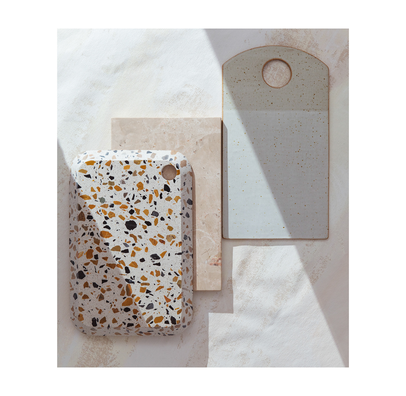
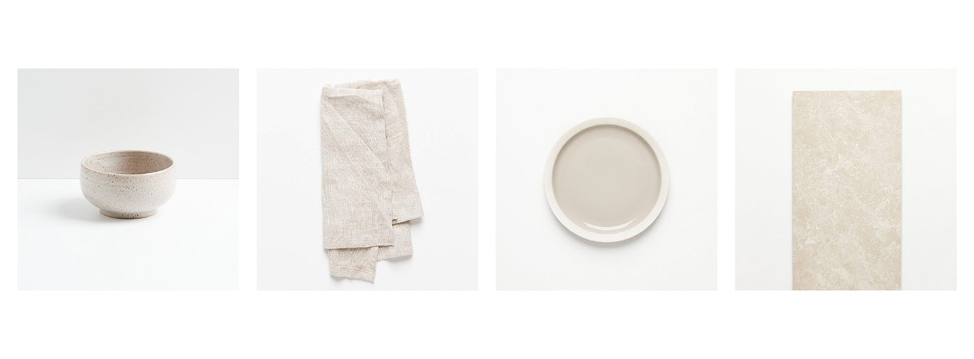
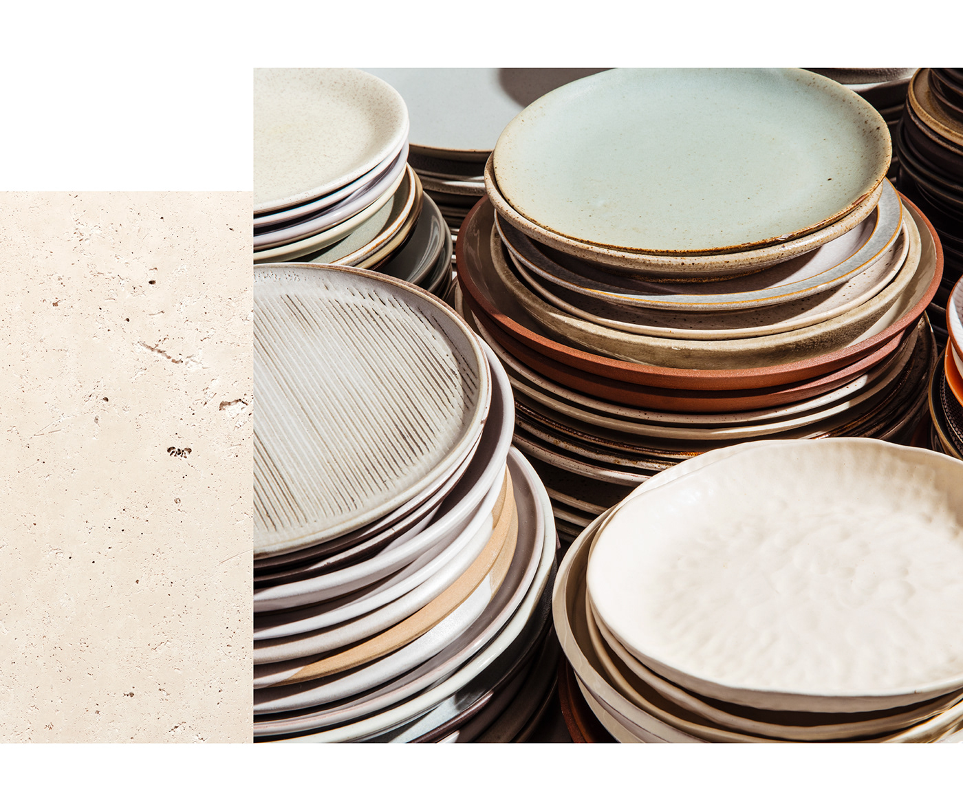
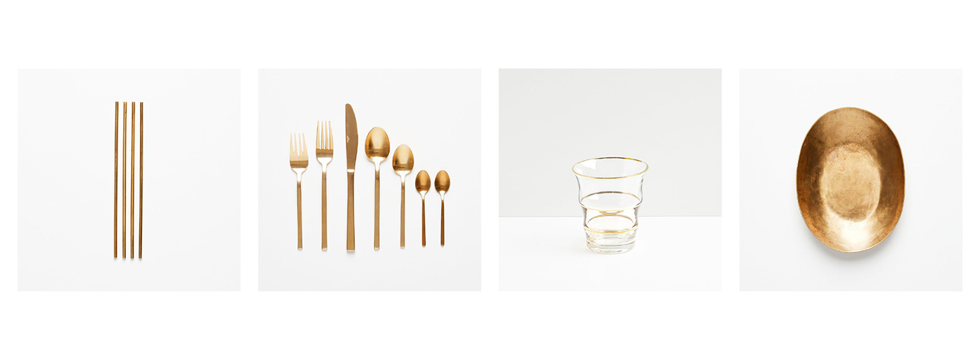
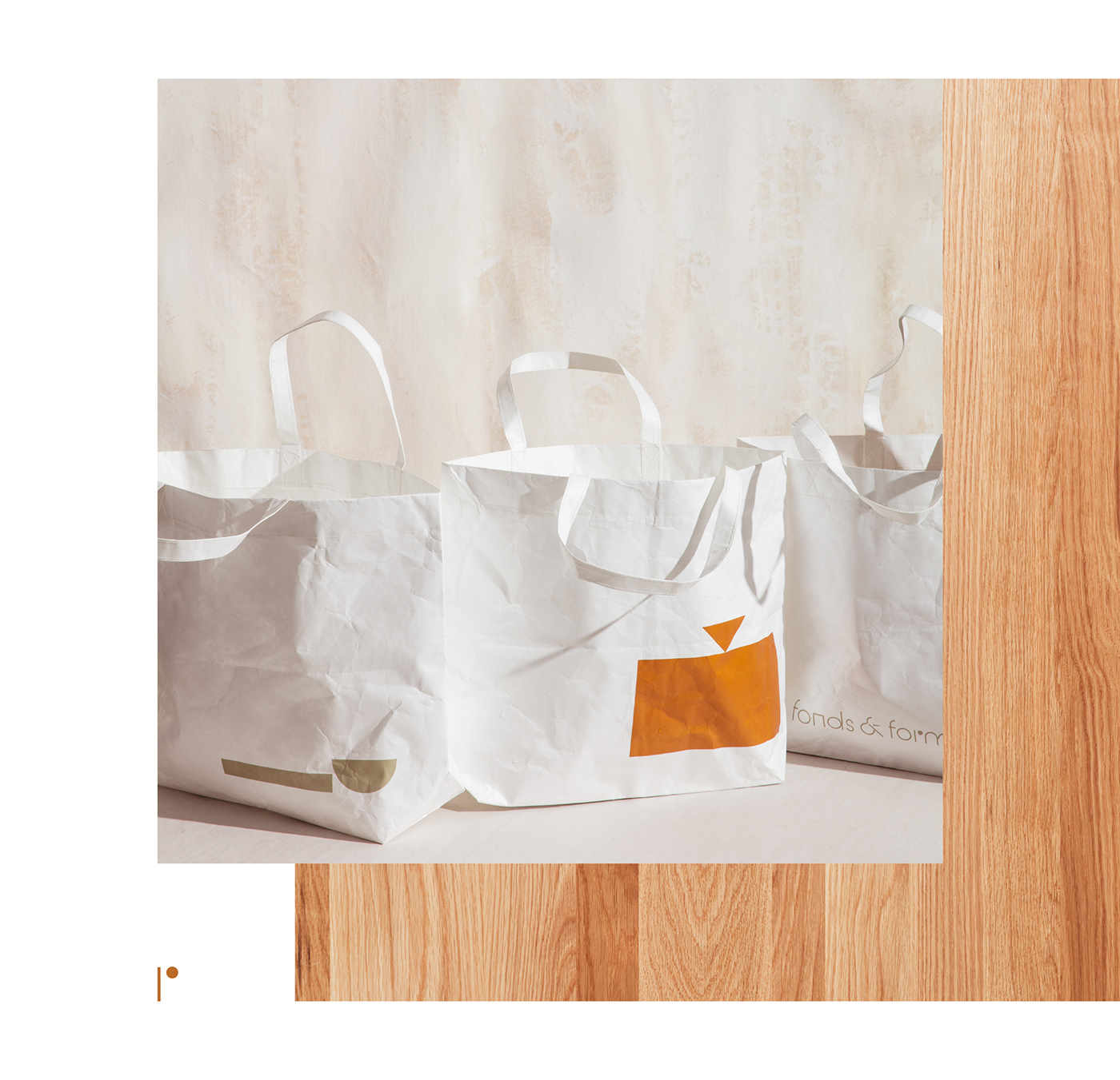
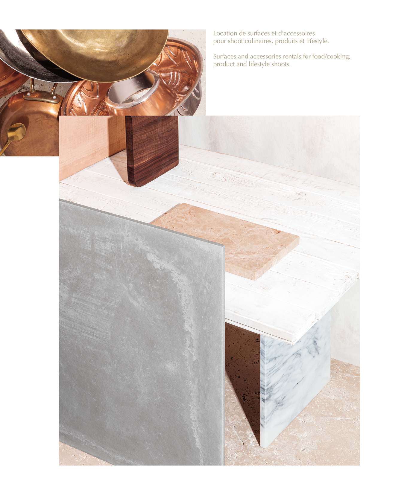
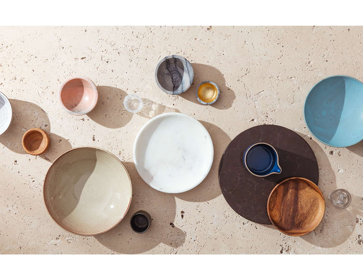
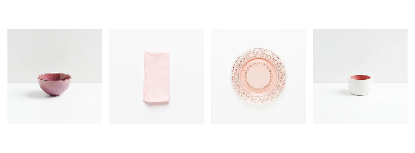
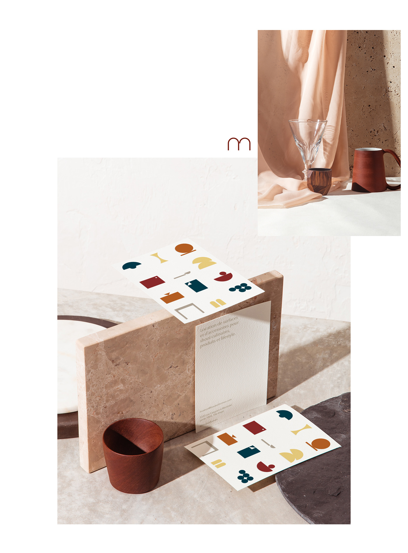
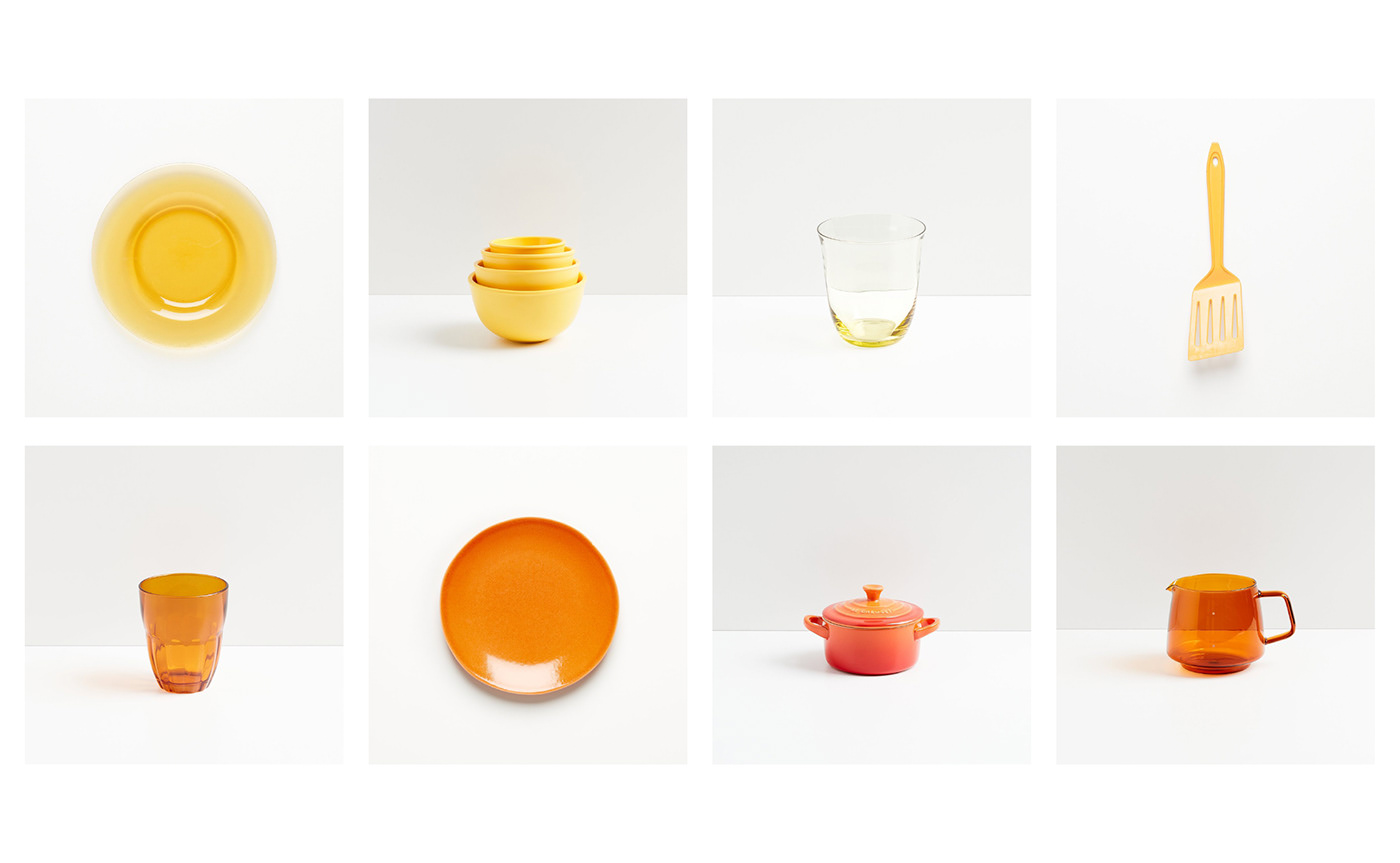
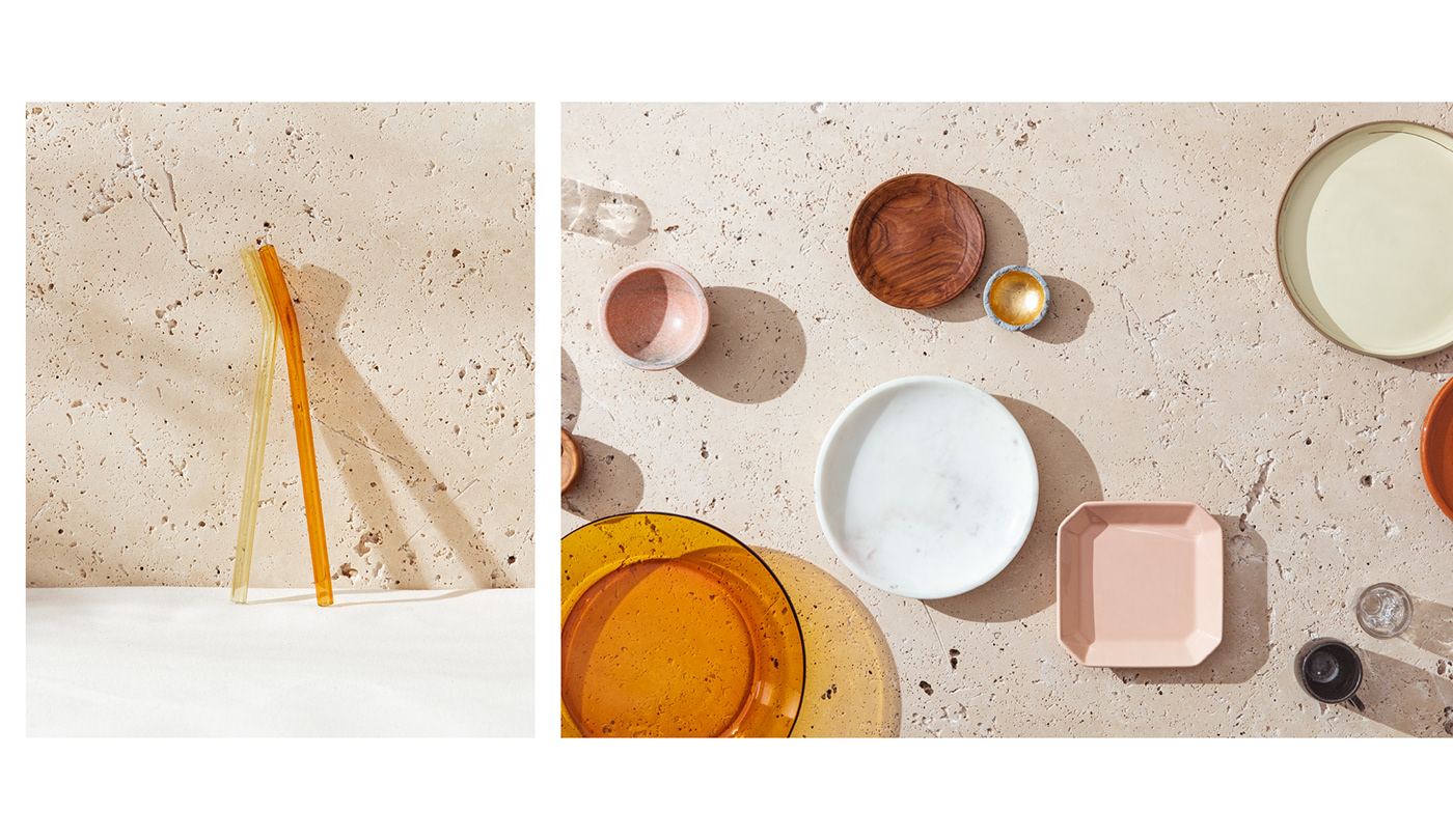
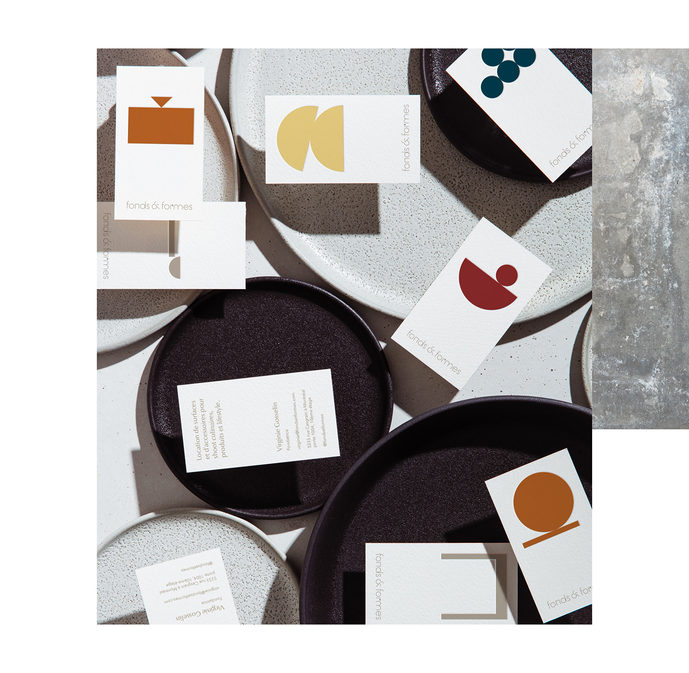
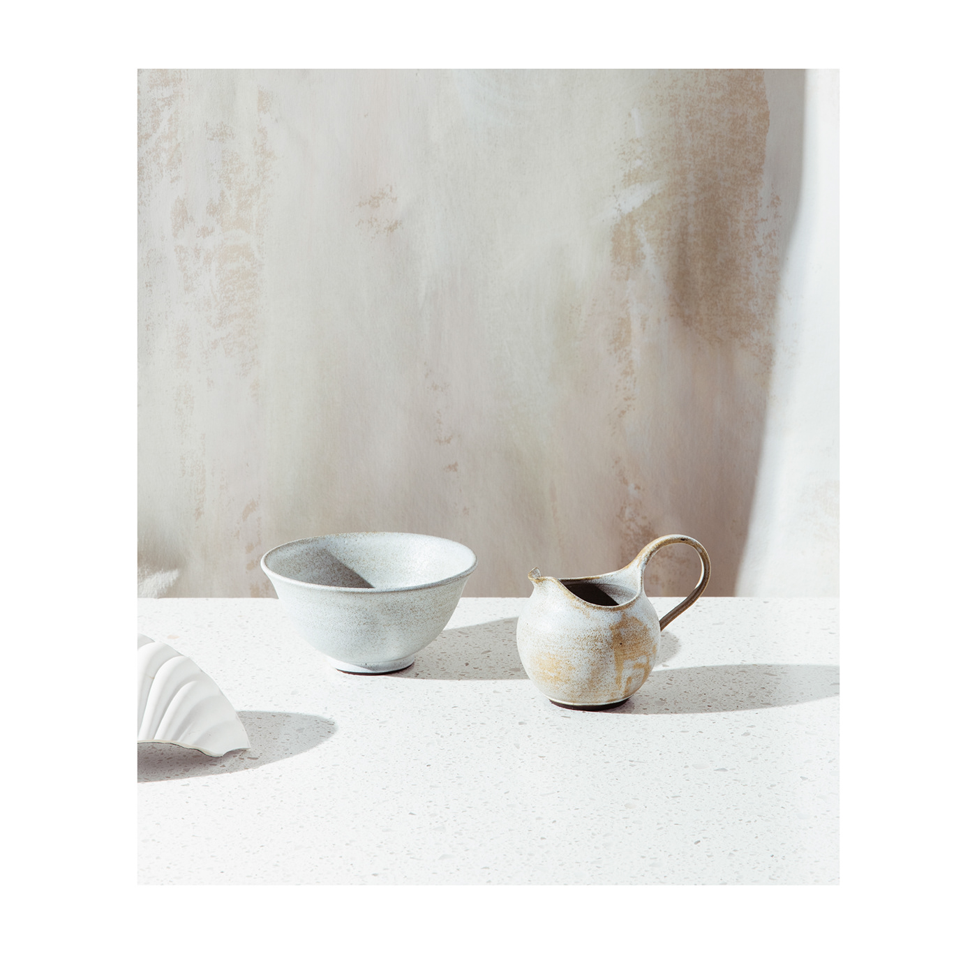
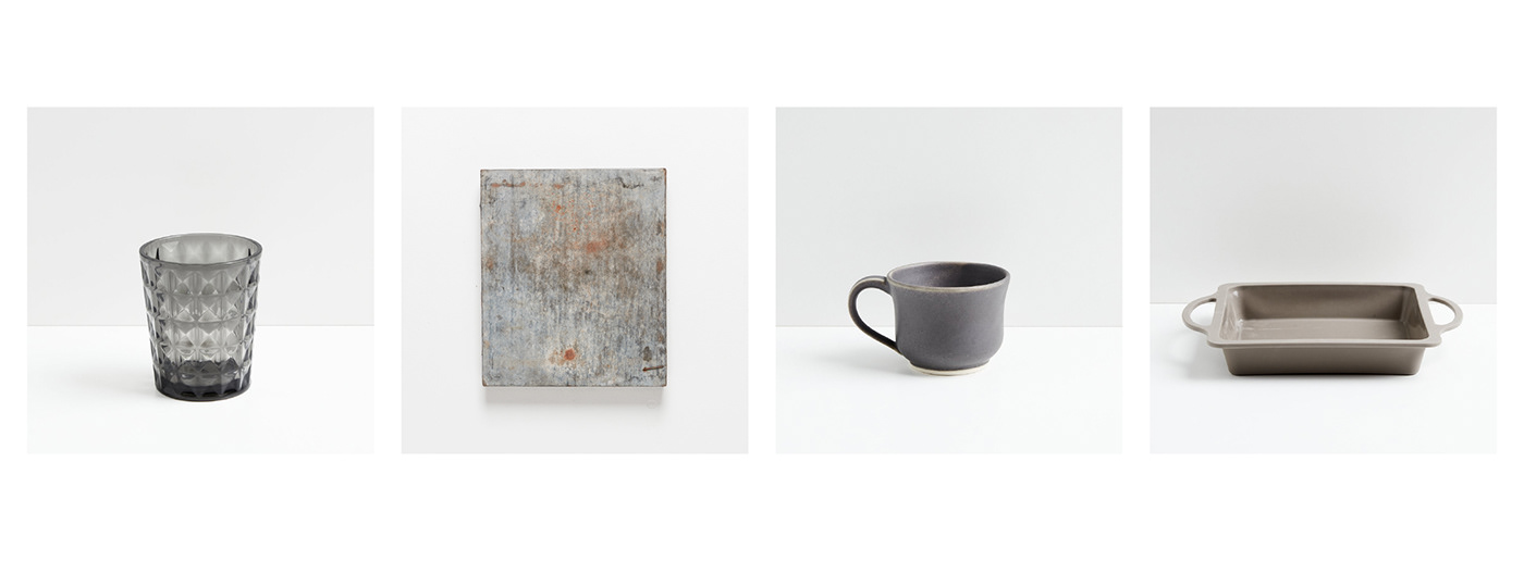
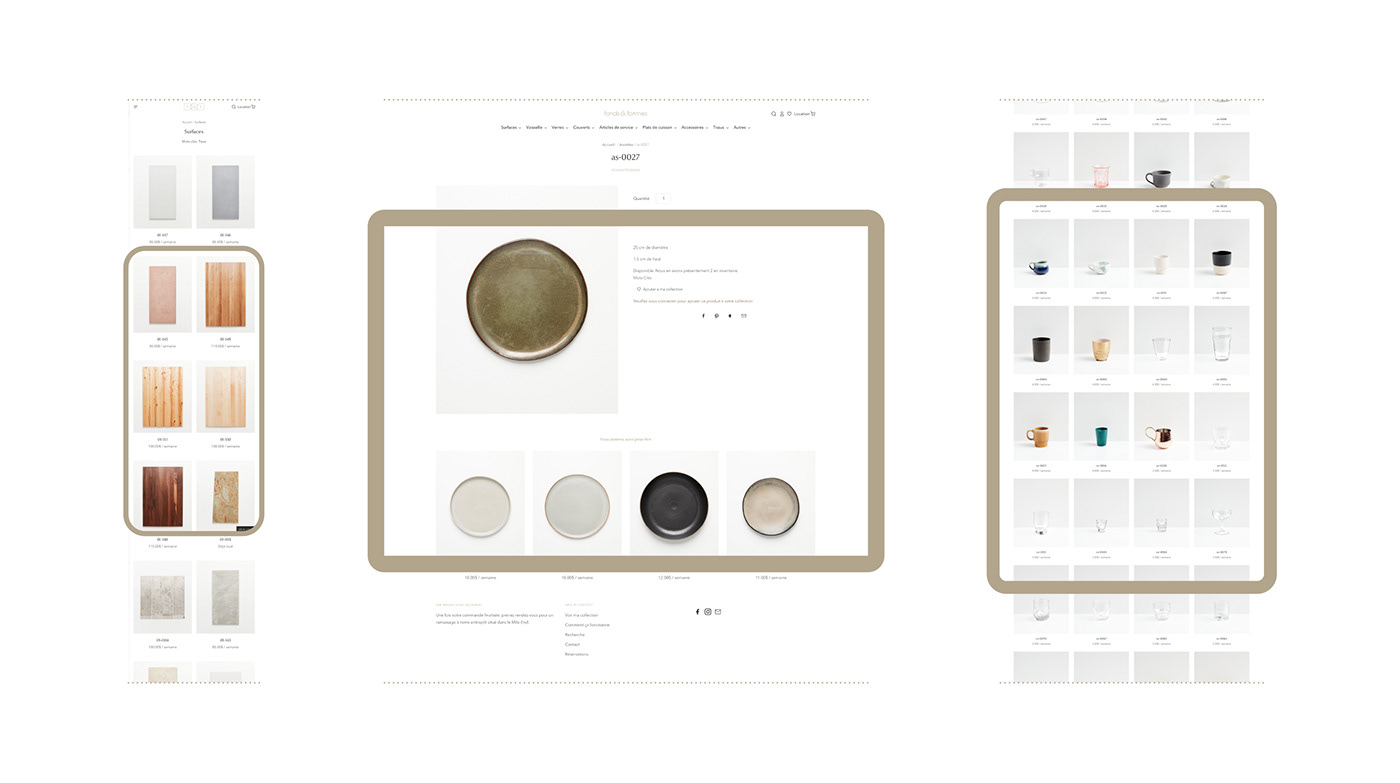
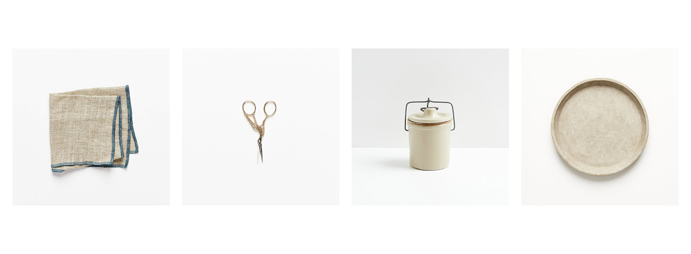
Fonds & Formes is a new rental service offering surfaces and kitchen accessories for photo and videos shoots, operating like an online one-stop shop to simplify searches for people in the industry. Located in Montréal’s Mile-End neighbourhood, the recently opened warehouse already has over 1,800 items in a wide range of styles.
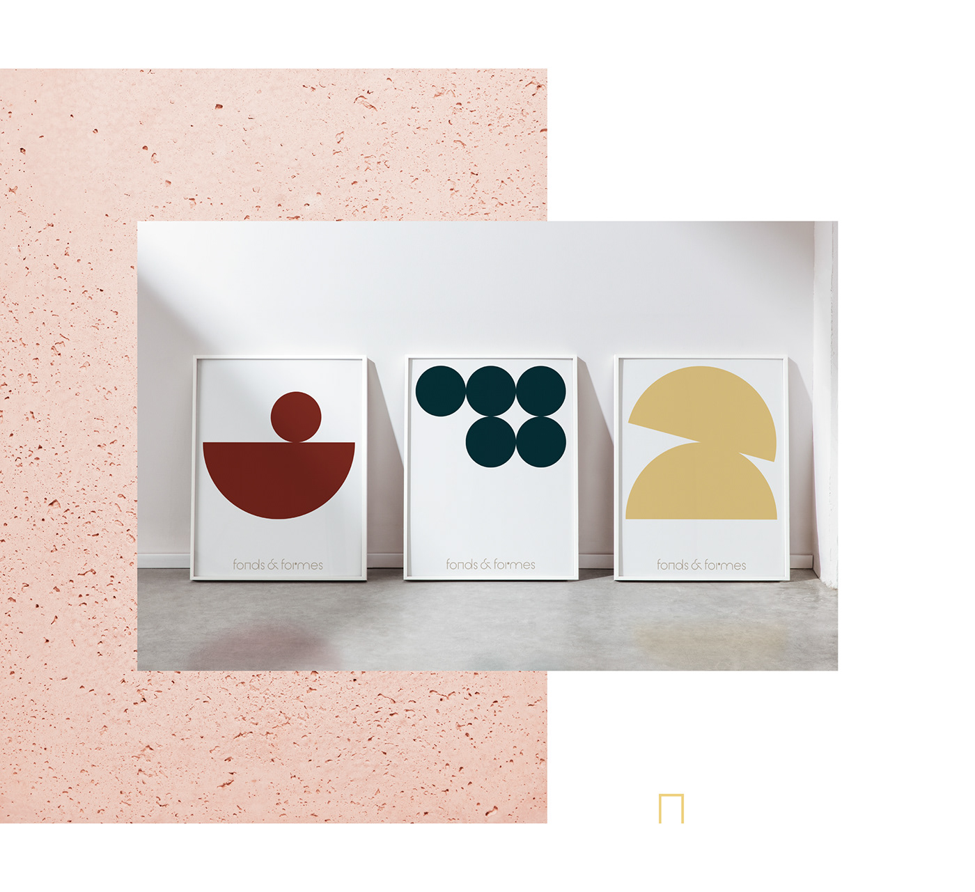
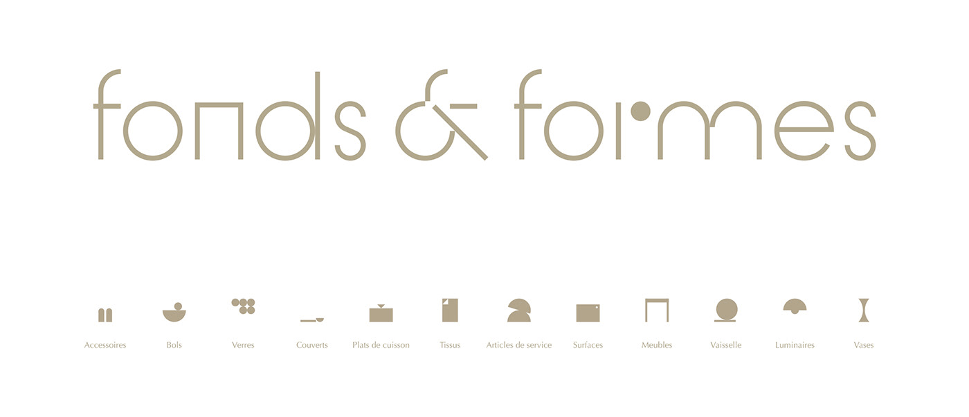
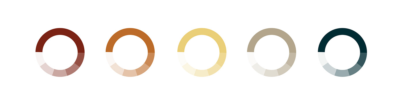
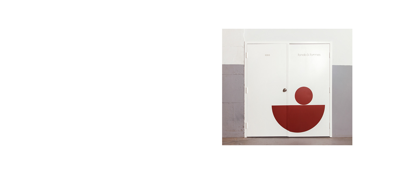
The logo, colour palette and icons created for the brand identity lend a Bauhausy feel to the nostalgic look of items on offer. Photography and communications simply focus on showcasing the diversity and quality of available accessories.
In French, the brand name has a nice second meaning. Although ‘fond et forme’ usually refers to ‘content and form’, the word ‘fond’ can also mean ‘base’ or ‘background.’ This second meaning thus alludes to the company’s offer: ‘fonds’ → surfaces and ‘formes’ → accessories.


Thank you!
Credits
Photography - Virginie Gosselin
Strategy, Naming and Brand Identity - Rachel Lecompte & Gabriel Lefebvre
Photo Retouching - Lucas Bayzelon
Tote bags - St.Denis


