


Overview
Busybee is a web-app that helps people track live occupancy for an institution, see historical data, and plan their visit accordingly. The users are the students at KTH University, Sweden, and social distancing is mandatory for them, to continue their studies and stay safe.
Pain-points
When I started working on the project, the web app had a simple page for an institution with a graph for occupancy and a contact page - the core idea. More information and context were needed, a landing page explaining the service and how it works. Data visualization was not optimal either.
Another problem to solve was information architecture, because an institution like KTH University had a few buildings, and the buildings had many rooms.
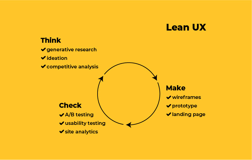
Approach
As I had less than 2 weeks to design the app, I used a Lean UX methodology.
Research
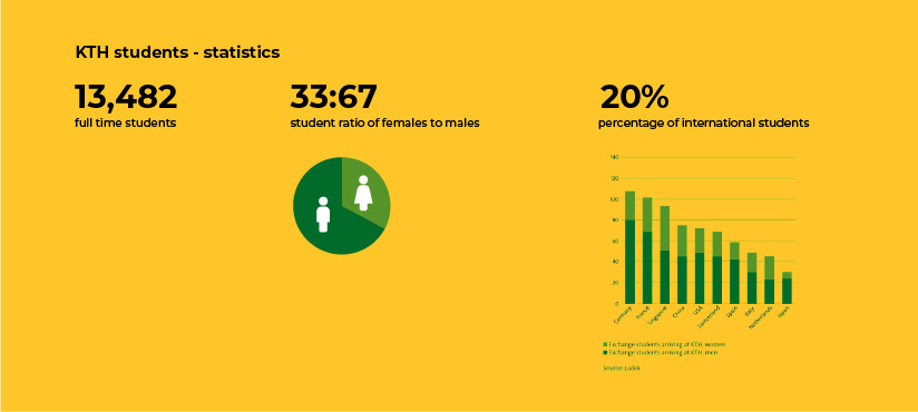
When launched, the Busybee web app has information only for KTH University from Stockholm, Sweden, so the users were mainly students, but I had to keep in mind that more institutions will be added later (cafés, gyms) and will serve a wide demographic.
Competitive analysis revealed that the best services have informative landing pages that tell and show what they do, explain the technology, have easy to scan graphs and list additional information like accessibility, Wi-Fi, computers and lockers.
I found inspiration for data visualization in Google's Material System and the Revolut App.
User flow

Prototype

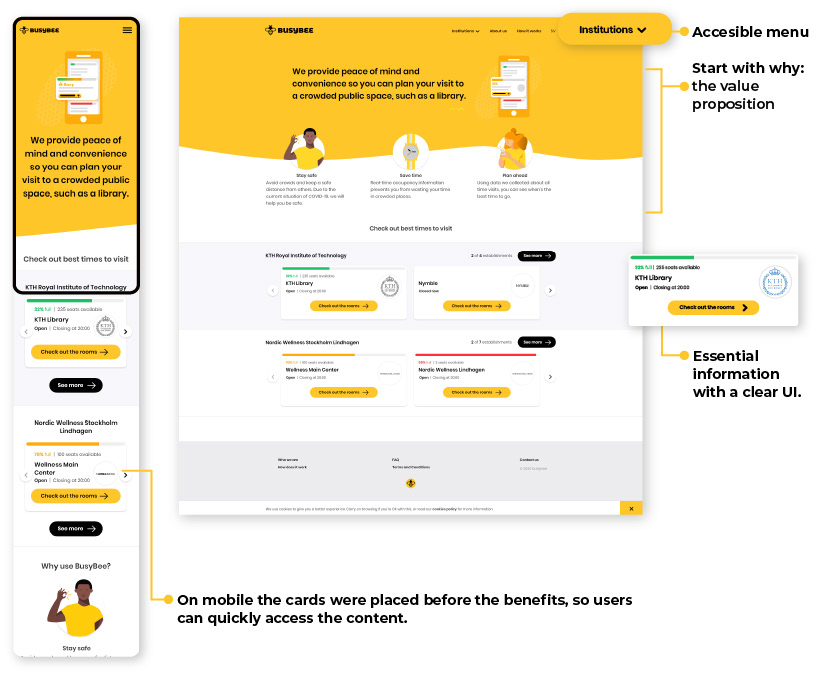
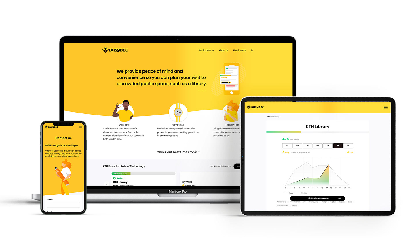
High fidelity design - homepage
User testing
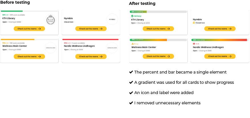
As soon as I had the design for the homepage and the stakeholders were ok with it, I did user testing to check everything’s clear. I tested with 4 persons, remote, asking what this is and what it does. The findings led to UI improvement especially for the cards, and some micro copy adjustment.
Institution page

Testing the user flow revealed labeling issues and some small changes we could make to ensure the users find the appropriate information where they expect, like a "contact" button in the "about us" page.
Final design

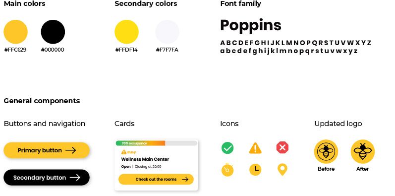
Design system

Time frame
I had less than 2 weeks to research, design the flow, the UI, test the layout, create illustrations, and complete the design for desktop and mobile.
Next steps
Supervise the implementation. Study user feedback when available, to see what needs to be improved.
Conclusion
Doing user testing as soon as I had something to show showed small issues I didn’t expect. I discovered how doing small changes like improving micro copy or eliminating unnecessary things can improve product usability.
Thank you for reading


