


Keep moving forward
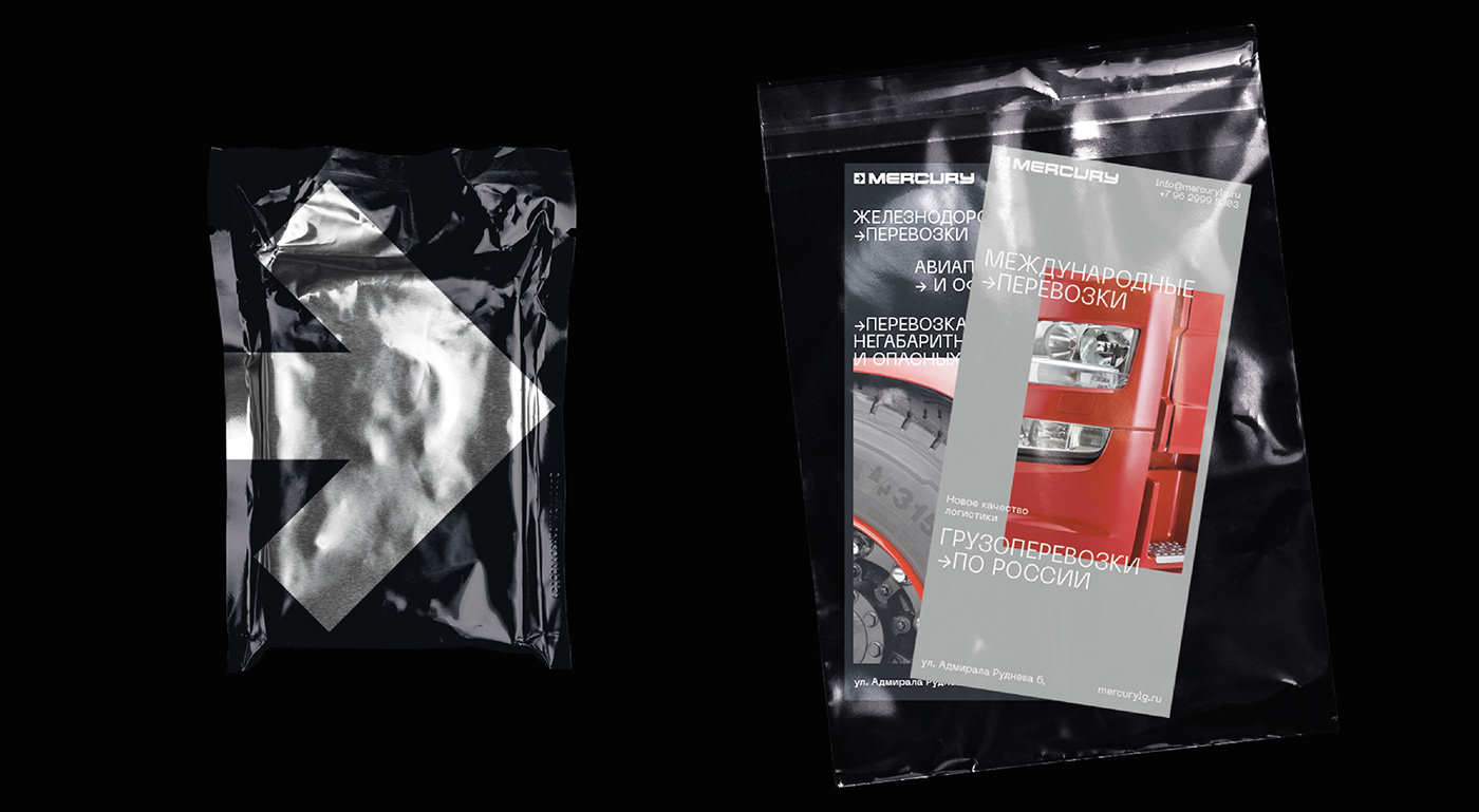
The main task we had while working on the Mercury project was updating brand's perception, improving and making it more modern and stylish. The client needed a new logo to be developed and a new corporate identity for a logistics company operating in Russia. The design was supposed to look technologically and it should have been associative with movies about the future, modern technologies and the corresponding task of returning of a reliable brand of world scale. The logo was divided into two parts: a sign - an arrow that indicates the movement forward, development and main type of company; font - a wide grotesque with ink traps, which create a technological and serious image of the logo and hence the brand. The visual style of the Mercury brand was decided to appear in two colors: black and white layout and backgrounds complement the image of red trucks used by the company.
Thanks to the new modern and technological design, Mercury brand has clearly become prominent in the logistics market and began to stand out among competitors in this niche. Updated design adaptation for all communication channels which means more convenience, mobility and attracting more new customers. The brand has become more dynamic and now it is a new stimulus for the development of their business for customers.


Design & Art Direction — Yaroslav Kryzhanivsky
Copywriter — Lolita Kryzhanivska-Ostroverkh
Copywriter — Lolita Kryzhanivska-Ostroverkh
Photo credits: shutterstock, unsplash, stutterheim


