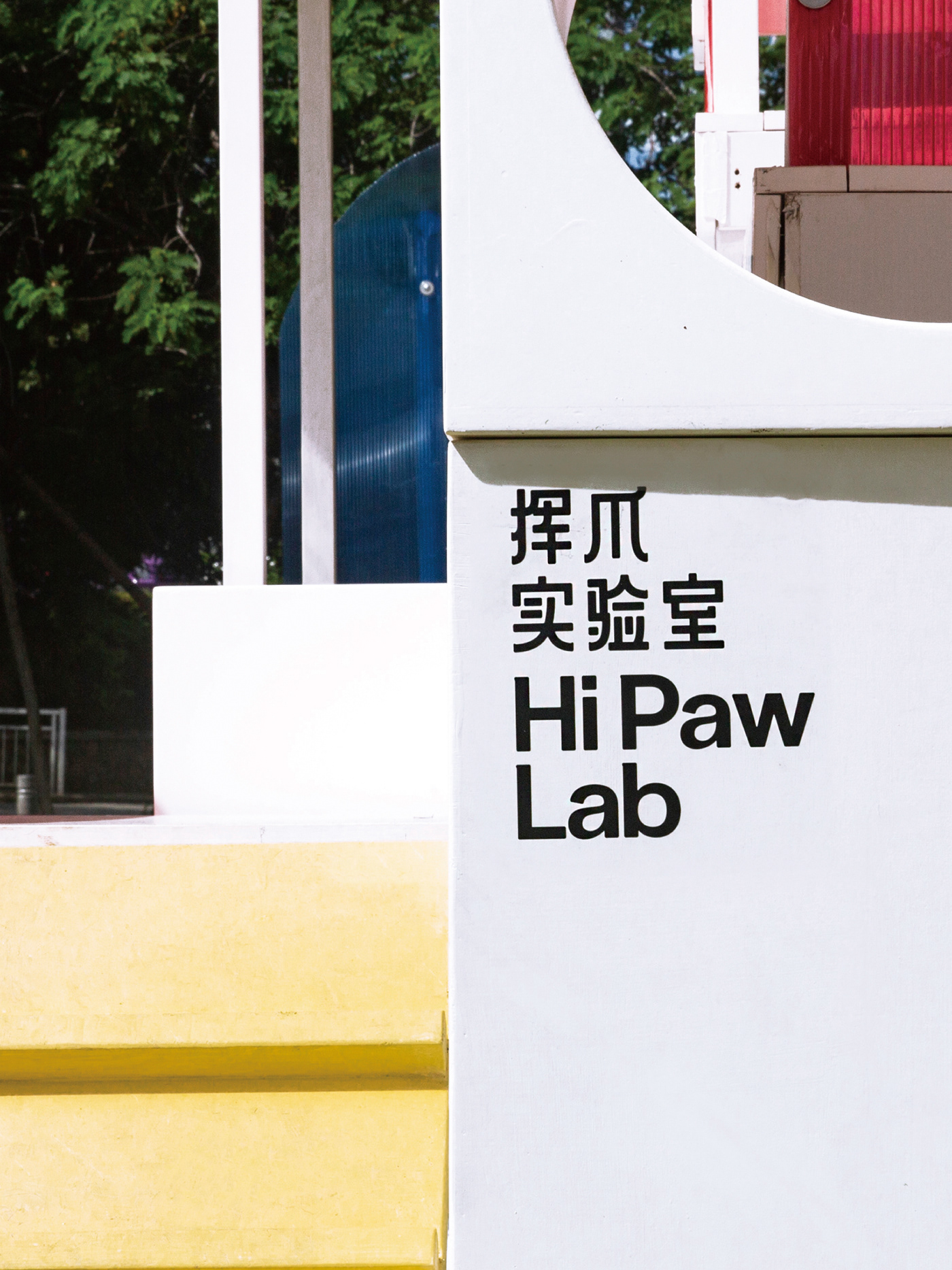
Hi Paw Lab 挥爪实验室
挥爪实验室是一个全新的人宠互动空间的研发品牌,探索人与宠物的不同相处方。我们为品牌设计了视觉识别系统,通过品牌友善、相处和有趣的核心理念,我们以HPL三个英文字母组合成了品牌的标志图形,为品牌在三种不同的空间版块设计了一系列图形元素:
互动空间以主图形延展出两个小爪碰触或互动的画面,色彩以两个主色调渐变为标准,呈现好玩互动的氛围;
餐饮空间以主图形的造型为关键,放大图形的曲线细节,结合手写字母的线条。色彩以两个主色调的浅色调为标准,呈现好吃好看的氛围;
零售空间以主图形的标语延展方式为关键,使用直线延伸,具有强指引性和标语感。色彩以两个主色调的纯色调为标准,呈现新鲜有趣的购物氛围;
整体品牌形象在统一视觉的前提下营造丰富的变化,并将在未来的发展中不断的演化出现新的图形。
HiPawLab is a brand-new R & D brand of human PET interaction space, exploring the different prescriptions of human and pet. We have designed a visual identity system for HiPawLab. Through the core concept of brand friendliness, coexistence and fun, we have combined three English letters “H””P””L” into the logo, and designed a series of graphic elements for the brand in three different parts:In the interactive space, the main figure extends the picture of two small claws touching or interacting, and the color takes two main tone gradients as the standard, presenting the atmosphere of fun and interaction;
The dining space takes the shape of the main figure as the key, enlarges the curve details of the figure, and combines the lines of the handwritten letters. The color takes the light tone of two main colors as the standard, presenting delicious and beautiful atmosphere;
The key of shop space is the way of slogan extension of the main figure, which uses straight-line extension and has strong guidance and slogan sense. The color is based on the solid tone of two main colors, presenting a fresh and interesting shopping atmosphere;The overall brand image creates rich changes under the premise of unified vision, and will continue to evolve in the future development of new graphics