


When the Covid epidemic was still raging on throughout the world, Intermask set itself on a mission to protect public health and fight against it. Specializing in medical mask production, with development based on a unit with long experience in the fashion field. Intermask’s founder was concerned about the Covid outbreak and came to Tree to create a medical brand that shows the brand's dedication to serving social life and protecting human health.

Challenges
As a multinational company, the Intermask image identity must show the global aspects of the brand, while also introducing the business products to the market through identification images.


Solutions
Developed from the brand name, Intermask is a combination of International and Mask. These two words directly represent the brand’s product and business scope, creating a mask brand that exports its products in and out of the country.
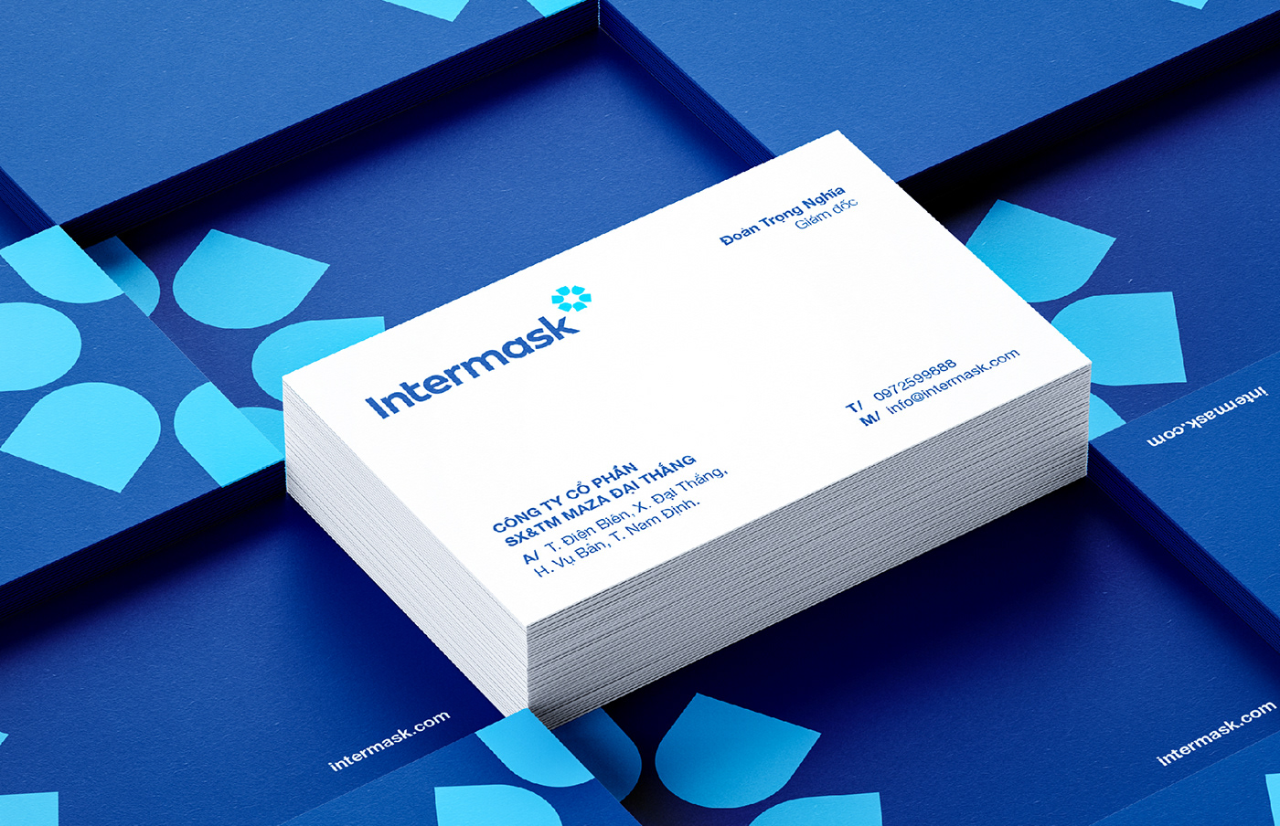
The inspiration for the logo came from a popular symbol in the medical industry " the star of life." It’s a special 6-pointed star created from the image of a "mask" and "shield." The symbol itself represents the brand’s product's protection for consumer health. The solid circle in the logo is a symbol of the brand's strategic global positioning and a testament to the brand's sustainable development.
In this identity, Tree uses a lowercase font with uppercase first letters, a simple style that is extremely easy to deploy in all publications. Making blue the primary color of the logo leaves an impression on the viewers because of its high association with the medical industry, the color of trust, prestige, and quality.


Results
With the brand identity developed by Tree Creative, Intermask has reached the international market through just visual communication. Intermask masks have is now widely known, and are primarily exported to many countries such as Laos, Cambodia, etc...


