

Stavanger Ysteri is an urban cheese factory in the industrial city of Stavanger, on the west coast of Norway. By only using raw milk, Lise Brunborg honours the traditional recipes handed down through generations and brings to life the “terroir” of the milk. Lise's approach to cheesemaking combines tradition and science, which positions her at the forefront of a growing movement towards local, organic food production. By bridging chemistry with a conscious connection to nature and farming, Stavanger Ysteri belongs to the future of food.


In recent years, Lise has established herself as one of the front runners of artisanal cheesemaking in Norway, and her cheeses are used by the best restaurants in the country. Five years in, she felt that her identity, packaging and website needed to align with the quality of her products and reflect her reputation. We were immediately fascinated by her passion and inspired by her mission to create a better future for the next generations of cheesemakers. As both tradition and innovation is important in Lise's vision, we wanted to showcase this through a personal narrative that could become an integral part of the branding. We created a visual universe for Stavanger Ysteri that is inspired by Lise's interest in mythology, philosophy and nature.


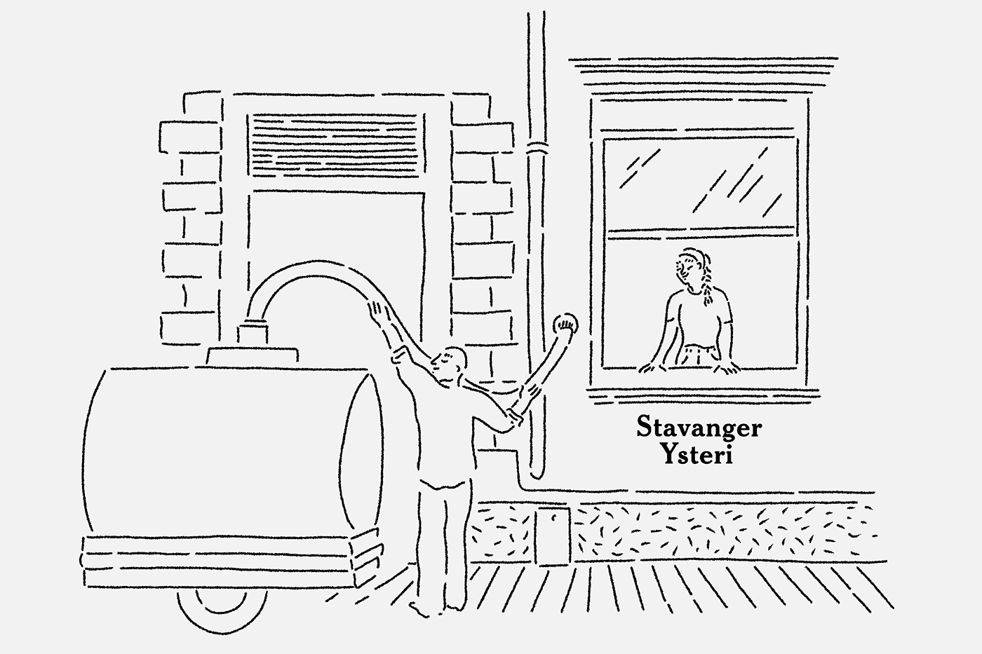
In the past years, the city of Stavanger has had an increase in progressive food producers and restaurants, taking over old buildings to create something new. Founded in 2015, Stavanger Ysteri is located in the centre of what was once the heart of the city’s fish canning industry. Being an urban cheese factory, the story is not the one of the farmer in the countryside that makes artisanal cheese from the milk produced by his animals. Lise's background is in science, with physics and a Masters degree in chèvre. Opening a cheese factory in the middle of the city, she’s offering a window into innovative ecological agriculture in Norway. This allowed us to portray a different story than the conventional imagery of the cheesemaker in the countryside — hers felt more like that of a chef, creating exquisite taste experiences from high quality produce.


It all starts with milk. Like a blank canvas, the milk can transform into a multitude of tastes and textures. Stavanger Ysteri gets their raw milk delivered fresh every day from Leikvoll Økologiske Gard, an organic milk producer just 20 min from the factory. Being unpasteurised, the milk has character and is alive, allowing the terroir to fully express itself. Fermentation is an age-old technique and time honouring process that allows us to create any kind of cheese.
The act of fermenting food lets us engage with a dimension of our world that we cannot see with our bare eyes. It’s about the role of the beneficial microorganisms with which we live in symbiosis. Before we knew what fermentation was, we attributed it to magic. Now that we know, we can still be in awe at how amazing and natural the work of these microorganisms really is. To echo this process, we chose an illustration style that is composed of small organic strokes, that at the same time feels humanist and scientific. Debora Szpilmans illustrations elegantly convey these qualities. We chose a natural white background, as an ode both to the milk and to the lab, where everything is clean and ceremonial.


Fønix is a blue cheese, "the star" and the first cheese that Lise produced, marking the beginning of her adventure. Fønix has had a dish of its own at the 3 stars Michelin Restaurant Maaemo. It’s named after the Phoenix — the mythological bird that is cyclically reborn from the ashes of his predecessor. It symbolises a new start and is associated to fire and the sun. One legend says that picking up a burning feather means to take a challenge — the one that Lise feels she took when starting the cheese factory. We couldn’t avoid noticing that she also has a beautiful, almost real size, Phoenix standing on a branch tattooed on her arm. A story started to emerge when we connected the symbolism of Phoenix to one of the Aspen trees, tattooed on her wrists, also a symbol of rebirth and transformation.


The tree trunk with sprouting leaves is a symbol of Lise’s connection to the community of Stavanger — being rooted in the city, as well as being part of the new “sprouting” food scene. The mark is a nod to the city’s coat of arms — a branch with three leaves, and an older version of the city emblem, still visible in some vintage sardines labels. The tree trunk represents history, nature and tradition. The sprouting leaves symbolise new life, innovation and an independent spirit.


As Stavanger Ysteri's products are preserving and enhancing the local expression (terroir) of the raw milk, we looked for a traditional, yet unique, labelling system. This materialised as a set of two sizes of round labels — one common for the cut pieces and small cheeses, and a bigger one with tailored illustrations for each cheese wheel. The labels are printed on uncoated self-adhesive paper, with a one colour print and a common round embossed logo, all paired with a hand-applied colour coded sticker carrying the name and cheese type. The name tags have an additional debossed texture and embossing of each name, to contrast with the more sober round labels.


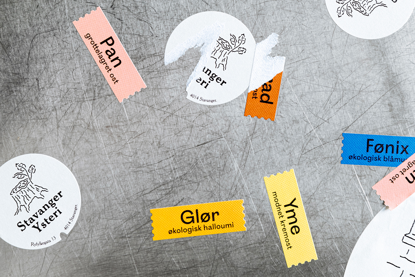
The illustration style, typographic treatment and the small touches of colours are connecting the product range. The colours are inspired by different visual attributes of the cheeses themselves — blue for the mould in the Fønix, pink as the “skin” of Pan and warm brown as the stout beer used to wash Konrad. The three main illustrations are inspired by the story behind each name, and the process of each cheese. A balance between mythology, magic and traditional components of cheesemaking are references in each illustration. The trembling, rough edges of the illustrations capture the richness and live nature of the raw milk with a reference to both the molecular and the visible transformation of the milk when curdling. The typography is a combination of a serif font influenced by the Arts and Crafts movement and a sans serif that adds a clean, friendly and modern touch.
This collaboration has allowed us to work with an inspiring female-led company. As both the industry of food and the design profession is still struggling with equal representation, we were happy to support Lise’s choice of an all-female team, choosing all female partners for this project.


Year: 2020
Client: Stavanger Ysteri
Industries: Food
Industries: Food
Deliverables:
Design strategy, Identity, Packaging, Art Direction, lllustration, Storytelling, Website, Social Media Content & Curation
Materials:
Uncoated paper, Waxed paper, Organic Cotton Canvas
Techniques:
Embossing/Debossing, Digital printing, Silkscreening
Collaborators:
Debora Szpilman, Illustration
Anne Valeur, Photography


