NEON TYPOGRAPHY INSTALLATION
Category
Municipality
SERVICES
Copywriting | Custom lettering | Messaging + Narrative | Social media | Production | Photography | Architectural detail | Light design | Signage | Social activation
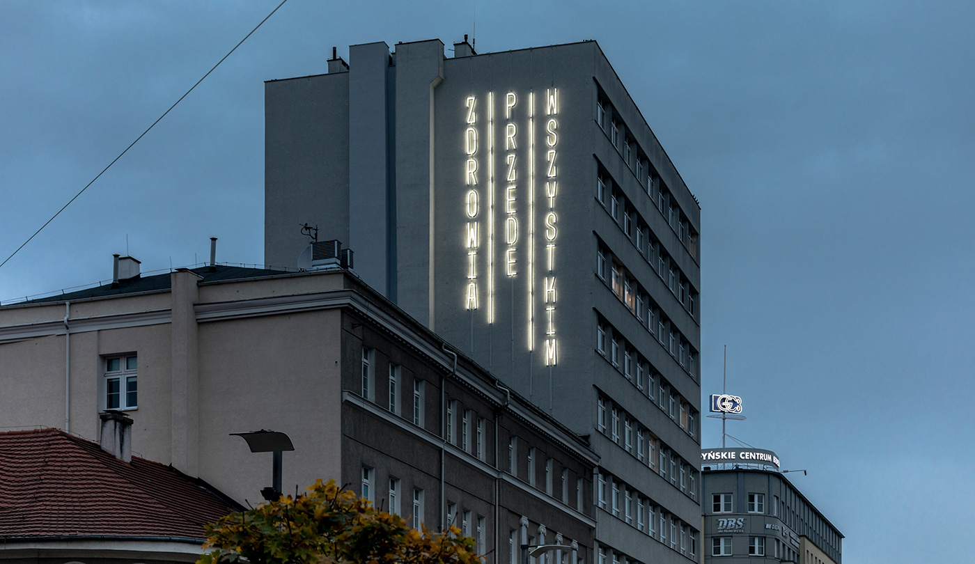
HAVE YOU EVER SENT SOMEONE A 13 METER-HIGH GET WELL CARD?
WE DID.
WE DID.
When facing a threat or a challenge people drift towards one another. During the pandemic we re-learned the value of supportive community, the meaning of care and discovered how fleeting our health can be. Annual events, like the Independence Day parade, had to be cancelled, even though the need for the celebratory spirit couldn't be underestimated. We were approached by the Independence Day Parade organizers, who asked us to help find another way to send out a positive, communal message of hope in the public realm.
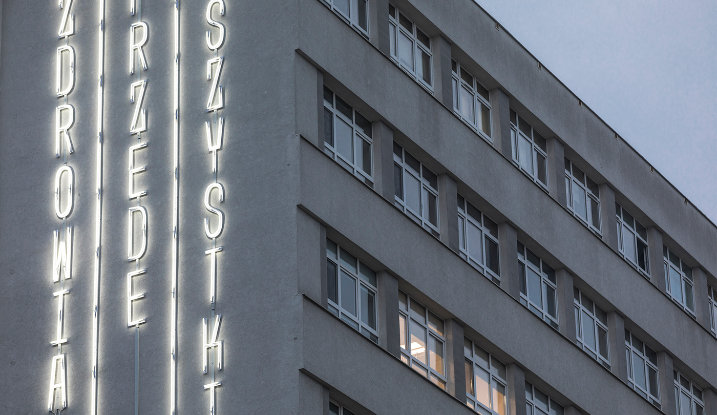
Tasked with this dilemma we set to work on a new art project. The aim was for the piece to be displayed in public space, so that everyone can enjoy it. First, we searched for a perfect spot, and we soon set our eyes on a visible wall of a hospital building in a busy square in the city center. Second question was — how to convey the community spirit in the middle of a raging pandemic? We found an answer in the common Polish phrase “Zdrowia przede wszystkim”: it translates into “First and foremost, I wish you health”. It puts an emphasis on the value of health, something everyone can get behind, while its familiarity guarantees a universal appeal. To our delight, the parade organizers made a decision to use our copywriting in all of their Independence Day communications.
It was absolutely essential for a piece of this scale to fit well with the architecture, so we designed custom letterforms to match the rhythm of the 70s hospital building. The public response has been overwhelmingly positive.