After the success of the PNE education project, Mr. Luan once again came to Tree Creative with trust and a desire to renew the Vikopa brand identity - manufacturing and distributing phone accessories in Hung Yen. This cooperation is a step in the brand reform towards professionalism while improving distributors and sales systems in many provinces.


Challenges
The brand identity is the result of the harmonious combination between the core values and the slogan. In which the four core values : "Prestige - Dedication - Intelligence - Speed" and the slogan "Pioneering technology" create a complete identity both in terms of meaningfulness and creative imagery.


Solutions
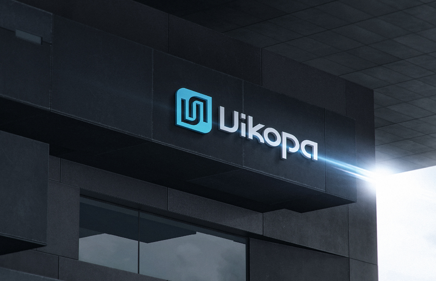
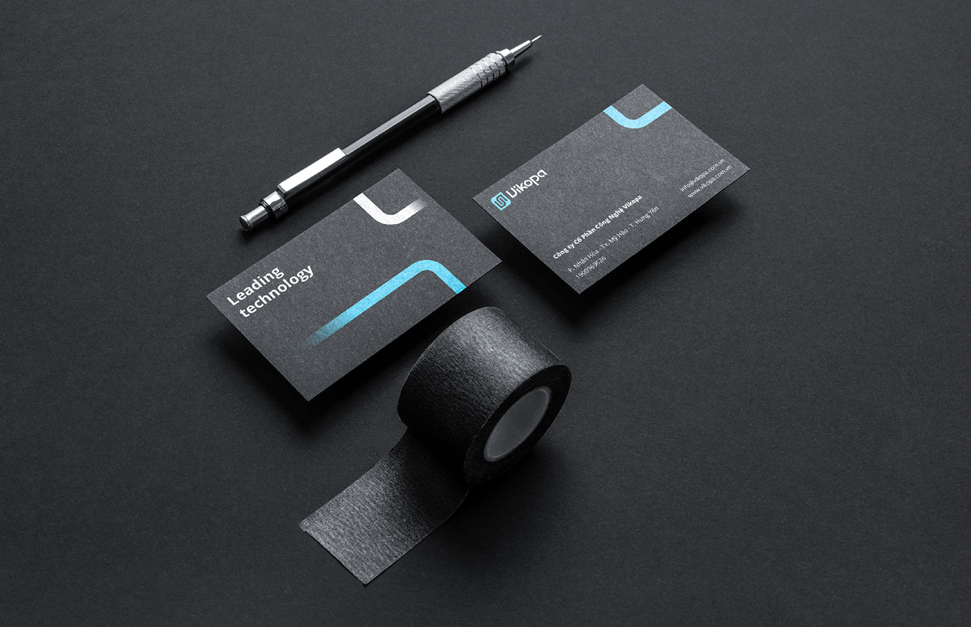
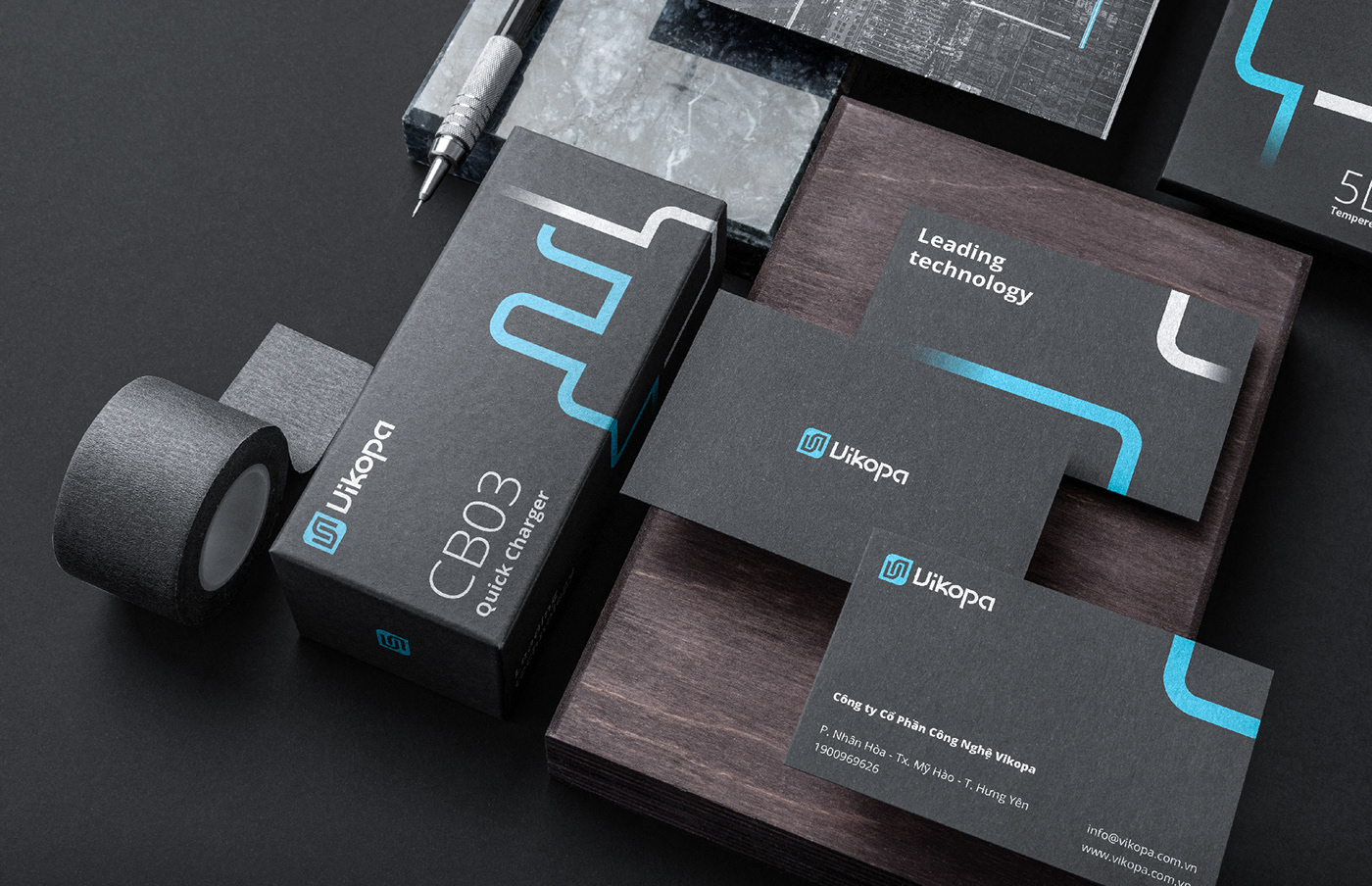
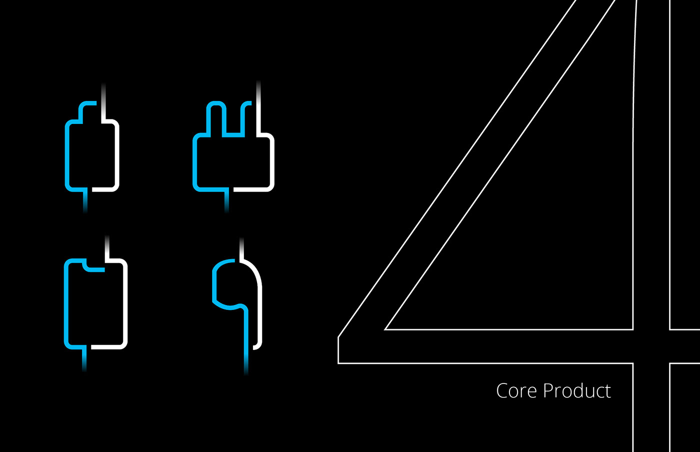
The logo is formed from the first letter of the brand name (the letter V) in a symmetrical direction, bringing a sense of balance, certainty, and prestige, the two stylized "Vs" intertwine representing the connection between Vietnamese - Korean technology in business products. At the same time, it creates an association image for viewers with the resemblance to a "speed line", where the network system and power lines move in space, providing a smooth and satisfying experience.
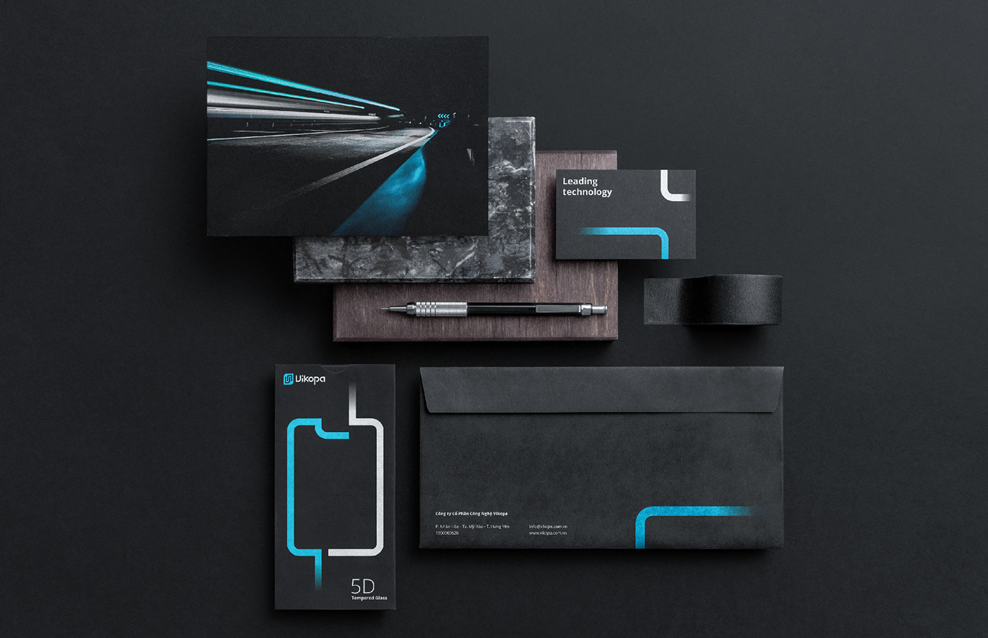
Choosing the standard blue color according to the characteristic of the industry with a neat font creates prestige, and the bright white and blue tones on the black background create a striking effect that captures the eyes of the customer.


Results
Looking at Vikopa's brand identity, it is easy to see the production values that this brand brings, with the "speed" of the brand clearly shown within the logo, a testament to the pioneering, professionalism, and prestigious of each brand's products.


