

Iconography design
This project was to create an icon set of my favorite food items. We know how icons are a crucial part of any design system or product experience. And therefore, designing an icon effectively becomes extremely important. To do this, I began with a research on the various icon styles out there. There are numerous styles including outline (clean, modern strokes), colored (strokes filled with colors), flat style (encompassing clean and subtle lights and shadows), doodle (hand-drawn), long-shadow (shadow on the edge of the icon), gradient, skeuomorphic (inspired by real objects), line-art (using simple narrow strokes of line), etc.
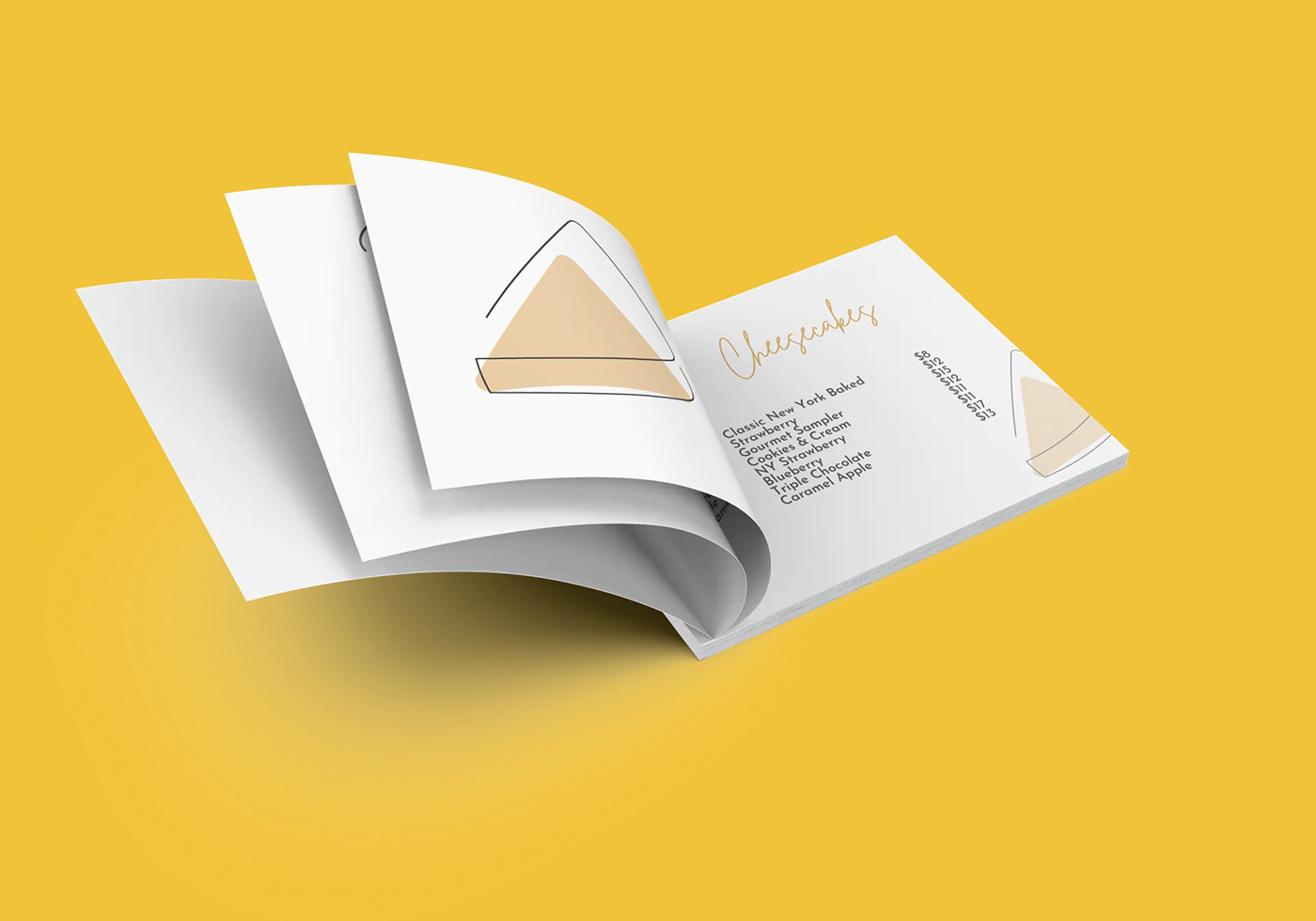
I was keen on experimenting with line-art style and particularly with mono-line (using a single line). I shortlisted some inspirations. Then I decided to combine it with an offset style to bring in some colors in order to break the monotony of mono-line art.

I began by creating some sketches for the icon designs on Procreate and transforming them into vector graphics on Illustrator.


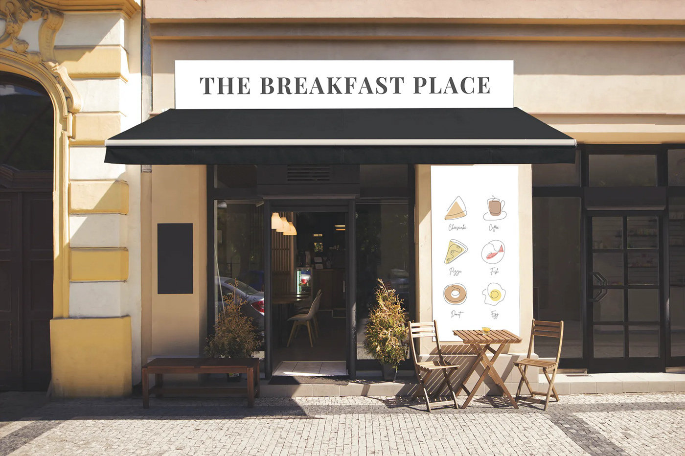
With this project, I had a fair understanding of how to create a neat and uniform icon set. I learnt how to use square and circle key outlines as an icon container. One of the important aspect about an icon set is its consistency. The consistency is not just in terms of weight or stroke, but even in its colors. I learnt how important it is to asses the lines weight, corners size & color palette and maintain it across icons. I also had great fun discovering and experimenting with the line art style and also along the way learnt more about the other styles.


