06 Animation: Logomotion

This project is all about creating a logomotion for the Homemakers campaign that was designed in a branding project. The objective for this project is to make a 30 second video that captures the style, mood and theme that was designed for the Homemakers campaign.
What you can expect:
30 second logomotion video
Design breakdown
Concept
The concept presented to homemakers in the branding project was formed on the design trend, maximalism. Homemakers represents a style for everyone, but their largest target market consists of new homeowners of a younger age group. This fact is what directed the concept for this project. The logomotion is meant to display the eclectic nature of the Homemakers brand. As one ages and changes, so does one’s aesthetic and Homemakers is always there through the change.
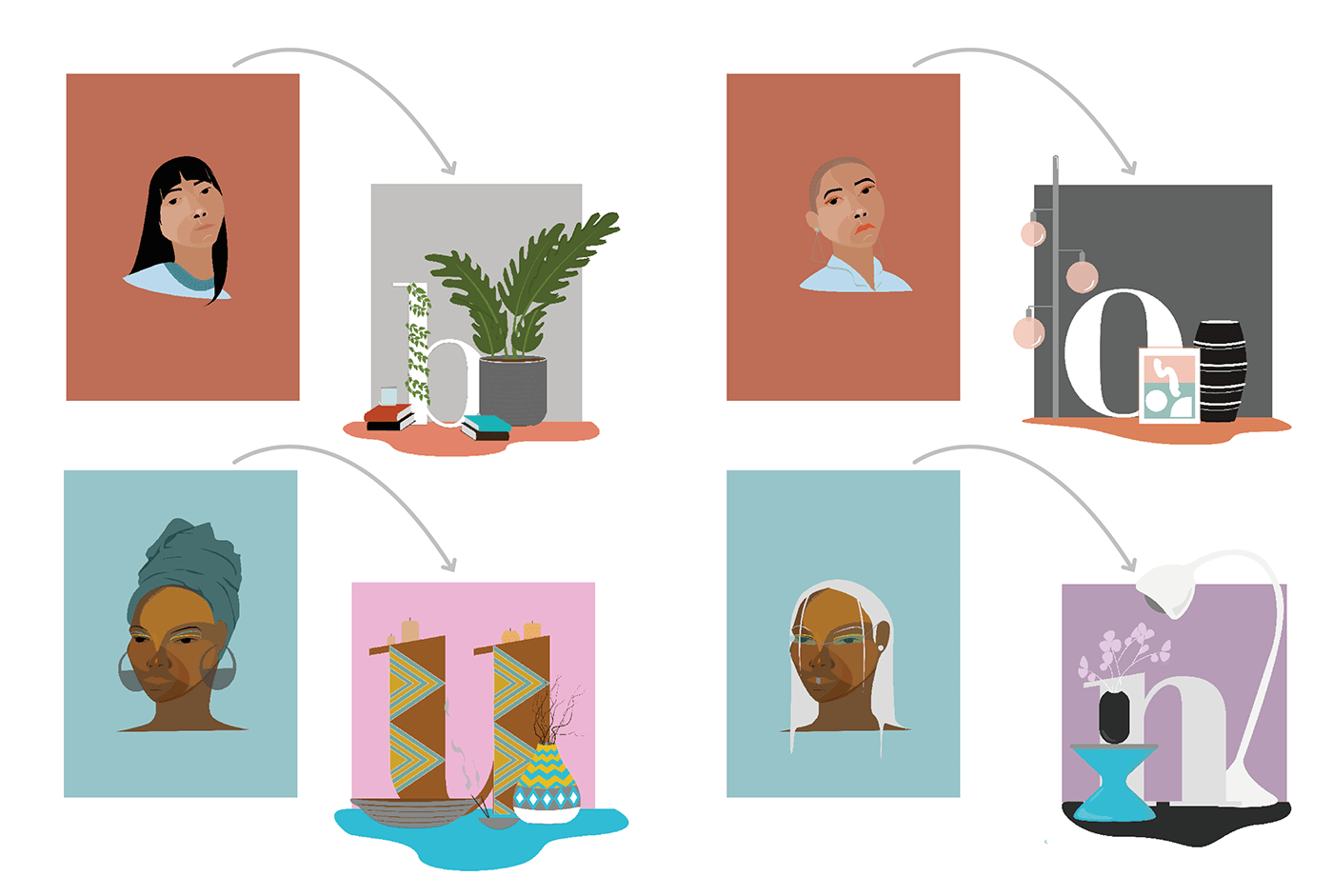
Illustrative breakdown
The characters start of with a style and then change to a style that is the opposite of their previous one. This drastic change was done with intent to highlight the fact that Homemakers is a place for every style and every style change that one person can have.

Logo variation breakdown
The original logo that was design for the Homemakers brand needed to compliment the very busy illustrative style of the campaign and so a minimalist logo was chosen to complement the maximalist visuals. In this logomotion, the logo could be busy because the background was simple. Instead of having a maximalist background, the visuals of the logomotions encompassed a maximalist characteristic.


Connecting the dots
The letters are treated as furniture for each illustrated character, as the character’s sense of fashion and identity changes and as it does, so do the Homemakers’ letters, this solidifies that Homemakers is always there, always prepared for change and eclecticism.