The Old logo
We designed this logo back in 2008 trying to give to creative forward a fresh and delicate style.

The New "Square" logo
Social networks are right now, officially one of the most powerful communication tools.
Trying to adjust our brand to theese running trends we faced a big issue. Our name and logo is very wide to fit in all these square avatar spots. And then came the idea that we need to "think outside the box", to open it.
It was tough to combine the box breaking with the thinking forward name concept.
It was tough to combine the box breaking with the thinking forward name concept.
We used an isometric system to design the box so the viewer could read it from two different angles.
The Isometric angle displays a box built by smaller red and black boxes. Then opening some surfaces
(deconstructing the box) reveals the CF Initials.
The 2D view provides an angle more powerful displaying the CF initials closer to the forward meaning.
(deconstructing the box) reveals the CF Initials.
The 2D view provides an angle more powerful displaying the CF initials closer to the forward meaning.
With this method we achived the initial goal to combine the 2 different purposes Creative Forward has.

Implementations

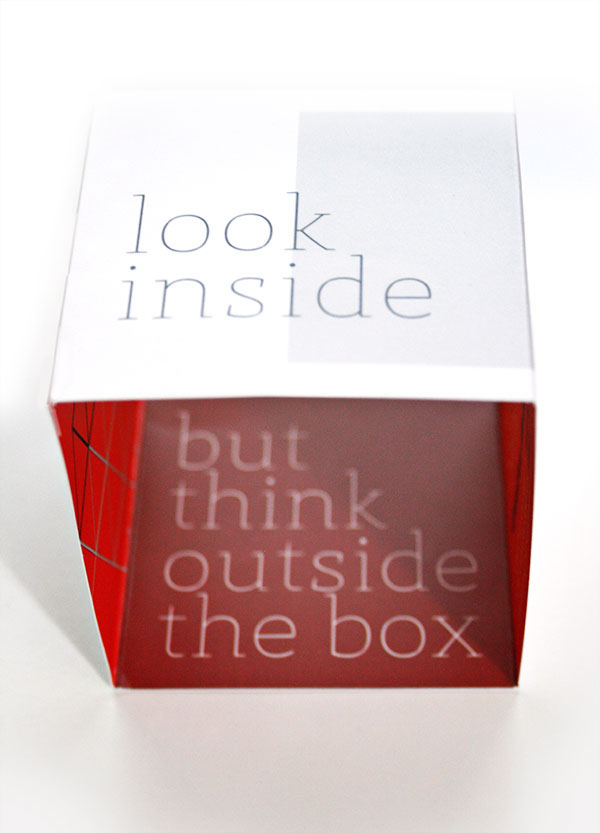
The "box" card
One of the strongest aspects of communication is innovation. You cannot refresh your image without bringing something new. The most suitable part of stationary to do so is business card. So we designed two different cards, one a little bit formal for the wallet use and the other, for the desk use. The second one is based on the "think outside the box" concept. Is a single gatefold card glued, with two extra creases in the center of each side. The concept follows the guidelines by influencing the audience to "look inside". When you press the edges to do so, that transforms to a 4 sided box inside of it is written "but think outside the box"


Stationary

DL Envelope


Invoice


