


About
Back in 2013 I created this simple and minimal identity as part of my portfolio redesign (see last board above).
You may have originally liked this, but I felt it was in need of a facelift.
I originally combined my initials JA and fused this with a shape representative of nature. The shape you see here represents a leaf or a petal. I evolved the logo structure by linking the two letters using points and angles. It is flexible to work as an outline, occupying space in either black or white.
A leaf of course, is part of foliage, a thin flatted organ, maximising the surface area directly exposed to light. In this instance the light represents the digital landscape - which has now become a metaphor for my identity.
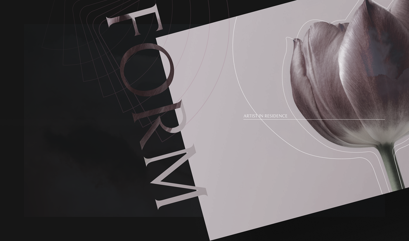
It’s now 2024 and I wanted to update the boards and move the branding forward by combining elements with my own photography. I was interested in unconventional layouts, with an elegant yet informal style that evolves the branding to become more responsive, whether that be for tablets, phones or print.
All but one of the images are my own. Credit to RoonZ nl for the tulip shot.
All but one of the images are my own. Credit to RoonZ nl for the tulip shot.


