
In my novel 'Insangel', 'Incorporeus' is a fictional language spoken by some of the characters (art and words relating to my creative writing can be found at www.garethcarter.com/creative-writing). However, to the reader, it is intended to give a sense of the unknown more than being an actual functioning language. Therefore, practically speaking, it works like a substitution cypher in that a certain symbol represents 'A', another represents 'B' and so on.
Incorporeus is actually my second typeface of similar purpose, the first being 'Shadow Walker', in which the glyphs are based on a consistently sized circle.
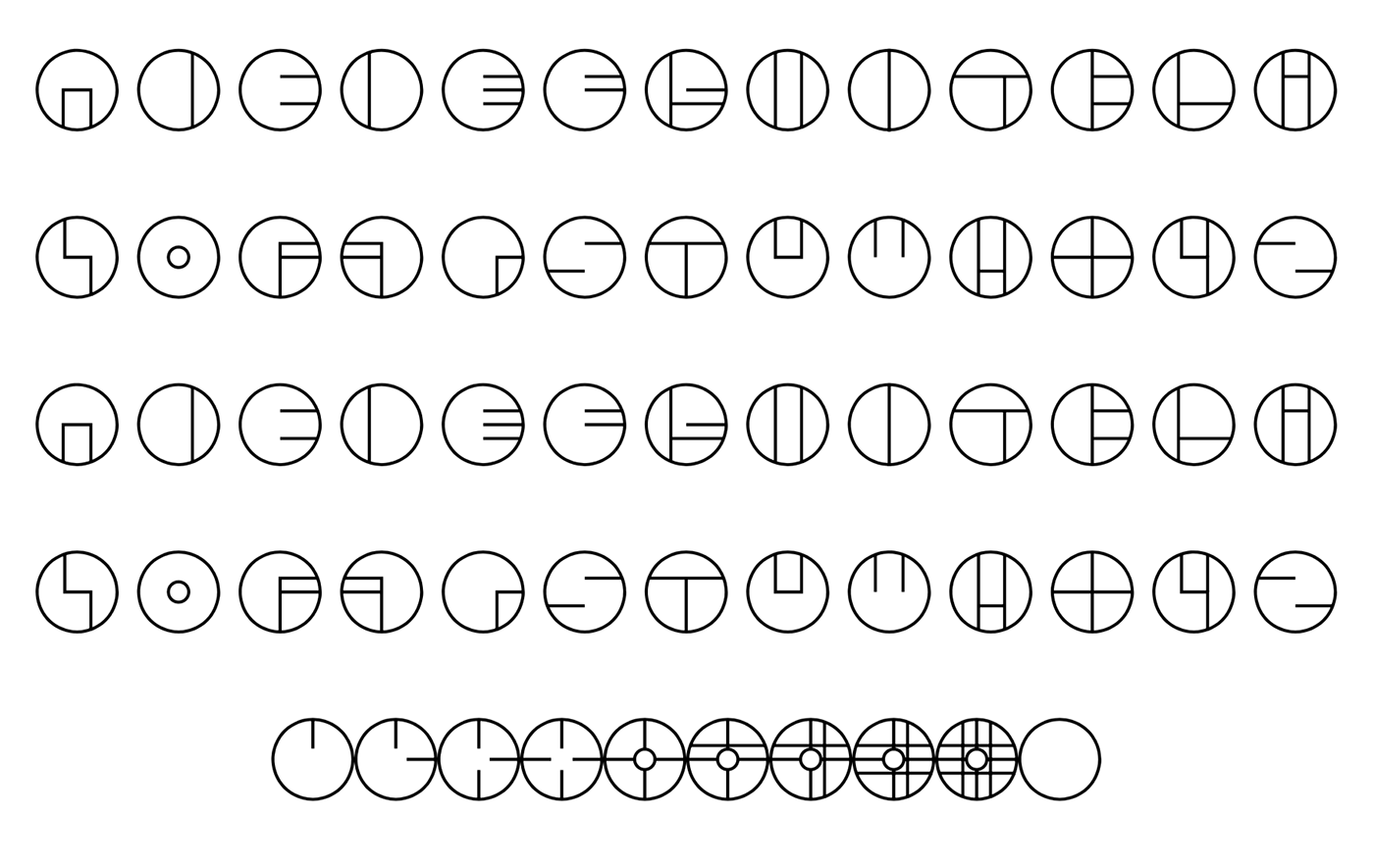
'Shadow Walker' typeface
These are my initial pencil sketches for the Incorporeus typeface. Graph paper was used because, like with Shadow Walker, Incorporeus was intended to be monospaced with each glyph filling the same square of space.

Initial sketches
This is an example of how the guidelines are positioned around the glyphs. Only a handful of glyphs extend above the x-height or below the baseline, for example 'A' (as seen below), which does the latter.
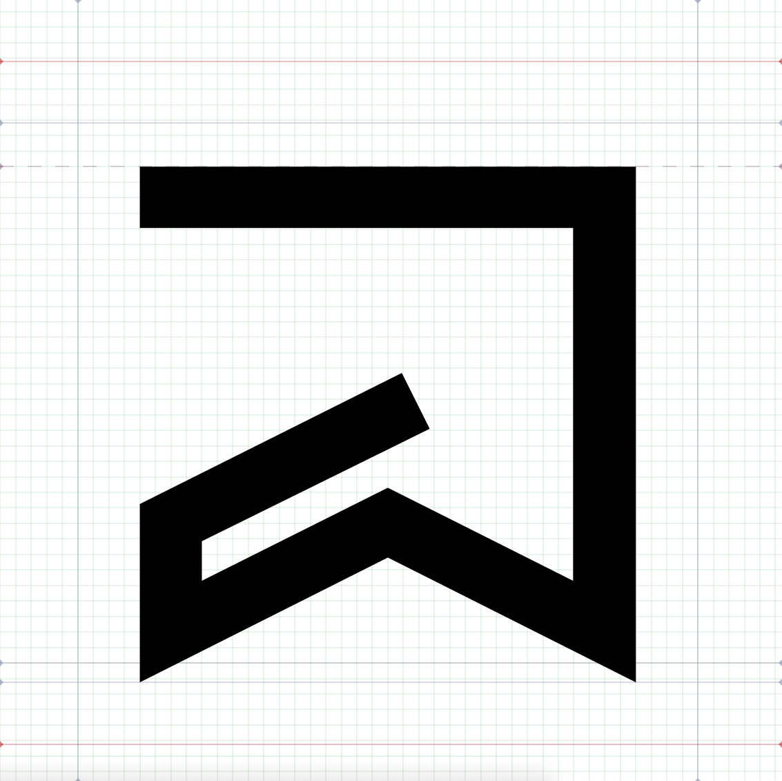
Glyph 'A' creation in 'Birdfont'
As is usual for me, consistency was of paramount importance, resulting a rigid set of rules for how the glyphs interact with the guidelines (which remain the same throughout). To demonstrate this, I have included the entire glyph set with the guidelines marked out on each.

From left to right, top to bottom: 0 1 2 3 4 5 6 7 8 9 A B C D E F G H I J K L M N O

From left to right, top to bottom: P Q R S T U V W X Y Z ' ( ) : , ! / . ' ? ; " " "
NOTE: Two variants of apostrophe-like symbols, left speech marks, neutral speech marks and right speech marks.
Below is the completed typeface without guidelines, thereby offering an unobstructed view of each glyph. Some of the glyphs were loosely inspired by their real world equivalent, such as 'D', 'F' and 'R'.

From left to right, top to bottom: 0 1 2 3 4 5 6 7 8 9 A B C D E F G H I J K L M N O
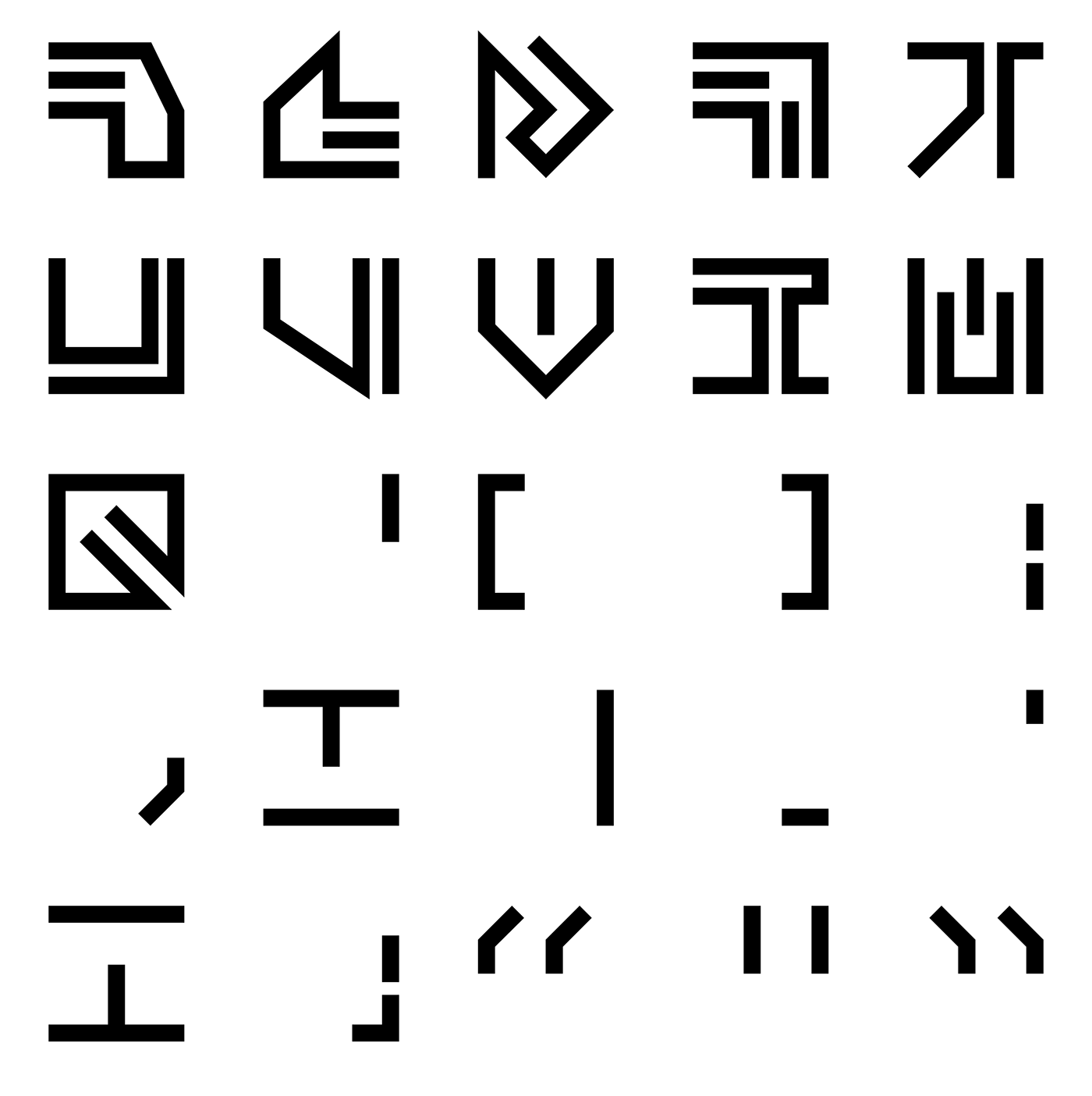
From left to right, top to bottom: P Q R S T U V W X Y Z ' ( ) : , ! / . ' ? ; " " "
NOTE: Two variants of apostrophe-like symbols, left speech marks, neutral speech marks and right speech marks.
This is a page of 'Insangel' that features the typeface within the story itself. The font size is smaller than Garamond, which I used for the legible parts, so it had to be increased to compensate. This wasn't a huge issue because the typeface does not appear a huge amount of times besides the header of each page and is, as stated before, designed for aesthetics over legibility.

Extract from 'insangel in which the typeface is used in the story itself. Note that it is also used in the header on every page.
The same page in an earlier proof copy I had printed features an older version of the typeface. One of the main differences is the equivalent for 'Y' was not square like the rest (one example can be seen second row Incorporeus row down second glyph across on the left page), which was fixed in later revisions of the typeface. There were also a visible error in 'G' only discovered after printing (Sixth letter in the header. The error is one of the vertical lines being detached from the rest of the glyph.), which was caused by the glyphs being made of multiple parts in the font software. This was fixed by combining all the shapes into one.

The letters and numbers were reorganised into a 6x6 grid and featured on my Redbubble store, available on a variety of products such as this baseball t-shirt. As with the proof copy of the book, seeeing them in printed form gives a sense of pride not felt when viewing them on a screen.

A-Z and 0-9 organised into 6x6 grid and printed onto a baseball t-shirt via Redbubble


