


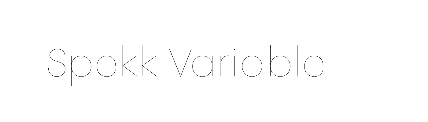
PF Spekk
Variable, Warm, Unconventional
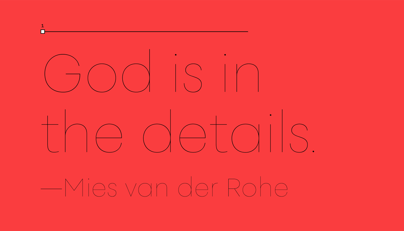
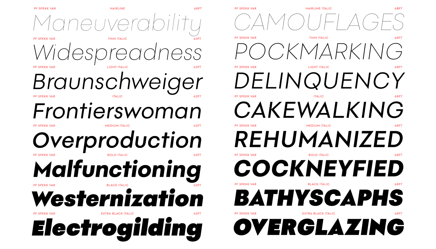
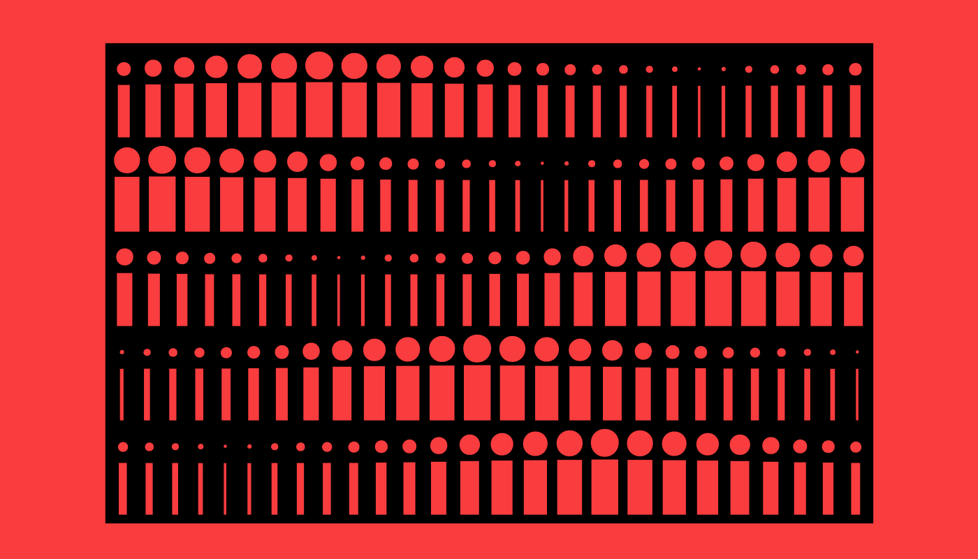
Intricate type design is out, simple letterforms are in. In the past few years our attention has moved away from complicated letterform designs back onto shapely simple forms and PF Spekk –Parachute's latest release– is an answer to this ongoing visual trend. A geometric variable typeface tastefully revived from early 20th century archives, Spekk encapsulates the sheer tension among squares, triangles, and circles at its core. Blended with the smooth curved strokes which end up in horizontal terminals, or the open counters with optimized aperture which preserve legibility at small sizes, Spekk manifests a warm and friendly personality, something we do not often encounter in the monoline geometric genre. Spekk’s idiosyncrasies/merits include shortened capitals, consistent geometry in the entire set of styles, and intuitive italics.

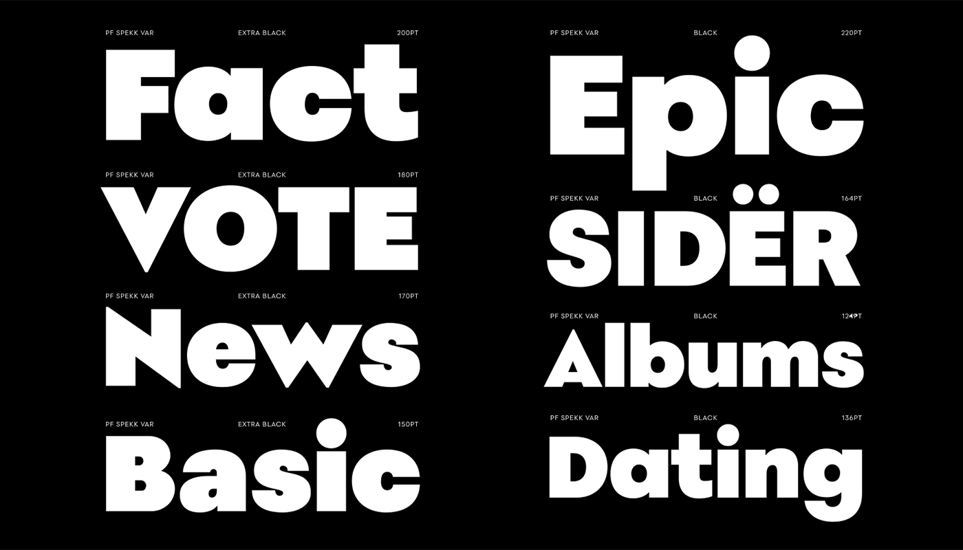
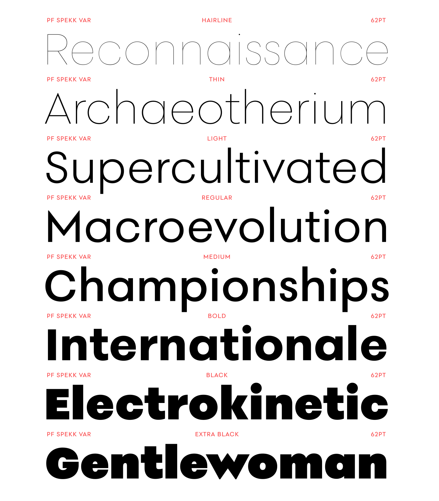
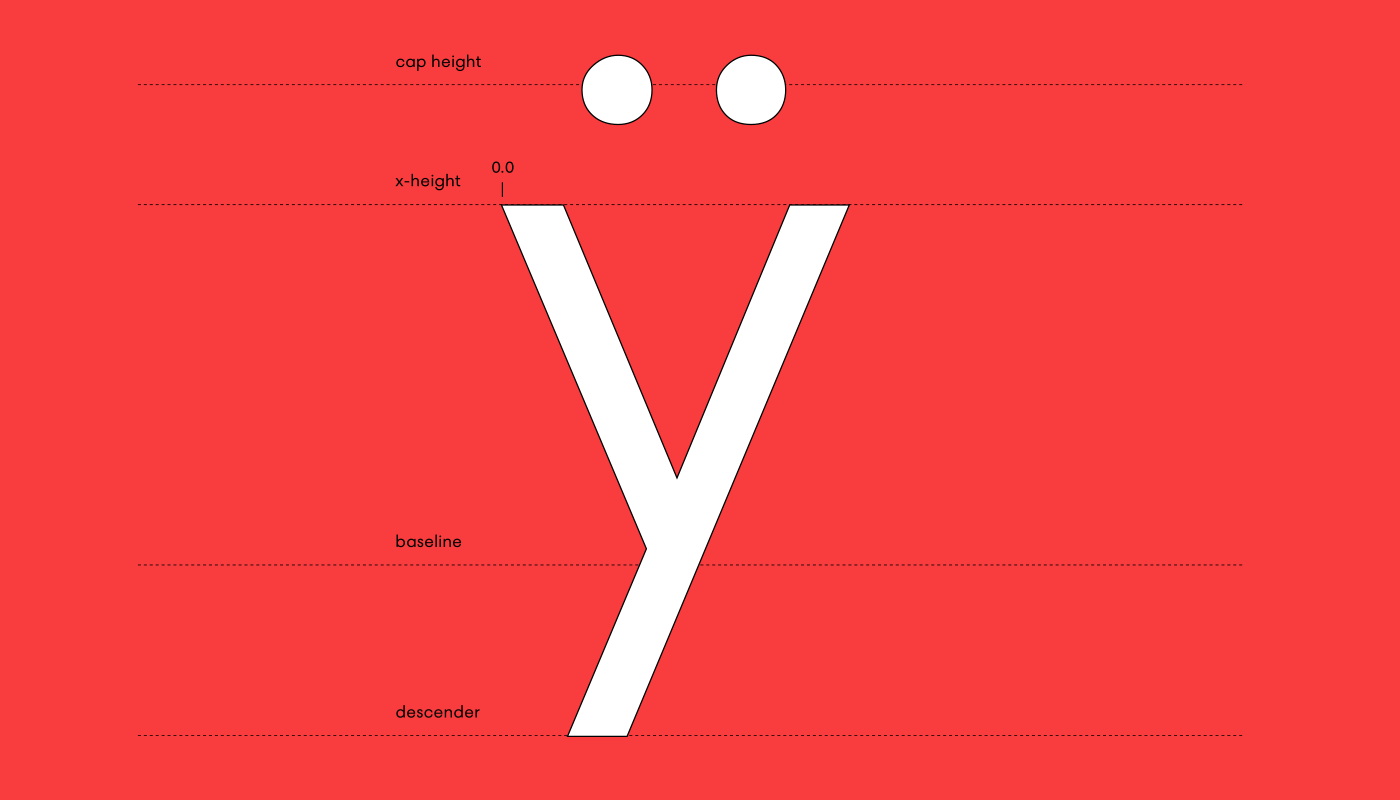
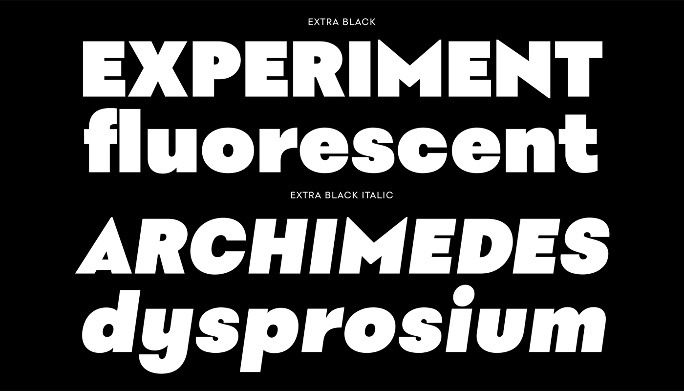
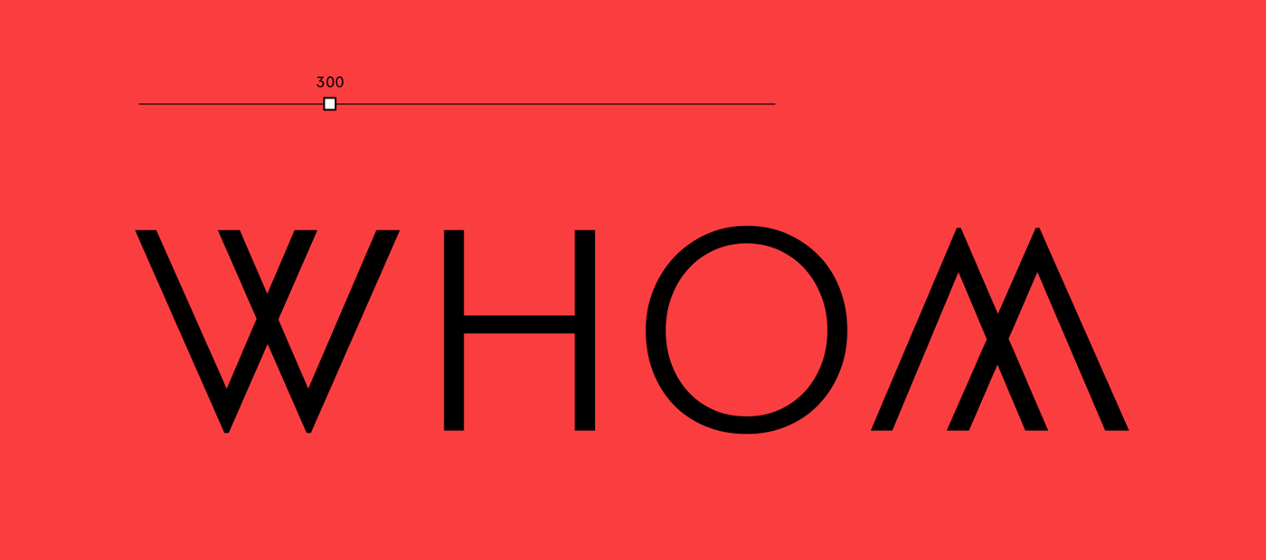
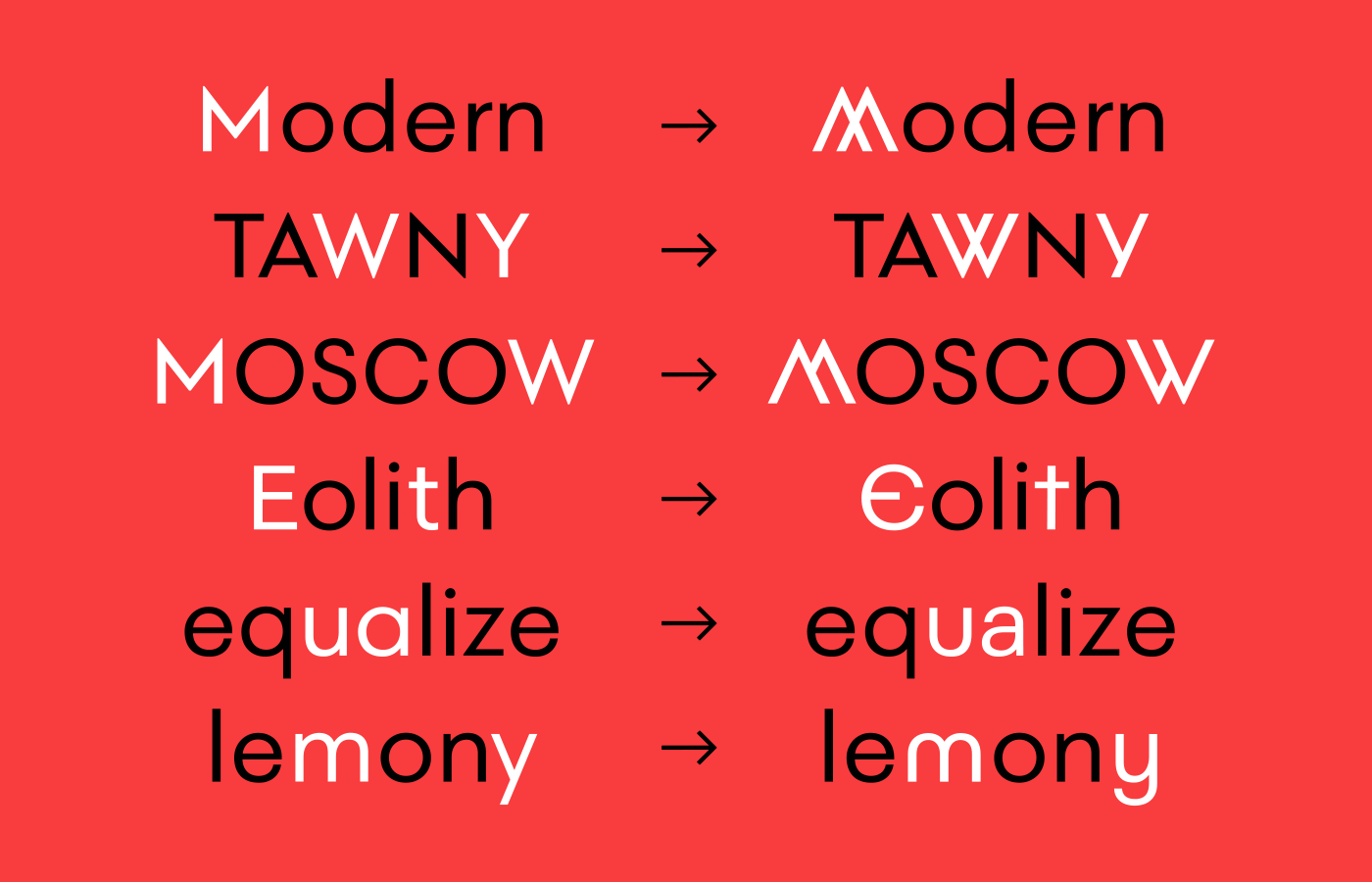
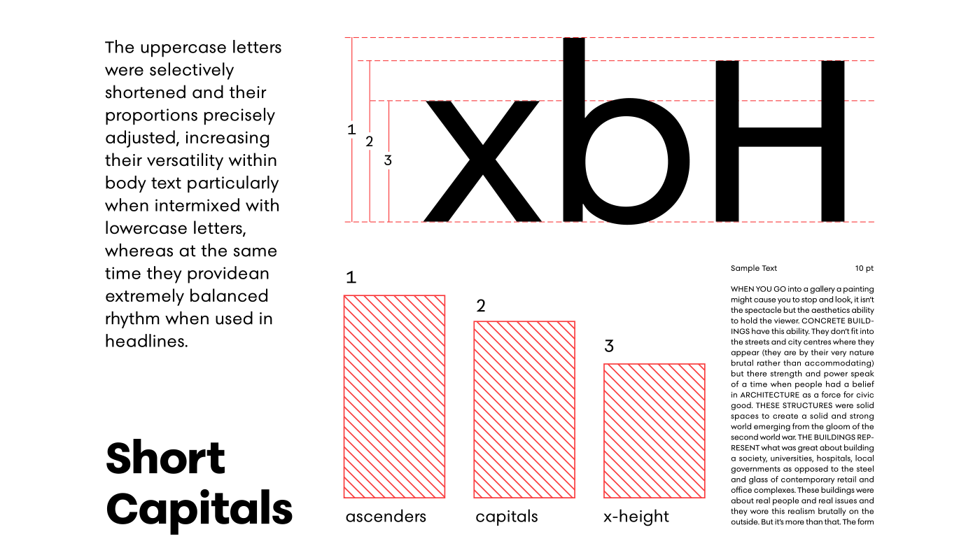
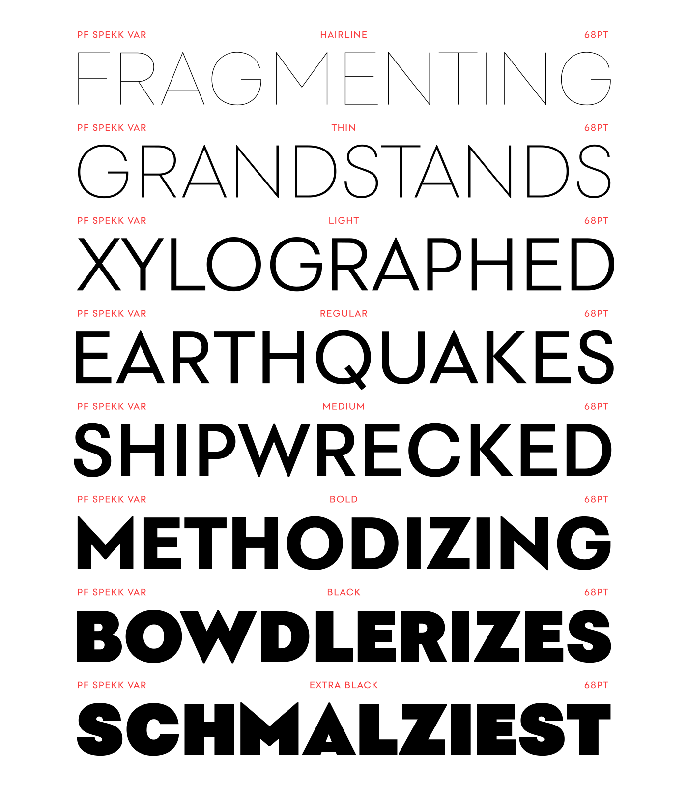
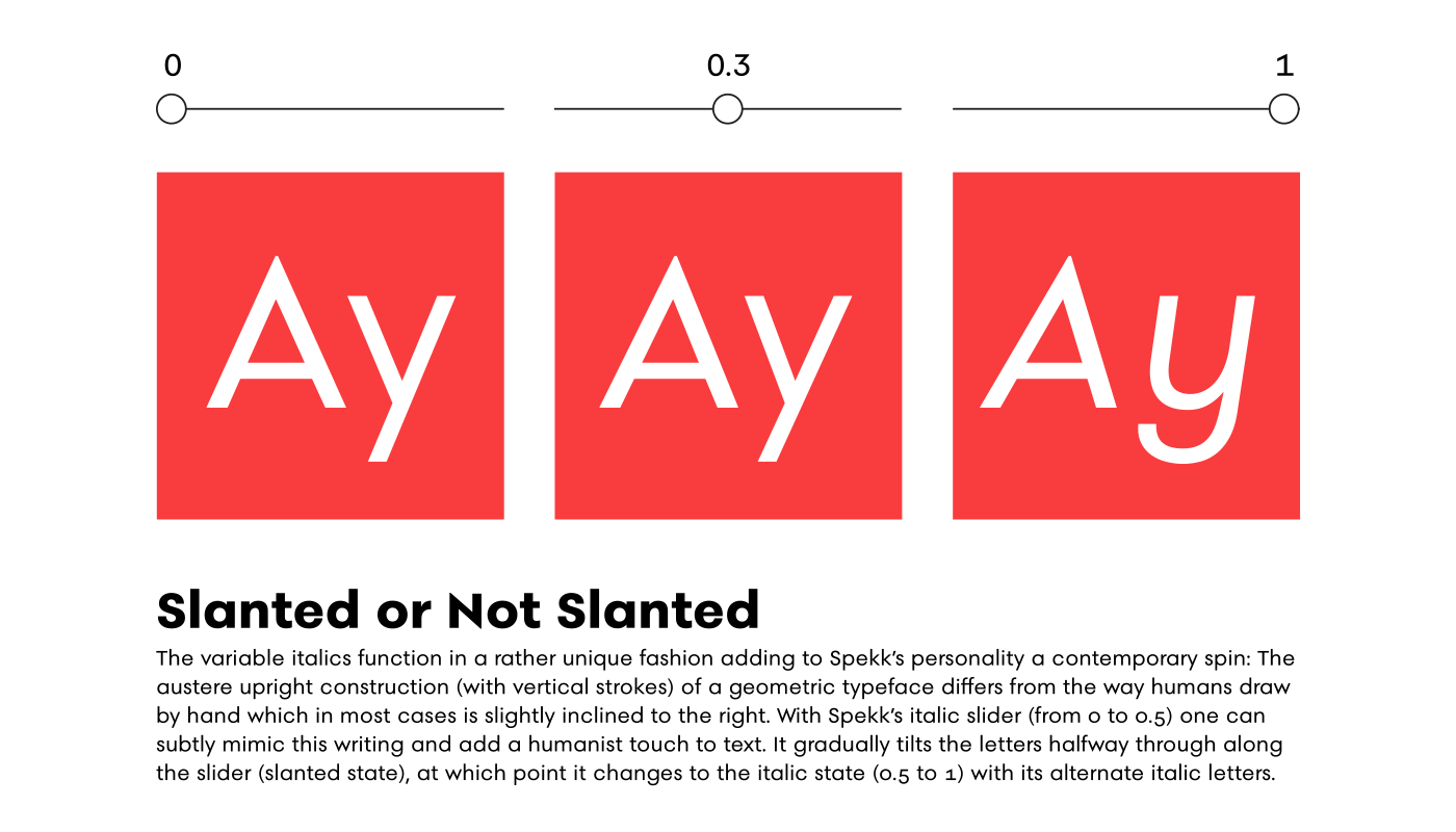
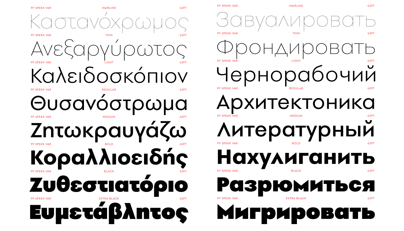
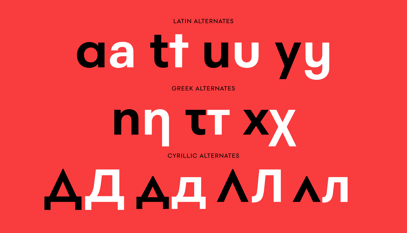
The typeface's uppercase letters were selectively shortened and their proportions precisely adjusted, increasing their versatility within body text when intermixed with lowercase letters (in place of small caps), whereas at the same time they provide an extremely balanced rhythm when used in headlines. Meanwhile, the geometry of sharp-pointed letters such as A, M, N, V, W is consistent throughout, against the conventional practice to square-off the acute details at heavy weights. The variable italics function in a rather unique fashion adding to Spekk’s personality a contemporary spin. The austere upright construction (with vertical strokes) of a geometric typeface differs from the way we humans draw by hand which in most cases is slightly inclined to the right. With Spekk’s italic slider one can subtly mimic this writing and add a humanist touch to text. It gradually tilts the letters halfway through along the slider (slanted state), at which point it switches to the 'italic state' accommodating alternate italic letters. Spekk’s design space includes 2 axes, weight and italic, and is available as a variable font or as a separate OpenType family. The typeface comes with 8 standard weights spanning from Hairline to Extra Black whereas it supports an extended array of languages and scripts such as Latin, Greek, Cyrillic. PF Speck is a warm, versatile, precisely engineered contemporary typeface that reads amazingly well both in print and on-screen.


MORE ON PF SPEKK
Check out the 100-page comprehensive specimen manual:
Also:


