

PT
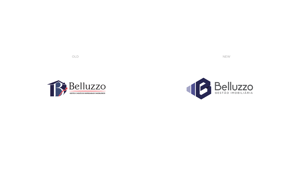
Belluzzo - Gestão Imobiliária cuida e gerencia imóveis desde 2009, além de casas e prédios, o foco também é a gestão financeira. Com o crescimento da empresa nesses anos, surgiu a necessidade de revitalizar a marca.
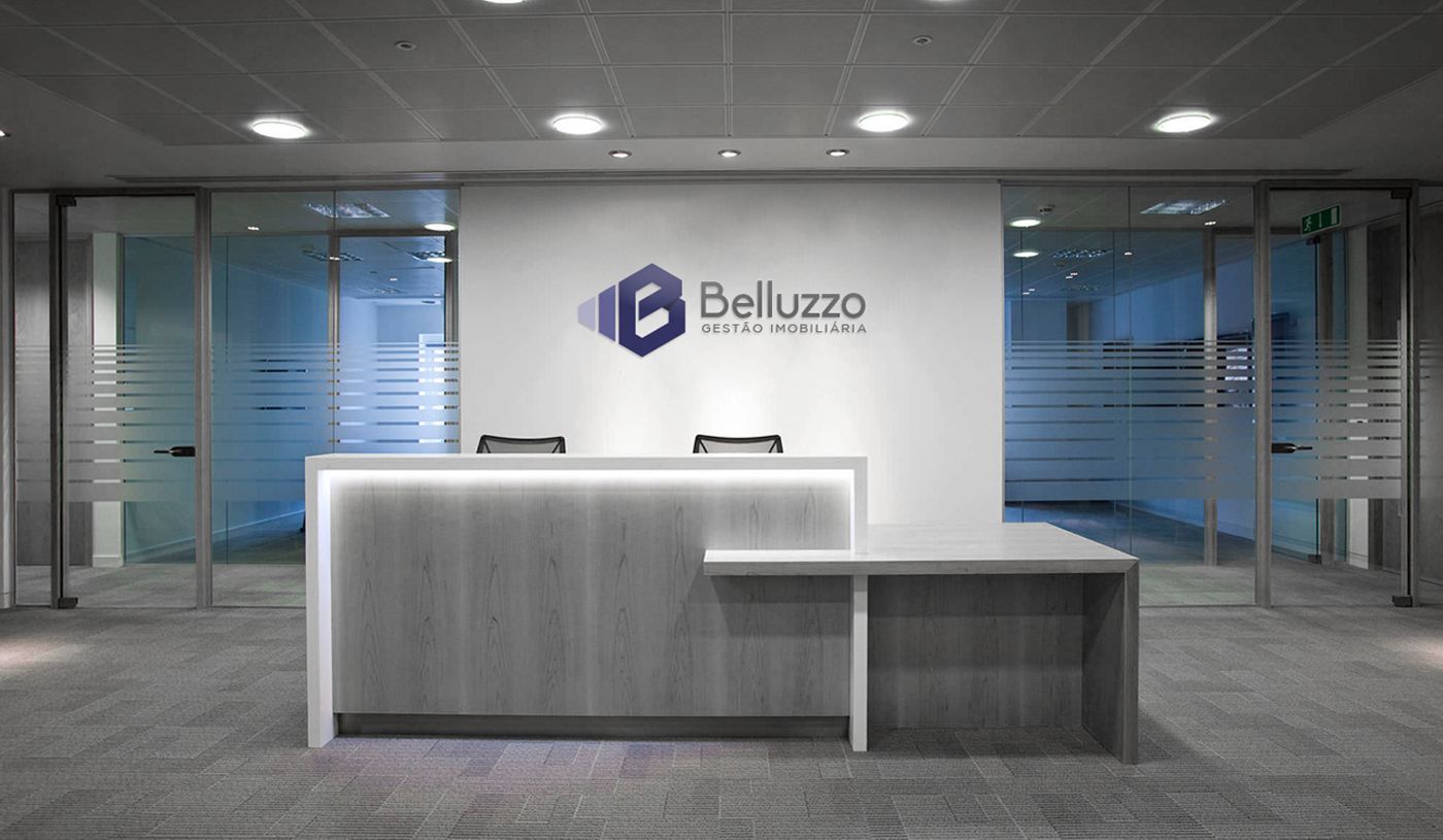
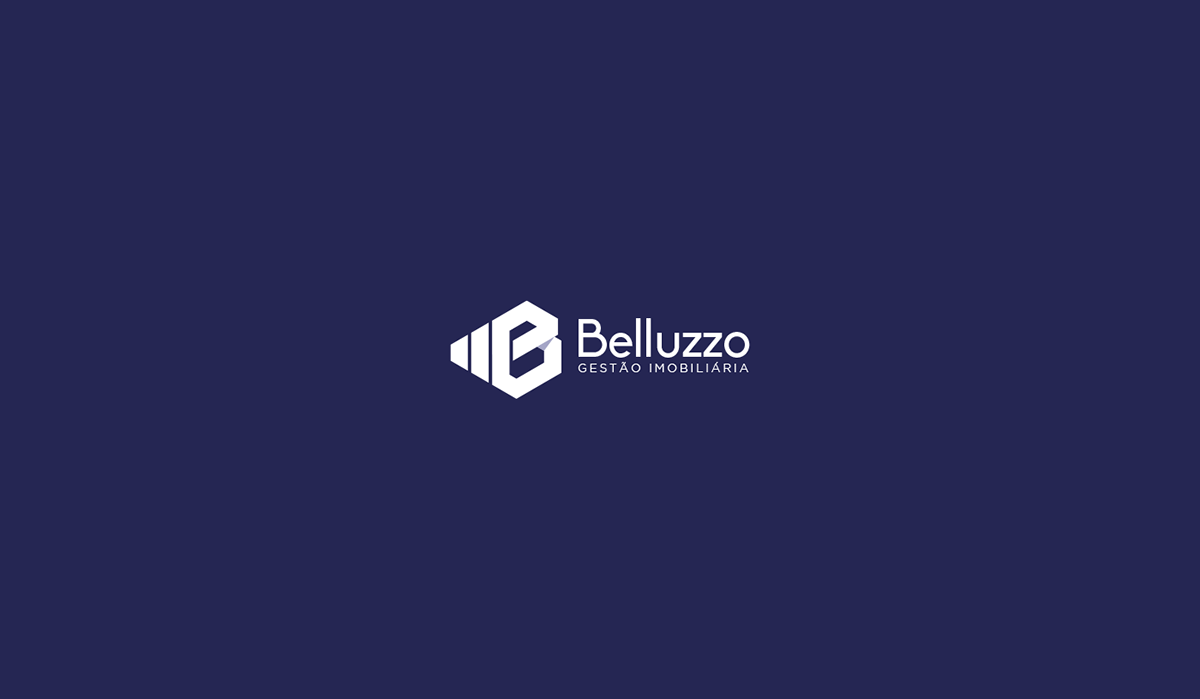
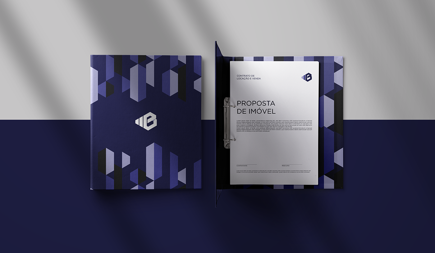
O objetivo era criar um logo forte, que expressasse o DNA da empresa. Pensando nisso foi criado um símbolo em grid isométrico que reúne as ideias de imóveis alinhados no horizonte e gráficos financeiros, assim formando a letra "B" que é a inicial do nome da empresa. A composição é moderna e consistente, assim como a empresa quer ser vista por seu público.
ENG
Belluzzo has been looking after and managing properties since 2009, in addition to houses and buildings, the focus is also on financial management. With the company's growth in these years, the need to revitalize the brand arose.
The goal was to create a strong logo that would express the company's DNA. With this in mind, an isometric grid symbol was created that gathers the ideas of real estate aligned on the horizon and financial graphs, thus forming the letter "B", which is the initial of the company name. The composition is modern and consistent, just as the company wants to be seen by its audience.


Obrigado! Thanks!


