

Sol — Brand Identity
As a Brazilian expat living in London, quarantine has made it especially hard being away from family and friends. I wanted to do a tribute to my home country and that's how Sol was born.
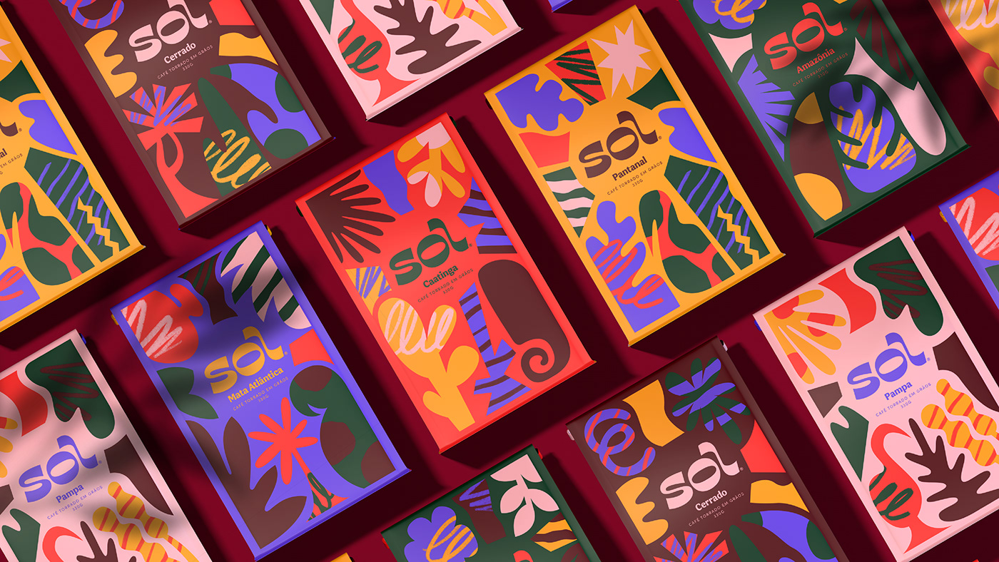
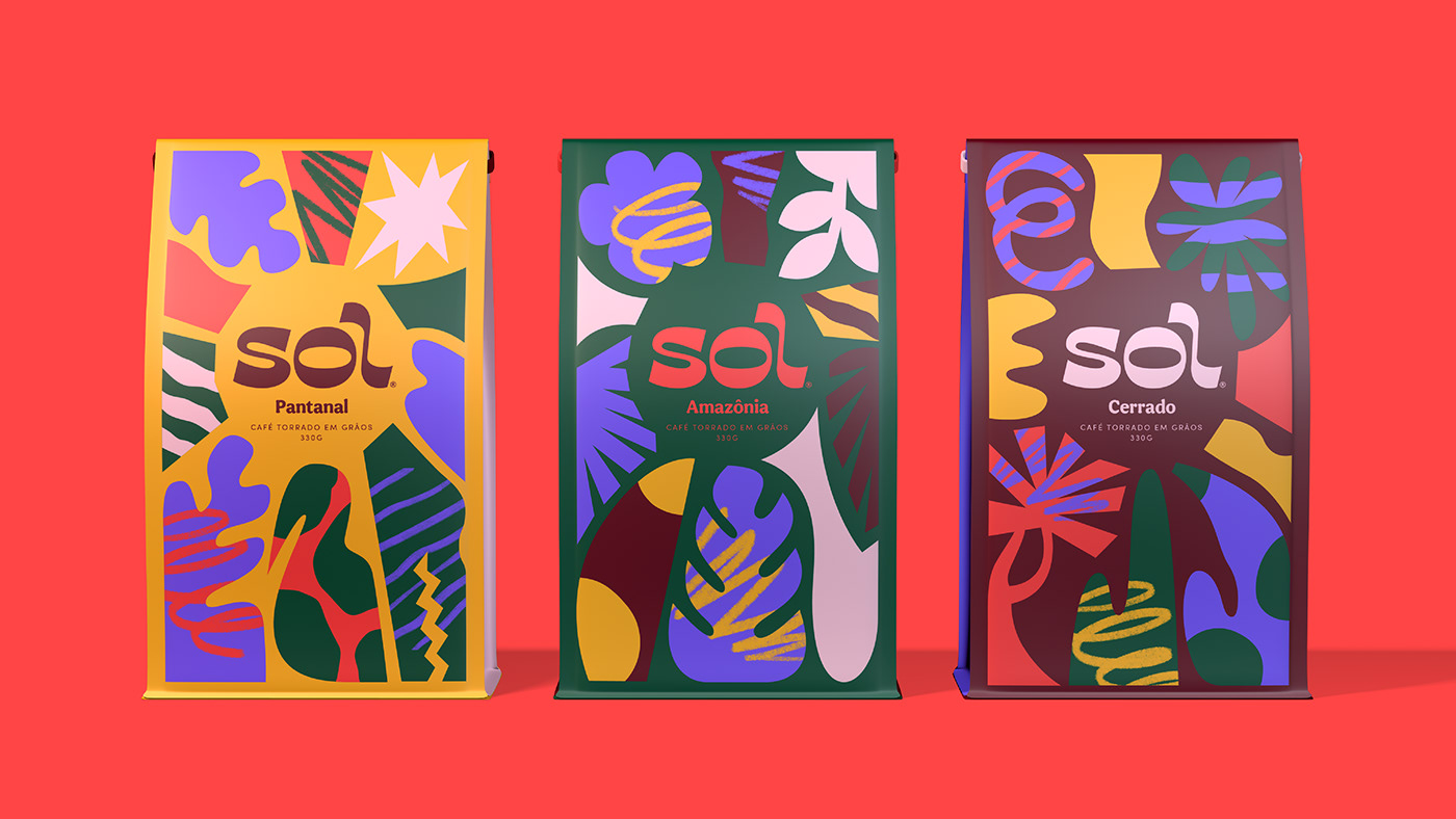
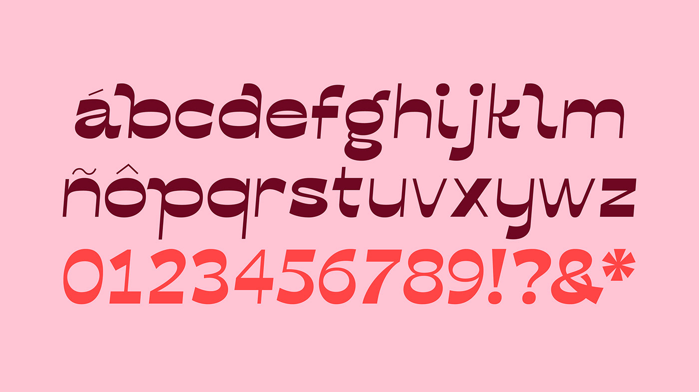
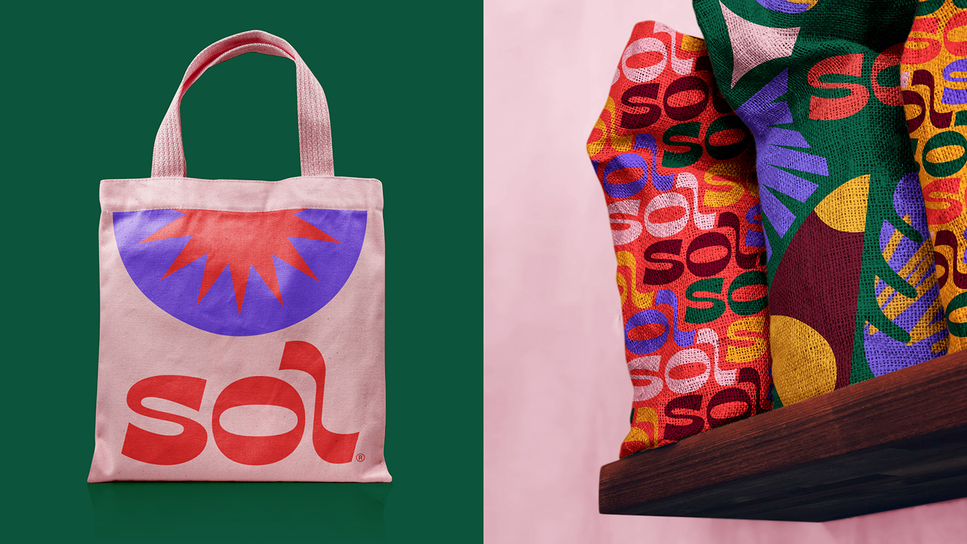
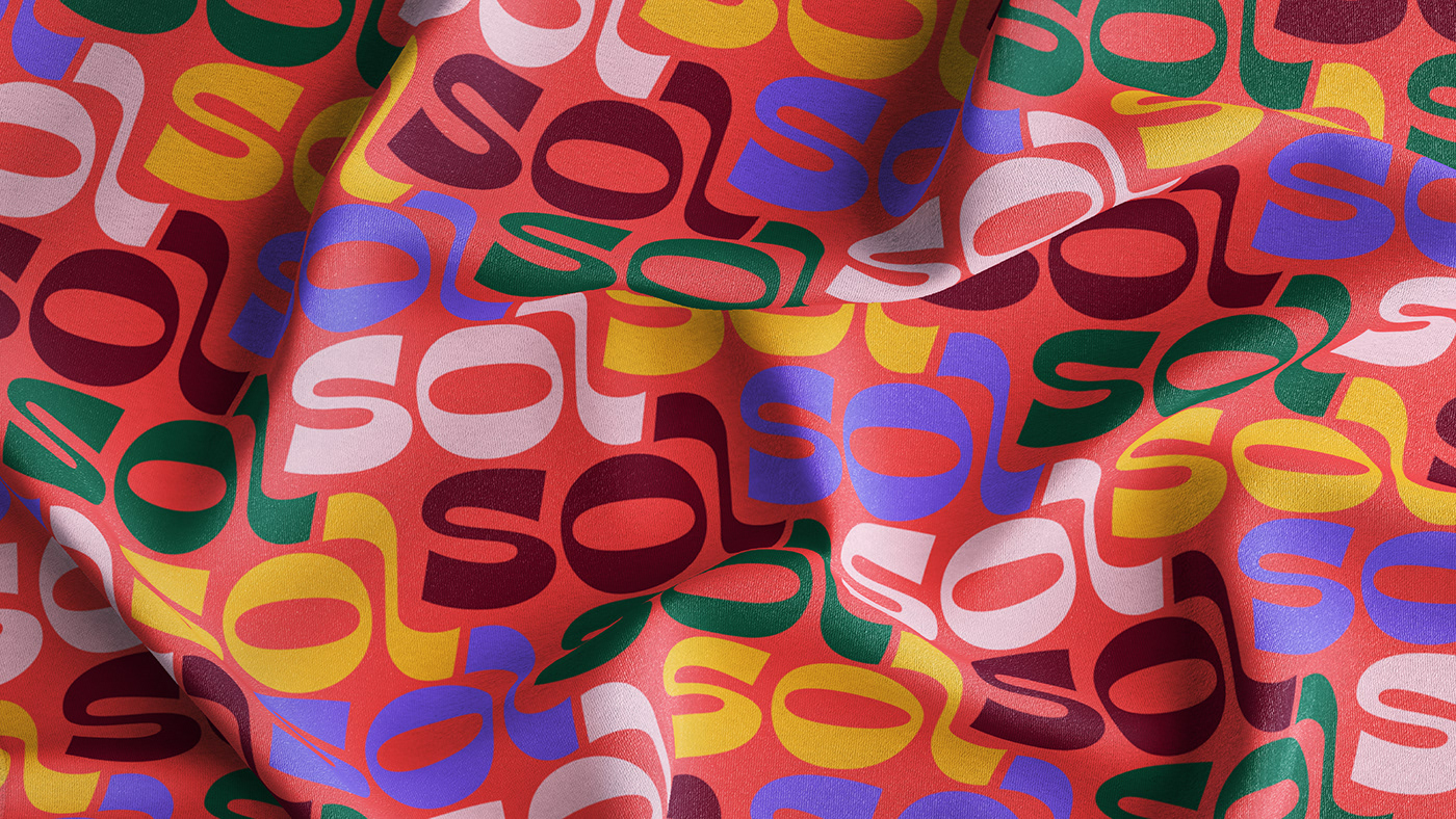
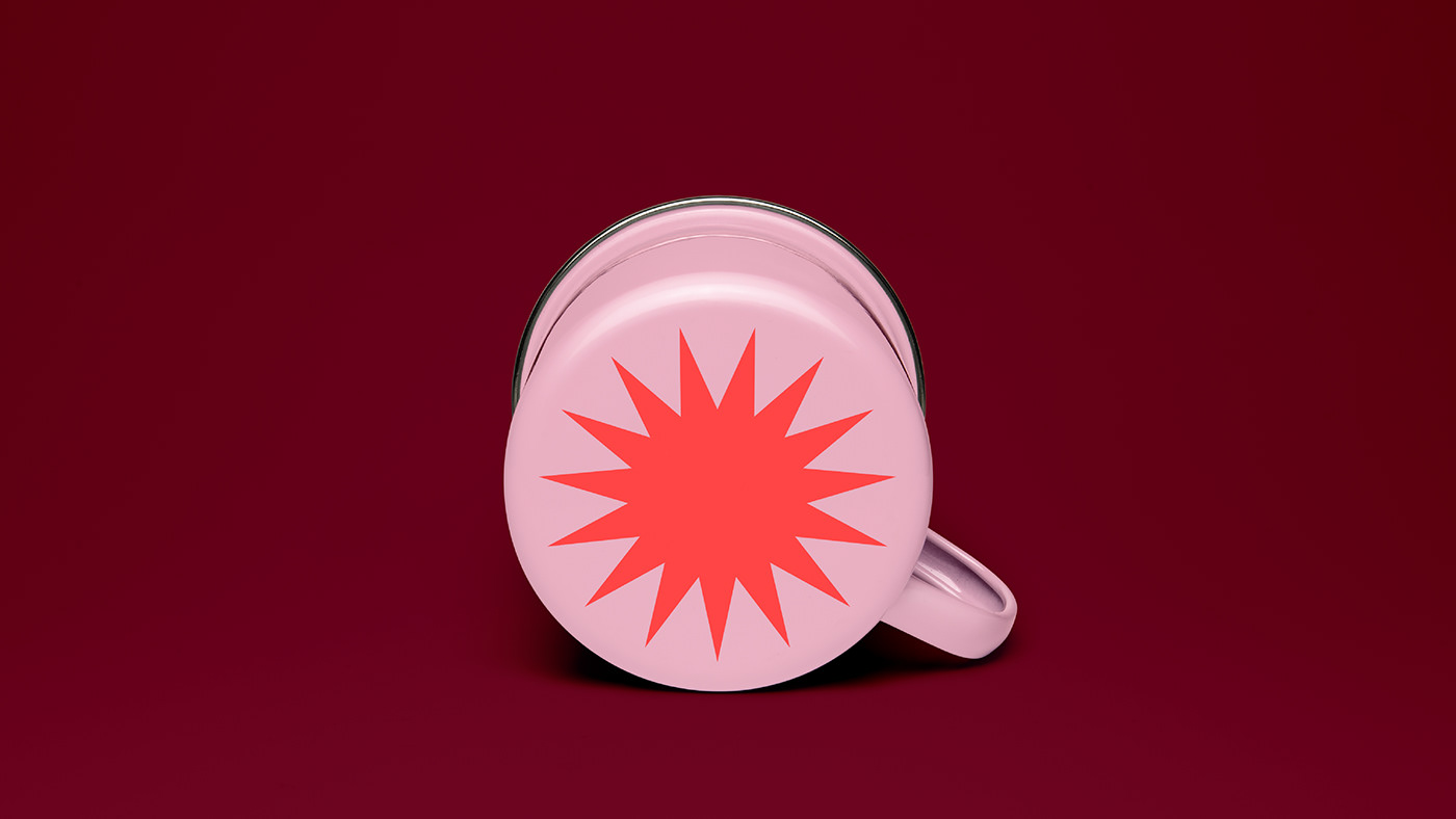
Sol, which translates to "sun”, is a concept coffee brand inspired by the diverse colours and flavours of Brazil. The wordmark takes inspiration from the sinuous shapes of its natural and urban landscapes, followed by a custom bold display typeface.
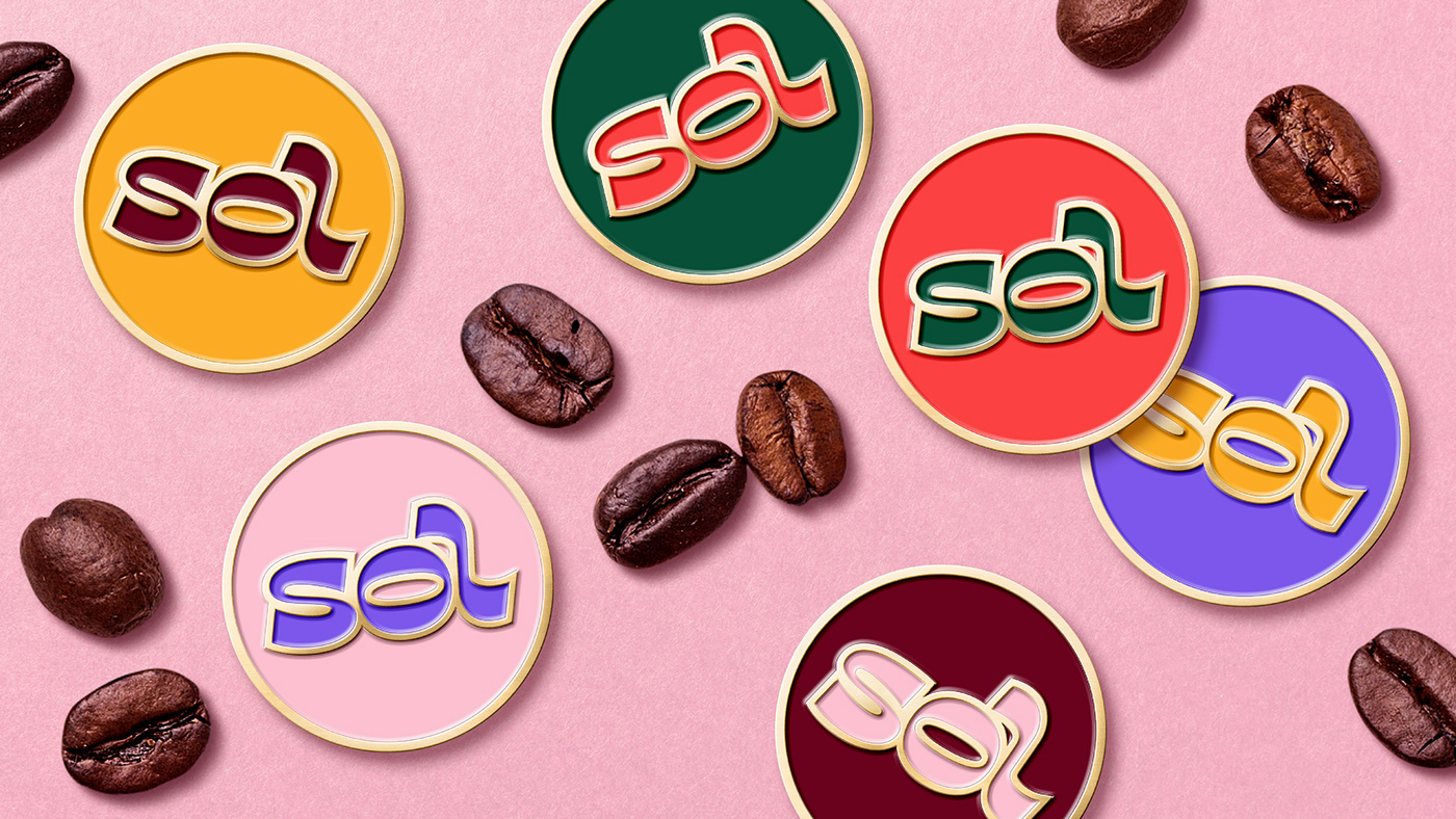
Sol’s flavours are inspired by the 6 regions of Brazil - Amazônia, Pantanal, Cerrado, Mata Atlântica, Caatinga & Pampa - and their native fauna, flora and ingredients. With an expanded colour palette that is a modern interpretation of the flag's green, yellow and blue, all elements come together on the packaging, keeping the wordmark centred as a source of life and growth.


Personal Project, 2020
DESIGN & ILLUSTRATION
Lilia Quinaud
Lilia Quinaud
RESOURCES
Unsplash
Shutterstock
PixaBay
Adobe Fonts
Layers.Design
GraphicBurger
Creative Market
Mr. Mockup
Unsplash
Shutterstock
PixaBay
Adobe Fonts
Layers.Design
GraphicBurger
Creative Market
Mr. Mockup
FEATURED ON
Follow me on Instagram: @quinaud


