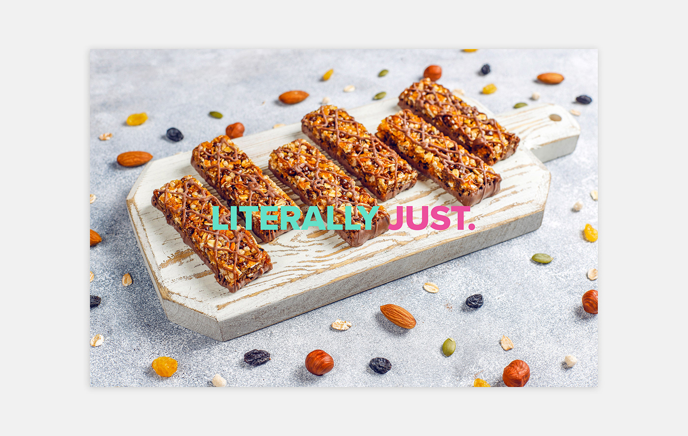
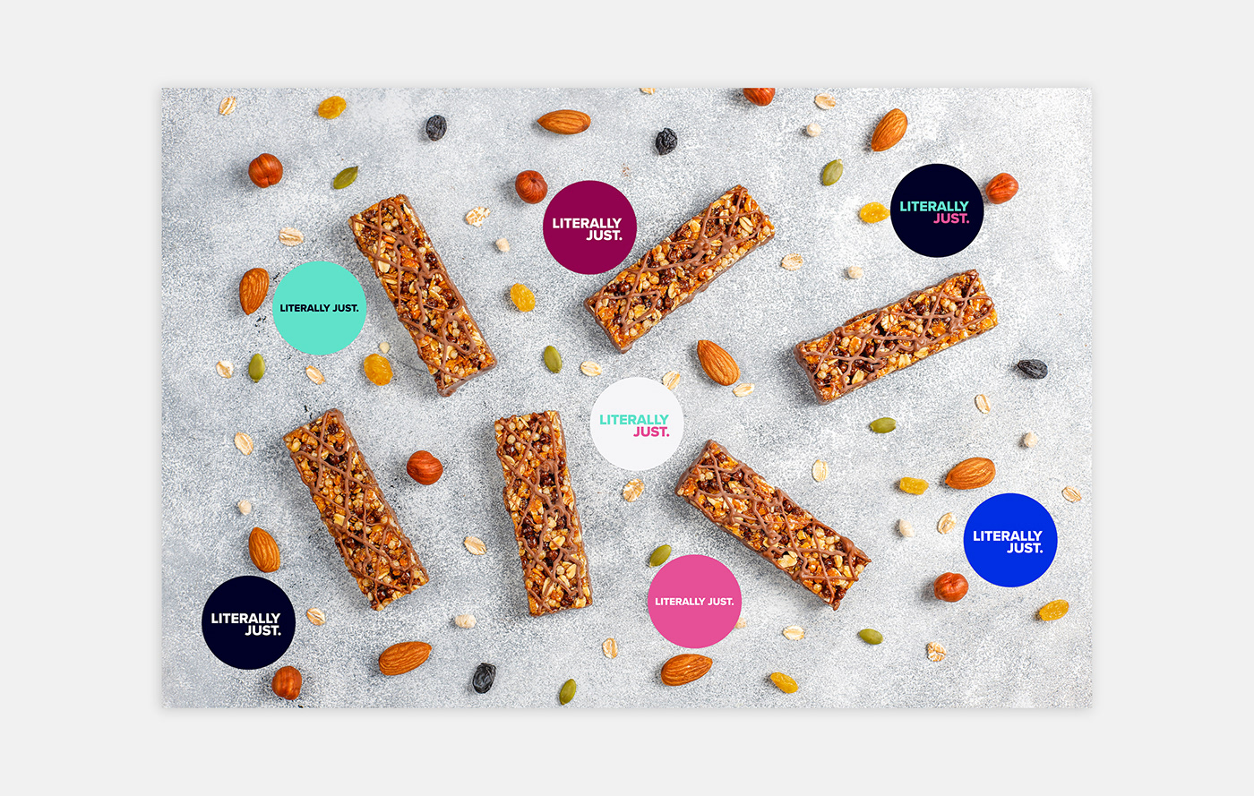
LITERALLY JUST.
A health product that looks to disrupt the market by being bold yet simple in its ethos. The message is using ('literally just') basic ingredients for food products; beginning with a granola range and expanding into bars and other health foods.
The founder wanted something simplistic but striking and had a vision that they wanted to create around the health, fitness and busy schedules of people's lives. An identity needed to be created with particular focus on packaging and stickers.
THE BRAND
Using striking colour palette that breaks the 'norm' of health products, Literally Just. looks to stand out in a crowded marketplace and offer something visually appealing with a minimalist aesthetic. Typography is the main player here and a clean sans-serif typeface has been chosen that is versatile, bold and readable across digital & print media.
A colour palette has been created to reflect the different types of product with two primary colours taking the centre stage for the brand; a crisp mint & bold pink to attract the attention of the target market - fitness fanatics and concious eaters.