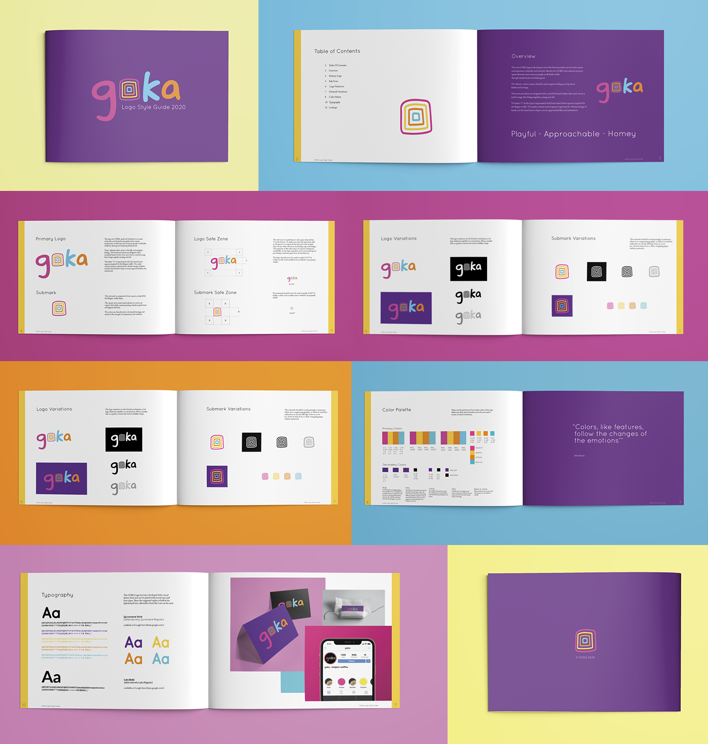

GOKA LOGO DESIGN
The Project:
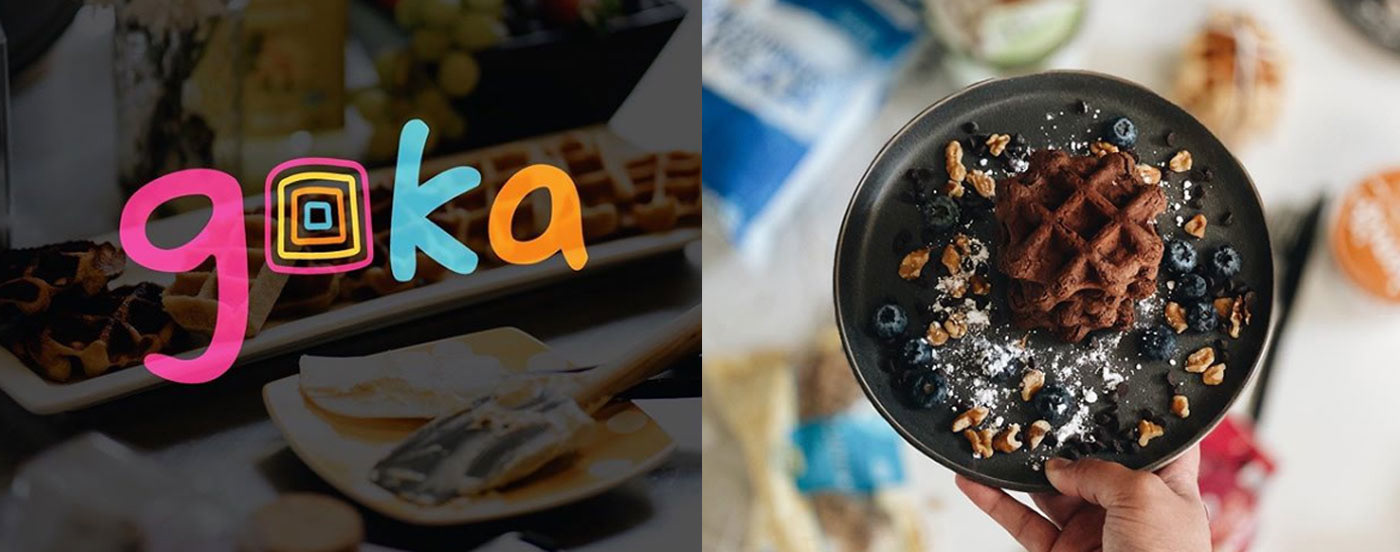
New logo identity for the brand GOKA, a Belgian waffle product (galette congolaise) created from a secret passed down family recipe.
The Objective:
Create a friendly and inclusive logo identity that attracts interest, sparks diversity and connects people of all fields of life through baked goods.
The What & Why:
Create a brand new logo identity for GOKA to stand out in a saturated food market.
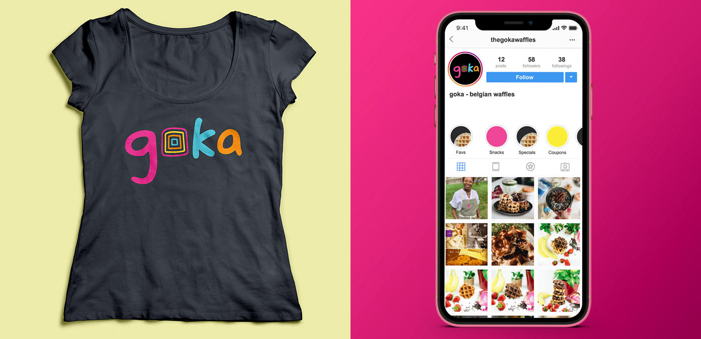
The logo identity is to be used across a wide range of media including online, print and social media.
The Feel & Tone:
Friendly - Inclusive - Diversity- Colorful - Togetherness - Family - Vibrant - Authentic - Young
Playful - Approachable - Homey
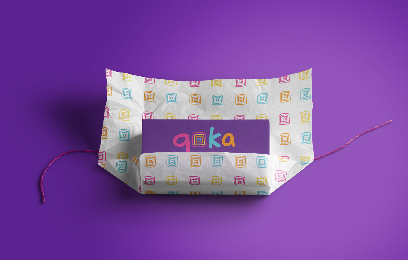
The new GOKA logo is developed out of the first two letters of two first names and represents a friendly and inclusive identity for GOKA that attracts interest, sparks diversity and connects people of all fields of life through family foods and baked good.
The vibrant colors create a friendly and energetic feeling and represent family and heritage.
The lowercase letters are designed with a youthful hand written font and convey a joyful energy that brings together young and old.
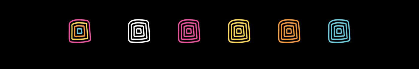
The letter “o” in the logo is represented with four hand drawn squares inspired by the Belgian waffle. The multi-colored nested squares represent the vibrant energy of family and the hand drawn shape conveys approachability and excitement.

Primary Logo
The logo for GOKA goal and objective is to create a friendly and inclusive perception that creates excitement, invokes joy and connects people of all fields of life by sharing and enjoying family foods. These vibrant colors create a friendly and energetic feeling. The lowercase letters are designed with a youthful hand written font and convey a joyful energy that brings together young and old. The letter “o” is represented with four hand drawn squares inspired by the Belgian waffle.
The multi-colored squares represent the vibrant energy of family and the hand drawn shape conveys approachability and excitement.

The submark is comprised of four squares, inspired by the Belgian waffle shape.
The square were nested and redrawn to convey an organic feel while communicating a family togetherness and approachability. The colors are directly tied to the family heritage and speak to the strength of community and tradition.