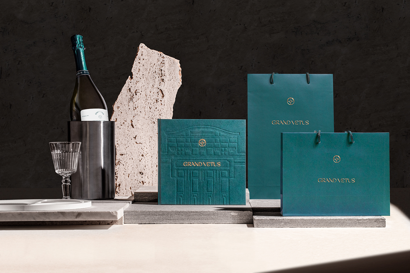
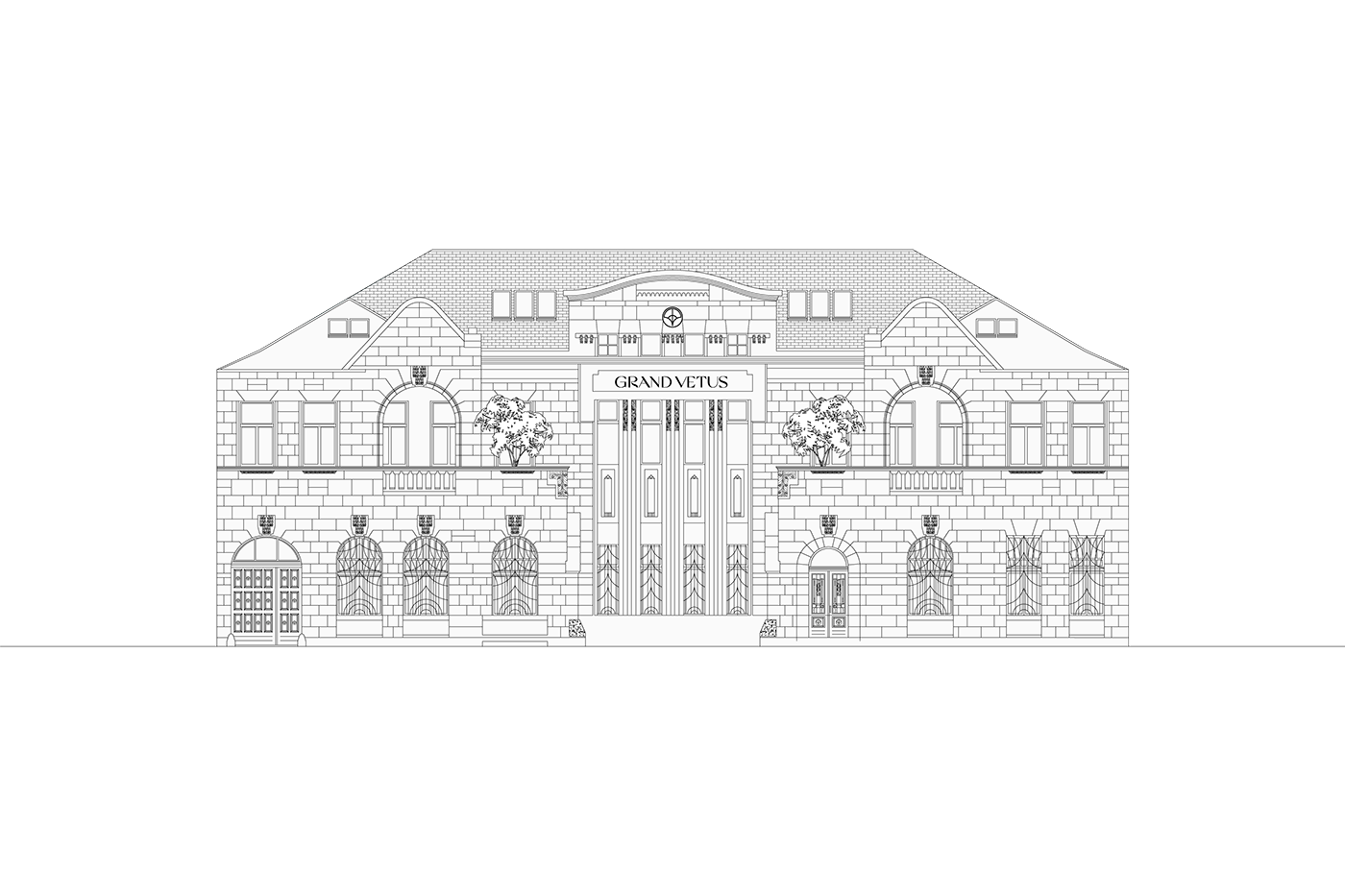
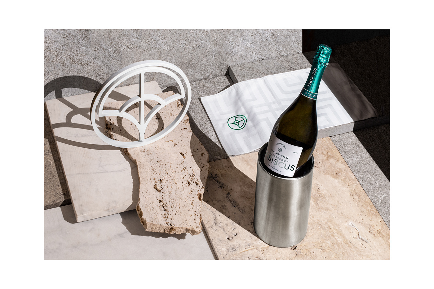
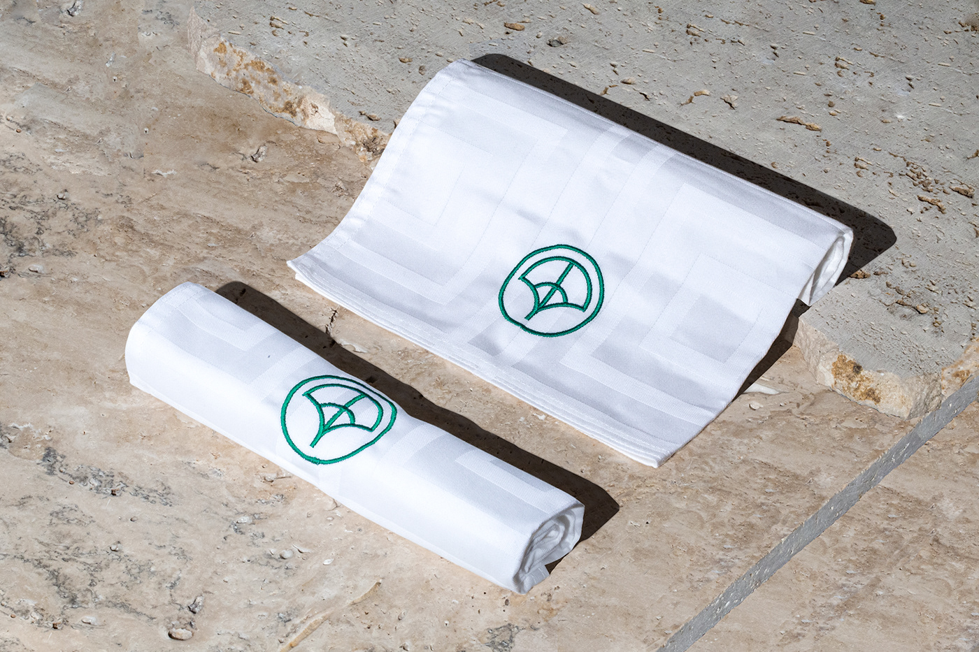
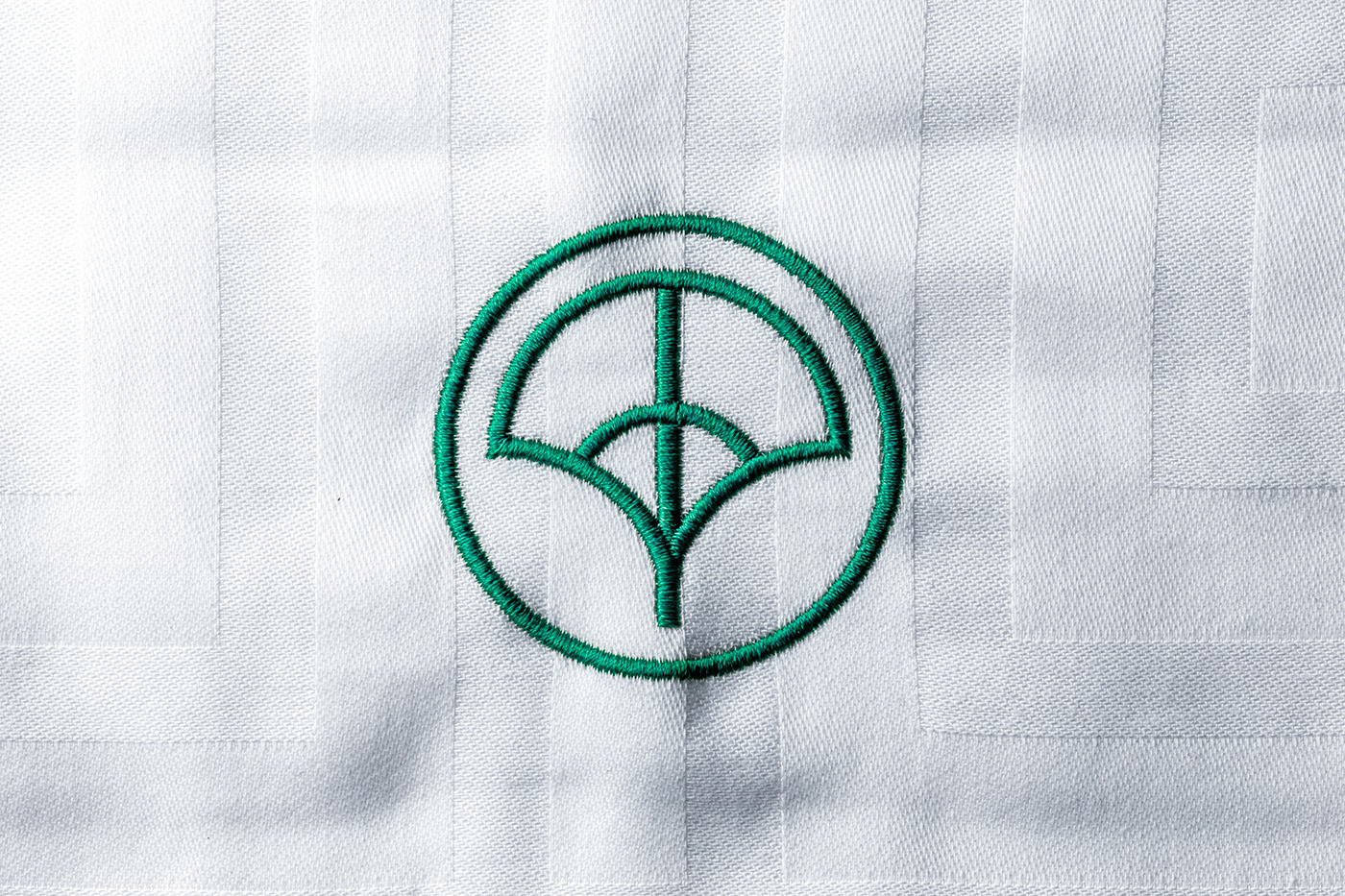
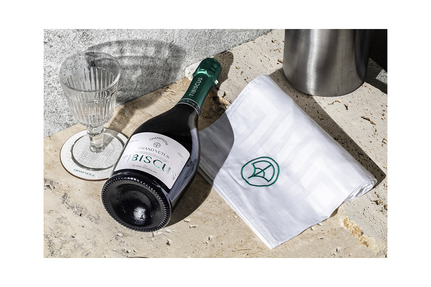
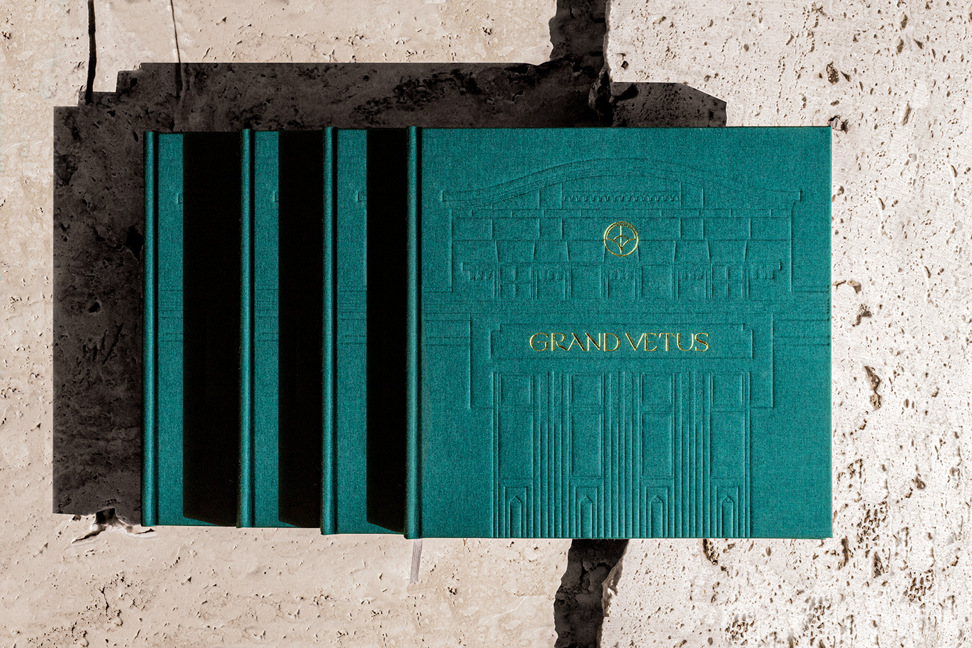
The building of the First Savings and Loan Bank of Bečej, classified as a significant historic heritage, was built in a structure according to secessionist stylistic marks. The secessionist style rose as a new and modern trend starting from Europe, which greatly influenced the image of cities on the East Coast of North America in the beginning of the 20th century (there known as Art Deco). The style emphasizes respect for nature. In its designs the lush systematism of plants dominates, the principle is that secessionism refrains from straight, measured and rigid shapes. At the creation of the brand, Explicit Design Studio marked this key sentence regarding the characteristics of its image. The created logo searches for its symbolism in nature, the shape also symbolizes with its specific visual image the upward striving growth of plant life and water springs, while in an abstract interpretation it radiates with the building’s opening, openness toward people. Thus, the nonfigurative logo combines the two foundation stones of secessionist philosophy, the classic value system as well as modern and innovative thinking. In the choice of the color it was also an important aspect that the object should be tied to its history, at the same time radiate its natural sensation. Turquoise-green is a combination that radiates the atmosphere of the characteristically green color of old banks, and the elusive passions of green lush nature.
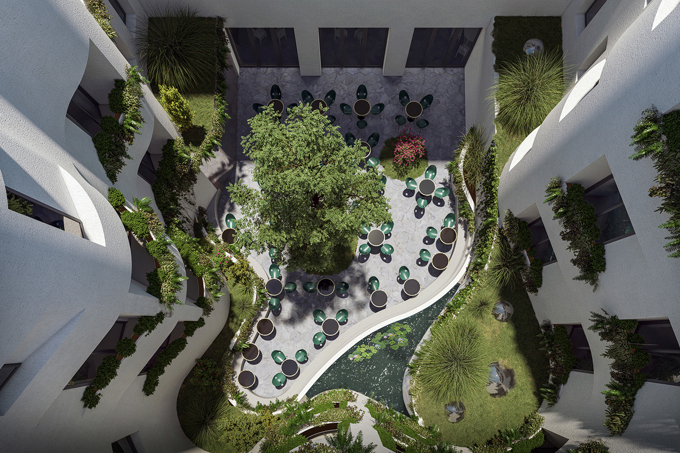
Architecture and renders: SPP ARCHITECTURE
Typefaces: Grand Slang by Nikolas Wrobel and Riviera by Swiss Typefaces
Bookbinding: Stanctechnik Digital
Signage: Minimal Ceramic
Special thanks: Rétfalvi Orsolya (Kézművész Bt.) and Németh Andor